library("Hiiragi2013")
data("x")
dim(Biobase::exprs(x))[1] 45101 101
There are (at least) two types of data visualization. The first enables a scientist to explore data and make discoveries about the complex processes at work. The other type of visualization provides informative, clear and visually attractive illustrations of her results that she can show to others and eventually include in a publication.
Both of these types of visualizations can be made with R. In fact, R offers multiple graphics systems. This is because R is extensible, and because progress in R graphics over the years has proceeded largely not by replacing the old functions, but by adding packages. Each of the different graphics systems has its advantages and limitations. In this chapter we will get to know two of them. First, we have a cursory look at the base R plotting functions1. Subsequently we will switch to ggplot2.
1 They live in the graphics package, which ships with every basic R installation.
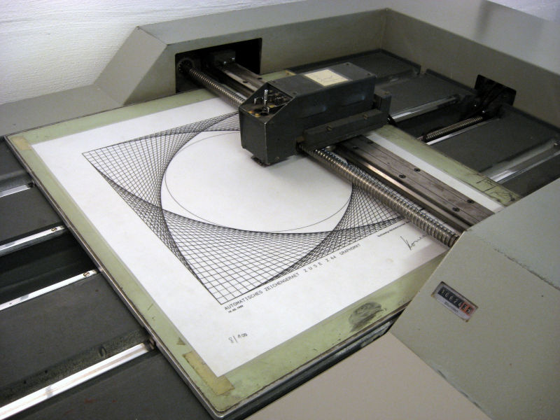
Base R graphics came historically first: simple, procedural, conceptually motivated by drawing on a canvas. There are specialized functions for different types of plots. These are easy to call – but when you want to combine them to build up more complex plots, or exchange one for another, this quickly gets messy, or even impossible. The user plots (the word harks back to some of the first graphics devices – see Figure 3.1) directly onto a (conceptual) canvas. She explicitly needs to deal with decisions such as how much space to allocate to margins, axes labels, titles, legends, subpanels; once something is “plotted” it cannot be moved or erased.
There is a more high-level approach: in the grammar of graphics, graphics are built up from modular logical pieces, so that we can easily try different visualization types for our data in an intuitive and easily deciphered way, like we can switch in and out parts of a sentence in human language. There is no concept of a canvas or a plotter, rather, the user gives ggplot2 a high-level description of the plot she wants, in the form of an R object, and the rendering engine takes a wholistic view on the scene to lay out the graphics and render them on the output device.
In this chapter, we will:
Learn how to rapidly and flexibly explore datasets by visualization.
Create beautiful and intuitive plots for scientific presentations and publications.
Review the basics of base R plotting.
Understand the logic behind the grammar of graphics concept.
Introduce ggplot2’s ggplot function.
See how to plot data in one, two, or even three to five dimensions, and explore faceting.
Create “along-genome” plots for molecular biology data (or along other sequences, e.g., peptides).
Discuss some of our options of interactive graphics.
The most basic function is plot. In the code below, the output of which is shown in Figure 3.2, it is used to plot data from an enzyme-linked immunosorbent assay (ELISA) assay. The assay was used to quantify the activity of the enzyme deoxyribonuclease (DNase), which degrades DNA. The data are assembled in the R object DNase, which conveniently comes with base R. The object DNase is a dataframe whose columns are Run, the assay run; conc, the protein concentration that was used; and density, the measured optical density.
head(DNase) Run conc density
1 1 0.04882812 0.017
2 1 0.04882812 0.018
3 1 0.19531250 0.121
4 1 0.19531250 0.124
5 1 0.39062500 0.206
6 1 0.39062500 0.215plot(DNase$conc, DNase$density)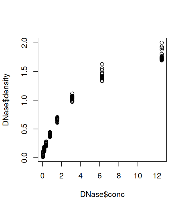
This basic plot can be customized, for example by changing the plot symbol and axis labels using the parameters xlab, ylab and pch (plot character), as shown in Figure 3.3. Information about the variables is stored in the object DNase, and we can access it with the attr function.
plot(DNase$conc, DNase$density,
  ylab = attr(DNase, "labels")$y,
  xlab = paste(attr(DNase, "labels")$x, attr(DNase, "units")$x),
  pch = 3,
  col = "blue")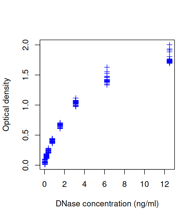
Besides scatterplots, we can also use built-in functions to create histograms and boxplots (Figure 3.4).
hist(DNase$density, breaks=25, main = "")
boxplot(density ~ Run, data = DNase)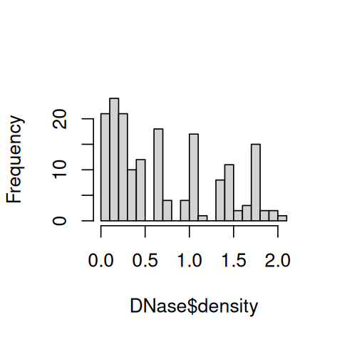
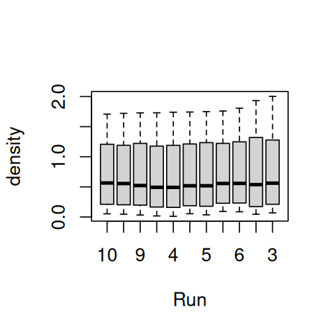
Boxplots are convenient for showing multiple distributions next to each other in a compact space. We will see more about plotting multiple univariate distributions in Section 3.6.
The base R plotting functions are great for quick interactive exploration of data; but we run soon into their limitations if we want to create more sophisticated displays. We are going to use a visualization framework called the grammar of graphics, implemented in the package ggplot2, that enables step by step construction of high quality graphics in a logical and elegant manner. First let us introduce and load an example dataset.
To properly testdrive the ggplot2 functionality, we are going to need a dataset that is big enough and has some complexity so that it can be sliced and viewed from many different angles. We’ll use a gene expression microarray dataset that reports the transcriptomes of around 100 individual cells from mouse embryos at different time points in early development. The mammalian embryo starts out as a single cell, the fertilized egg. Through synchronized waves of cell divisions, the egg multiplies into a clump of cells that at first show no discernible differences between them. At some point, though, cells choose different lineages. By further and further specification, the different cell types and tissues arise that are needed for a full organism. The aim of the experiment, explained by Ohnishi et al. (2014), was to investigate the gene expression changes associated with the first symmetry breaking event in the embryo. We’ll further explain the data as we go. More details can be found in the paper and in the documentation of the Bioconductor data package Hiiragi2013. We first load the data:

x, rather than a more descriptive name. To avoid name collisions, perhaps the most pragmatic solution would be to run code such as following: esHiiragi = x; rm(list="x").library("Hiiragi2013")
data("x")
dim(Biobase::exprs(x))[1] 45101 101You can print out a more detailed summary of the ExpressionSet object x by just typing x at the R prompt. The 101 columns of the data matrix (accessed above through the exprs function from the Biobase package) correspond to the samples (each of these is a single cell), the 45101 rows correspond to the genes probed by the array, an Affymetrix mouse4302 array. The data were normalized using the RMA method (Irizarry et al. 2003). The raw data are also available in the package (in the data object a) and at EMBL-EBI’s ArrayExpress database under the accession code E-MTAB-1681.
Let’s have a look at what information is available about the samples2.
2 The notation #CAB2D6 is a hexadecimal representation of the RGB coordinates of a color; more on this in Section 3.10.2.
head(pData(x), n = 2) File.name Embryonic.day Total.number.of.cells lineage genotype
1 E3.25 1_C32_IN E3.25 32 WT
2 E3.25 2_C32_IN E3.25 32 WT
ScanDate sampleGroup sampleColour
1 E3.25 2011-03-16 E3.25 #CAB2D6
2 E3.25 2011-03-16 E3.25 #CAB2D6The information provided is a mix of information about the cells (i.e., age, size and genotype of the embryo from which they were obtained) and technical information (scan date, raw data file name). By convention, time in the development of the mouse embryo is measured in days, and reported as, for instance, E3.5. Moreover, in the paper the authors divided the cells into 8 biological groups (sampleGroup), based on age, genotype and lineage, and they defined a color scheme to represent these groups (sampleColour3). Using the following code (see below for explanations), we define a small dataframe groups that contains summary information for each group: the number of cells and the preferred color.
3 This identifier in the dataset uses the British spelling. Everywhere else in this book, we use the US spelling (color). The ggplot2 package generally accepts both spellings.
library("dplyr")
groups = group_by(pData(x), sampleGroup) |>
  summarise(n = n(), color = unique(sampleColour))
groups
# A tibble: 8 × 3
sampleGroup n color
<chr> <int> <chr>
1 E3.25 36 #CAB2D6
2 E3.25 (FGF4-KO) 17 #FDBF6F
3 E3.5 (EPI) 11 #A6CEE3
4 E3.5 (FGF4-KO) 8 #FF7F00
5 E3.5 (PE) 11 #B2DF8A
6 E4.5 (EPI) 4 #1F78B4
7 E4.5 (FGF4-KO) 10 #E31A1C
8 E4.5 (PE) 4 #33A02CThe cells in the groups whose name contains FGF4-KO are from embryos in which the FGF4 gene, an important regulator of cell differentiation, was knocked out. Starting from E3.5, the wildtype cells (without the FGF4 knock-out) undergo the first symmetry breaking event and differentiate into different cell lineages, called pluripotent epiblast (EPI) and primitive endoderm (PE).
Since the code chunk above is the first instance that we encounter the pipe operator |> and the functions group_by and summarise from the dplyr package, let’s unpack the code. First, the pipe |>4. Generally, the pipe is useful for making nested function calls easier to read for humans. The following two lines of code are equivalent to R.
4 |> is the pipe operator that has been coming with base R since version 4.1, released in 2021. The package magrittr has provided the %>% operator, which has similar although not identical semantics, already since a long time before, as well as several other piping related operators, such as %<>% and %T>%. As much of the book was written before 2021, magrittr’s %>% operator is used in many places. We are occasionally updating from %>% to |> during book maintenance, as in the code shown here.
f(x) |> g(y) |> h()
h(g(f(x), y))
It says: “Evaluate f(x), then pass the result to function g as the first argument, while y is passed to g as the second argument. Then pass the output of g to the function h.” You could repeat this ad infinitum. Especially if the arguments x and y are complex expressions themselves, or if there is quite a chain of functions involved, the first version tends to be easier to read.
The group_by function simply “marks” the dataframe with a note that all subsequent operations should not be applied to the whole dataframe at once, but to blocks defined by the sampleGroup factor. Finally, summarise computes summary statistics; this could be, e.g., the mean, sum; in this case, we just compute the number of rows in each block, n(), and the prevalent color.
ggplot2 is a package by Hadley Wickham (Wickham 2016) that implements the idea of grammar of graphics – a concept created by Leland Wilkinson in his eponymous book (Wilkinson 2005). We will explore some of its functionality in this chapter, and you will see many examples of how it can be used in the rest of this book. Comprehensive documentation for the package can be found on its website. The online documentation includes example use cases for each of the graphic types that are introduced in this chapter (and many more) and is an invaluable resource when creating figures.
Let’s start by loading the package and redoing the simple plot of Figure 3.2.
library("ggplot2")
ggplot(DNase, aes(x = conc, y = density)) + geom_point()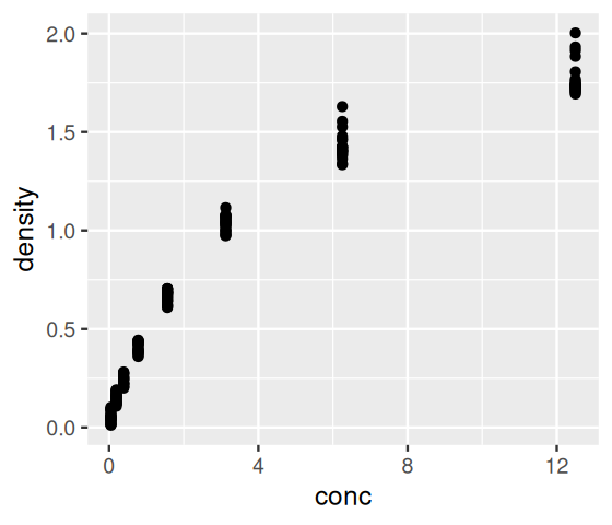
We just wrote our first “sentence” using the grammar of graphics. Let’s deconstruct this sentence. First, we specified the dataframe that contains the data, DNase. The aes (this stands for aesthetic) argument states which variables we want to see mapped to the \(x\)- and \(y\)-axes, respectively. Finally, we stated that we want the plot to use points (as opposed to, say, lines or bars), by adding the result of calling the function geom_point.
Now let’s turn to the mouse single cell data and plot the number of samples for each of the 8 groups using the ggplot function. The result is shown in Figure 3.7.
ggplot(groups, aes(x = sampleGroup, y = n)) +
  geom_bar(stat = "identity")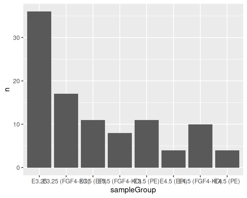
ggplot function from the table of group sizes in the mouse single cell data.
With geom_bar we now told ggplot that we want each data item (each row of groups) to be represented by a bar. Bars are one example of geometric object (geom in the ggplot2 package’s parlance) that ggplot knows about. We have already seen another such object in Figure 3.6: points, indicated by the geom_point function. We will encounter many other geoms later. We used the aes to indicate that we want the groups shown along the \(x\)-axis and the sizes along the \(y\)-axis. Finally, we provided the argument stat = "identity" (in other words, do nothing) to the geom_bar function, since otherwise it would try to compute a histogram of the data (the default value of stat is "count"). stat is short for statistic, which is what we call any function of data. Besides the identity and count statistic, there are others, such as smoothing, averaging, binning, or other operations that reduce the data in some way.
These concepts –data, geometrical objects, statistics– are some of the ingredients of the grammar of graphics, just as nouns, verbs and adverbs are ingredients of an English sentence.
The plot in Figure 3.7 is not bad, but there are several potential improvements. We can use color for the bars to help us quickly see which bar corresponds to which group. This is particularly useful if we use the same color scheme in several plots. To this end, let’s define a named vector groupColor that contains our desired colors for each possible value of sampleGroup.5
5 The information is completely equivalent to that in the sampleGroup and color columns of the dataframe groups; we are just adapting to the fact that ggplot2 expects this information in the form of a named vector.
groupColor = setNames(groups$color, groups$sampleGroup)Another thing that we need to fix in Figure 3.7 is the readability of the bar labels. Right now they are running into each other — a common problem when you have descriptive names.
ggplot(groups, aes(x = sampleGroup, y = n, fill = sampleGroup)) +
  geom_bar(stat = "identity") +
  scale_fill_manual(values = groupColor, name = "Groups") +
  theme(axis.text.x = element_text(angle = 90, hjust = 1))
This is now already a longer and more complex sentence. Let’s dissect it. We added an argument, fill to the aes function that states that we want the bars to be colored (filled) based on sampleGroup (which in this case co-incidentally is also the value of the x argument, but that need not always be so). Furthermore we added a call to the scale_fill_manual function, which takes as its input a color map – i.e., the mapping from the possible values of a variable to the associated colors – as a named vector. We also gave this color map a title (note that in more complex plots, there can be several different color maps involved). Had we omitted the call to scale_fill_manual, ggplot2 would have used its choice of default colors. We also added a call to theme stating that we want the \(x\)-axis labels rotated by 90 degrees and right-aligned (hjust; the default would be to center).
The function ggplot expects your data in a dataframe. If they are in a matrix, in separate vectors, or other types of objects, you will have to convert them. The packages dplyr and broom, among others, offer facilities to this end. We will discuss this more in Section 13.10, and you will see examples of such conversions throughout the book.
The result of a call to the ggplot is a ggplot object. Let’s recall a piece of code from above:
gg = ggplot(DNase, aes(x = conc, y = density)) + geom_point()We have now assigned the output of ggplot to the object gg, instead of sending it directly to the console, where it was “printed” and produced Figure 3.6. The situation is completely analogous to what you’re used to from working with the R console: when you enter an expression such as 1+1 and hit “Enter”, the result is printed. When the expression is an assignment, such as s = 1+1, the side effect takes place (the name "s" is bound to an object in memory that represents the value of 1+1), but nothing is printed. Similarly, when an expression is evaluated as part of a script called with source, it is not printed. Thus, the above code also does not create any graphic output, since no print method is invoked. To print gg, type its name (in an interactive session) or call print on it:
gg
print(gg)ggplot2 has a built-in plot saving function called ggsave:
ggplot2::ggsave("DNAse-histogram-demo.pdf", plot = gg)There are two major ways of storing plots: vector graphics and raster (pixel) graphics. In vector graphics, the plot is stored as a series of geometrical primitives such as points, lines, curves, shapes and typographic characters. The preferred format in R for saving plots into a vector graphics format is PDF. In raster graphics, the plot is stored in a dot matrix data structure. The main limitation of raster formats is their limited resolution, which depends on the number of pixels available. In R, the most commonly used device for raster graphics output is png. Generally, it’s preferable to save your plots in a vector graphics format, since it is always possible later to convert a vector graphics file into a raster format of any desired resolution, while the reverse is quite difficult. And you don’t want the figures in your talks or papers look poor because of pixelization artefacts!
The components of ggplot2’s grammar of graphics are
one or more datasets,
one or more geometric objects that serve as the visual representations of the data, – for instance, points, lines, rectangles, contours,
descriptions of how the variables in the data are mapped to visual properties (aesthetics) of the geometric objects, and an associated scale (e. g., linear, logarithmic, rank),
one or more coordinate systems,
statistical summarization rules,
a facet specification, i.e. the use of multiple similar subplots to look at subsets of the same data,
optional parameters that affect the layout and rendering, such text size, font and alignment, legend positions.
In the examples above, Figures 3.7 and 3.8, the dataset was groupsize, the variables were the numeric values as well as the names of groupsize, which we mapped to the aesthetics \(y\)-axis and \(x\)-axis respectively, the scale was linear on the \(y\) and rank-based on the \(x\)-axis (the bars are ordered alphanumerically and each has the same width), and the geometric object was the rectangular bar.
Items 4–7 in the above list are optional. If you don’t specify them, then the Cartesian is used as the coordinate system, the statistical summary is the trivial one (i.e., the identity), and no facets or subplots are made (we’ll see examples later on, in Section 3.8). The first three items are required: a valid ggplot2 “sentence” needs to contain at least one of each of them.
In fact, ggplot2’s implementation of the grammar of graphics allows you to use the same type of component multiple times, in what are called layers (Wickham 2010). For example, the code below uses three types of geometric objects in the same plot, for the same data: points, a line and a confidence band.
dftx = data.frame(t(Biobase::exprs(x)), pData(x))
ggplot( dftx, aes( x = X1426642_at, y = X1418765_at )) +
  geom_point( shape = 1 ) +
  geom_smooth( method = "loess" )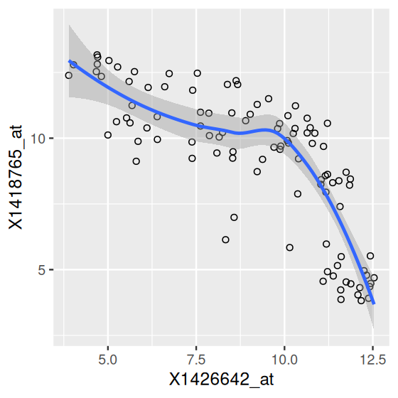
geom_point), a smooth regression line and a confidence band (the latter two from geom_smooth).
Here we had to assemble a copy of the expression data (Biobase::exprs(x)) and the sample annotation data (pData(x)) all together into the dataframe dftx – since this is the data format that ggplot2 functions most easily take as input (more on this in Section 13.10).
We can further enhance the plot by using colors – since each of the points in Figure 3.9 corresponds to one sample, it makes sense to use the sampleColour information in the object x.
ggplot(dftx, aes(x = X1426642_at, y = X1418765_at))  +
  geom_point(aes(color = sampleGroup), shape = 19) +
  scale_color_manual(values = groupColor, guide = "none") +
  geom_smooth(method = "loess")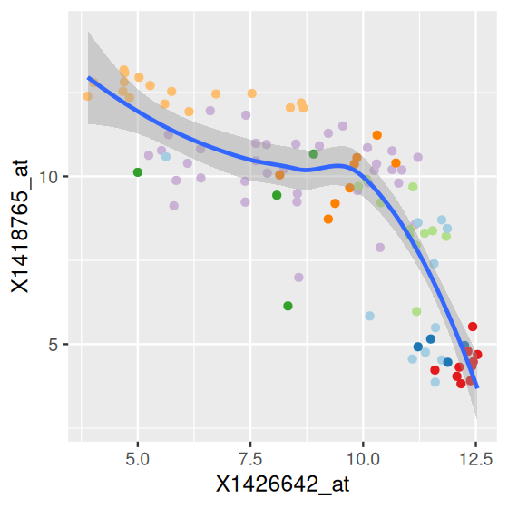
As an aside, if we want to find out which genes are targeted by these probe identifiers, and what they might do, we can call:
x. The leading “X” that we used above when working with dftx was inserted during the creation of dftx by the constructor function data.frame, since its argument check.names is set to TRUE by default. Alternatively, we could have kept the original identifier notation by setting check.names = FALSE, but then our code (e.g., the calls to aes()) would need to use backticks around the identifiers to make sure R interprets them correctly.:: operator to call the select function by its fully qualified name, including the package. We already encountered this in Chapter 2.library("mouse4302.db")AnnotationDbi::select(mouse4302.db,
keys = c("1426642_at", "1418765_at"), keytype = "PROBEID",
columns = c("SYMBOL", "GENENAME")) PROBEID SYMBOL GENENAME
1 1426642_at Fn1 fibronectin 1
2 1418765_at Timd2 T cell immunoglobulin and mucin domain containing 2Often when using ggplot you will only need to specify the data, aesthetics and a geometric object. Most geometric objects implicitly call a suitable default statistical summary of the data. For example, if you are using geom_smooth, then ggplot2 uses stat = "smooth" by default and displays a line; if you use geom_histogram, the data are binned and the result is displayed in barplot format. Here’s an example:
dfx = as.data.frame(Biobase::exprs(x))
ggplot(dfx, aes(x = `20 E3.25`)) + geom_histogram(binwidth = 0.2)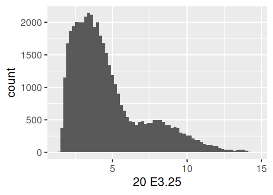
Let’s come back to the barplot example from above.
pb = ggplot(groups, aes(x = sampleGroup, y = n))This creates a plot object pb. If we try to display it, it creates an empty plot, because we haven’t specified what geometric object we want to use. All that we have in our pb object so far are the data and the aesthetics (Figure 3.12).
class(pb)[1] "ggplot2::ggplot" "ggplot" "ggplot2::gg" "S7_object"
[5] "gg" pbpb: without a geometric object (a geom), the plot area remains empty. With the default style parameters, the tick labels on the \(x\)-axis are not legible.
Now we can simply add on the other components of our plot through using the + operator (Figure 3.13):
pb = pb + geom_bar(stat = "identity")
pb = pb + aes(fill = sampleGroup)
pb = pb + theme(axis.text.x = element_text(angle = 90, hjust = 1))
pb = pb + scale_fill_manual(values = groupColor, name = "Groups")
pb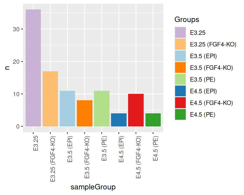
bp in its full glory.
This step-wise buildup –taking a graphics object already produced in some way and then further refining it– can be more convenient and easy to manage than, say, providing all the instructions upfront to the single function call that creates the graphic.
We can quickly try out different visualization ideas without having to rebuild our plots each time from scratch, but rather store the partially finished object and then modify it in different ways. For example we can switch our plot to polar coordinates to create an alternative visualization of the barplot.
pb.polar = pb + coord_polar() +
  theme(axis.text.x = element_text(angle = 0, hjust = 1),
        axis.text.y = element_blank(),
        axis.ticks = element_blank()) +
  xlab("") + ylab("")
pb.polar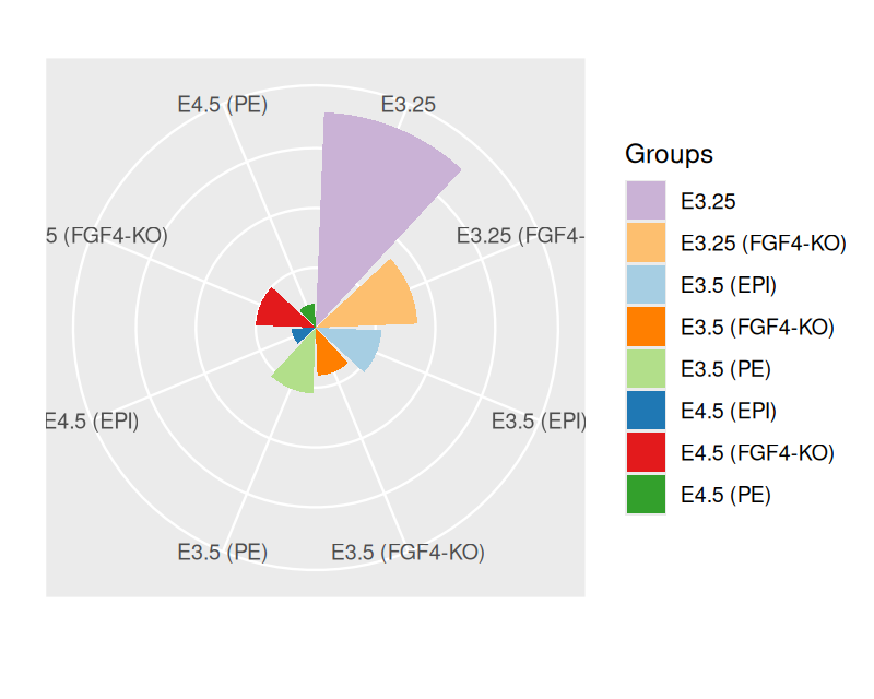
Note above that we can override previously set theme parameters by simply setting them to a new value – no need to go back to recreating pb, where we originally set them.
A common task in biological data analysis is the comparison between several samples of univariate measurements. In this section we’ll explore some possibilities for visualizing and comparing such samples. As an example, we’ll use the intensities of a set of four genes: Fgf4, Gata4, Gata6 and Sox26. On the microarray, they are represented by
6 You can read more about these genes in (Ohnishi et al. 2014).
selectedProbes = c( Fgf4 = "1420085_at", Gata4 = "1418863_at",
                   Gata6 = "1425463_at",  Sox2 = "1416967_at")
To extract data from this representation and convert them into a dataframe, we use the function melt from the reshape2 package7.
7 We’ll talk more about the concepts and mechanics of different data representations in Section 13.10.
library("reshape2")
genes = melt(Biobase::exprs(x)[selectedProbes, ],
             varnames = c("probe", "sample"))
For good measure, we also add a column that provides the gene symbol along with the probe identifiers.
genes$gene =
  names(selectedProbes)[match(genes$probe, selectedProbes)]
head(genes)
probe sample value gene
1 1420085_at 1 E3.25 3.027715 Fgf4
2 1418863_at 1 E3.25 4.843137 Gata4
3 1425463_at 1 E3.25 5.500618 Gata6
4 1416967_at 1 E3.25 1.731217 Sox2
5 1420085_at 2 E3.25 9.293016 Fgf4
6 1418863_at 2 E3.25 5.530016 Gata4A popular way to display data such as in our dataframe genes is through barplots (Figure 3.15).
ggplot(genes, aes(x = gene, y = value)) +
  stat_summary(fun = mean, geom = "bar")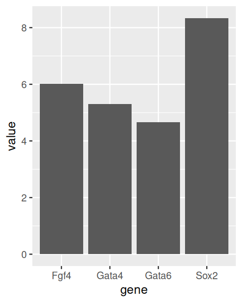
In Figure 3.15, each bar represents the mean of the values for that gene. Such plots are commonly used in the biological sciences, as well as in the popular media. However, summarizing the data into only a single number, the mean, loses much of the information, and given the amount of space they take, barplot are a poor way to visualize data8.
8 In fact, if the mean is not an appropriate summary, such as for highly skewed or multimodal distributions, or for datasets with large outliers, this kind of visualization can be outright misleading.
Sometimes we want to add error bars, and one way to achieve this in ggplot2 is as follows.
library("Hmisc")
ggplot(genes, aes( x = gene, y = value, fill = gene)) +
  stat_summary(fun = mean, geom = "bar") +
  stat_summary(fun.data = mean_cl_normal, geom = "errorbar",
               width = 0.25)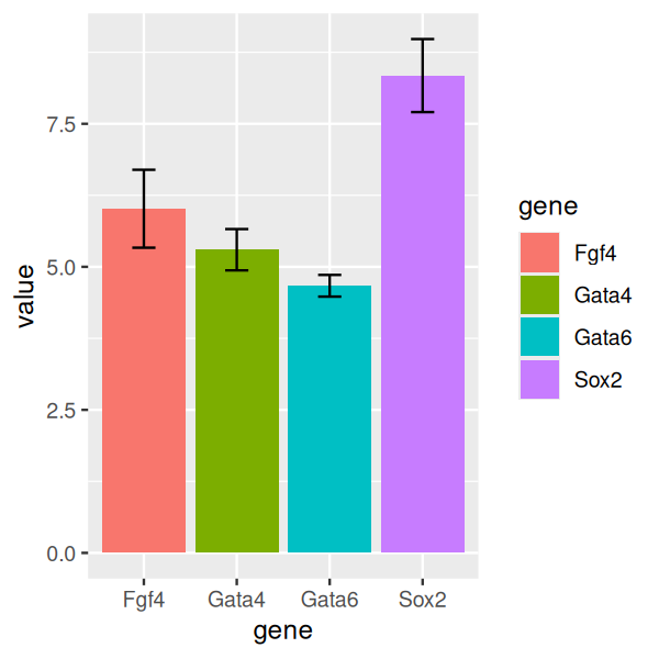
Here, we see again the principle of layered graphics: we use two summary functions, mean and mean_cl_normal, and two associated geometric objects, bar and errorbar. The function mean_cl_normal is from the Hmisc package and computes the standard error (or confidence limits) of the mean; it’s a simple function, and we could also compute it ourselves using base R expressions if we wished to do so. We have also colored the bars to make the plot more visually pleasing.
Boxplots take up a similar amount of space as barplots, but are much more informative.
p = ggplot(genes, aes( x = gene, y = value, fill = gene))
p + geom_boxplot()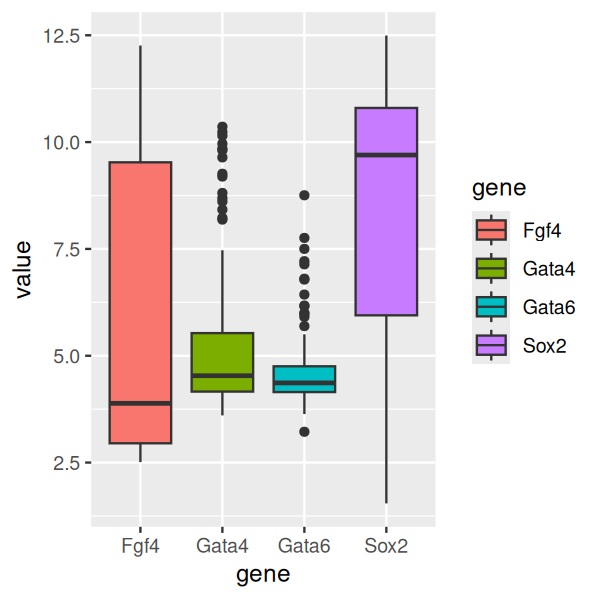
In Figure 3.17 we see that two of the genes (Gata4, Gata6) have relatively concentrated distributions, with only a few data points venturing out in the direction of higher values. For Fgf4, we see that the distribution is right-skewed: the median, indicated by the horizontal black bar within the box is closer to the lower (or left) side of the box. Conversely, for Sox2 the distribution is left-skewed.
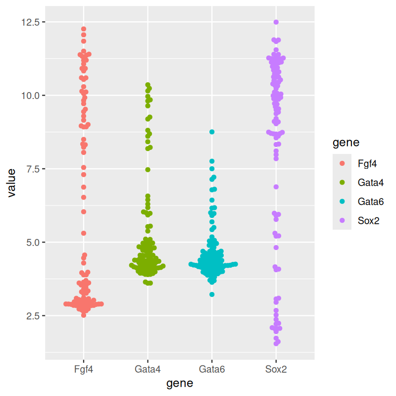
If the number of data points is not too large, it is possible to show the data points directly, and it is good practice to do so, compared to the summaries we saw above. However, plotting the data directly will often lead to overlapping points, which can be visually unpleasant, or even obscure the data. We can try to lay out the points so that they are as near possible to their proper locations without overlap (Wilkinson 1999).
p + geom_dotplot(binaxis = "y", binwidth = 1/6,
       stackdir = "center", stackratio = 0.75,
       aes(color = gene))
library("ggbeeswarm")
p + geom_beeswarm(aes(color = gene))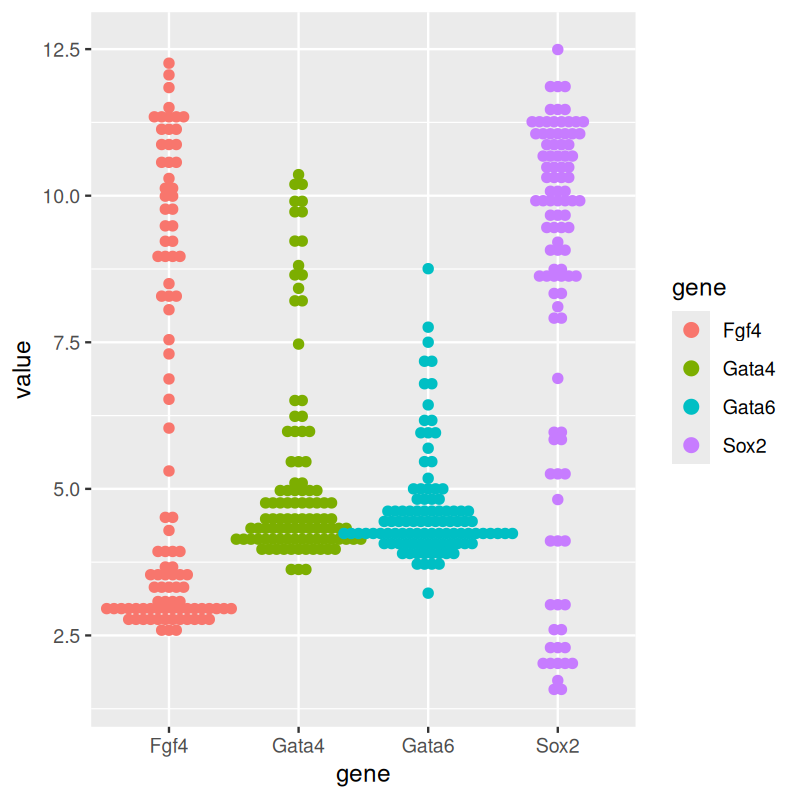
geom_dotplot from ggplot2. (b) Beeswarm plots, made using geom_beeswarm from ggbeeswarm.
The plot in panel (a) of Figure 3.18. The \(y\)-coordinates of the points are discretized into bins (above we chose a bin size of 1/6), and then they are stacked next to each other.
An alternative is provided by the package ggbeeswarm, which provides geom_beeswarm. The plot is shown in panel (b) of Figure 3.18. The layout algorithm aims to avoid overlaps between the points. If a point were to overlap an existing point, it is shifted along the \(x\)-axis by a small amount sufficient to avoid overlap. Some tweaking of the layout parameters is usually needed for each new dataset to make a dot plot or a beeswarm plot look good.
Yet another way to represent the same data is by density plots. Here, we try to estimate the underlying data-generating density by smoothing out the data points (Figure 3.19).
ggplot(genes, aes( x = value, color = gene)) + geom_density()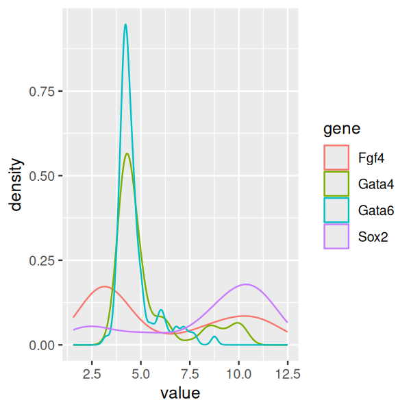
As you can see from Figures 3.17—3.19, boxplots work fairly well for unimodal data, but they can be misleading if the data distribution is multimodal, and they also do not always give a fair impression of long-tailed distributions. By showing the data points, or their densities, directly, Figures 3.18—3.19) give a better impression of such features. For instance, we can see that the data for Fgf4 and Sox2 are bimodal, while Gata4 and Gata6 have most of their values concentrated around a baseline, but a certain fraction of cells have elevated expression levels, across a wide range of values.
Density estimation has, however, a number of complications, in particular, the need for choosing a smoothing window. A window size that is small enough to capture peaks in the dense regions of the data may lead to instable (“wiggly”) estimates elsewhere. On the other hand, if the window is made bigger, pronounced features of the density, such as sharp peaks, may be smoothed out. Moreover, the density lines do not convey the information on how much data was used to estimate them, and plots like Figure 3.19 can be especially problematic if the sample sizes for the curves differ.
Density plots such as Figure 3.19 can look crowded if there are several densities, and one idea is to arrange the densities in a layout inspired by boxplots: the violin plot (Figure 3.20). Here, the density estimate is used to draw a symmetric shape, which sometimes visually reminds of a violin.
p + geom_violin()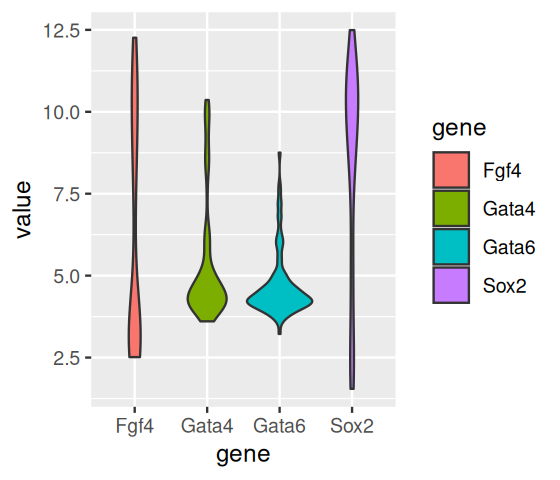
Another play on density plots are ridgeline plots (Figure 3.21):
library("ggridges")
ggplot(genes, aes(x = value, y = gene, fill = gene)) +
  geom_density_ridges()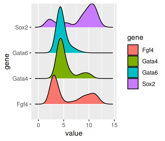
This type of display is perhaps most appropriate if the number of densities shown goes into the dozens.
top42 = order(rowMeans(Biobase::exprs(x)), decreasing = TRUE)[1:42]
g42 = melt(Biobase::exprs(x)[rev(top42), ], varnames = c("probe", "sample"))
ggplot(g42, aes(x = value, y = probe)) 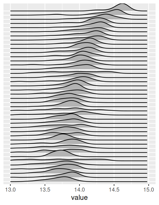
The mathematically most convenient way to describe the distribution of a one-dimensional random variable \(X\) is its cumulative distribution function (CDF), i.e., the function defined by
\[ F(x) = P(X\le x), \tag{3.1}\]
where \(x\) takes all values along the real axis. The density of \(X\) is then the derivative of \(F\), if it exists9. The finite sample version of the probability 3.1 is called the empirical cumulative distribution function (ECDF),
9 By its definition, \(F\) tends to 0 for small \(x\) (\(x\to-\infty\)) and to 1 for large \(x\) (\(x\to+\infty\)).
\[ F_{n}(x) = \frac{\text{number of $i$ for which } x_i \le x}{n} = \frac{1}{n}\sum_{i=1}^n 𝟙({x\le x_i}), \tag{3.2}\]
where \(x_1,...,x_n\) denote a sample of \(n\) draws from \(X\) and \(𝟙\) is the indicator function, i.e., the function that takes the value 1 if the expression in its argument is true and 0 otherwise. If this sounds abstract, we can get a perhaps more intuitive understanding from the following example (Figure 3.23):
simdata = rnorm(70)
tibble(index = seq_along(simdata),
          sx = sort(simdata)) %>%
ggplot(aes(x = sx, y = index)) + geom_step()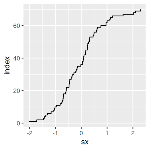
simdata versus their index. This is the empirical cumulative distribution function of simdata.
Plotting the sorted values against their ranks gives the essential features of the ECDF (Figure 3.23). In practice, we do not need to do the sorting and the other steps in the above code manually and will rather use the stat_ecdf() geometric object. The ECDFs of our data are shown in Figure 3.24.
ggplot(genes, aes( x = value, color = gene)) + stat_ecdf()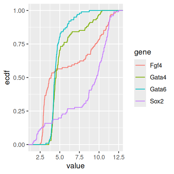
The ECDF has several nice properties:
It is lossless: the ECDF \(F_{n}(x)\) contains all the information contained in the original sample \(x_1,...,x_n\), except for the order of the values, which is assumed to be unimportant.
As \(n\) grows, the ECDF \(F_{n}(x)\) converges to the true CDF \(F(x)\). Even for limited sample sizes \(n\), the difference between the two functions tends to be small. Note that this is not the case for the empirical density! Without smoothing, the empirical density of a finite sample is a sum of Dirac delta functions, which is difficult to visualize and quite different from any underlying smooth, true density. With smoothing, the difference can be less pronounced, but is difficult to control, as we discussed above.
It is tempting to look at histograms or density plots and inspect them for evidence of bimodality (or multimodality) as an indication of some underlying biological phenomenon. Before doing so, it is important to remember that the number of modes of a density depends on scale transformations of the data, via the chain rule. For instance, let’s look at the data from one of the arrays in the Hiiragi dataset (Figure 3.26):
ggplot(dfx, aes(x = `64 E4.5 (EPI)`)) + geom_histogram(bins = 100)
ggplot(dfx, aes(x = 2 ^ `64 E4.5 (EPI)`)) +
  geom_histogram(binwidth = 20) + xlim(0, 1500)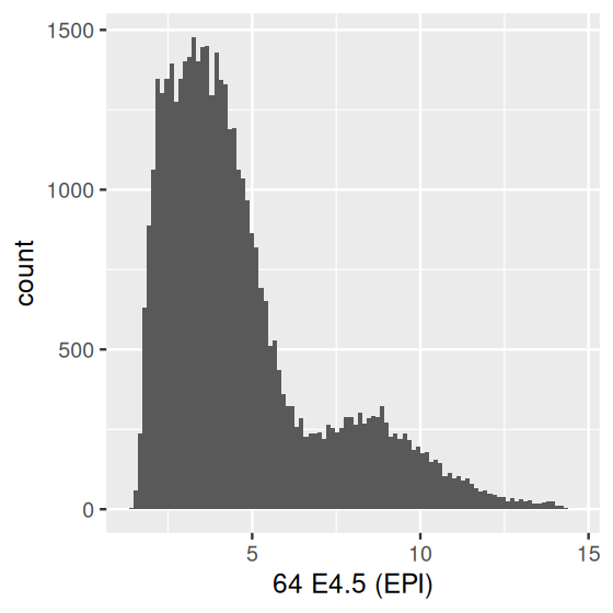
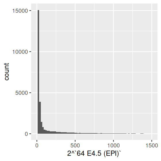
x, which resulted from logarithm (base 2) transformation of the microarray fluorescence intensities (Irizarry et al. 2003); (b) after re-exponentiating them back to the fluorescence scale. For better use of space, we capped the \(x\)-axis range at 1500.
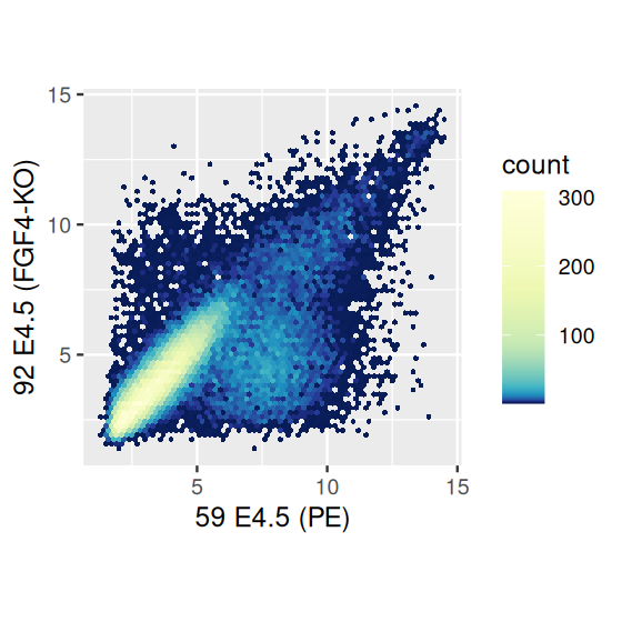
Scatterplots are useful for visualizing treatment–response comparisons (as in Figure 3.3), associations between variables (as in Figure 3.10), or paired data (e.g., a disease biomarker in several patients before and after treatment). We use the two dimensions of our plotting paper, or screen, to represent the two variables. Let’s take a look at differential expression between a wildtype and an FGF4-KO sample.
scp = ggplot(dfx, aes(x = `59 E4.5 (PE)` ,
                      y = `92 E4.5 (FGF4-KO)`))
scp + geom_point()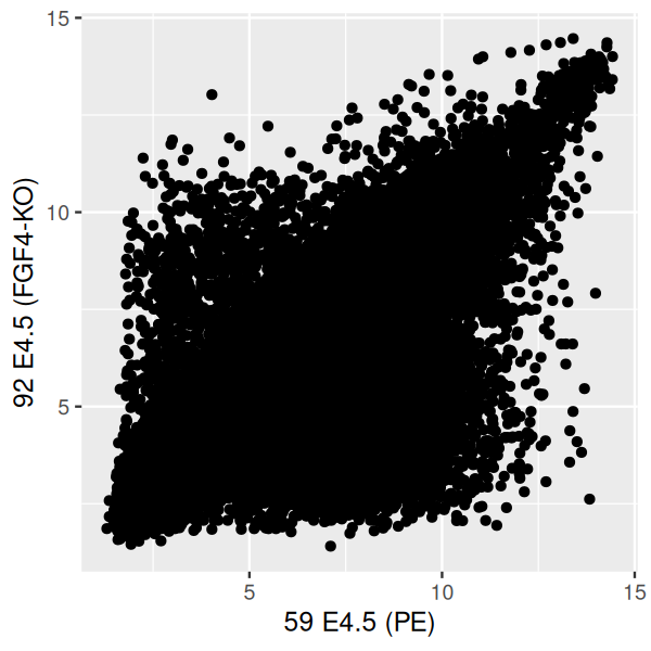
The labels and refer to column names (sample names) in the dataframe dfx, which we created above. Since they contain special characters (spaces, parentheses, hyphen) and start with numerals, we need to enclose them with the downward sloping quotes to make them syntactically digestible for R. The plot is shown in Figure 3.27. We get a dense point cloud that we can try and interpret on the outskirts of the cloud, but we really have no idea visually how the data are distributed within the denser regions of the plot.
One easy way to ameliorate the overplotting is to adjust the transparency (alpha value) of the points by modifying the alpha parameter of geom_point (Figure 3.28).
scp + geom_point(alpha = 0.1)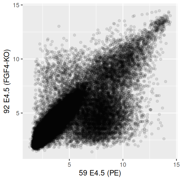
This is already better than Figure 3.27, but in the more dense regions even the semi-transparent points quickly overplot to a featureless black mass, while the more isolated, outlying points are getting faint. An alternative is a contour plot of the 2D density, which has the added benefit of not rendering all of the points on the plot, as in Figure 3.29.
However, we see in Figure 3.29 that the point cloud at the bottom right (which contains a relatively small number of points) is no longer represented. We can somewhat overcome this by tweaking the bandwidth and binning parameters of geom_density2d (Figure 3.30, left panel).
scp + geom_density2d()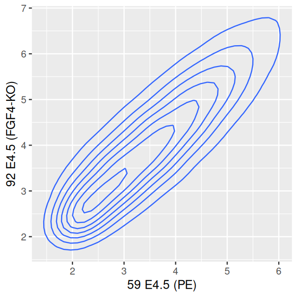
scp + geom_density2d(h = c(0.5, 0.5), bins = 60)
library("RColorBrewer")
colorscale = scale_fill_gradientn(
    colors = rev(brewer.pal(9, "YlGnBu")),
    values = c(0, exp(seq(-5, 0, length.out = 100))))

scp + stat_density2d(h = c(0.5, 0.5), bins = 60,
          aes( fill = after_stat(level)), geom = "polygon") +
  colorscale + coord_fixed()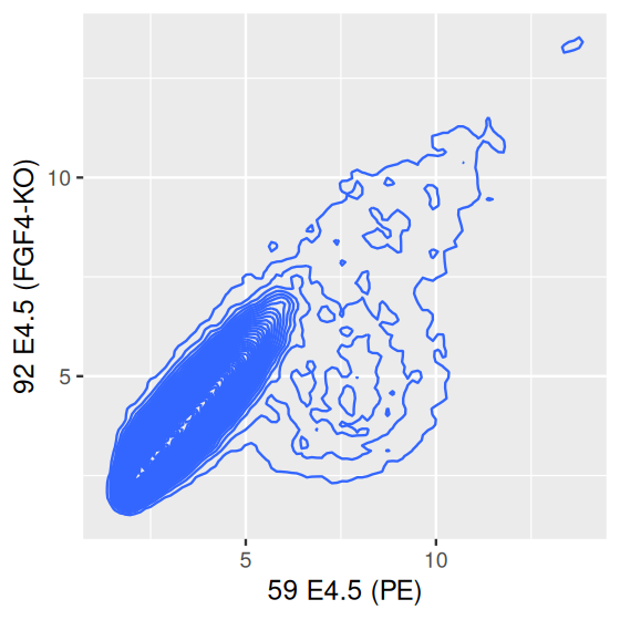
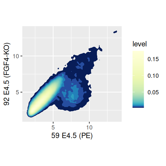
We can fill in each space between the contour lines with the relative density of points by explicitly calling the function stat_density2d (for which geom_density2d is a wrapper) and using the geometric object polygon, as in the right panel of Figure 3.30.
We used the function brewer.pal from the package RColorBrewer to define the color scale, and we added a call to coord_fixed to fix the aspect ratio of the plot, to make sure that the mapping of data range to \(x\)- and \(y\)-coordinates is the same for the two variables. Both of these issues merit a deeper look, and we’ll talk more about plot shapes in Section 3.7.1 and about colors in Section 3.9.
The density based plotting methods in Figure 3.30 are more visually appealing and interpretable than the overplotted point clouds of Figures 3.27 and 3.28, though we have to be careful in using them as we lose much of the information on the outlier points in the sparser regions of the plot. One possibility is using geom_point to add such points back in.
But arguably the best alternative, which avoids the limitations of smoothing, is hexagonal binning (Carr et al. 1987).
scp + geom_hex() + coord_fixed()
scp + geom_hex(binwidth = c(0.2, 0.2)) + colorscale +
  coord_fixed()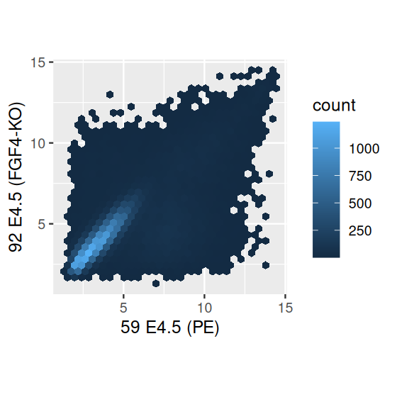
Choosing the proper shape for your plot is important to make sure the information is conveyed well. By default, the shape parameter, that is, the ratio between the height of the graph and its width, is chosen by ggplot2 based on the available space in the current plotting device. The width and height of the device are specified when it is opened in R, either explicitly by you or through default parameters10. Moreover, the graph dimensions also depend on the presence or absence of additional decorations, like the color scale bars in Figure 3.31.
10 See for example the manual pages of the pdf and png functions.
There are two simple rules that you can apply for scatterplots:
If the variables on the two axes are measured in the same units, then make sure that the same mapping of data space to physical space is used – i.e., use coord_fixed. In the scatterplots above, both axes are the logarithm to base 2 of expression level measurements; that is, a change by one unit has the same meaning on both axes (a doubling of the expression level). Another case is principal component analysis (PCA), where the \(x\)-axis typically represents component 1, and the \(y\)-axis component 2. Since the axes arise from an orthonormal rotation of input data space, we want to make sure their scales match. Since the variance of the data is (by definition) smaller along the second component than along the first component (or at most, equal), well-made PCA plots usually have a width that’s larger than the height.
If the variables on the two axes are measured in different units, then we can still relate them to each other by comparing their dimensions. The default in many plotting routines in R, including ggplot2, is to look at the range of the data and map it to the available plotting region. However, in particular when the data more or less follow a line, looking at the typical slope of the line can be useful. This is called banking (Cleveland et al. 1988).
To illustrate banking, let’s use the classic sunspot data from Cleveland’s paper.
library("ggthemes")
sunsp = tibble(year   = time(sunspot.year),
               number = as.numeric(sunspot.year))
sp = ggplot(sunsp, aes(x = year, y = number)) + geom_line()
sp
ratio = with(sunsp, bank_slopes(year, number))
sp + coord_fixed(ratio = ratio)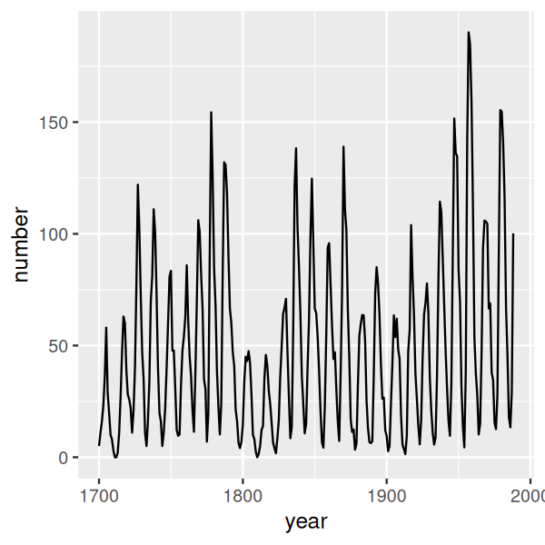
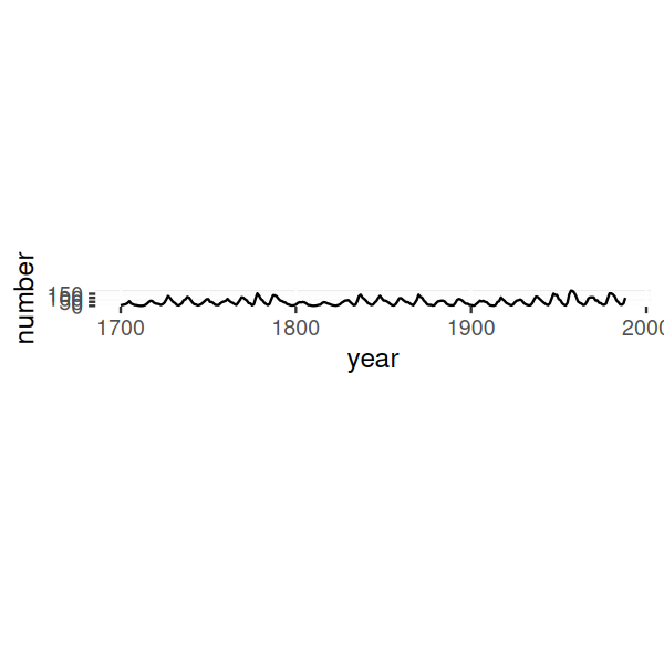
The resulting plot is shown in the upper panel of Figure 3.32. We can clearly see long-term fluctuations in the amplitude of sunspot activity cycles, with particularly low maximum activities in the early 1700s, early 1800s, and around the turn of the 20\(^\text{th}\) century. But now lets try out banking.
How does the algorithm work? It aims to make the slopes in the curve be around one. In particular, bank_slopes computes the median absolute slope, and then with the call to coord_fixed we set the aspect ratio of the plot such that this quantity becomes 1. The result is shown in the lower panel of Figure 3.32. Quite counter-intuitively, even though the plot takes much smaller space, we see more on it! In particular, we can see the saw-tooth shape of the sunspot cycles, with sharp rises and more slow declines.
Sometimes we want to show the relationships between more than two variables. Obvious choices for including additional dimensions are the plot symbol shapes and colors. The geom_point geometric object offers the following aesthetics (beyond x and y):
fill
color
shape
size
alpha
They are explored in the manual page of the geom_point function. fill and color refer to the fill and outline color of an object, and alpha to its transparency level. Above, in Figures 3.28 and following, we have used color or transparency to reflect point density and avoid the obscuring effects of overplotting. We can also use these properties to show other dimensions of the data. In principle, we could use all five aesthetics listed above simultaneously to show up to seven-dimensional data; however, such a plot would be hard to decipher. Usually we are better off to limit ourselves to choosing only one or two of these aesthetics and varying them to show one or two additional dimensions in the data.
Another way to show additional dimensions of the data is to show multiple plots that result from repeatedly subsetting (or “slicing”) our data based on one (or more) of the variables, so that we can visualize each part separately. This is called faceting and it enables us to visualize data in up to four or five dimensions. So we can, for instance, investigate whether the observed patterns among the other variables are the same or different across the range of the faceting variable. Let’s look at an example:
library("magrittr")
dftx$lineage %<>% sub("^$", "no", .)
dftx$lineage %<>% factor(levels = c("no", "EPI", "PE", "FGF4-KO"))

ggplot(dftx, aes(x = X1426642_at, y = X1418765_at)) +
  geom_point() + facet_grid( . ~ lineage )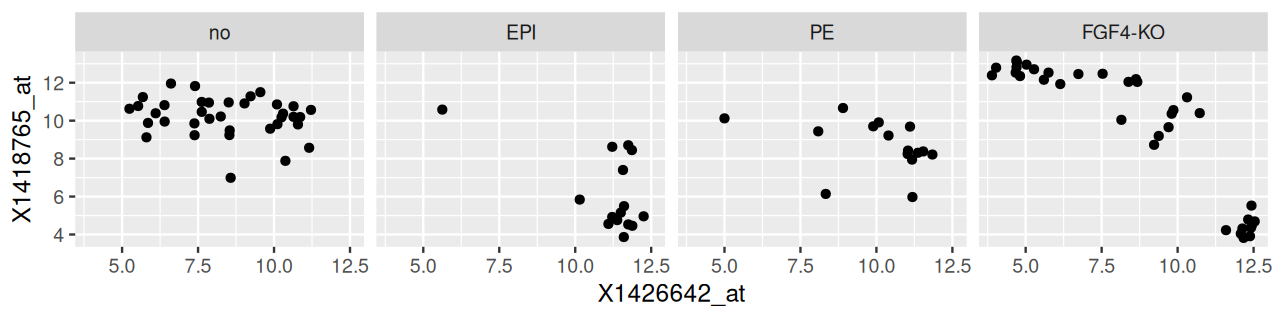
lineage.
The result is shown in Figure 3.33. We have used R’s formula language to specify the variable by which we want to split the data, and that the separate panels should be in different columns: facet_grid( . ~ lineage ). In fact, we can specify two faceting variables, as follows; the result is shown in Figure 3.34.
ggplot(dftx,
  aes(x = X1426642_at, y = X1418765_at)) + geom_point() +
   facet_grid( Embryonic.day ~ lineage )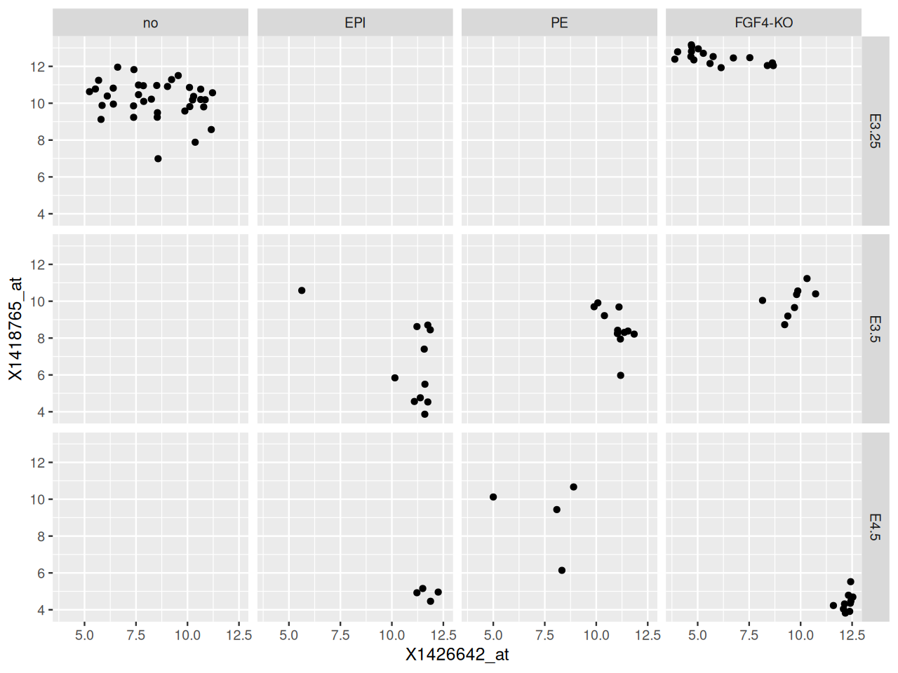
Embryonic.day (rows) and lineage (columns).
Another useful function is facet_wrap: if the faceting variable has too many levels for all the plots to fit in one row or one column, then this function can be used to wrap them into a specified number of columns or rows. So far we have seen faceting by categorical variables, but we can also use it with continuous variables by discretizing them into levels. The function cut is useful for this purpose.
ggplot(mutate(dftx, Tdgf1 = cut(X1450989_at, breaks = 4)),
   aes(x = X1426642_at, y = X1418765_at)) + geom_point() +
   facet_wrap( ~ Tdgf1, ncol = 2 )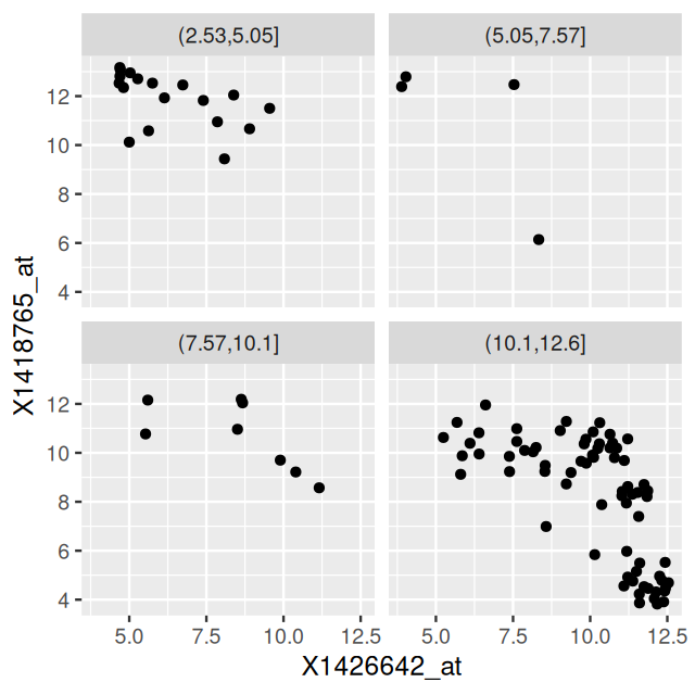
X1450989_at and arranged by facet_wrap.
We see in Figure 3.35 that the number of points in the four panels is different. This is because cut splits into bins of equal length, not equal number of points. If we want the latter, then we can use quantile in conjunction with cut, or cut on the ranks of the variable’s values.
In Figures 3.33—3.35, the axes scales are the same for all panels. Alternatively, we could let them vary by setting the scales argument of the facet_grid and facet_wrap functions. This argument lets you control whether \(x\)-axis and \(y\)-axis in each panel have the same scale, or whether either of them or both adapt to each panel’s data range. There is a trade-off: adaptive axes scales might let us see more detail, on the other hand, the panels are then less comparable across the groupings.
You can also facet your plots (without explicit calls to facet_grid and facet_wrap) by specifying the aesthetics. A very simple version of implicit faceting is using a factor as your \(x\)-axis, such as in Figures 3.15—3.18.
The plots generated thus far have been static images. You can add an enormous amount of information and expressivity by making your plots interactive. We do not try here to to convey interactive visualizations in any depth, but we provide pointers to a few important resources. This is a dynamic space, so readers should explore the R ecosystem for recent developments.
Rstudio’s shiny is a web application framework for R. It makes it easy to create interactive displays with sliders, selectors and other control elements that allow changing all aspects of the plot(s) shown – since the interactive elements call back directly into the R code that produces the plot(s). See the shiny gallery for some great examples.
As a graphics engine for shiny-based interactive visualizations you can use ggplot2, and indeed, base R graphics or any other graphics package. What may be a little awkward here is that the language used for describing the interactive options is separated from the production of the graphics via ggplot2 and the grammar of graphics. The ggvis package aims to overcome this limitation:
ggvis11 is an attempt at extending the good features of ggplot2 into the realm of interactive graphics. In contrast to ggplot2, which produces graphics into R’s traditional graphics devices (PDF, PNG, etc.), ggvis builds upon a JavaScript infrastructure called Vega, and its plots are intended to be viewed in an HTML browser. Like ggplot2, the ggvis package is inspired by grammar of graphics concepts, but uses distinct syntax. It leverages shiny’s infrastructure to connect to R to perform the computations needed for the interactivity. As its author put it12, “The goal is to combine the best of R (e.g., every modeling function you can imagine) and the best of the web (everyone has a web browser). Data manipulation and transformation are done in R, and the graphics are rendered in a web browser, using Vega.”
11 At the time of writing (summer 2017), it is not clear whether the initial momentum of ggvis development will be maintained, and its current functionality and maturity do no yet match ggplot2.
12 https://ggvis.rstudio.com
As a consequence of the interactivity in shiny and ggvis, there needs to be an R interpreter running with the underlying data and code to respond to the user’s actions while she views the graphic. This R interpreter can be on the local machine or on a server; in both cases, the viewing application is a web browser, and the interaction with R goes through web protocols (http or https). That is, of course, different from a graphic stored in a self-contained file, which is produced once by R and can then be viewed in a PDF or HTML viewer without any connection to a running instance of R.
A great web-based tool for interactive graphic generation is plotly. You can view some examples of interactive graphics online at https://plot.ly/r. To create your own interactive plots in R, you can use code such as
library("plotly")
plot_ly(economics, x = ~ date, y = ~ unemploy / pop)
As with shiny and ggvis, the graphics are viewed in an HTML browser; however, no running R session is required. The graphics are self-contained HTML documents whose “logic” is coded in JavaScript, or more precisely, in the D3.js system.
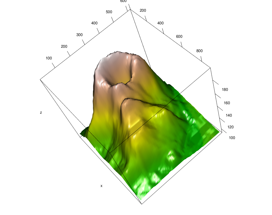
volcano data, the topographic information for Maunga Whau (Mt Eden), one of about 50 volcanos in the Auckland volcanic field.
For visualizing 3D objects (say, a geometrical structure), there is the package rgl. It produces interactive viewer windows (either in specialized graphics device on your screen or through a web browser) in which you can rotate the scene, zoom and in out, etc. A screenshot of the scene produced by the code below is shown in Figure 3.36; such screenshots can be produced using the function snapshot3d.
data("volcano")
volcanoData = list(
  x = 10 * seq_len(nrow(volcano)),
  y = 10 * seq_len(ncol(volcano)),
  z = volcano,
  col = terrain.colors(500)[cut(volcano, breaks = 500)]
)
library("rgl")
In chunk 'volcano': Warning in rgl.init(initValue, onlyNULL): RGL: unable to open X11 display
In chunk 'volcano': Warning: 'rgl.init' failed, will use the null device.See '?rgl.useNULL' for ways to avoid this warning.
with(volcanoData, persp3d(x, y, z, color = col))In the code above, the base R function cut computes a mapping from the value range of the volcano data to the integers between 1 and 50013, which we use to index the color scale, terrain.colors(500). For more information, consult the package’s excellent vignette.
13 More precisely, it returns a factor with as many levels, which we let R autoconvert to integers.
An important consideration when making plots is the coloring that we use in them. Most R users are likely familiar with the built-in R color scheme, used by base R graphics, as shown in Figure 3.37.
pie(rep(1, 8), col=1:8)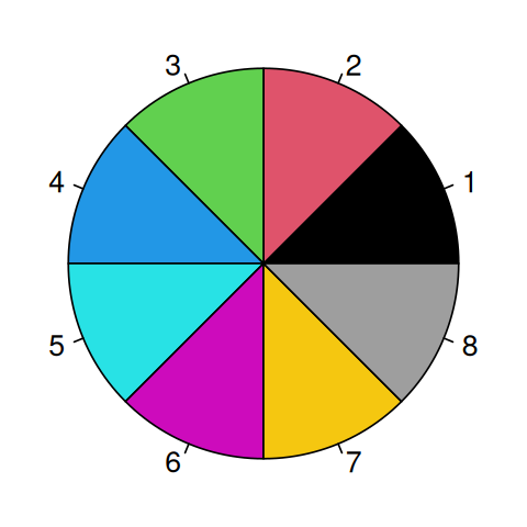
The origins of this color palette date back to 1980s hardware, where graphics cards handled colors by letting each pixel either use or not use each of the three basic color channels of a cathode-ray tube: red, green and blue (RGB). This led to \(2^3=8\) combinations at the eight corners of an RGB color cube14.
14 Thus, the \(8^\text{th}\) color in Figure 3.37 should be white, instead it is grey.
The first eight colors for a categorical variable in ggplot2 are shown in Figure 3.38:
ggplot(tibble(u = factor(1:8), v = 1),
       aes(x = "",  y = v, fill = u)) +
  geom_bar(stat = "identity", width = 1) +
  coord_polar("y", start = 0) + theme_void()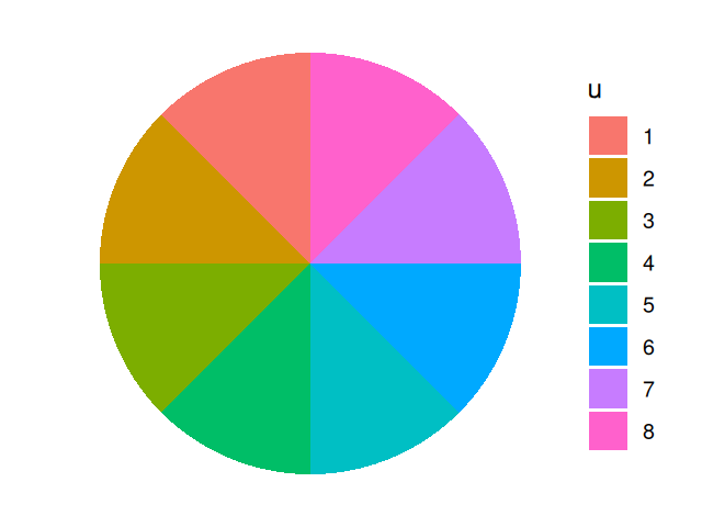
These defaults are appropriate for simple use cases, but often we will want to make our own choices. In Section 3.7 we already saw the function scale_fill_gradientn, with which we created the smooth-looking color gradient used in Figures 3.30 and 3.31 by interpolating a set of color steps provided by the function brewer.pal in the RColorBrewer package. This package defines a set of purpose-designed color palettes. We can see all of them at a glance with the function display.brewer.all (Figure 3.39).
display.brewer.all()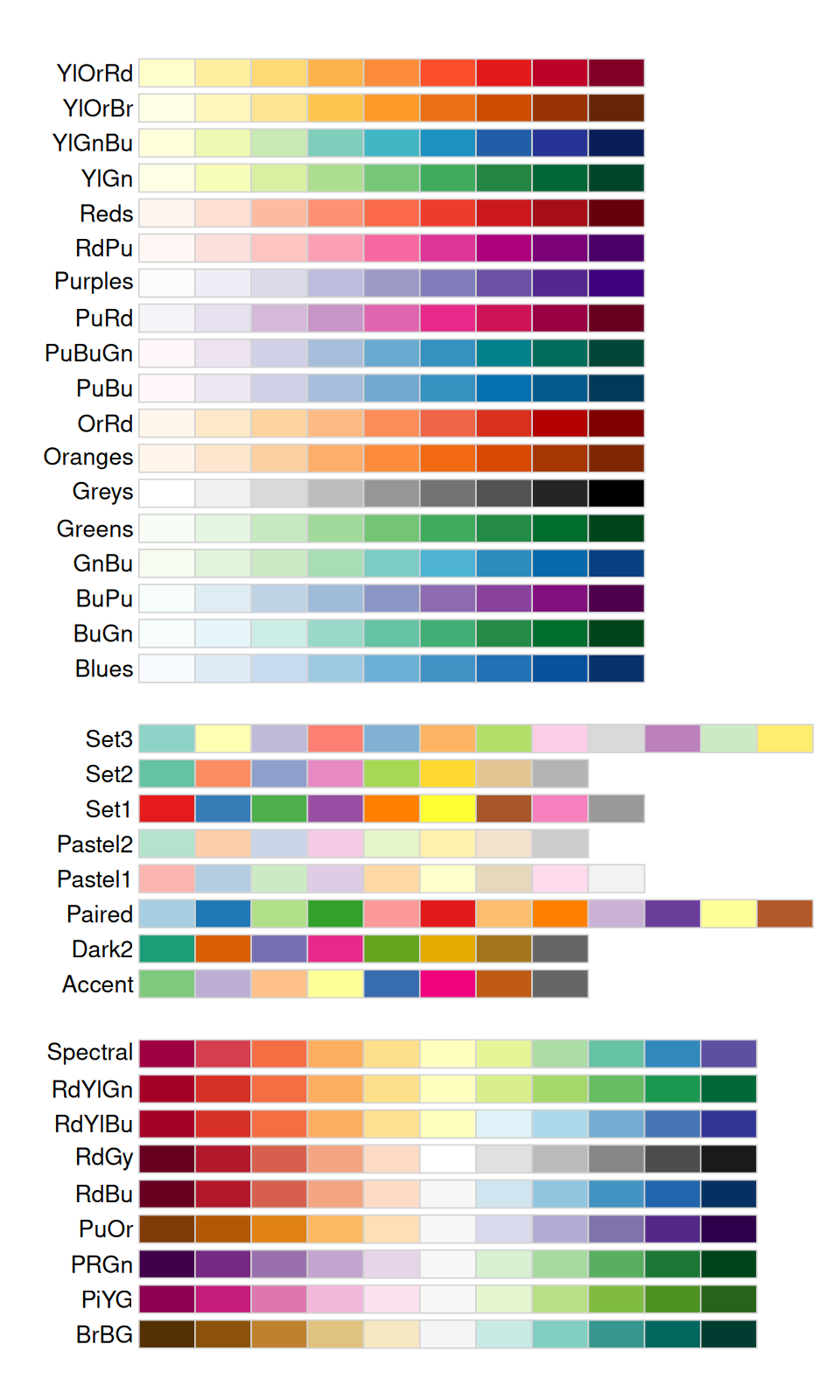
We can get information about the available color palettes from brewer.pal.info.
head(brewer.pal.info) maxcolors category colorblind
BrBG 11 div TRUE
PiYG 11 div TRUE
PRGn 11 div TRUE
PuOr 11 div TRUE
RdBu 11 div TRUE
RdGy 11 div FALSEtable(brewer.pal.info$category)
 div qual  seq
   9    8   18
The palettes are divided into three categories:
qualitative: for categorical properties that have no intrinsic ordering. The Paired palette supports up to 6 categories that each fall into two subcategories - such as before and after, with and without treatment, etc.
sequential: for quantitative properties that go from low to high
diverging: for quantitative properties for which there is a natural midpoint or neutral value, and whose value can deviate both up- and down; we’ll see an example in Figure 3.41.
To obtain the colors from a particular palette we use the function brewer.pal. Its first argument is the number of colors we want (which can be less than the available maximum number in brewer.pal.info).
brewer.pal(4, "RdYlGn")[1] "#D7191C" "#FDAE61" "#A6D96A" "#1A9641"If we want more than the available number of preset colors (for example so we can plot a heatmap with continuous colors) we can interpolate using the colorRampPalette function15.
15 colorRampPalette returns a function of one parameter, an integer. In the code shown, we call that function with the argument 100.
mypalette  = colorRampPalette(
    c("darkorange3", "white","darkblue")
  )(100)
head(mypalette)
[1] "#CD6600" "#CE6905" "#CF6C0A" "#D06F0F" "#D17214" "#D27519"image(matrix(1:100, nrow = 100, ncol = 10), col = mypalette,
xaxt = "n", yaxt = "n", useRaster = TRUE)
darkorange3, white and darkblue.
Heatmaps are a powerful way of visualizing large, matrix-like datasets and providing a quick overview of the patterns that might be in the data. There are a number of heatmap drawing functions in R; one that is convenient and produces a good-looking output is the function pheatmap from the eponymous package16. In the code below, we first select the top 500 most variable genes in the dataset x and define a function rowCenter that centers each gene (row) by subtracting the mean across columns. By default, pheatmap uses the RdYlBu color palette from RcolorBrewer in conjuction with the colorRampPalette function to interpolate the 11 colors into a smooth-looking palette (Figure 3.41).
16 A very versatile and modular alternative is the ComplexHeatmap package.
library("pheatmap")
topGenes = order(MatrixGenerics::rowVars(Biobase::exprs(x)), decreasing = TRUE)[1:500]
rowCenter = function(x) { x - rowMeans(x) }
pheatmap(rowCenter(dfx[topGenes, ]),
  show_rownames = FALSE,
  show_colnames = FALSE,
  breaks = seq(-5, +5, length.out = 101),
  annotation_col = pData(x)[, c("sampleGroup", "Embryonic.day", "ScanDate", "genotype") ],
  annotation_colors = list(
    sampleGroup = groupColor,
    genotype = c(`FGF4-KO` = "chocolate1", `WT` = "azure2"),
    Embryonic.day = setNames(brewer.pal(9, "Blues")[c(3, 6, 9)], c("E3.25", "E3.5", "E4.5")),
    ScanDate = setNames(brewer.pal(nlevels(x$ScanDate), "YlGn"), levels(x$ScanDate))
  )
)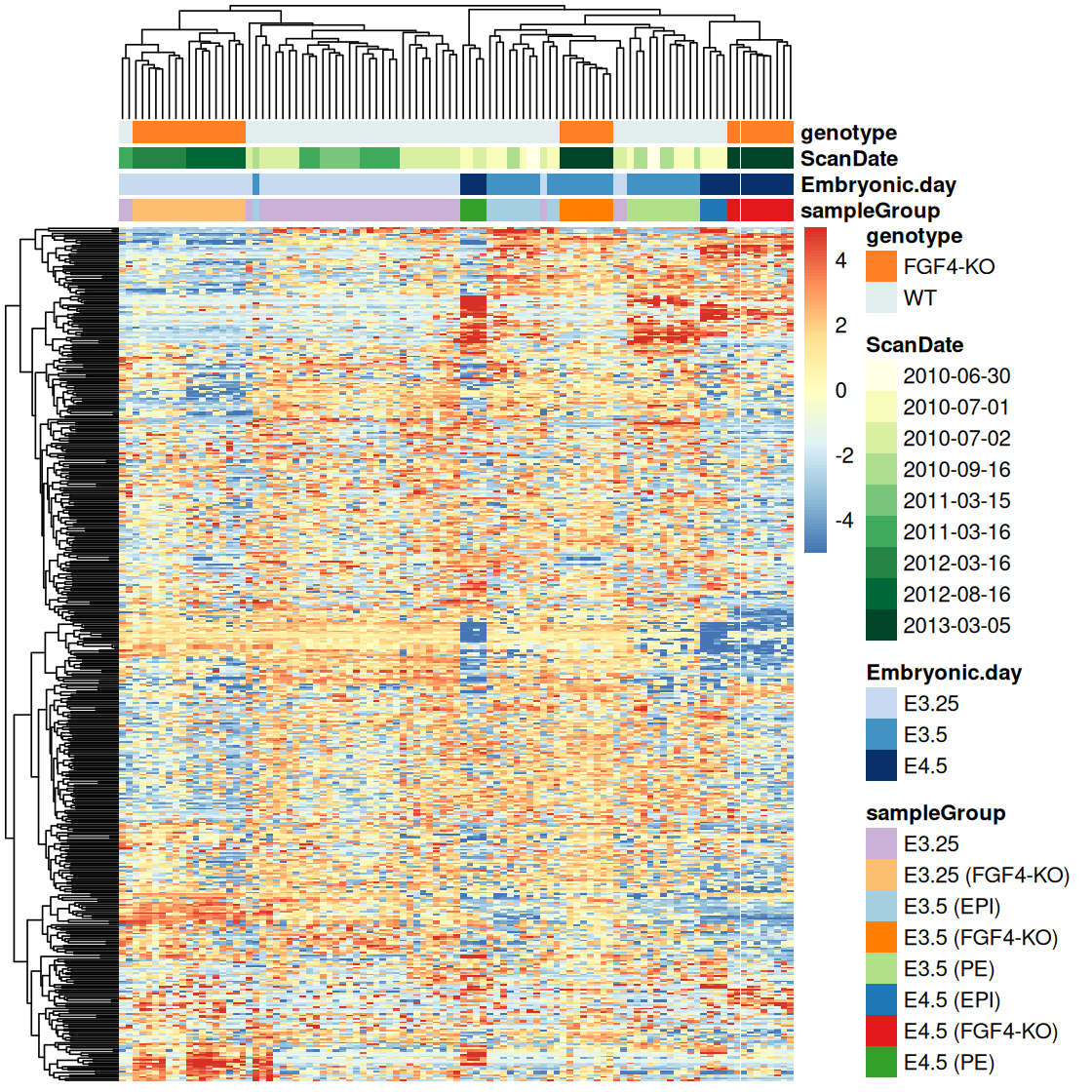
Let’s take a minute to deconstruct this rather massive-looking call to pheatmap. The options show_rownames and show_colnames control whether the row and column names are printed at the sides of the matrix. Because our matrix is large in relation to the available plotting space, the labels would not be readable, so we might as well suppress them. The annotation_col argument takes a data frame that carries additional information about the samples. The information is shown in the colored bars on top of the heatmap. There is also a similar annotation_row argument, which we haven’t used here, to annotate the rows (genes) with colored bars at the side. The argument annotation_colors is a list of named vectors by which we can override the default choice of colors for the annotation bars. The pheatmap function has many further options, and if you want to use it for your own data visualizations, it’s worth studying them.
In Figure 3.41, the trees at the left and the top represent the result of a hierarchical clustering algorithm and are also called dendrograms. The ordering of the rows and columns is based on the dendrograms. It has an enormous effect on the visual impact of the heatmap. However, it can be difficult to decide which of the apparent patterns are real and which are consequences of arbitrary tree layout decisions17. Let’s keep in mind that:
17 We will learn about clustering and methods for evaluating cluster significance in Chapter 5.
Ordering the rows and columns by cluster dendrogram (as in Figure 3.41) is an arbitrary choice, and you could just as well make others.
Even if you settle on dendrogram ordering, there is an essentially arbitrary choice at each internal branch, as each branch could be flipped without changing the topology of the tree (see also Figure 5.24).
Color perception in humans (Helmholtz 1867) is three-dimensional18. There are different ways of parameterizing this space. Above we already encountered the RGB color model, which uses three values in [0,1], for instance at the beginning of Section 3.4, where we printed out the contents of groupColor:
18 Physically, there is an infinite number of wave-lengths of light and an infinite number of ways of mixing them, so for other species, or robots, color space can have fewer or more dimensions.
groupColor[1] E3.25
"#CAB2D6" Here, CA is the hexadecimal representation for the strength of the red color channel, B2 of the green and D6 of the blue color channel. In decimal, these numbers are 202, 178 and 214. The range of these values goes from to 0 to 255, so by dividing by this maximum value, an RGB triplet can also be thought of as a point in the three-dimensional unit cube.


The function hcl uses a different coordinate system. Again this consists of three coordinates: hue \(H\), an angle in the range \([0, 360]\), chroma \(C\), a positive number, and luminance \(L\), a value in \([0, 100]\). The upper bound for \(C\) depends on on hue and luminance.
The hcl function corresponds to polar coordinates in the CIE-LUV19 and is designed for area fills. By keeping chroma and luminance coordinates constant and only varying hue, it is easy to produce color palettes that are harmonious and avoid irradiation illusions that make light colored areas look bigger than dark ones. Our attention also tends to get drawn to loud colors, and fixing the value of chroma makes the colors equally attractive to our eyes.
19 CIE: Commission Internationale de l’Éclairage – see e.g. Wikipedia for more on this.
There are many ways of choosing colors from a color wheel. Triads are three colors chosen equally spaced around the color wheel; for example, \(H=0,120,240\) gives red, green, and blue. Tetrads are four equally spaced colors around the color wheel, and some graphic artists describe the effect as “dynamic”. Warm colors are a set of equally spaced colors close to yellow, cool colors a set of equally spaced colors close to blue. Analogous color sets contain colors from a small segment of the color wheel, for example, yellow, orange and red, or green, cyan and blue. Complementary colors are colors diametrically opposite each other on the color wheel. A tetrad is two pairs of complementaries. Split complementaries are three colors consisting of a pair of complementaries, with one partner split equally to each side, for example, \(H=60,\,240-30,\,240+30\). This is useful to emphasize the difference between a pair of similar categories and a third different one. A more thorough discussion is provided in the references (Mollon 1995; Ihaka 2003).
For lines and points, we want a strong contrast to the background, so on a white background, we want them to be relatively dark (low luminance \(L\)). For area fills, lighter, more pastel-type colors with low to moderate chromatic content are usually more pleasant.
Plots in which most points are huddled up in one area, with much of the available space sparsely populated, are difficult to read. If the histogram of the marginal distribution of a variable has a sharp peak and then long tails to one or both sides, transforming the data can be helpful. These considerations apply both to x and y aesthetics, and to color scales. In the plots of this chapter that involved the microarray data, we used the logarithmic transformation20 – not only in scatterplots like Figure 3.27 for the \(x\) and \(y\)-coordinates, but also in Figure 3.41 for the color scale that represents the expression fold changes. The logarithm transformation is attractive because it has a definitive meaning - a move up or down by the same amount on a log-transformed scale corresponds to the same multiplicative change on the original scale: \(\log(ax)=\log a+\log x\).
20 We used it implicitly since the data in the ExpressionSet object x already come log-transformed.
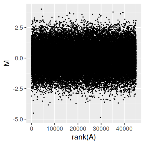
Sometimes the logarithm however is not good enough, for instance when the data include zero or negative values, or when even on the logarithmic scale the data distribution is highly uneven. From the upper panel of Figure 3.43, it is easy to take away the impression that the distribution of M depends on A, with higher variances for lower A. However, this is entirely a visual artefact, as the lower panel confirms: the distribution of M is independent of A, and the apparent trend we saw in the upper panel was caused by the higher point density at smaller A.
gg = ggplot(tibble(A = Biobase::exprs(x)[, 1], M = rnorm(length(A))),
            aes(y = M))
gg + geom_point(aes(x = A), size = 0.2)
gg + geom_point(aes(x = rank(A)), size = 0.2)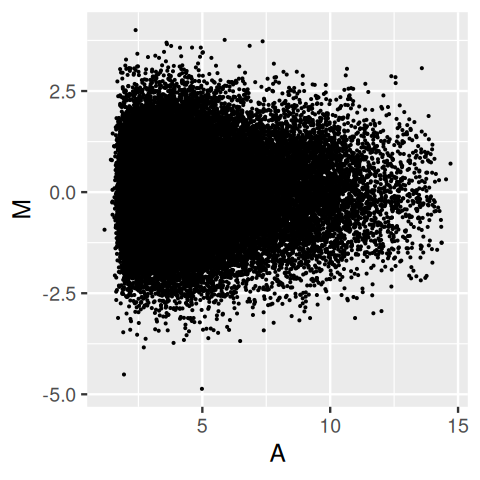
We can use mathematical notation in plot labels, using a notation that is a mix of R syntax and LaTeX-like notation (see help("plotmath") for details):
volume = function(rho, nu) (
            pi^(nu/2) * rho^nu / gamma(nu/2+1)
)
ggplot(tibble(nu  = 1:15, Omega = volume(1, nu)), aes(x = nu, y = Omega)) +
  geom_line() +
  xlab(expression(nu)) +
  ylab(expression(Omega)) +
  geom_text(label = "Omega(rho,nu)==frac(pi^frac(nu,2)~rho^nu, Gamma(frac(nu,2)+1))", parse = TRUE, x = 6, y = 1.5)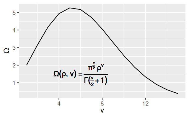
The result is shown in Figure 3.44. It is also easy to switch to other fonts, for instance the serif font Times (Figure 3.45).
ggplot(genes, aes( x = value, color = gene)) + stat_ecdf() +
  theme(text = element_text(family = "Times"))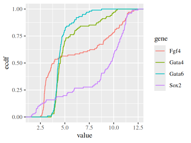
In fact, the set of fonts that can be used with a standard R installation are limited, but luckily there is the package extrafont, which facilitates using fonts other than R’s standard set of PostScript fonts. There’s some extra work needed before we can use it, since fonts external to R first need to be made known to it. They could come shipped with your operating system, with a word processor or with another graphics application. The set of fonts available and their physical location is therefore not standardized, but will depend on your operating system and further configurations. In the first session after attaching the extrafont package, you will need to run the function font_import to import fonts and make them known to the package. Then in each session in which you want to use them, you need to call the loadfonts function to register them with one or more of R’s graphics devices. Finally you can use the fonttable function to list the available fonts. You will need to refer to the documentation of the extrafonts package to see how to make this work on your machine.
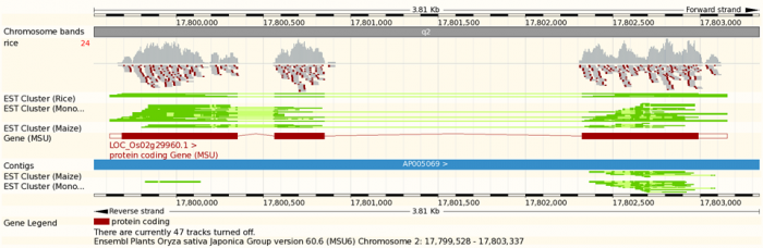
To visualize genomic data, in addition to the general principles we have discussed in this chapter, there are some specific considerations. The data are usually associated with genomic coordinates. In fact genomic coordinates offer a great organizing principle for the integration of genomic data. You will probably have seen genome browser displays such as in Figure 3.47. Here we will briefly show how to produce such plots programmatically, using your data as well as public annotation. It will be a short glimpse, and we refer to resources such as Bioconductor for a fuller picture.
The main challenge of genomic data visualization is the size of genomes. We need visualizations at multiple scales, from whole genome down to the nucleotide level. It should be easy to zoom in and and out, and we may need different visualization strategies for the different size scales. It can be convenient to visualize biological molecules (genomes, genes, transcripts, proteins) in a linear manner, although their embedding in the 3D physical world can matter (a great deal).
Let’s start with some fun examples, an ideogram plot of human chromosome 1 (Figure 3.48) and a plot of the genome-wide distribution of RNA editing sites (Figure 3.49).
library("ggbio")
data("hg19IdeogramCyto", package = "biovizBase")
plotIdeogram(hg19IdeogramCyto, subchr = "chr1")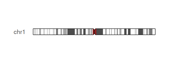
The darned_hg19_subset500 lists a selection of 500 RNA editing sites in the human genome. It was obtained from the Database of RNA editing in Flies, Mice and Humans (DARNED, https://darned.ucc.ie/). The result is shown in Figure 3.49.
library("GenomicRanges")
data("darned_hg19_subset500", package = "biovizBase")
autoplot(darned_hg19_subset500, layout = "karyogram",
         aes(color = exReg, fill = exReg))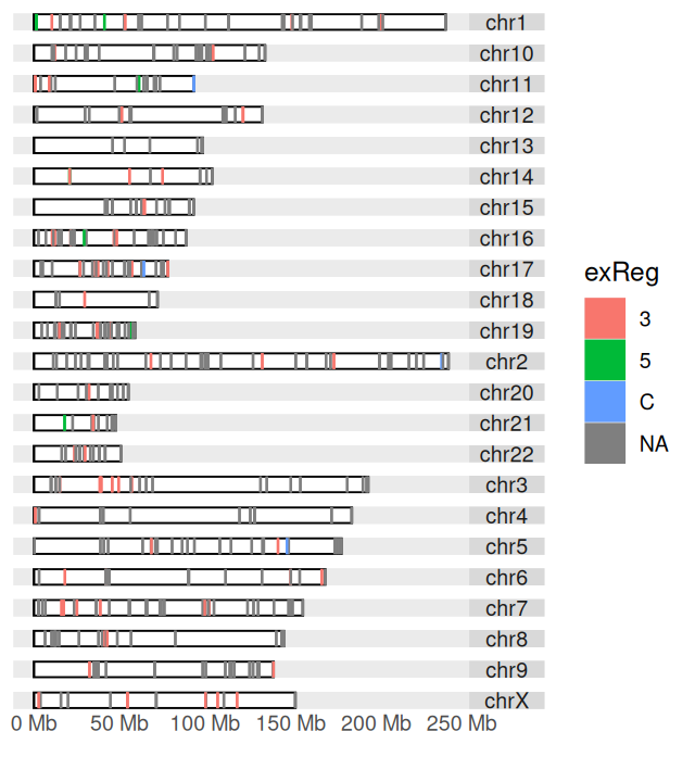
exReg indicates whether a site is in the coding region (C), 3’- or 5’-UTR.
The information on chromosome lengths in the hg19 assembly of the human genome is (for instance) stored in the ideoCyto dataset. We use the function keepSeqlevels to reorder the chromosomes. See Figure 3.50.
library("GenomeInfoDb")
data("ideoCyto", package = "biovizBase")
dn = darned_hg19_subset500
seqlengths(dn) = seqlengths(ideoCyto$hg19)[names(seqlengths(dn))]
dn = keepSeqlevels(dn, paste0("chr", c(1:22, "X")))
autoplot(dn, layout = "karyogram", aes(color = exReg, fill = exReg))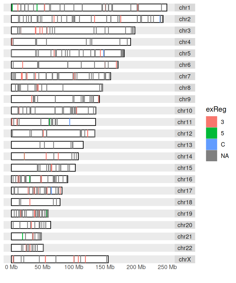
Visualizing data, either “raw” or along the various steps of processing, summarization and inference, is one of the most important activities in applied statistics, and indeed, in science. It sometimes gets short shrift in textbooks since there is not much deductive theory. However, there is a large number of good (and bad) practices, and once you pay attention to it, you will quickly see whether a certain graphic is effective in conveying its message, or what choices you could make to create powerful and aesthetically attrative data visualizations. Among the important options are the plot type (what is called a geom in ggplot2), proportions (incl. aspect ratios) and colors. The grammar of graphics is a powerful set of concepts to reason about graphics and to communicate our intentions for a data visualization to a computer.
Avoid laziness—just using the software’s defaults without thinking about the options—, and avoid getting carried away—adding lots of visual candy that just clutters up the plot but has no real message. Creating your own visualizations is in many ways like good writing. It is extremely important to get your message across (in talks, in papers), but there is no simple recipe for it. Look carefully at lots of visualizations made by others, experiment with making your own visualizations to learn the ropes, and then decide what is your style.
The most useful resources about ggplot2 are the second edition of Wickham (2016) and the ggplot2 website. There are many ggplot2 code snippets online, which you will find through search engines after some practice. But be critical and check your sources: sometimes, code examples you find online refer to outdated versions of the package, and sometimes they are of poor quality.
The foundation of the system is based on Wilkinson (2005) and the ideas by Tukey (1977; Cleveland 1988).
21 You can also get this from https://www.ema.europa.eu/en/medicines/human/EPAR/comirnaty.
Page built at 21:14 on 2026-07-15 using R version 4.6.0 (2026-04-24)