library("EBImage")
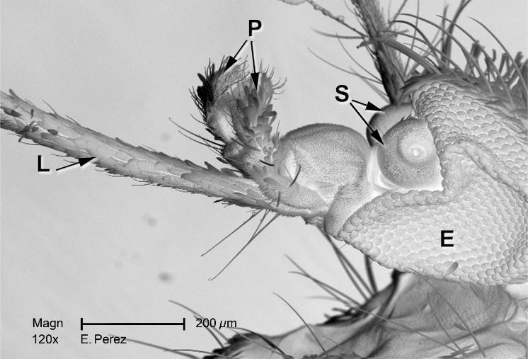
imagefile = system.file("images", "mosquito.png", package = "MSMB")
mosq = readImage(imagefile)11 Image data
Images are a rich source of data. In this chapter, we will see how quantitative information can be extracted from images, and how we can use statistical methods to summarize and understand the data. The goal of the chapter is to show that getting started working with image data is easy – if you are able to handle the basic R environment, you are ready to start working with images. That said, this chapter is not a general introduction to image analysis. The field is extensive; it touches many areas of signal processing, information theory, mathematics, engineering and computer science, and there are excellent books that present a systematic overview.
We will mainly study series of two-dimensional images, in particular, images of cells. We will learn how to identify the cells’ positions and shapes and how to quantitatively measure characteristics of the identified shapes and patterns, such as sizes, intensities, color distributions and relative positions. Such information can then be used in down-stream analyses: for instance, we can compare cells between different conditions, say under the effect of different drugs, or in different stages of differentiation and growth; or we can measure how the objects in the image relate to each other, e.g., whether they like to cluster together or repel each other, or whether certain characteristics tend to be shared between neighboring objects, indicative of cell-to-cell communication. In the language of genetics, what this means is that we can use images as complex phenotypes or as multivariate quantitative traits.
We will here not touch upon image analysis in more than two dimensions: we won’t consider 3D segmentation and registration, nor temporal tracking. These are sophisticated tasks for which specialized software would likely perform better than what we could assemble in the scope of this chapter.
There are similarities between data from high-throughput imaging and other high-throughput data in genomics. Batch effects tend to play a role, for instance because of changes in staining efficiency, illumination or many other factors. We’ll need to take appropriate precautions in our experimental design and analysis choices. In principle, the intensity values in an image can be calibrated in physical units, corresponding, say to radiant energy or fluorophore concentration; however this is not always done in practice in biological imaging, and perhaps also not needed. Somewhat easier to achieve and clearly valuable is a calibration of the spatial dimensions of the image, i.e., the conversion factor between pixel units and metric distances.
11.1 Goals for this chapter
In this chapter we will:
Learn how to read, write and manipulate images in R.
Understand how to apply filters and transformations to images.
Combine these skills to do segmentation and feature extraction; we will use cell segmentation as an example.
Learn how to use statistical methods to analyse spatial distributions and dependencies.
Get to know the most basic distribution for a spatial point process: the homogeneous Poisson process.
Recognize whether your data fit that basic assumption or whether they show evidence of clumping or exclusion.
11.2 Loading images
A useful toolkit for handling images in R is the Bioconductor package EBImage (Pau et al. 2010). We start out by reading in a simple picture to demonstrate the basic functions.
EBImage currently supports three image file formats: jpeg, png and tiff. Above, we loaded a sample image from the MSMB package. When you are working with your own data, you do not need that package, just provide the name(s) of your file(s) to the readImage function. As you will see later in this chapter, readImage can read multiple images in one go, which are then all assembled into a single image data object. For this to work, the images need to have the same dimensions and color mode.
11.3 Displaying images
Let’s visualize the image that we just read in. The basic function is EBImage::display.
EBImage::display(mosq)The above command opens the image in a window of your web browser (as set by getOption("browser")). Using the mouse or keyboard shortcuts, you can zoom in and out of the image, pan and cycle through multiple image frames.
Alternatively, we can also display the image using R’s built-in plotting by calling display with the argument method = "raster". The image then goes to the current device. In this way, we can combine image data with other plotting functionality, for instance, to add text labels.
EBImage::display(mosq)
text(x = 85, y = 800, labels = "A mosquito", adj = 0, col = "orange", cex = 1.5)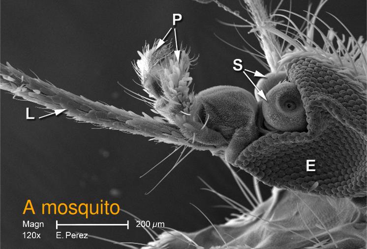
The resulting plot is shown in Figure 11.1. As usual, the graphics displayed in an R device can be saved using the base R functions dev.print or dev.copy.
Note that we can also read and view color images, see Figure 11.2.
imagefile = system.file("images", "hiv.png", package = "MSMB")
hivc = readImage(imagefile)EBImage::display(hivc, method = "raster")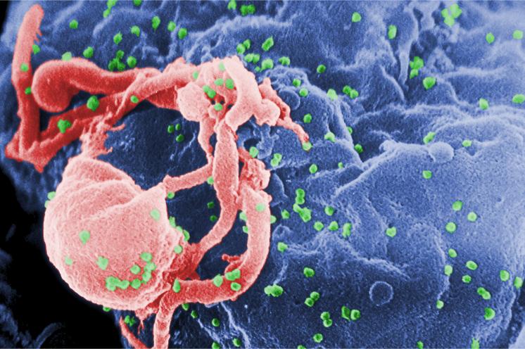
Furthermore, if an image has multiple frames, they can be displayed all at once in a grid arrangement by specifying the function argument all = TRUE (Figure 11.3),
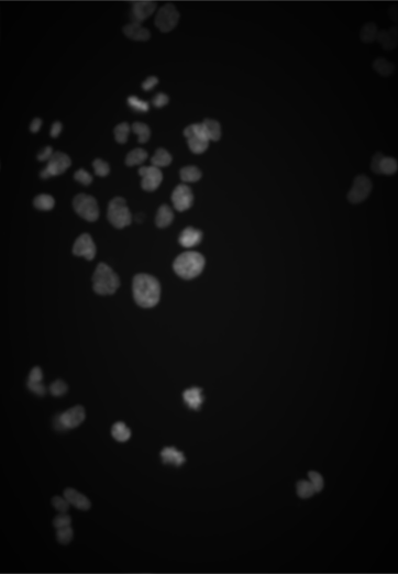
nuc = readImage(system.file("images", "nuclei.tif", package = "EBImage"))
EBImage::display(1 - nuc, all = TRUE)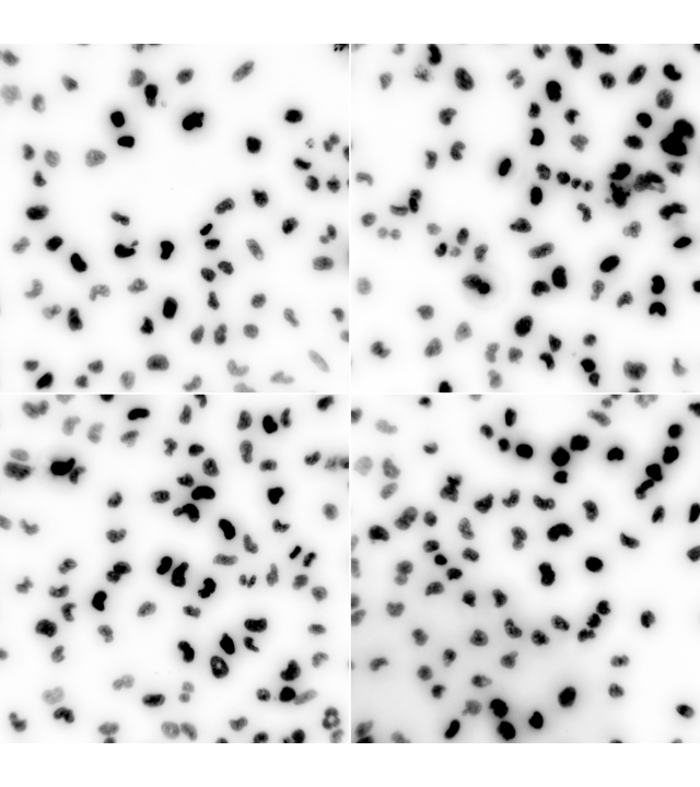
or we can just view a single frame, for instance, the second one.
EBImage::display(1 - nuc, frame = 2)11.4 How are images stored in R?
Let’s dig into what’s going on by first identifying the class of the image object.
class(mosq)[1] "Image"
attr(,"package")
[1] "EBImage"So we see that this object has the class Image. This is not one of the base R classes, rather, it is defined by the package EBImage. We can find out more about this class through the help browser or by typing class ? Image. The class is derived from the base R class array, so you can do with Image objects everything that you can do with R arrays; in addition, they have some extra features and behaviors1.
1 In R’s parlance, the extra features are called slots and the behaviors are called methods; methods are a special kind of function.
The dimensions of the image can be extracted using the dim method, just like for regular arrays.
dim(mosq)[1] 1400 952The hist method has been redefined2 compared to the ordinary hist function for arrays: it uses different and possibly more useful defaults (Figure 11.4).
2 In object oriented parlance, overloaded.
hist(mosq)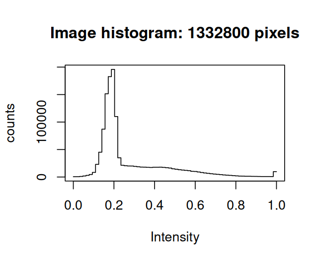
mosq. Note that the range is between 0 and 1.
If we want to directly access the data matrix as an R array, we can use the accessor function imageData.
imageData(mosq)[1:3, 1:6] [,1] [,2] [,3] [,4] [,5] [,6]
[1,] 0.1960784 0.1960784 0.1960784 0.1960784 0.1960784 0.1960784
[2,] 0.1960784 0.1960784 0.1960784 0.1960784 0.1960784 0.1960784
[3,] 0.1960784 0.1960784 0.2000000 0.2039216 0.2000000 0.1960784A useful summary of an Image object is printed if we simply type the object’s name.
mosqImage
colorMode : Grayscale
storage.mode : double
dim : 1400 952
frames.total : 1
frames.render: 1
imageData(object)[1:5,1:6]
          [,1]      [,2]      [,3]      [,4]      [,5]      [,6]
[1,] 0.1960784 0.1960784 0.1960784 0.1960784 0.1960784 0.1960784
[2,] 0.1960784 0.1960784 0.1960784 0.1960784 0.1960784 0.1960784
[3,] 0.1960784 0.1960784 0.2000000 0.2039216 0.2000000 0.1960784
[4,] 0.1960784 0.1960784 0.2039216 0.2078431 0.2000000 0.1960784
[5,] 0.1960784 0.2000000 0.2117647 0.2156863 0.2000000 0.1921569Now let us look at the color image.
hivcImage
colorMode : Color
storage.mode : double
dim : 1400 930 3
frames.total : 3
frames.render: 1
imageData(object)[1:5,1:6,1]
[,1] [,2] [,3] [,4] [,5] [,6]
[1,] 0 0 0 0 0 0
[2,] 0 0 0 0 0 0
[3,] 0 0 0 0 0 0
[4,] 0 0 0 0 0 0
[5,] 0 0 0 0 0 0The two images differ by their property colorMode, which is Grayscale for mosq and Color for hivc. What is the point of this property? It turns out to be convenient when we are dealing with stacks of images. If colorMode is Grayscale, then the third and all higher dimensions of the array are considered as separate image frames corresponding, for instance, to different \(z\)-positions, time points, replicates, etc. On the other hand, if colorMode is Color, then the third dimension is assumed to hold different color channels, and only the fourth and higher dimensions – if present – are used for multiple image frames. In hivc, there are three color channels, which correspond to the red, green and blue intensities of our photograph. However, this does not necessarily need to be the case, there can be any number of color channels.
11.5 Writing images to file
Directly saving images to disk in the array representation that we saw in the previous section would lead to large file sizes – in most cases, needlessly large. It is common to use compression algorithms to reduce the storage consumption. There are two main types of image3 compression:
3 In an analogous way, this is also true for movies and music.
Lossless compression: it is possible to exactly reconstruct the original image data from the compressed file. Simple principles of lossless compression are: (i) do not spend more bits on representing a pixel than needed (e.g., the pixels in the
mosqimage have a range of 256 gray scale values, and this could be represented by 8 bits, althoughmosqstores them in a 64-bit numeric format4); and (2) identify patterns (such as those that you saw above in the printed pixel values formosqandhivc) and represent them by much shorter to write down rules instead.Lossy compression: additional savings are made compared to lossless compression by dropping details that a human viewer would be unlikely to notice anyway.
4 While this is somewhat wasteful of memory, it is more compatible with the way the rest of R works, and is rarely a limiting factor on modern computer hardware.
An example for a storage format with lossless compression is PNG5, an example for lossy compression is the JPEG6 format. While JPEG is good for your holiday pictures, it is good practice to store scientific images in a lossless format.
We read the image hivc from a file in PNG format, so let’s now write it out as a JPEG file. The lossiness is specified by the quality parameter, which can lie between 1 (worst) and 100 (best).
output_file = file.path(tempdir(), "hivc.jpeg")
writeImage(hivc, output_file, quality = 85)
Similarly, we could have written the image as a TIFF file and chosen among several compression algorithms (see the manual page of the writeImage and writeTiff functions). The package RBioFormats lets you write to many further image file formats.
11.6 Manipulating images
Now that we know that images are stored as arrays of numbers in R, our method of manipulating images becomes clear – simple algebra! For example, we can take our original image, shown again in Figure 11.5a, and flip the bright areas to dark and vice versa by multiplying the image with -1 Figure 11.5b).
mosqinv = normalize(-mosq)We could also adjust the contrast through multiplication (Figure 11.5c) and the gamma-factor through exponentiation Figure 11.5d).
mosqcont = mosq * 3
mosqexp = mosq ^ (1/3)

Furthermore, we can crop, threshold and transpose images with matrix operations (Figure 11.6).
mosqcrop   = mosq[100:438, 112:550]
mosqthresh = mosq > 0.5
mosqtransp = transpose(mosq)
11.7 Spatial transformations
We just saw one type of spatial transformation, transposition, but there are many more—here are some examples:
mosqrot   = EBImage::rotate(mosq, angle = 30)
mosqshift = EBImage::translate(mosq, v = c(100, 170))
mosqflip  = flip(mosq)
mosqflop  = flop(mosq)

flip), (d) reflection about the central vertical axis (flop).
In the code above, the function rotate7 rotates the image clockwise with the given angle, translate moves the image by the specified two-dimensional vector (pixels that end up outside the image region are cropped, and pixels that enter into the image region are set to zero). The functions flip and flop reflect the image around the central horizontal and vertical axis, respectively. The results of these operations are shown in Figure 11.7.
7 Here we call the function with its namespace qualifier EBImage:: to avoid confusion with a function of the same name in the namespace of the spatstat package, which we will attach later.
11.8 Linear filters
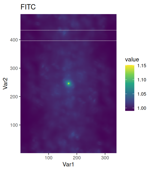
Let’s now switch to an application in cell biology. We load images of human cancer cells that were studied by Laufer, Fischer and co-workers (Laufer et al. 2013). They are shown in Figure 11.8.
imagefiles = system.file("images", c("image-DAPI.tif", "image-FITC.tif", "image-Cy3.tif"), package = "MSMB")
cells = readImage(imagefiles)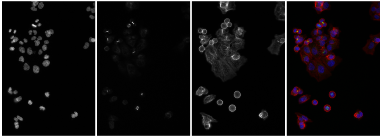
The Image object cells is a three-dimensional array of size 340 \(\times\) 490 \(\times\) 3, where the last dimension indicates that there are three individual grayscale frames. Our goal now is to computationally identify and quantitatively characterize the cells in these images. That by itself would be a modest goal, but note that the dataset of Laufer et al.contains over 690,000 images, each of which has 2,048 \(\times\) 2,048 pixels. Here, we are looking at three of these, out of which a small region was cropped. Once we know how to achieve our stated goal, we can apply our abilities to such large image collections, and that is no longer a modest aim!
11.8.1 Interlude: the intensity scale of images
However, before we can start with real work, we need to deal with a slightly mundane data conversion issue. This is, of course, not unusual. Let us inspect the dynamic range (the minimum and the maximum value) of the images.
apply(cells, 3, range) image-DAPI image-FITC image-Cy3
[1,] 0.001586938 0.002899214 0.001663233
[2,] 0.031204700 0.062485695 0.055710689We see that the maximum values are small numbers well below 1. The reason for this is that the readImage function recognizes that the TIFF images uses 16 bit integers to represent each pixel, and it returns the data – as is common for numeric variables in R – in an array of double precision floating point numbers, with the integer values (whose theoretical range is from 0 to \(2^{16}-1=65535\)) stored in the mantissa of the floating point representation and the exponents chosen so that the theoretical range is mapped to the interval \([0,1]\). However, the scanner that was used to create these images only used the lower 11 or 12 bits, and this explains the small maximum values in the images. We can rescale these data to approximately cover the range \([0,1]\) as follows8.
8 The function normalize provides a more flexible interface to the scaling of images.
cells[,,1]   = 32 * cells[,,1]
cells[,,2:3] = 16 * cells[,,2:3]
apply(cells, 3, range)
image-DAPI image-FITC image-Cy3
[1,] 0.05078202 0.04638743 0.02661173
[2,] 0.99855039 0.99977111 0.89137102We can keep in mind that these multiplications with a multiple of 2 have no impact on the underlying precision of the stored data.
11.8.2 Noise reduction by smoothing
Now we are ready to get going with analyzing the images. As our first goal is segmentation of the images to identify the individual cells, we can start by removing local artifacts or noise from the images through smoothing. An intuitive approach is to define a window of a selected size around each pixel and average the values within that window. After applying this procedure to all pixels, the new, smoothed image is obtained. Mathematically, we can express this as
\[ f^*(x,y) = \frac{1}{N} \sum_{s=-a}^{a}\sum_{t=-a}^{a} f(x+s, y+t), \tag{11.1}\]
where \(f(x,y)\) is the value of the pixel at position \(x\), \(y\), and \(a\) determines the window size, which is \(2a+1\) in each direction. \(N=(2a+1)^2\) is the number of pixels averaged over, and \(f^*\) is the new, smoothed image.
More generally, we can replace the moving average by a weighted average, using a weight function \(w\), which typically has highest weight at the window midpoint (\(s=t=0\)) and then decreases towards the edges.
\[ (w * f)(x,y) = \sum_{s=-\infty}^{+\infty} \sum_{t=-\infty}^{+\infty} w(s,t)\, f(x+s, y+s) \tag{11.2}\]
For notational convenience, we let the summations range from \(-\infty\) to \(\infty\), even if in practice the sums are finite as \(w\) has only a finite number of non-zero values. In fact, we can think of the weight function \(w\) as another image, and this operation is also called the convolution of the images \(f\) and \(w\), indicated by the the symbol \(*\). In EBImage, the 2-dimensional convolution is implemented by the function filter2, and the auxiliary function makeBrush can be used to generate weight functions \(w\).
w = makeBrush(size = 51, shape = "gaussian", sigma = 7)
nucSmooth = filter2(getFrame(cells, 1), w)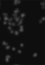
nucSmooth, a smoothed version of the DNA channel in the image object cells (the original version is shown in the leftmost panel of Figure 11.8).
Solution
See Figure 11.10
library("tibble")
library("ggplot2")
tibble(w = w[(nrow(w)+1)/2, ]) |>
  ggplot(aes(y = w, x = seq_along(w))) + geom_point()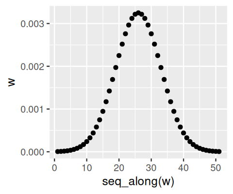
w[26, ].
In fact, the filter2 function does not directly perform the summation indicated in Equation 11.2. Instead, it uses the Fast Fourier Transformation in a way that is mathematically equivalent and computationally more efficient.
The convolution in Equation 11.2 is a linear operation, in the sense that \(w*(c_1f_1+c_2f_2)= c_1w*f_1 + c_2w*f_2\) for any two images \(f_1\), \(f_2\) and numbers \(c_1\), \(c_2\). There is beautiful and powerful theory underlying linear filters (Vetterli et al. 2014).
To proceed we now use smaller smoothing bandwidths than what we displayed in Figure 11.9 for demonstration. Let’s use a sigma of 1 pixel for the DNA channel and 3 pixels for actin and tubulin.
cellsSmooth = Image(dim = dim(cells))
sigma = c(1, 3, 3)
for(i in seq_along(sigma))
  cellsSmooth[,,i] = filter2( cells[,,i],
         filter = makeBrush(size = 51, shape = "gaussian",
                            sigma = sigma[i]) )
The smoothed images have reduced pixel noise, yet still the needed resolution.
11.9 Adaptive thresholding
The idea of adaptive thresholding is that, compared to straightforward thresholding as we did for Figure 11.6b, the threshold is allowed to be different in different regions of the image. In this way, one can anticipate spatial dependencies of the underlying background signal caused, for instance, by uneven illumination or by stray signal from nearby bright objects. In fact, we have already seen an example for uneven background in the bottom right image of Figure 11.3.
Our colon cancer images (Figure 11.8) do not have such artefacts, but for demonstration, let’s simulate uneven illumination by multiplying the image with a two-dimensional bell function illuminationGradient, which has highest value in the middle and falls off to the sides (Figure 11.11).
py = seq(-1, +1, length.out = dim(cellsSmooth)[1])
px = seq(-1, +1, length.out = dim(cellsSmooth)[2])
illuminationGradient = Image(outer(py, px, function(x, y) exp(-(x^2 + y^2))))
nucBadlyIlluminated = cellsSmooth[,,1] * illuminationGradient
We now define a smoothing window, disc, whose size is 21 pixels, and therefore bigger than the nuclei we want to detect, but small compared to the length scales of the illumination artifact. We use it to compute the image localBackground (shown in Figure 11.11 (c)) and the thresholded image nucBadThresh.
disc = makeBrush(21, "disc")
disc = disc / sum(disc)
localBackground = filter2(nucBadlyIlluminated, disc)
offset = 0.02
nucBadThresh = (nucBadlyIlluminated - localBackground > offset)
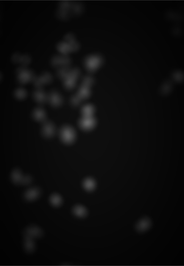
illuminationGradient, a function that has its maximum at the center and falls off towards the sides, and which simulates uneven illumination sometimes seen in images. (b) nucBadlyIlluminated, the image that results from multiplying the DNA channel in cellsSmooth with illuminationGradient. (c) localBackground, the result of applying a linear filter with a bandwidth that is larger than the objects to be detected. (d) nucBadThresh, the result of adaptive thresholding. The nuclei at the periphery of the image are reasonably well identified, despite the drop off in signal strength.
After having seen that this may work, let’s do the same again for the actual (not artificially degraded) image, as we need this for the next steps.
nucThresh = (cellsSmooth[,,1] - filter2(cellsSmooth[,,1], disc) > offset)By comparing each pixel’s intensity to a background determined from the values in a local neighborhood, we assume that the objects are relatively sparse distributed in the image, so that the signal distribution in the neighborhood is dominated by background. For the nuclei in our images, this assumption makes sense, for other situations, you may need to make different assumptions. The adaptive thresholding that we have done here uses a linear filter, filter2, and therefore amounts to (weighted) local averaging. Other distribution summaries, e.g. the median or a low quantile, tend to be preferable, even if they are computationally more expensive. For local median filtering, EBimage provides the function medianFilter.
11.10 Morphological operations on binary images
The thresholded image nucThresh (shown in the left panel of Figure 11.12) is not yet satisfactory. The boundaries of the nuclei are slightly rugged, and there is noise at the single-pixel level. An effective and simple way to remove these nuisances is given by a set of morphological operations (Serra 1983).
Provided a binary image (with values, say, 0 and 1, representing back- and foreground pixels), and a binary mask9 (which is sometimes also called the structuring element), these operations work as follows.
9 An example for a mask is a circle with a given radius, or more precisely, the set of pixels within a certain distance from a center pixel.
erode: For every foreground pixel, put the mask around it, and if any pixel under the mask is from the background, then set all these pixels to background.dilate: For every background pixel, put the mask around it, and if any pixel under the mask is from the foreground, then set all these pixels to foreground.open: performerodefollowed bydilate.
We can also think of these operations as filters, however, in contrast to the linear filters of Section 11.8 they operate on binary images only, and there is no linearity.
Let us apply morphological opening to our image.
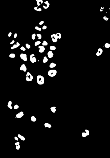
nucOpened = EBImage::opening(nucThresh, kern = makeBrush(5, shape = "disc"))The result of this is subtle, and you will have to zoom into the images in Figure 11.12 to spot the differences, but this operation manages to smoothen out some pixel-level features in the binary images that for our application are undesirable.
11.11 Segmentation of a binary image into objects
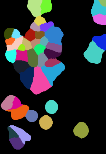
The binary image nucOpened represents a segmentation of the image into foreground and background pixels, but not into individual nuclei. We can take one step further and extract individual objects defined as connected sets of pixels. In EBImage, there is a handy function for this purpose, bwlabel.
nucSeed = bwlabel(nucOpened)
table(nucSeed)
nucSeed
0 1 2 3 4 5 6 7 8 9 10
155408 511 330 120 468 222 121 125 159 116 520
11 12 13 14 15 16 17 18 19 20 21
115 184 179 116 183 187 303 226 164 309 194
22 23 24 25 26 27 28 29 30 31 32
148 345 287 203 379 371 208 222 320 443 409
33 34 35 36 37 38 39 40 41 42 43
493 256 169 225 376 214 228 341 269 119 315 The function returns an image, nucSeed, of integer values, where 0 represents the background, and the numbers from 1 to 43 index the different identified objects.
To visualize such images, the function colorLabels is convenient, which converts the (grayscale) integer image into a color image, using distinct, arbitrarily chosen colors for each object.
EBImage::display(colorLabels(nucSeed))This is shown in the middle panel of Figure 11.12. The result is already encouraging, although we can spot two types of errors:
Some neighboring objects were not properly separated.
Some objects contain holes.
Indeed, we could change the occurrences of these by playing with the disc size and the parameter offset in Section 11.9: making the offset higher reduces the probability that two neighboring object touch and are seen as one object by bwlabel; on the other hand, that leads to even more and even bigger holes. Vice versa for making it lower.
Segmentation is a rich and diverse field of research and engineering, with a large body of literature, software tools (Schindelin et al. 2012; Chaumont et al. 2012; Carpenter et al. 2006; Held et al. 2010) and practical experience in the image analysis and machine learning communities. What is the adequate approach to a given task depends hugely on the data and the underlying question, and there is no universally best method. It is typically even difficult to obtain a “ground truth” or “gold standards” by which to evaluate an analysis – relying on manual annotation of a modest number of selected images is not uncommon. Despite the bewildering array of choices, it is easy to get going, and we need not be afraid of starting out with a simple solution, which we can successively refine. Improvements can usually be gained from methods that allow inclusion of more prior knowledge of the expected shapes, sizes and relations between the objects to be identified.
For statistical analyses of high-throughput images, we may choose to be satisfied with a simple method that does not rely on too many parameters or assumptions and results in a perhaps sub-optimal but rapid and good enough result (Rajaram et al. 2012). In this spirit, let us proceed with what we have. We generate a lenient foreground mask, which surely covers all nuclear stained regions, even though it also covers some regions between nuclei. To do so, we simply apply a second, less stringent adaptive thresholding.
nucMask = cellsSmooth[,,1] - filter2(cellsSmooth[,,1], disc) > 0and apply another morphological operation, fillHull, which fills holes that are surrounded by foreground pixels.
nucMask = fillHull(nucMask)To improve nucSeed, we can now propagate its segmented objects until they fill the mask defined by nucMask. Boundaries between nuclei, in those places where the mask is connected, can be drawn by Voronoi tessellation, which is implemented in the function propagate, and will be explained in the next section.
nuclei = propagate(cellsSmooth[,,1], nucSeed, mask = nucMask)The result is displayed in the rightmost panel of Figure 11.12.

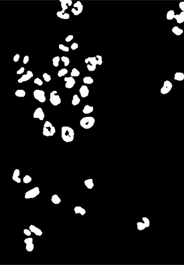
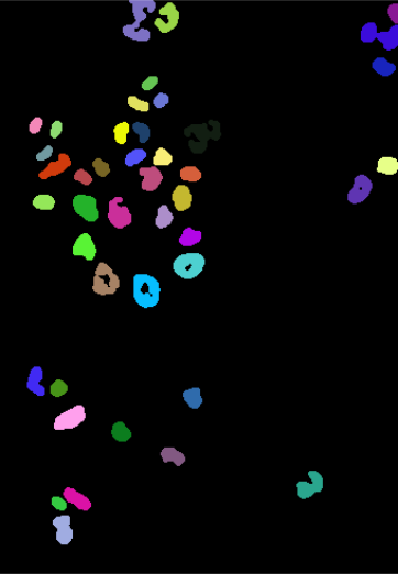
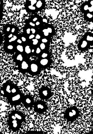

nucThresh, nucOpened, nucSeed, nucMask, nuclei.
11.12 Voronoi tessellation
Voronoi tessellation is useful if we have a set of seed points (or regions) and want to partition the space that lies between these seeds in such a way that each point in the space is assigned to its closest seed. As this is an intuitive and powerful idea, we’ll use this section for a short digression on it. Let us consider a basic example. We use the image nuclei as seeds. To call the function propagate, we also need to specify another image: for now we just provide a trivial image of all zeros, and we set the parameter lambda to a large positive value (we will come back to these choices).
zeros        = Image(dim = dim(nuclei))
voronoiExamp = propagate(seeds = nuclei, x = zeros, lambda = 100)
voronoiPaint = paintObjects(voronoiExamp, 1 - nucOpened)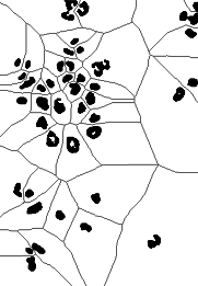
The result is shown in Figure 11.13. This looks interesting, but perhaps not yet as useful as the image nuclei in Figure 11.12. We note that the basic definition of Voronoi tessellation, which we have given above, allows for two generalizations:
By default, the space that we partition is the full, rectangular image area – but indeed we could restrict ourselves to any arbitrary subspace. This is akin to finding the shortest distance from each point to the next seed not in a simple flat landscape, but in a landscape that is interspersed by lakes and rivers (which you cannot cross), so that all paths need to remain on the land.
propagateallows for this generalization through itsmaskparameter.By default, we think of the space as flat – but in fact it could have hills and canyons, so that the distance between two points in the landscape not only depends on their \(x\)- and \(y\)-positions but also on the ascents and descents, up and down in \(z\)-direction, that lie in between. We can think of \(z\) as an “elevation”. You can specify such a landscape to
propagatethrough itsxargument.
Mathematically, we say that instead of the simple default case (a flat rectangle, or image, with a Euclidean metric on it), we perform the Voronoi segmentation on a Riemann manifold that has a special shape and a special metric. Let us use the notation \(x\) and \(y\) for the column and row coordinates of the image, and \(z\) for the elevation. For two neighboring points, defined by coordinates \((x, y, z)\) and \((x+\text{d}x, y+\text{d}y, z+\text{d}z)\), the distance \(\text{d}s\) between them is thus not obtained by the usual Euclidean metric on the 2D image,
\[ \text{d}s^2 = \text{d}x^2 + \text{d}y^2 \tag{11.3}\]
but instead
\[ \text{d}s^2 = \frac{2}{\lambda+1} \left[ \lambda \left( \text{d}x^2 + \text{d}y^2 \right) + \text{d}z^2 \right], \tag{11.4}\]
where the parameter \(\lambda\) is a real number \(\ge0\). To understand this, lets look at some important cases:
\[ \begin{aligned} \lambda=1:&\quad \text{d}s^2 = \text{d}x^2 + \text{d}y^2 + \text{d}z^2\\ \lambda=0:&\quad \text{d}s^2 = 2\, \text{d}z^2\\ \lambda\to\infty:&\quad \text{d}s^2 = 2 \left( \text{d}x^2 + \text{d}y^2 \right)\\ \end{aligned} \tag{11.5}\]
For \(\lambda=1\), the metric becomes the isotropic Euclidean metric, i.e., a movement in \(z\)-direction is equally “expensive” or “far” as in \(x\)- or \(y\)-direction. In the extreme case of \(\lambda=0\), only the \(z\)-movements matter, whereas lateral movements (in \(x\)- or \(y\)-direction) do not contribute to the distance. In the other extreme case, \(\lambda\to\infty\), only lateral movements matter, and movement in \(z\)-direction is “free”. Distances between points further apart are obtained by summing \(\text{d}s\) along the shortest path between them. The parameter \(\lambda\) serves as a convenient control of the relative weighting between sideways movement (along the \(x\) and \(y\) axes) and vertical movement. Intuitively, if you imagine yourself as a hiker in such a landscape, by choosing \(\lambda\) you can specify how much you are prepared to climb up and down to overcome a mountain, versus walking around it. When we used lambda = 100 in our call to propagate at the begin of this section, this value was effectively infinite, so we were in the third boundary case of Equation 11.5.
For the purpose of cell segmentation, these ideas were put forward by Thouis Jones et al. (Jones et al. 2005; Carpenter et al. 2006), who also wrote the efficient algorithm that is used by propagate.
11.13 Segmenting the cell bodies
cellsSmooth, after taking the logarithm.

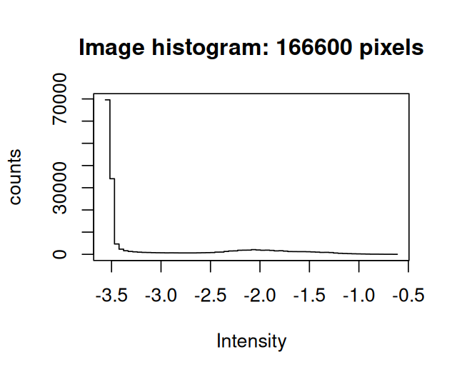
To determine a mask of cytoplasmic area in the images, let us explore a different way of thresholding, this time using a global threshold which we find by fitting a mixture model to the data. The histograms show the distributions of the pixel intensities in the actin image. We look at the data on the logarithmic scale, and in Figure 11.15 zoom into the region where most of the data lie.
hist(log(cellsSmooth[,,3]) )
hist(log(cellsSmooth[,,3]), xlim = -c(3.6, 3.1), breaks = 300)
Looking at the these histograms for many images, we can set up the following model for the purpose of segmentation: the signal in the cytoplasmic channels of the Image cells is a mixture of two distributions, a log-Normal background and a foreground with another, unspecified, rather flat, but mostly non-overlapping distribution10. Moreover the majority of pixels are from the background. We can then find robust estimates for the location and width parameters of the log-Normal component from the half range mode (implemented in the package genefilter) and from the root mean square of the values that lie left of the mode.
10 This is an application of the ideas we saw in Chapter 4 on mixture models.
library("genefilter")
bgPars = function(x) {
  x    = log(x)
  loc  = half.range.mode( x )
  left = (x - loc)[ x < loc ]
  wid  = sqrt( mean(left^2) )
  c(loc = loc, wid = wid, thr = loc + 6*wid)
}
cellBg = apply(cellsSmooth, MARGIN = 3, FUN = bgPars)
cellBg
[,1] [,2] [,3]
loc -2.90176965 -2.94427499 -3.52191681
wid 0.00635322 0.01121337 0.01528207
thr -2.86365033 -2.87699477 -3.43022437The function defines as a threshold the location loc plus 6 widths wid11.
11 The choice of the number 6 here is ad hoc; we could make the choice of threshold more objective by estimating the weights of the two mixture components and assigning each pixel to either fore- or background based on its posterior probability according to the mixture model. More advanced segmentation methods use the fact that this is really a classification problem and include additional features and more complex classifiers to separate foreground and background regions (e.g., (Berg et al. 2019)).
hist(log(cellsSmooth[,,3]), xlim = -c(3.6, 3.1), breaks = 300)
abline(v = cellBg[c("loc", "thr"), 3], col = c("brown", "red"))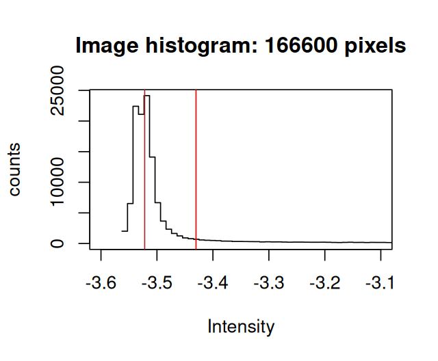
loc and thr shown by vertical lines.
We can now define cytoplasmMask by the union of all those pixels that are above the threshold in the actin or tubulin image, or that we have already classified as nuclear in the image nuclei.
cytoplasmMask = (cellsSmooth[,,2] > exp(cellBg["thr", 2])) |
       nuclei | (cellsSmooth[,,3] > exp(cellBg["thr", 3]))
The result is shown in the left panel of Figure 11.17. To define the cellular bodies, we can now simply extend the nucleus segmentation within this mask by the Voronoi tessellation based propagation algorithm of Section 11.12. This method makes sure that there is exactly one cell body for each nucleus, and the cell bodies are delineated in such a way that a compromise is reached between compactness of cell shape and following the actin and \(\alpha\)-tubulin intensity signal in the images. In the terminology of the propagate algorithm, cell shape is kept compact by the \(x\) and \(y\) components of the distance metric 11.4, and the actin signal is used for the \(z\) component. \(\lambda\) controls the trade-off.
cellbodies = propagate(x = cellsSmooth[,,3], seeds = nuclei,
                       lambda = 1.0e-2, mask = cytoplasmMask)
As an alternative representation to the colorLabel plots, we can also display the segmentations of nuclei and cell bodies on top of the original images using the paintObjects function; the Images nucSegOnNuc, nucSegOnAll and cellSegOnAll that are computed below are show in the middle to right panels of Figure 11.17
cellsColor = EBImage::rgbImage(red   = cells[,,3],
                               green = cells[,,2],
                               blue  = cells[,,1])
nucSegOnNuc  = paintObjects(nuclei, tgt = EBImage::toRGB(cells[,,1]), col = "#ffff00")
nucSegOnAll  = paintObjects(nuclei,     tgt = cellsColor,    col = "#ffff00")
cellSegOnAll = paintObjects(cellbodies, tgt = nucSegOnAll,   col = "#ff0080")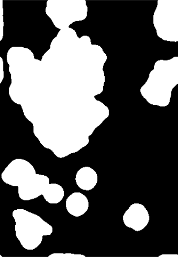
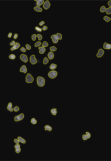
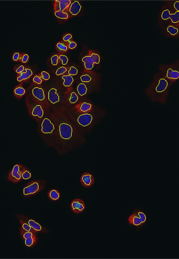
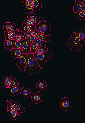
cytoplasmMask, cellbodies (blue: DAPI, red: actin, green: alpha-tubulin), nucSegOnNuc, nucSegOnAll, cellSegOnAll.
11.14 Feature extraction
Now that we have the segmentations nuclei and cellbodies together with the original image data cells, we can compute various descriptors, or features, for each cell. We already saw in the beginning of Section 11.11 how to use the base R function table to determine the total number and sizes of the objects. Let us now take this further and compute the mean intensity of the DAPI signal (cells[,,1]) in the segmented nuclei, the mean actin intensity (cells[,,3]) in the segmented nuclei and the mean actin intensity in the cell bodies.
meanNucInt       = tapply(cells[,,1], nuclei, mean)
meanActIntInNuc  = tapply(cells[,,3], nuclei, mean)
meanActIntInCell = tapply(cells[,,3], cellbodies, mean)
We can visualize the features in pairwise scatterplots (Figure 11.18). We see that they are correlated with each other, although each feature also carries independent information.
library("GGally")
ggpairs(tibble(meanNucInt, meanActIntInNuc, meanActIntInCell))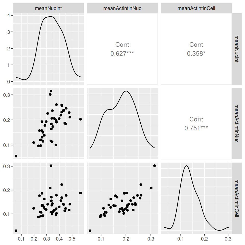
With a little more work, we could also compute more sophisticated summary statistics – e.g., the ratio of nuclei area to cell body area; or entropies, mutual information and correlation of the different fluorescent signals in each cell body, as more or less abstract measures of cellular morphology. Such measures can be used, for instance, to detect subtle drug induced changes of cellular architecture.
While it is easy and intuitive to perform these computations using basic R idioms like in the tapply expressions above, the package EBImage also provides the function computeFeatures which efficiently computes a large collection of features that have been commonly used in the literature (a pioneering reference is Boland and Murphy. (2001)). Details about this function are described in its manual page, and an example application is worked through in the HD2013SGI vignette. Below, we compute features for intensity, shape and texture for each cell from the DAPI channel using the nucleus segmentation (nuclei) and from the actin and tubulin channels using the cell body segmentation (cytoplasmRegions).
F1 = computeFeatures(nuclei,     cells[,,1], xname = "nuc",  refnames = "nuc")
F2 = computeFeatures(cellbodies, cells[,,2], xname = "cell", refnames = "tub")
F3 = computeFeatures(cellbodies, cells[,,3], xname = "cell", refnames = "act")
dim(F1)
[1] 43 89F1 is a matrix with 43 rows (one for each cell) and 89 columns, one for each of the computed features.
F1[1:3, 1:5] nuc.0.m.cx nuc.0.m.cy nuc.0.m.majoraxis nuc.0.m.eccentricity nuc.0.m.theta
1 119.5523 17.46895 44.86819 0.8372059 -1.314789
2 143.4511 15.83709 26.15009 0.6627672 -1.213444
3 336.5401 11.48175 18.97424 0.8564444 1.470913The column names encode the type of feature, as well the color channel(s) and segmentation mask on which it was computed. We can now use multivariate analysis methods – like those we saw in Chapters 5, 7 and 9 – for many dfferent tasks, such as
detecting cell subpopulations (clustering)
classifying cells into pre-defined cell types or phenotypes (classification)
seeing whether the absolute or relative frequencies of the subpopulations or cell types differ between images that correspond to different biological conditions
In addition to these “generic” machine learning tasks, we also know the cell’s spatial positions, and in the following we will explore some ways to make use of these in our analyses.
11.15 Spatial statistics: point processes
In the previous sections, we have seen ways how to use images of cells to extract their positions and various shape and morphological features. We’ll now explore spatial distributions of the position. In order to have interesting data to work on, we’ll change datasets and look at breast cancer lymph node biopsies.
11.15.1 A case study: Interaction between immune cells and cancer cells
The lymph nodes function as an immunologic filter for the bodily fluid known as lymph. Antigens are filtered out of the lymph in the lymph node before returning it to the circulation. Lymph nodes are found throughout the body, and are composed mostly of T cells, B cells, dendritic cells and macrophages. The nodes drain fluid from most of our tissues. The lymph ducts of the breast usually drain to one lymph node first, before draining through the rest of the lymph nodes underneath the arm. That first lymph node is called the sentinel lymph node. In a similar fashion as the spleen, the macrophages and dendritic cells that capture antigens present these foreign materials to T and B cells, consequently initiating an immune response.
T lymphocytes are usually divided into two major subsets that are functionally and phenotypically different.
CD4+ T-cells, or T helper cells: they are pertinent coordinators of immune regulation. The main function of T helper cells is to augment or potentiate immune responses by the secretion of specialized factors that activate other white blood cells to fight off infection.
CD8+ T cells, or T killer/suppressor cells: these cells are important in directly killing certain tumor cells, viral-infected cells and sometimes parasites. The CD8+ T cells are also important for the down-regulation of immune responses.
Both types of T cells can be found throughout the body. They often depend on the secondary lymphoid organs (the lymph nodes and spleen) as sites where activation occurs.
Dendritic Cells or CD1a cells are antigen-presenting cells that process antigen and present peptides to T cells.
Typing the cells can be done by staining the cells with protein antibodies that provide specific signatures. For instance, different types of immune cells have different proteins expressed, mostly in their cell membranes.
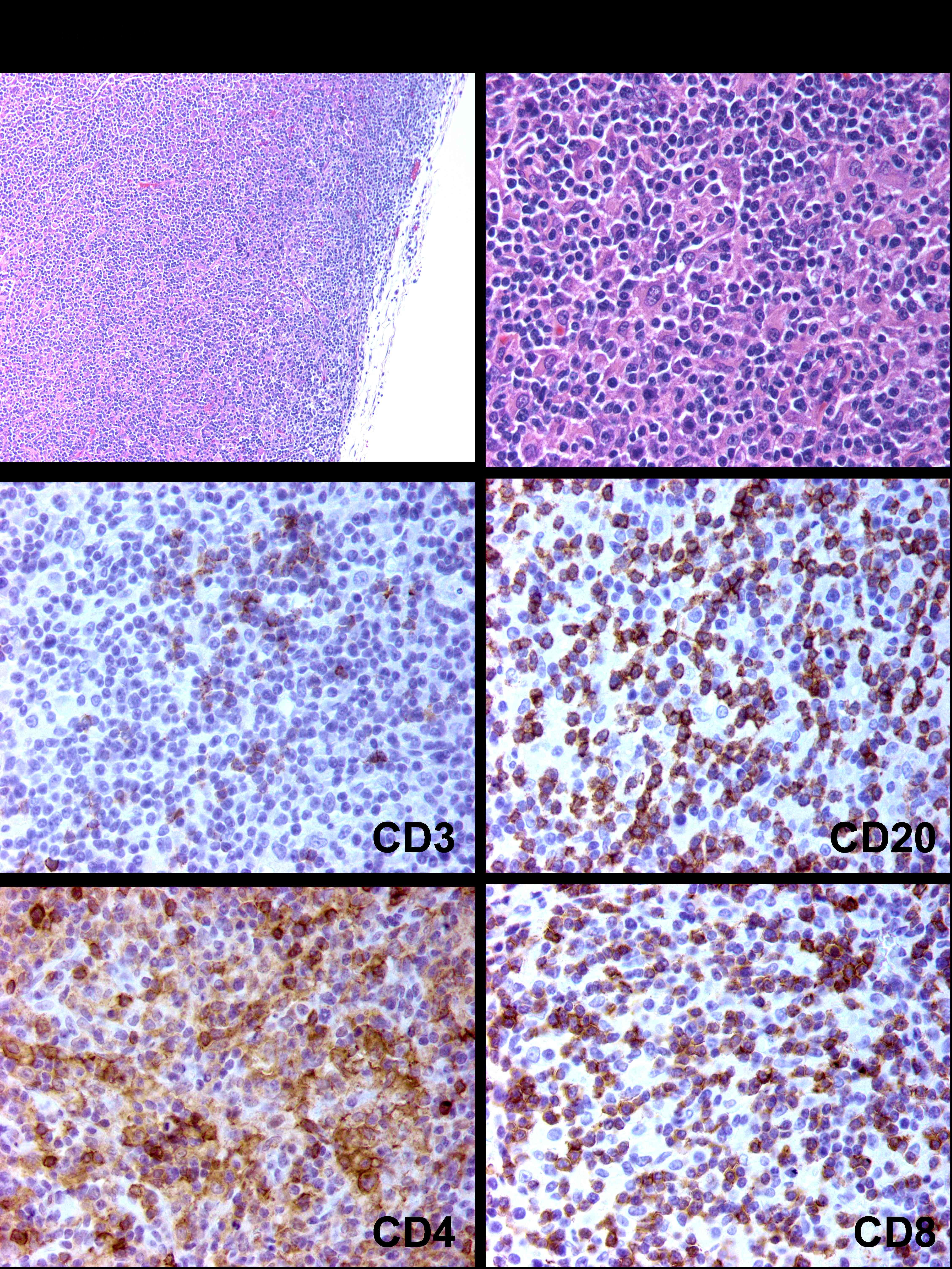
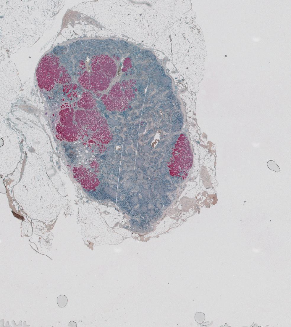
brcalymphnode.
We’ll look at data by Setiadi et al. (2010). After segmentating the image shown in Figure 11.20 using the segmentation method GemIdent (Holmes et al. 2009), the authors obtained the coordinates and the type of all the cells in the image. We call this type of data a marked point process, and it can be seen as a simple table with 3 columns.
library("readr")
library("dplyr")
cellclasses = c("T_cells", "Tumor", "DCs", "other_cells")
brcalymphnode = lapply(cellclasses, function(k) {
    read_csv(file.path("..", "data", sprintf("99_4525D-%s.txt", k))) |>
    transmute(x = globalX, y = globalY, class = k)
}) |> bind_rows() |> mutate(class = factor(class))

brcalymphnode
# A tibble: 209,462 × 3
x y class
<dbl> <dbl> <fct>
1 6355 10382 T_cells
2 6356 10850 T_cells
3 6357 11070 T_cells
4 6357 11082 T_cells
5 6358 10600 T_cells
6 6361 10301 T_cells
7 6369 10309 T_cells
8 6374 10395 T_cells
9 6377 10448 T_cells
10 6379 10279 T_cells
# ℹ 209,452 more rowstable(brcalymphnode$class)
        DCs other_cells     T_cells       Tumor
        878       77081      103681       27822
We see that there are over a 100,000 T cells, around 28,000 tumor cells, and only several hundred dendritic cells. Let’s plot the \(x\)- and \(y\)-positions of the cells (Figure 11.21).
ggplot(filter(brcalymphnode, class %in% c("T_cells", "Tumor")),
   aes(x = x, y = y, col = class)) + geom_point(shape = ".") +
   facet_grid( . ~ class) + guides(col = "none")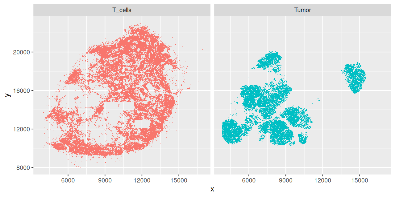
brcalymphnode. The locations were obtained by a segmentation algorithm from a high resolution version of Figure 11.20. Some rectangular areas in the T-cells plot are suspiciously empty, this could be because the corresponding image tiles within the overall composite image went missing, or were not analyzed.
To use the functionality of the spatstat package, it is convenient to convert our data in brcalymphnode into an object of class ppp; we do this by calling the eponymous function.
library("spatstat")ln = with(brcalymphnode, ppp(x = x, y = y, marks = class,
xrange = range(x), yrange = range(y)))
lnMarked planar point pattern: 209462 points
Multitype, with levels = DCs, other_cells, T_cells, Tumor
window: rectangle = [3839, 17276] x [6713, 23006] unitsppp objects are designed to capture realizations of a spatial point process, that is, a set of isolated points located in a mathematical space; in our case, as you can see above, the space is a two-dimensional rectangle that contains the range of the \(x\)- and \(y\)-coordinates. In addition, the points can be marked with certain properties. In ln, the mark is simply the factor variable class. More generally, it could be several attributes, times, or quantitative data as well. There are similarities between a marked point process and an image, although for the former, the points can lie anywhere within the space, whereas in an image, the pixels are covering the space in regular, rectangular way.
11.15.2 Convex hull
Above, we (implicitly) confined the point process to lie in a rectangle. In fact, the data generating process is more confined, by the shape of the tissue section. We can approximate this and compute a tighter region from the convex hull of the points12.
12 You can use str(cvxhull) to look at the internal structure of this S3 object.
cvxhull = convexhull.xy(cbind(ln$x, ln$y))
ggplot(as_tibble(cvxhull$bdry[[1]]), aes(x = x, y = y)) +
  geom_polygon(fill = NA, col = "black") + geom_point() + coord_fixed()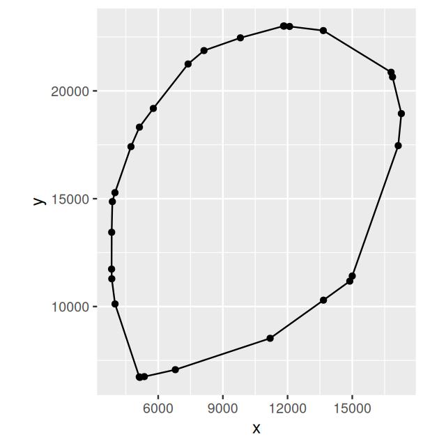
ln.
We can see the polygon in Figure 11.22 and now call ppp again, this time with the polygon.
ln = with(brcalymphnode, ppp(x = x, y = y, marks = class,
                             poly = cvxhull$bdry[[1]]))
ln
Marked planar point pattern: 209462 points
Multitype, with levels = DCs, other_cells, T_cells, Tumor
window: polygonal boundary
enclosing rectangle: [3839, 17276] x [6713, 23006] units11.15.3 Other ways of defining the space for the point process
We do not have to use the convex hull to define the space on which the point process is considered. Alternatively, we could have provided an image mask to ppp that defines the space based on prior knowledge; or we could use density estimation on the sampled points to only identify a region in which there is a high enough point density, ignoring sporadic outliers. These choices are part of the analyst’s job when considering spatial point processes.
11.16 First order effects: the intensity
One of the most basic questions of spatial statistics is whether neighboring points are “clustering”, i.e., whether and to what extent they are closer to each other than expected “by chance”; or perhaps the opposite, whether they seem to repel each other. There are many examples where this kind of question can be asked, for instance
crime patterns within a city,
disease patterns within a country,
soil measurements in a region.
It is usually not hard to find reasons why such patterns exist: good and bad neighborhoods, local variations in lifestyle or environmental exposure, the common geological history of the soil. Sometimes there may also be mechanisms by which the observed events attract or repel each other – the proverbial “broken windows” in a neighborhood, or the tendency of many cell types to stick close to other cells.
The cell example highlights that spatial clustering (or anticlustering) can depend on the objects’ attributes (or marks, in the parlance of spatial point processes). It also highlights that the answer can depend on the length scale considered. Even if cells attract each other, they have a finite size, and cannot occupy the same space. So there will be some minmal distance between them, on the scale of which they essentially repel each other, while at further distances, they attract.
To attack these questions more quantitatively, we need to define a probabilistic model of what we expect by chance. Let’s count the number of points lying in a subregion, say, a circle of area \(a\) around a point \(p=(x,y)\); call this \(N(p, a)\)13 The mean and covariance of \(N\) provide first and second order properties. The first order is the intensity of the process:
13 As usual, we use the uppercase notation \(N(p, a)\) for the random variable, and the lowercase \(n(p, a)\) for its realizations, or samples.
\[ \lambda(p) = \lim_{a\rightarrow 0} \frac{E[ N(p, a)]}{a}. \tag{11.6}\]
Here we used infinitesimal calculus to define the local intensity \(\lambda(p)\). As for time series, a stationary process is one where we have homogeneity all over the region, i.e., \(\lambda(p) = \text{const.}\); then the intensity in an area \(A\) is proportional to the area: \(E[N(\cdot, A)] = \lambda A\). Later we’ll also look at higher order statistics, such as the spatial covariance
\[ \gamma(p_1, p_2) = \lim_{a \rightarrow 0} \frac{E \left[ \left(N(p_1, a) - E[ N(p_1, a)] \right) \left(N(p_2, a) - E[ N(p_2, a)] \right) \right]}{a^2}. \tag{11.7}\]
If the process is stationary, this will only depend on the relative position of the two points (the vector between them). If it only depends on the distance, i.e., only on the length but not on the direction of the vector, it is called second order isotropic.
11.16.1 Poisson Process
The simplest spatial process is the Poisson process. We will use it as a null model against which to compare our data. It is stationary with intensity \(\lambda\), and there are no further dependencies between occurrences of points in non-overlapping regions of the space. Moreover, the number of points in a region of area \(A\) follows a Poisson distribution with rate \(\lambda A\).
11.16.2 Estimating the intensity
To estimate the intensity, divide up the area into subregions, small enough to see potential local variations of \(\lambda(p)\), but big enough to contain a sufficient sample of points. This is analogous to 2D density estimation, and instead of hard region boundaries, we can use a smooth kernel function \(K\).
\[ \hat{\lambda}(p) = \sum_i e(p_i) K(p-p_i). \tag{11.8}\]
The kernel function depends on a smoothing parameter, \(\sigma\), the larger it is, the larger the regions over which we compute the local estimate for each \(p\). \(e(p)\) is an edge correction factor, and takes into account the estimation bias caused when the support of the kernel (the “smoothing window”) would fall outside the space on which the point process is defined. The function density, which is defined for ppp objects in the spatstat package, implements Equation 11.8.
d = density(subset(ln, marks == "Tumor"), edge=TRUE, diggle=TRUE)
plot(d)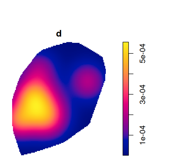
Tumor in ppp. The support of the estimate is the polygon that we specified earlier on (Figure 11.22).
The plot is shown in Figure 11.24.
Solution
d0 = density(subset(ln, marks == "Tumor"), edge = FALSE)
plot(d0)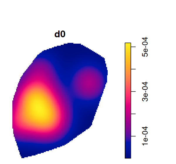
Now estimated intensity is smaller towards the edge of the space, reflecting edge bias (Figure 11.25).
density gives us as estimate of the intensity of the point process. A related, but different task is the estimation of the (conditional) probability of being a particular cell class. The function relrisk computes a nonparametric estimate of the spatially varying risk of a particular event type. We’re interested in the probability that a cell that is present at particular spatial location will be a tumor cell (Figure 11.26).
rr = relrisk(ln, sigma = 250)plot(rr)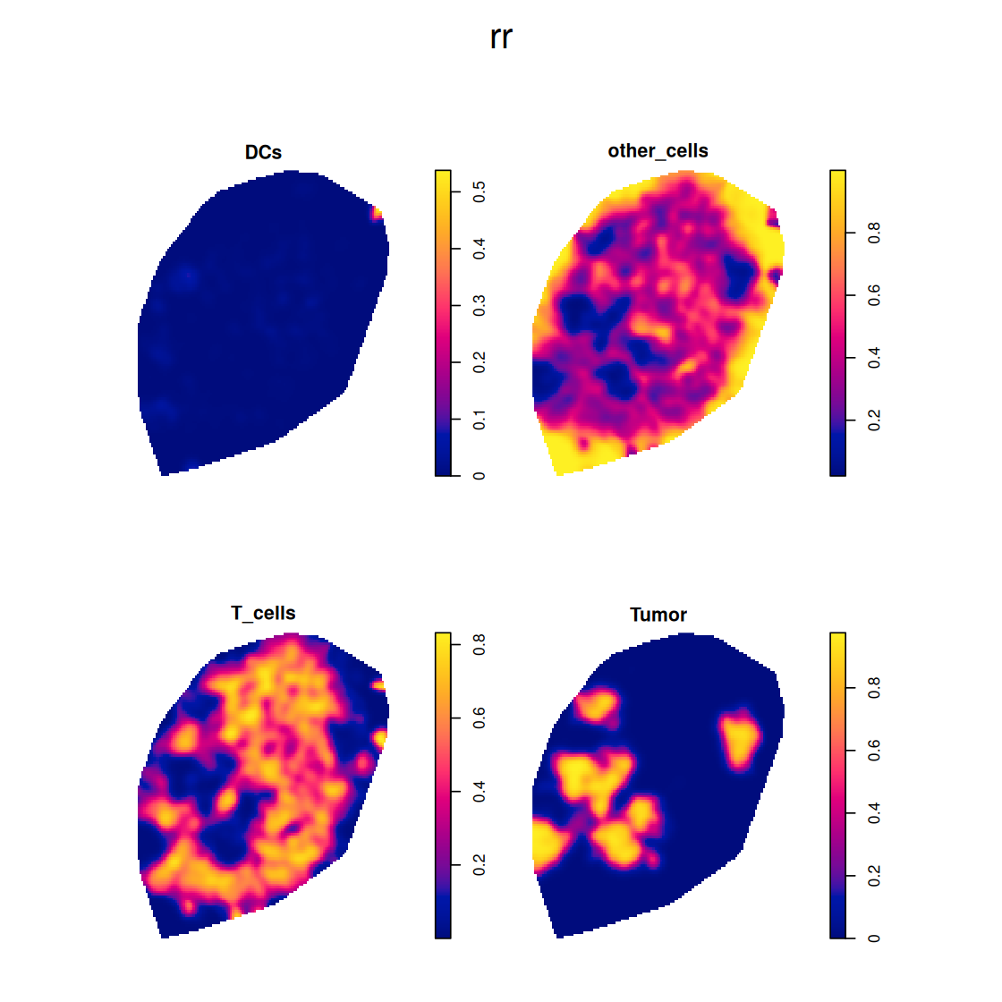
11.17 Second order effects: spatial dependence
If we pick a point at random in our spatial process, what is the distance \(W\) to its nearest neighbor? For a homogenous Poisson process, the cumulative distribution function of this distance is
\[ G(w) = P(W\leq w) = 1-e^{-\lambda \pi w^2}. \tag{11.9}\]
Plotting \(G\) gives a way of noticing departure from the homogenous Poisson process. An estimator of \(G\), which also takes into account edge effects (Baddeley 1998; Ripley 1988), is provided by the function Gest of the spatstat package.
gln = Gest(ln)
gln
Function value object (class 'fv')
for the function r -> G(r)
.....................................................................
Math.label Description
r r distance argument r
theo G[pois](r) theoretical Poisson G(r)
han hat(G)[han](r) Hanisch estimate of G(r)
rs hat(G)[bord](r) border corrected estimate of G(r)
km hat(G)[km](r) Kaplan-Meier estimate of G(r)
hazard hat(h)[km](r) Kaplan-Meier estimate of hazard function h(r)
theohaz h[pois](r) theoretical Poisson hazard function h(r)
.....................................................................
Default plot formula: .~r
where "." stands for 'km', 'rs', 'han', 'theo'
Recommended range of argument r: [0, 20.998]
Available range of argument r: [0, 52.443]library("RColorBrewer")
plot(gln, xlim = c(0, 10), lty = 1, col = brewer.pal(4, "Set1"))
The printed summary of the object gln gives an overview of the computed estimates; further explanations are in the manual page of Gest. In Figure 11.27 we see that the empirical distribution function and that of our null model, a homogenous Poisson process with a suitably chosen intensity, cross at around 4.5 units. Cell to cell distances that are shorter than this value are less likely than for the null model, in particular, there are essentially no distances below around 2; this, of course, reflects the fact that our cells have finite size and cannot overlap the same space. There seems to be trend to avoid very large distances –compared to the Poisson process–, perhaps indicative of a tendency of the cells to cluster.
11.17.1 Ripley’s \(K\) function
In homogeneous spatial Poisson process, if we randomly pick any point and count the number of points within a distance of at most \(r\), we expect this number to grow as the area of the circle, \(\pi r^2\). For a given dataset, we can compare this expectation to the observed number of neighbors within distance \(r\), averaged across all points.
The \(K\) function (variously called Ripley’s \(K\)-function or the reduced second moment function) of a stationary point process is defined so that \(\lambda K(r)\) is the expected number of (additional) points within a distance \(r\) of a given, randomly picked point. Remember that \(\lambda\) is the intensity of the process, i.e., the expected number of points per unit area. The \(K\) function is a second order moment property of the process.
The definition of \(K\) can be generalized to inhomogeneous point processes and written as in (Baddeley et al. 2000),
\[ K_{\scriptsize \mbox{inhom}}(r)= \sum_{i,j} 𝟙_{d(p_i, p_j) \le r} \times \frac{e(p_i, p_j, r)} { \lambda(x_i) \lambda(x_j) }, \tag{11.10}\]
where \(d(p_i, p_j)\) is the distance between points \(p_i\) and \(p_j\), and \(e(p_i, p_j, r)\) is an edge correction factor14. For estimation and visualisation, it is useful to consider a transformation of \(K\) (and analogously, of \(K_{\scriptsize \mbox{inhom}}\)), the so-called \(L\) function.
14 See the manual page of Kinhom for more.
\[ L(r)=\sqrt{\frac{K(r)}{\pi}}. \tag{11.11}\]
For a homogeneous spatial Poisson process, the theoretical value is \(L(r) = r\). By comparing that to the estimate of \(L\) for a dataset, we can learn about inter-point dependence and spatial clustering. The square root in Equation 11.11 has the effect of stabilising the variance of the estimator, so that compared to \(K\), \(L\) is more appropriate for data analysis and simulations. The computations in the function Linhom of the spatstat package take a few minutes for our data (Figure 11.28).
Lln = Linhom(subset(ln, marks == "T_cells"))LlnFunction value object (class 'fv')for the function r -> L[inhom](r)................................................................................
Math.label
r r
theo L[pois](r)
border {hat(L)[inhom]^{bord}}(r)
bord.modif {hat(L)[inhom]^{bordm}}(r)
Description
r distance argument r
theo theoretical Poisson L[inhom](r)
border border-corrected estimate of L[inhom](r)
bord.modif modified border-corrected estimate of L[inhom](r)
................................................................................
Default plot formula: .~.x
where "." stands for 'bord.modif', 'border', 'theo'
Recommended range of argument r: [0, 694.7]
Available range of argument r: [0, 694.7]plot(Lln, lty = 1, col = brewer.pal(3, "Set1"))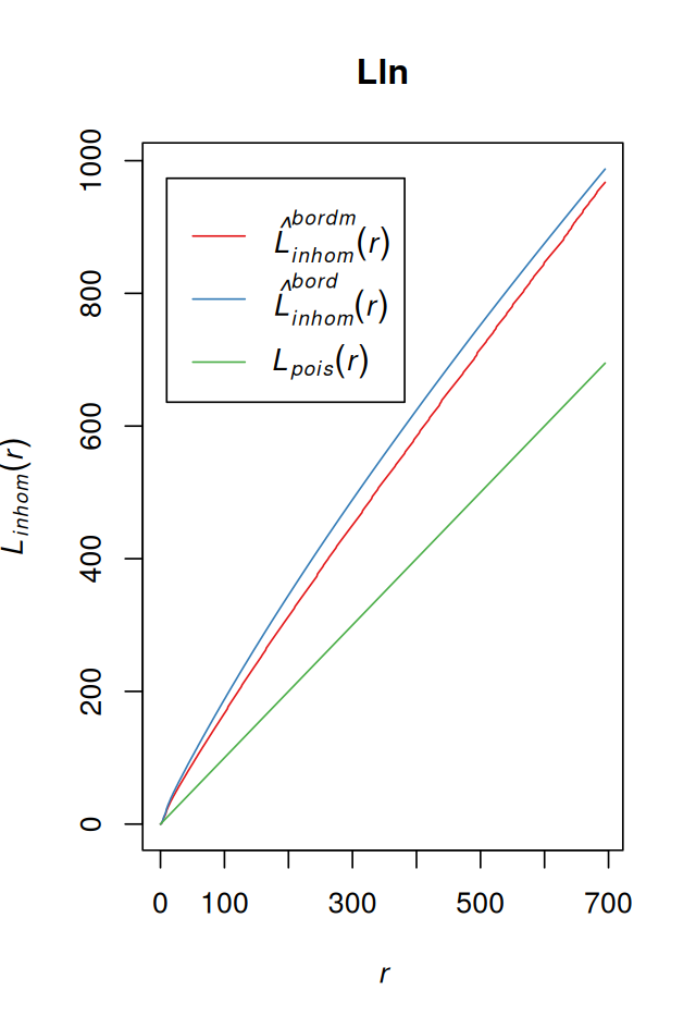
We could now proceed with looking at the \(L\) function also for other cell types, and for different tumors as well as for healthy lymph nodes. This is what Setiadi and colleagues did in their report (Setiadi et al. 2010), where by comparing the spatial grouping patterns of T and B cells between healthy and breast cancer lymph nodes they saw that B cells appeared to lose their normal localization in the extrafollicular region of the lymph nodes in some tumors.
The pair correlation function
describes how point density varies as a function of distance from a reference point. It provides a perspective inspired by physics for looking at spatial clustering. For a stationary point process, it is defined as
\[ g(r)=\frac{1}{2\pi r}\frac{dK}{dr}(r). \tag{11.12}\]
For a stationary Poisson process, the pair correlation function is identically equal to 1. Values \(g(r) < 1\) suggest inhibition between points; values greater than 1 suggest clustering.
The spatstat package allows computing estimates of \(g\) even for inhomogeneous processes, if we call pcf as below, the definition 11.12 is applied to the estimate of \(K_{\scriptsize \mbox{inhom}}\).
pcfln = pcf(Kinhom(subset(ln, marks == "T_cells")))plot(pcfln, lty = 1)
plot(pcfln, lty = 1, xlim = c(0, 10))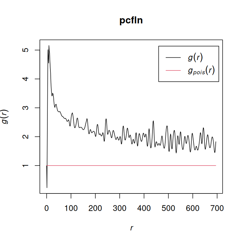
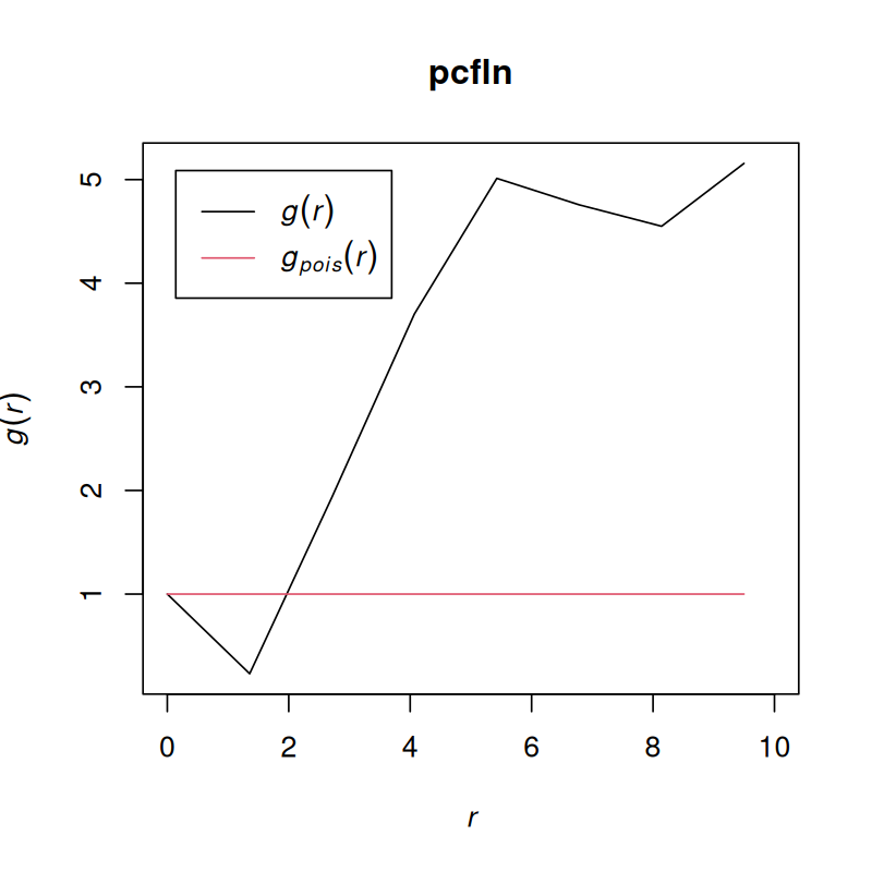
As we see in Figure 11.29, the T cells cluster, although at very short distances, there is also evidence for avoidance.
Solution
The answer lies in the r argument of the Kinhom function; see Figure 11.30.
pcfln2 = pcf(Kinhom(subset(ln, marks == "T_cells"),
                    r = seq(0, 10, by = 0.2)))
plot(pcfln2, lty = 1)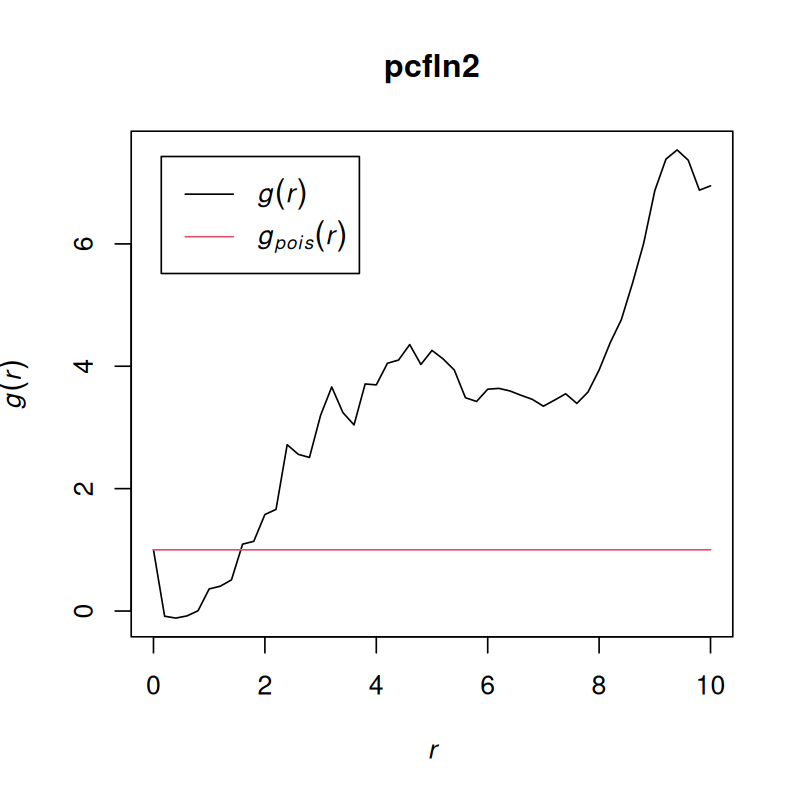
11.18 Summary of this chapter
We learned to work with image data in R. Images are basically just arrays, and we can use familiar idioms to manipulate them. We can extract quantitative features from images, and then many of the analytical questions are not unlike those with other high-throughput data: we summarize the features into statistics such as means and variances, do hypothesis testing for differences between conditions, perform analysis of variance, apply dimension reduction, clustering and classification.
Often we want to compute such quantitative features not on the whole image, but for individual objects shown in the image, and then we need to first segment the image to demarcate the boundaries of the objects of interest. We saw how to do this for images of nuclei and cells.
When the interest is on the positions of the objects and how these positions relate to each other, we enter the realm of spatial statistics. We have explored some of the functionality of the spatstat package, have encountered the point process class, and we learned some of the specific diagnostic statistics used for point patterns, like Ripley’s \(K\) function.
11.19 Further reading
There is a vast amount of literature on image analysis. When navigating it, it is helpful to realize that the field is driven by two forces: specific application domains (we saw the analysis of high-throughput cell-based assays) and available computer hardware. Some algorithms and concepts that were developed in the 1970s are still relevant, others have been superseeded by more systematic and perhaps computationally more intensive methods. Many algorithms imply certain assumptions about the nature of the data and and scientific questions asked, which may be fine for one application, but need a fresh look in another. A classic introduction is The Image Processing Handbook (Russ and Neal 2015), which now is its seventh edition.
For spatial point pattern analysis, Diggle (2013; Ripley 1988; Cressie 1991; Chiu et al. 2013).
11.20 Exercises
Exercise 11.3
Consider the two-dimensional empirical autocorrelation function,
\[ a(v_x, v_y) = \frac{1}{|I|} \sum_{(x,y)\in I} B(x, y)\;B(x+v_x, \, y+v_y), \tag{11.13}\]
where \(B\) is an image, i.e., a function over the set of pixels \(I\), the tuple \((x,y)\) runs over all the pixel coordinates, and \(v=(v_x, v_y)\) is the offset vector. Using the Wiener–Khinchin theorem, we can compute this function efficiently using the Fast Fourier Transformation.
autocorr2d = function(x) {
  y = fft(x/sum(x))
  abs(gsignal::fftshift(fft(y * Conj(y), inverse = TRUE), MARGIN = 1:2))
}
Below, we’ll use this little helper function, which shows a matrix as a heatmap with ggplot2 (similar to base R’s image).
matrix_as_heatmap = function(m)
  ggplot(reshape2::melt(m), aes(x = Var1, y = Var2, fill = value)) +
    geom_tile() + coord_fixed() +
    scale_fill_continuous(type = "viridis") +
    scale_x_continuous(expand = c(0, 0)) + scale_y_continuous(expand = c(0, 0))
Now let’s apply autocorr2d to each of the three color channels separately. The result is shown in Figure 11.31.
nm = dimnames(cells)[[3]]
ac = lapply(nm, function(i) autocorr2d(cells[,, i])) |> setNames(sub("^image-", "", nm))

for (w in names(ac))
  print(matrix_as_heatmap(ac[[w]]) + ggtitle(w))

cy = dim(cells)[1] / 2
cx = dim(cells)[2] / 2
r  = round(sqrt((col(cells[,,1]) - cx)^2 + (row(cells[,,1]) - cy)^2))

matrix_as_heatmap(r) + ggtitle("radius r")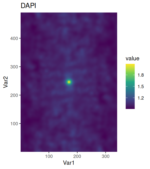
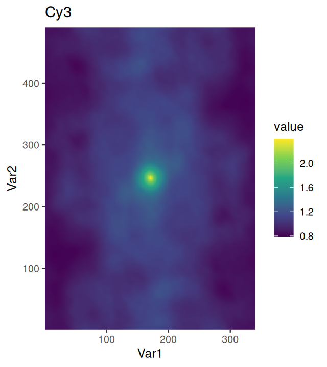
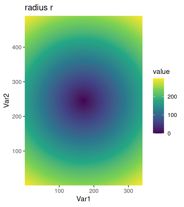
cells image, shown as heatmaps. The peaks in the centres correspond to signal correlations over short distances. Also shown is the radial coordinate r.
Since the images are (or should be) isotropic, i.e., there is no preferred direction, we can average over the angular coordinate. The result is shown in Figure 11.32. We can see that the signals in the different color channels have different length scales.
aggregate_by_radius = function(x, r)
  tibble(x = as.vector(x),
         r = as.vector(r)) |>
  group_by(r) |>
  summarize(value = mean(x))

lapply(names(ac), function(w)
  cbind(channel = w,
        aggregate_by_radius(ac[[w]], r))
  ) |>
  bind_rows() |>
  dplyr::filter(r <= 50) |>
  ggplot(aes(x = r, y = value, col = channel)) + geom_line() +
    scale_color_manual(values = c(`Cy3` = "red", `FITC` = "green", `DAPI` = "blue"))
Extend the autocorr2d function to also compute the cross-correlation between different channels.
- What is the motivation behind the
sumnormalization in the above implementationautocorr2d? - Would it make sense to subtract the mean of
xbefore the other computations? - What is the relation between this function and the usual empirical variance or correlation, i.e. the functions
varandsdin base R? - How might plots such as Figure 11.32 be used for the construction of quality metrics in a high-throughput screening setting, i.e., when thousands or millions of images need to be analyzed?
- How would a 3- or \(n\)-dimensional extension of
autocorr2dlook like? What would it be good for?

cells image, aggregated by radius.
15 For instance, http://www.digital-embryo.org
Page built at 21:15 on 2026-07-15 using R version 4.6.0 (2026-04-24)