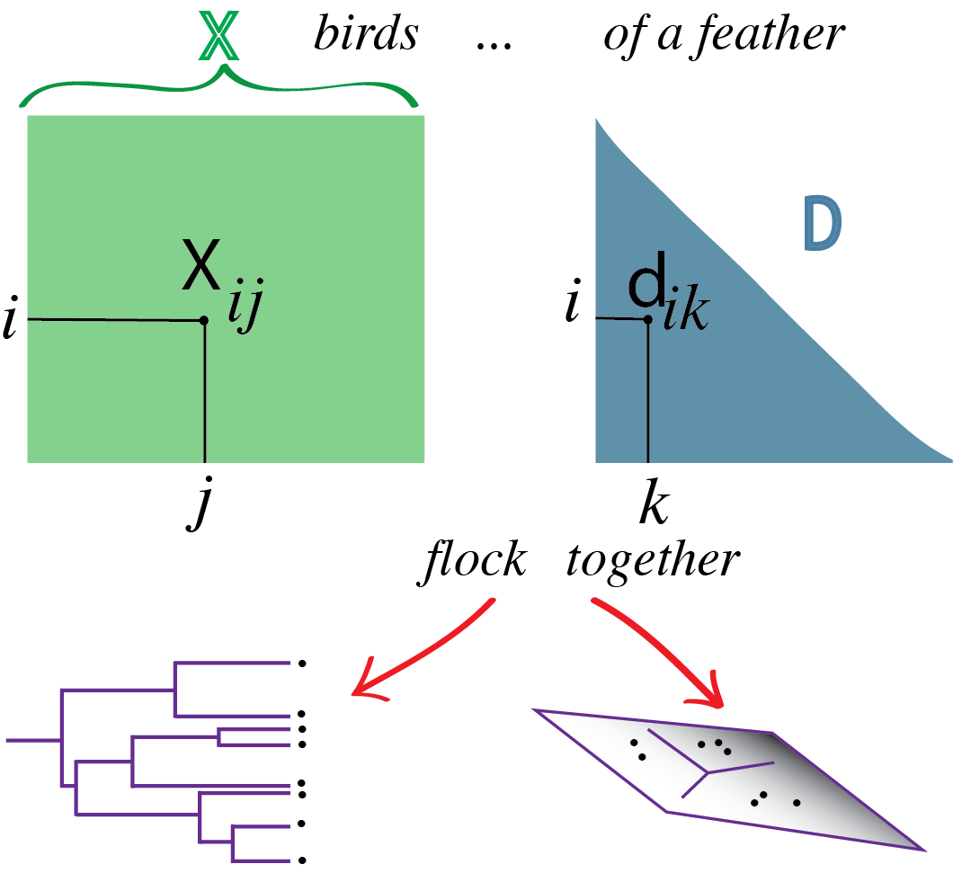
5 Clustering
Finding categories—of cells, organisms, diseases etc.—and then naming them is a core activity in the natural sciences. In Chapter 4, we’ve seen that some data can be modeled as mixtures from different groups or populations with simple, parametric generative models. We saw how to use the EM algorithm to disentangle the components. We are now going to extend the idea of finding groupings or clusters in the data to cases where the clusters do not necessarily have nice, parametric shapes.
Clustering takes a set of objects, described by features, and adds to each object a new categorical group variable. This can often simplify decision making, even if it comes at the cost of ignoring intermediate states. For instance, medical decisions are simplified by replacing complex high-dimensional diagnostic measurements by simple groupings: the full report of measurements of fasting glucose, glycated hemoglobin and plasma glucose two hours after intake is replaced by diagnosing (or not) the patient with diabetes.
There is also a conceptual link between clustering and smoothing: each individual object in our data may be thought of as a noisy instantiation of a “Platonic idea” that we are really trying to understand. We will explore this with single cell RNA-seq data, where each individual cell is reported by a sparse sampling of its true transcriptome content. We cluster the cells in the hope that the clusters correspond to “cell types”. For each cluster, we can then sum up (or average) the observed sequence counts, to get a more precise, averaged estimate of that cell type’s typical expression profile.
In this chapter, we will study how to find clusters in low- and high-dimensional data using nonparametric methods. However, there is a caveat: clustering algorithms are designed to find clusters. So they will always find clusters — even where there are none1. Cluster validation is an essential component of the process, especially if there is no prior knowledge that supports the existence of clusters.
1 This is reminiscent of humans: we like to see patterns—even in randomness.
5.1 Goals for this chapter
In this chapter, we will
- Study examples of data that can be beneficially clustered.
- See measures of (dis)similarity and distance that we need to define clusters.
- Use clustering when given features for each of hundreds of thousands cells. We’ll see that for instance immune cells can be naturally grouped into tight subpopulations.
- Run nonparametric algorithms such as \(k\)-means, \(k\)-medoids on real single cell data.
- Experiment with recursive approaches to clustering that combine observations and groups into a hierarchy of sets. These methods are known as hierarchical clustering.
- Study how to validate clusters through resampling-based approaches, which we will demonstrate on a single-cell dataset.
![]()
5.2 What are the data and why do we cluster them?
5.2.1 Clustering can lead to discoveries
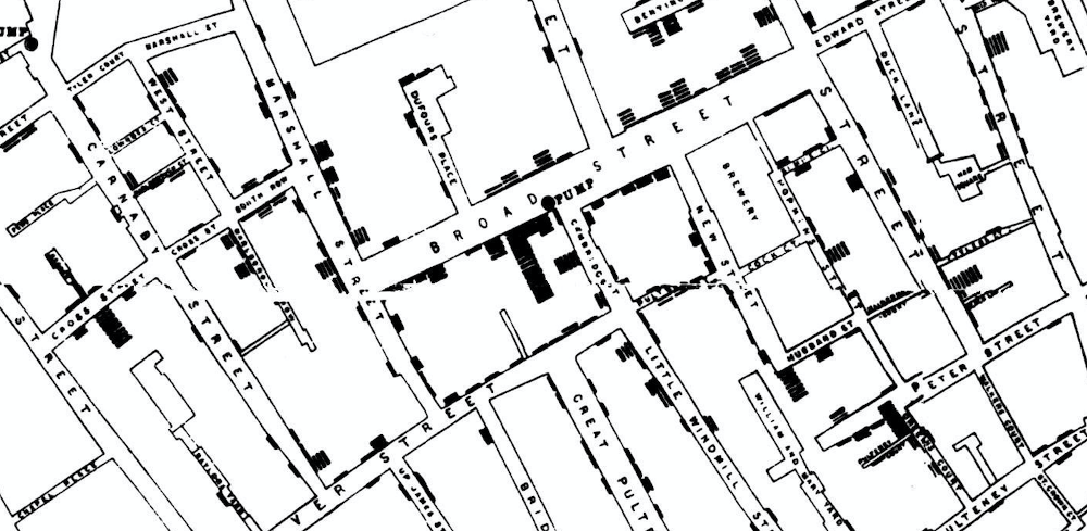
John Snow made a map of cholera cases and identified spatial clusters of cases. He then collected additional information about the situation of the pumps. The proximity of dense clusters of cases to the Broadstreet pump pointed to its water as a possible culprit. Clustering enabled him to infer the source of the cholera outbreak.
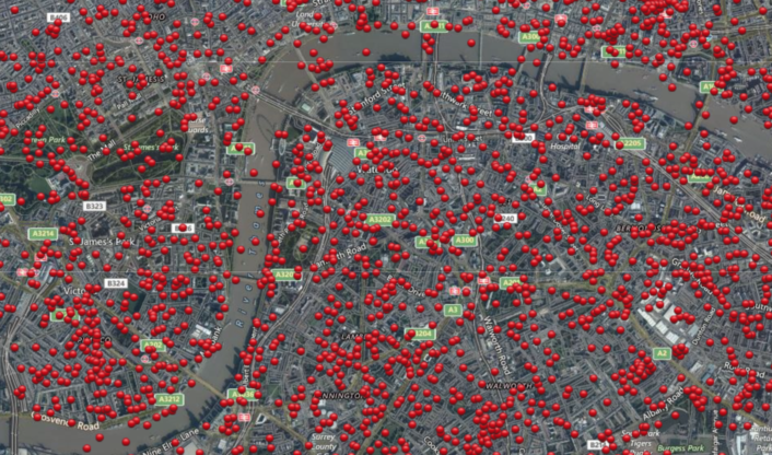
Now, let’s look at another map of London, shown in Figure 5.2. The red dots designate locations that were bombed during World War II. Many theories were put forward during the war by the analytical teams. They attempted to find a rational explanation for the bombing patterns (proximity to utility plants, arsenals, \(...\)). In fact, after the war it was revealed that the bombings were random, without any attempt at hitting particular targets.
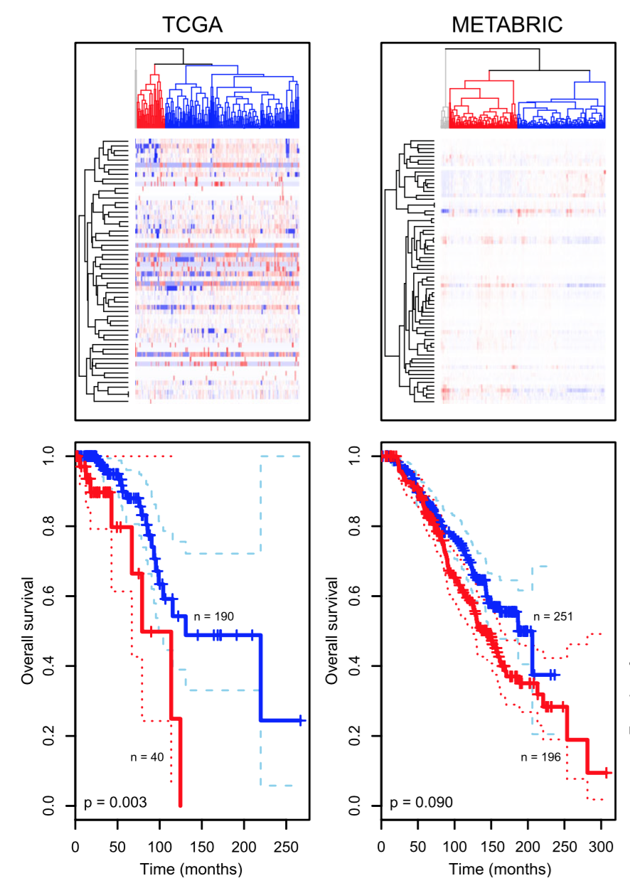
Another example is how clustering has enabled researchers to enhance their understanding of cancer biology. Tumors that appeared to be the same based on their anatomical location and histopathology fell into multiple clusters based on their molecular signatures, such as gene expression data (Hallett et al. 2012). Eventually, such clusterings might lead to the definition of new, more relevant disease types. Relevance is evidenced, e.g., by the fact that they are associated with different best ways of treatment, or different patient outcomes. What we aim to do in this chapter is understand how pictures like Figure 5.3 are constructed and how to interpret them.
In Chapter 4, we have already studied one technique, the EM algorithm, for clustering, by parameterizing groups. The techniques we explore in this chapter are more general and can be applied to more complex data. Many of them are based on distances between pairs of observations (this can be all versus all, or sometimes only all versus some), and they make no explicit assumptions about the generative mechanism of the data involving particular families of distributions, such as normal, gamma-Poisson, etc. There is a proliferation of clustering algorithms in the literature and in the scientific software landscape; this can be intimidating. In fact it is linked to the diversity of the types of data and the objectives pursued in different domains. The diversity of legitimate methods also indicates the difficulty, and in particular the subjectivity of the problem: there is no universal solution.
5.3 How do we measure similarity?
Question 5.1

Thus, our first step is to decide what we mean by similar, that is, we need to choose a metric. There is an infinite number of ways to do this. The first step is deciding which features to even include. Then, the features may live on different scales, e.g., height may be measured in meters or feet, weight in kilograms or stones, surface skin area in square centimeters or square inches, and depending on which it is, the numbers will look different. We may also want to transform the features: for the example features mentioned here, we may (or may not) want to take the square root of the area and the third root of the weight to adjust for basic physical scaling laws. We may choose to divide each feature by a measure of its scale (e.g., standard deviation)—in terms of the implied distance, this amounts to assuming that all features are equally important. Next, we need to choose the mathematical formula for the metric.
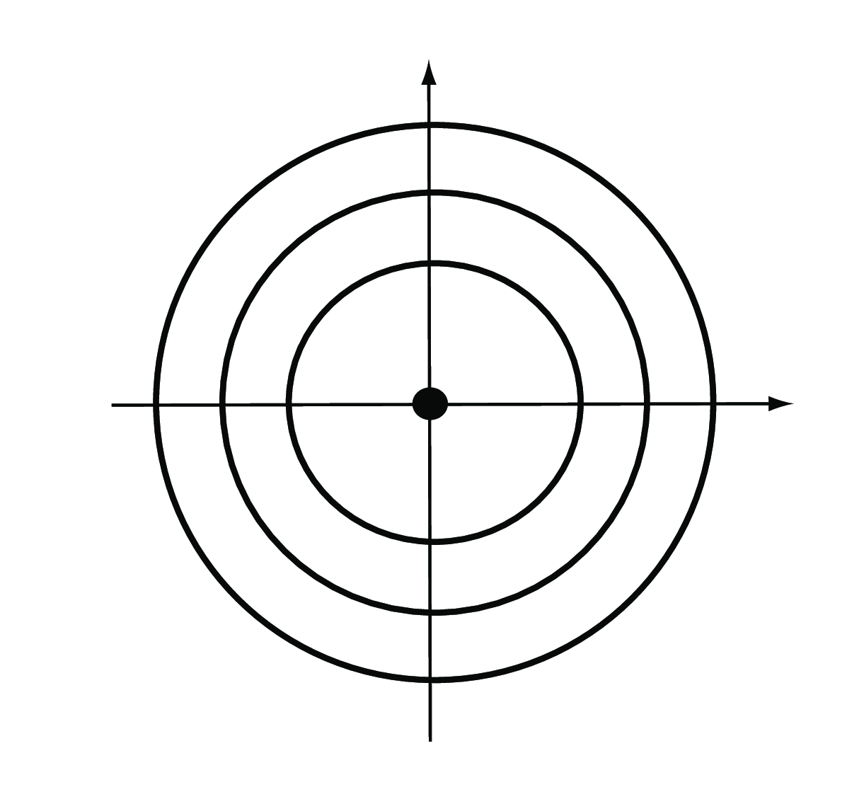
Euclidean: the Euclidean distance between two points \(A=(a_1,...,a_p)\) and \(B= (b_1,...,b_p)\) in a \(p\)-dimensional space (for the \(p\) features) is the square root of the sum of squares of the differences in all \(p\) coordinate directions (Figure 5.5),
\[ d(A,B)=\sqrt{(a_1-b_1)^2+(a_2-b_2)^2+... +(a_p-b_p)^2}. \tag{5.1}\]
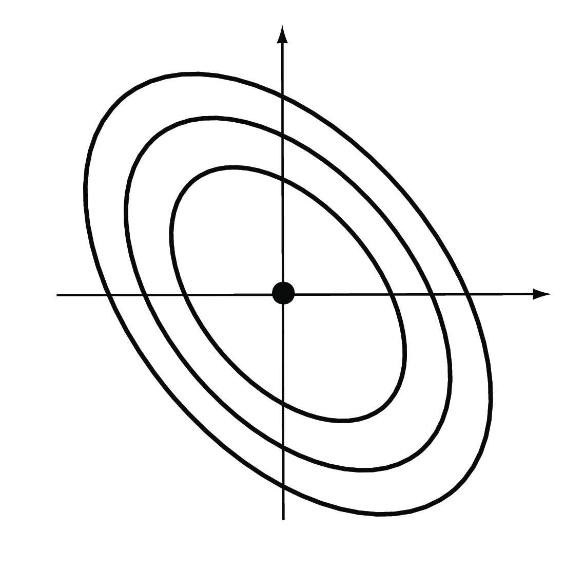
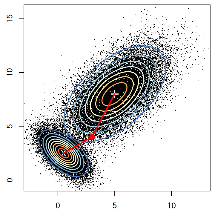
The weighted Euclidean distance is a generalization of the ordinary Euclidean distance, by giving different directions in feature space different weights. We have already encountered one example of a weighted Euclidean distance in Chapter 2, the \(\chi^2\) distance. It is used to compare rows in contingency tables, and the weight of each feature is the inverse of the expected value. The Mahalanobis distance is another weighted Euclidean distance that takes into account the fact that different features may have a different dynamic range, and that some features may be positively or negatively correlated with each other (Figure 5.6). The weights in this case are derived from the covariance matrix of the features. See also Question 5.2.
Minkowski: allowing the exponent to be \(m\) instead of \(2\), as in the Euclidean distance, gives the Minkowski distance,
\[ d(A,B) = \left( \left|a_1-b_1\right|^m + \left|a_2-b_2\right|^m + \ldots + \left|a_p-b_p\right|^m \right)^\frac{1}{m}. \tag{5.2}\]
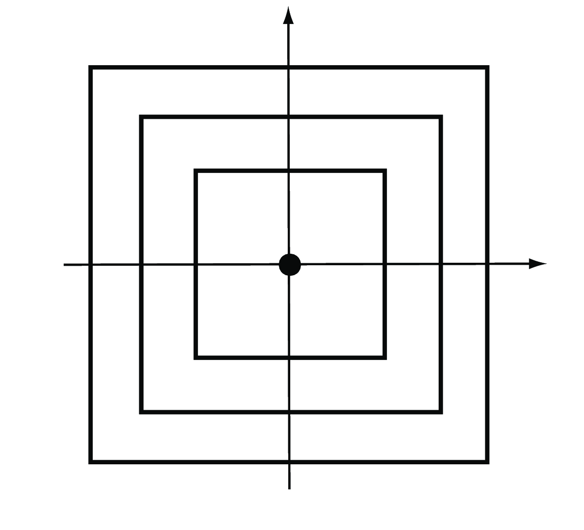
The special case \(m=1\) is also called the Manhattan, city block, taxicab or \(L_1\) distance (Figure 5.7). It takes the sum of the absolute differences in all coordinates,
\[ d(A,B)=|a_1-b_1|+|a_2-b_2|+\ldots+|a_p-b_p|. \tag{5.3}\]
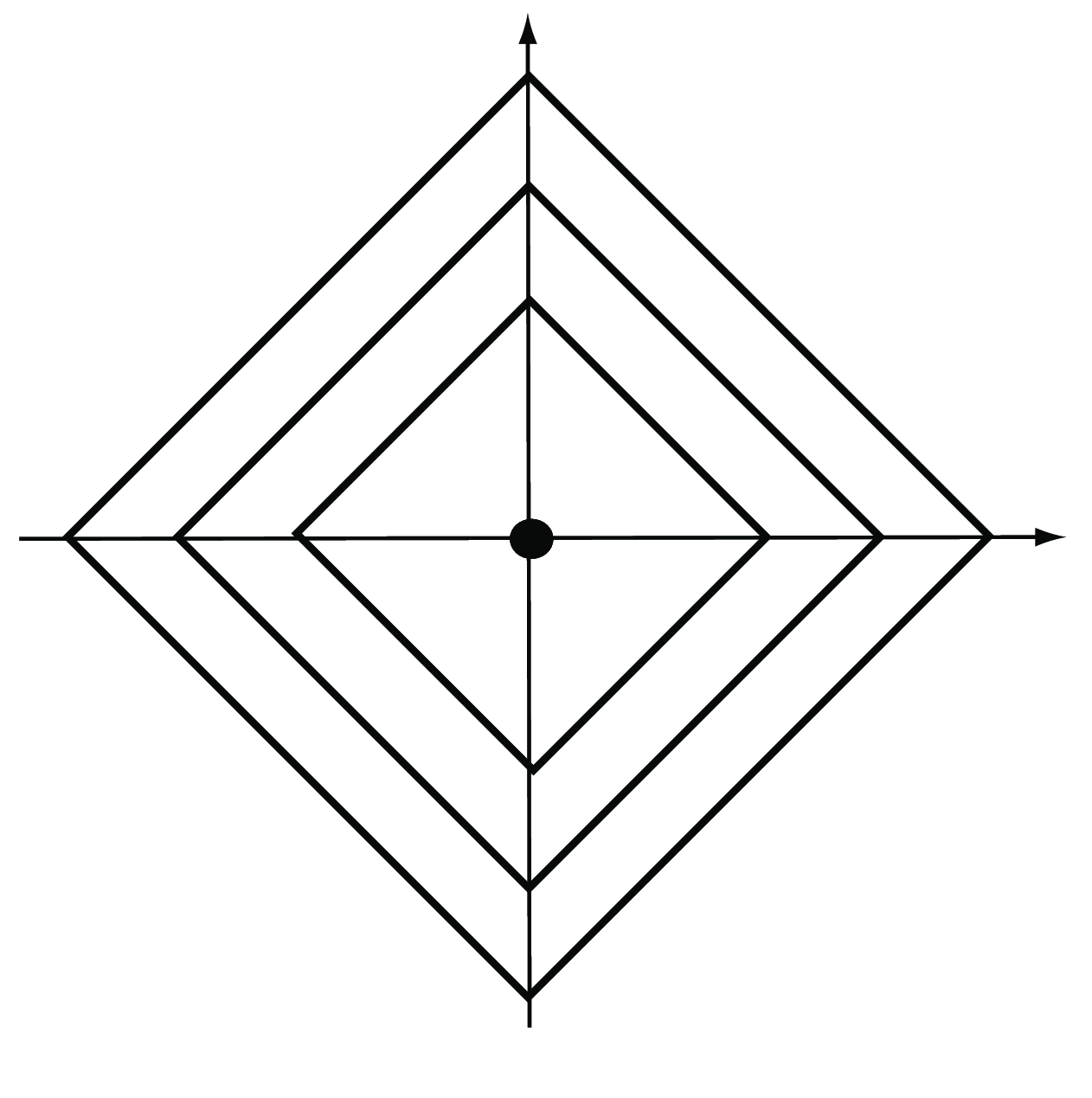
The special case \(m\to\infty\) yields the maximum or \(L_\infty\) distance (Figure 5.8). It takes the maximum of the absolute differences across all coordinates,
\[ d(A,B)= \max_{i}|a_i-b_i|. \tag{5.4}\]
Edit, Hamming: this distance is the simplest way to compare character sequences. It simply counts the number of differences between two character strings. It could be applied to nucleotide or amino acid sequences—although in that case, the different character substitutions are usually associated with different contributions to the distance (to account for physical or evolutionary similarity), and deletions and insertions may also be allowed.
Binary: when the two vectors have binary bits as coordinates, we can think of the non-zero elements as ‘on’ and the zero elements as ‘off’. The binary distance is the proportion of features having only one bit on amongst those features that have at least one bit on.
Jaccard distance: occurrence of traits or features in ecological or mutation data can be translated into presence and absence and encoded as 1’s and 0’s. In such situations, co-occurrence is often more informative than co-absence. For instance, when comparing mutation patterns in HIV, the co-existence in two different strains of a mutation tends to be a more important observation than its co-absence. For this reason, biologists use the Jaccard index. Let’s call \(f_{11}\) the number of times a feature co-occurs both in \(A\) and \(B\), \(f_{10}\) (and \(f_{01}\)) the number of times a feature occurs in \(A\) but not in \(B\) (and vice versa), and \(f_{00}\) the number of times a feature is co-absent. The Jaccard index is
\[ J(A,B) = \frac{f_{11}}{f_{01}+f_{10}+f_{11}}, \tag{5.5}\]
(note that it ignores \(f_{00}\)), and the Jaccard distance is
\[ d(A,B) = 1-J(A,B) = \frac{f_{01}+f_{10}}{f_{01}+f_{10}+f_{11}}. \tag{5.6}\]
Correlation based distance: the formula below considers two vectors \(A\) and \(B\) similar (\(d(A,B)=0\)) if their correlation is high (if \(cor(A,B)=1\)), gives them an intermediate distance of \(\sqrt{2}\) if they are uncorrelated, and a maximum distance of \(2\) if they are perfectly anticorrelated. Other transformations are also possible.
\[ d(A,B)=\sqrt{2(1-\text{cor}(A,B))}. \]
vegdist in vegan, daisy in cluster, genetic_distance in gstudio, dist.dna in ape, Dist in amap, distance in ecodist, dist.multiPhylo in distory, shortestPath in gdistance, % dudi.dist and dist.genet in ade4).
5.3.1 Computations related to distances in R
There are \(n \times n\) distances between all pairs of \(n\) objects, but they are made of only \(n\times(n-1)/2\) distinct numbers, due to symmetry (\(d(A,B)=d(B,A)\)) and \(d(A,A)=0\). The dist function in R computes one of six choices of distance (euclidean, maximum, manhattan, canberra, binary, minkowski) and outputs a memory-efficient object of class dist that contains these numbers. The full \(n \times n\) matrix can always be reconstructed from it. Here is an example for 3 objects:
o1  = c(0, 0, 0, 1, 1, 1)
o2  = c(1, 0, 1, 1, 0, 1)
o3  = c(1, 1, 1, 0, 1, 1)
mat = rbind(o1, o2, o3)
dist(mat)
o1 o2
o2 1.732051
o3 2.000000 1.732051dist(mat, method = "binary") o1 o2
o2 0.6000000
o3 0.6666667 0.5000000In order to access a particular distance (for example the distance between o1 and o2), the easiest is to turn the dist object back into a matrix.
load("../data/Morder.RData")
sqrt(sum((Morder[1, ] - Morder[2, ])^2))
[1] 5.593667as.matrix(dist(Morder))[2, 1][1] 5.593667Let’s look at how we would compute the Jaccard distance we defined above between HIV strains.
mut = read.csv("../data/HIVmutations.csv")
mut[1:3, 10:16]
p32I p33F p34Q p35G p43T p46I p46L
1 0 1 0 0 0 0 0
2 0 1 0 0 0 1 0
3 0 1 0 0 0 0 0
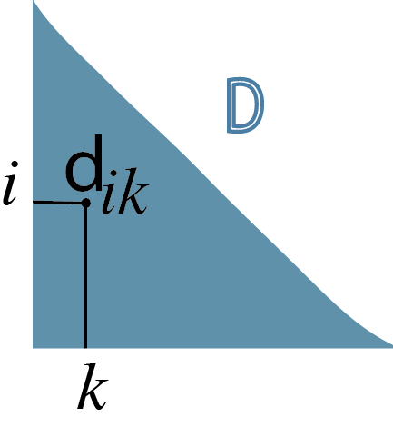
It can also be interesting to compare complex objects that are not traditional vectors or real numbers using dissimilarities or distances. Gower’s distance for data of mixed modalities (both categorical factors and continuous variables) can be computed with the daisy function. In fact, distances can be defined between any pairs of objects, not just points in \({\mathbb R}^p\) or character sequences. For instance, the shortest.paths function from the igraph package that we will see in Chapter 10 computes the distance between vertices on a graph and the function cophenetic computes the distance between leaves of a tree as illustrated in Figure 5.11. We can compute the distance between trees using dist.multiPhylo in the distory package.
There are multiple implementations in CRAN packages of the Haversine distance between two points on a sphere the size of the Earth, specified by latitude and longitude, and the package manifold contains functionality for computing geodesic distances on some other Riemann manifolds.
The Jaccard index between graphs can be computed by looking at two graphs built on the same nodes and counting the number of co-occurring edges. This is implemented in the function similarity in the igraph package. Distances and dissimilarities are also used to compare images, sounds, maps and documents. A distance can usefully encompass domain knowledge and, if carefully chosen, can lead to the solution of many hard problems involving heterogeneous data. Asking yourself what is the relevant notion of “closeness” or similarity for your data can provide useful ways of representing them, as we will explore in Chapter 9.
5.4 Nonparametric mixture detection
5.4.1 \(k\)-methods: \(k\)-means, \(k\)-medoids and PAM
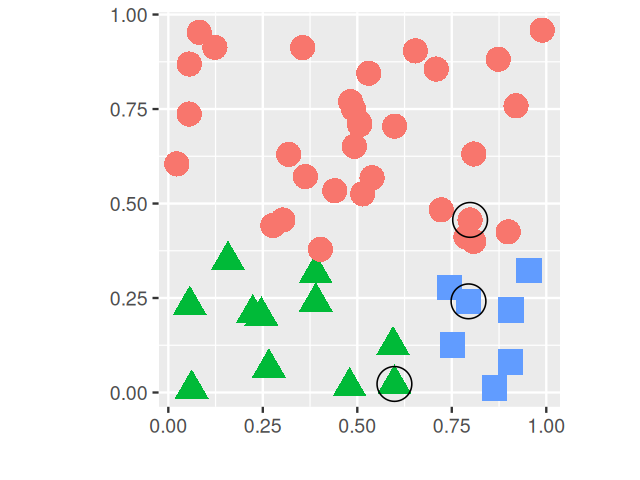
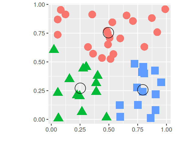
Partitioning or iterative relocation methods work well in high-dimensional settings, where we cannot2 easily use probability densities, the EM algorithm and parametric mixture modeling in the way we did in Chapter 4. Besides the distance measure, the main choice to be made is the number of clusters \(k\). The PAM (partitioning around medoids, Kaufman and Rousseeuw (2009)) method is as follows:
2 This is due to the so-called curse of dimensionality. We will discuss this in more detail in Chapter 12.
Starts from a matrix of \(p\) features measured on a set of \(n\) observations.
Randomly pick \(k\) distinct cluster centers out of the \(n\) observations (“seeds”).
Assign each of the remaining observation to the group to whose center it is the closest.
For each group, choose a new center from the observations in the group, such that the sum of the distances of group members to the center is minimal; this is called the medoid.
Repeat Steps 3 and 4 until the groups stabilize.
Each time the algorithm is run, different initial seeds will be picked in Step 2, and in general, this can lead to different final results. A popular implementation is the pam function in the package cluster.
A slight variation of the method replaces the medoids by the arithmetic means (centers of gravity) of the clusters and is called \(k\)-means. While in PAM, the centers are observations, this is not, in general, the case with \(k\)-means. The function kmeans comes with every installation of R in the stats package; an example run is shown in Figure 5.12.

These so-called \(k\)-methods are the most common off-the-shelf methods for clustering; they work particularly well when the clusters are of comparable size and convex (blob-shaped). On the other hand, if the true clusters are very different in size, the larger ones will tend to be broken up; the same is true for groups that have pronounced non-spherical or non-elliptic shapes.
5.4.2 Tight clusters with resampling
There are clever schemes that repeat the process many times using different initial centers or resampled datasets. Repeating a clustering procedure multiple times on the same data, but with different starting points creates strong forms according to Diday and Brito (1989). Repeated subsampling of the dataset and applying a clustering method will result in groups of observations that are “almost always” grouped together; these are called tight clusters (Tseng and Wong 2005). The study of strong forms or tight clusters facilitates the choice of the number of clusters. A recent package developed to combine and compare the output from many different clusterings is clusterExperiment. Here we give an example from its vignette. Single-cell RNA-Seq experiments provide counts of reads, representing gene transcripts, from individual cells. The single cell resolution enables scientists, among other things, to follow cell lineage dynamics. Clustering has proved very useful for analysing such data.
Solution
The following code produces Figure 5.13.
library("clusterExperiment")
fluidigm = scRNAseq::ReprocessedFluidigmData()
se = fluidigm[, fluidigm$Coverage_Type == "High"]
assays(se) = list(normalized_counts = as.matrix(limma::normalizeQuantiles(assay(se))))
ce = clusterMany(se, clusterFunction = "pam", ks = c(5, 7, 9), run = TRUE,
                 isCount = TRUE, reduceMethod = "var", nFilterDims = c(60, 100, 150))
9 parameter combinations, 0 use sequential method, 0 use subsampling method
Running Clustering on Parameter Combinations...
done.clusterLabels(ce) = sub("FilterDims", "", clusterLabels(ce))
plotClusters(ce, whichClusters = "workflow", axisLine = -1)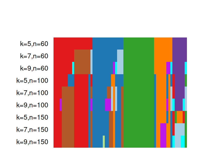
5.5 Clustering examples: flow cytometry and mass cytometry
![]()
Studying measurements on single cells improves both the focus and resolution with which we can analyze cell types and dynamics. Flow cytometry enables the simultaneous measurement of about 10 different cell markers. Mass cytometry expands the collection of measurements to as many as 80 proteins per cell. A particularly promising application of this technology is the study of immune cell dynamics.
5.5.1 Flow cytometry and mass cytometry
At different stages of their development, immune cells express unique combinations of proteins on their surfaces. These protein-markers are called CDs (clusters of differentiation) and are collected by flow cytometry (using fluorescence, see Hulett et al. (1969)) or mass cytometry (using single-cell atomic mass spectrometry of heavy element reporters, see Bendall et al. (2012)). An example of a commonly used CD is CD4, this protein is expressed by helper T cells that are referred to as being “CD4+”. Note however that some cells express CD4 (thus are CD4+), but are not actually helper T cells. We start by loading some useful Bioconductor packages for cytometry data, flowCore and flowViz, and read in an examplary data object fcsB as follows:
library("flowCore")
library("flowViz")
fcsB = read.FCS("../data/Bendall_2011.fcs", truncate_max_range = FALSE)
slotNames(fcsB)
[1] "exprs" "parameters" "description"Figure 5.14 shows a scatterplot of two of the variables available in the fcsB data. (We will see how to make such plots below.) We can see clear bimodality and clustering in these two dimensions.
5.5.2 Data preprocessing
First we load the table data that reports the mapping between isotopes and markers (antibodies), and then we replace the isotope names in the column names of fcsB with the marker names. This makes the subsequent analysis and plotting code more readable:
markersB = readr::read_csv("../data/Bendall_2011_markers.csv")
mt = match(markersB$isotope, colnames(fcsB))
stopifnot(!any(is.na(mt)))
colnames(fcsB)[mt] = markersB$marker
Now we are ready to generate Figure 5.14
flowPlot(fcsB, plotParameters = colnames(fcsB)[2:3], logy = TRUE)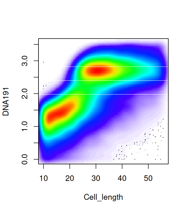
Plotting the data in two dimensions as in Figure 5.14 already shows that the cells can be grouped into subpopulations. Sometimes just one of the markers can be used to define populations on their own; in that case simple rectangular gating is used to separate the populations; for instance, CD4+ cells can be gated by taking the subpopulation with high values for the CD4 marker. Cell clustering can be improved by carefully choosing transformations of the data. The left part of Figure 5.15 shows a simple one dimensional histogram before transformation; on the right of Figure 5.15 we see the distribution after transformation. It reveals a bimodality and the existence of two cell populations.
Data Transformation: hyperbolic arcsin (asinh). It is standard to transform both flow and mass cytometry data using one of several special functions. We take the example of the inverse hyperbolic sine (asinh):
\[ \operatorname{asinh}(x) = \log{(x + \sqrt{x^2 + 1})}. \]
From this we can see that for large values of \(x\), \(\operatorname{asinh}(x)\) behaves like the logarithm and is practically equal to \(\log(x)+\log(2)\); for small \(x\) the function is close to linear in \(x\).
This is another example of a variance stabilizing transformation, also mentioned in Chapters 4 and 8. Figure 5.15 is produced by the following code, which uses the arcsinhTransform function in the flowCore package.
asinhtrsf = arcsinhTransform(a = 0.1, b = 1)
fcsBT = transform(fcsB, transformList(colnames(fcsB)[-c(1, 2, 41)], asinhtrsf))
densityplot(~`CD3all`, fcsB)
densityplot(~`CD3all`, fcsBT)Figure 5.16, generated by the following code, shows a naïve projection of the data into the two dimensions spanned by the CD3 and CD56 markers:
library("flowPeaks")
fp = flowPeaks(Biobase::exprs(fcsBT)[, c("CD3all", "CD56")])
plot(fp)
kmeans.
When plotting points that densely populate an area we should try to avoid overplotting. We saw some of the preferred techniques in Chapter 3; here we use contours and shading. This is done as follows:
flowPlot(fcsBT, plotParameters = c("CD3all", "CD56"), logy = FALSE)
contour(fcsBT[, c(40, 19)], add = TRUE)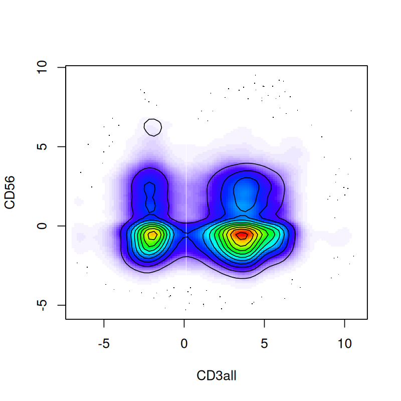
This produces Figure 5.17—a more informative version of Figure 5.16.
5.5.3 Density-based clustering
Data sets such as flow cytometry, that contain only a few markers and a large number of cells, are amenable to density-based clustering. This method looks for regions of high density separated by sparser regions. It has the advantage of being able to cope with clusters that are not necessarily convex. One implementation of such a method is called dbscan. Let’s look at an example by running the following code.
library("dbscan")
mc5 = Biobase::exprs(fcsBT)[, c(15,16,19,40,33)]
res5 = dbscan::dbscan(mc5, eps = 0.65, minPts = 30)
mc5df = data.frame(mc5, cluster = as.factor(res5$cluster))
table(mc5df$cluster)
    0     1     2     3     4     5     6     7     8
76053 4031 5450 5310 257 160 63 25 43 ggplot(mc5df, aes(x=CD4, y=CD8, col=cluster))+geom_density2d()
ggplot(mc5df, aes(x=CD3all, y=CD20, col=cluster))+geom_density2d()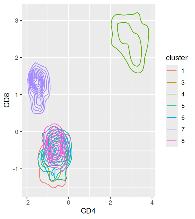
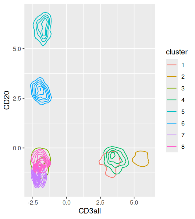
dbscan using five markers. Here we only show the projections of the data into the CD4-CD8 and C3all-CD20 planes.
The output is shown in Figure 5.18. The overlaps of the clusters in the 2D projections enable us to appreciate the multidimensional nature of the clustering.
How does density-based clustering (dbscan) work ?
The dbscan method clusters points in dense regions according to the density-connectedness criterion. It looks at small neighborhood spheres of radius \(\epsilon\) to see if points are connected.
The building block of dbscan is the concept of density-reachability: a point \(q\) is directly density-reachable from a point \(p\) if it is not further away than a given threshold \(\epsilon\), and if \(p\) is surrounded by sufficiently many points such that one may consider \(p\) (and \(q\)) be part of a dense region. We say that \(q\) is density-reachable from \(p\) if there is a sequence of points \(p_1,...,p_n\) with \(p_1 = p\) and \(p_n = q\), so that each \(p_{i + 1}\) is directly density-reachable from \(p_i\).
A cluster is then a subset of points that satisfy the following properties:
All points within the cluster are mutually density-connected.
If a point is density-connected to any point of the cluster, it is part of the cluster as well.
Groups of points must have at least
MinPtspoints to count as a cluster.
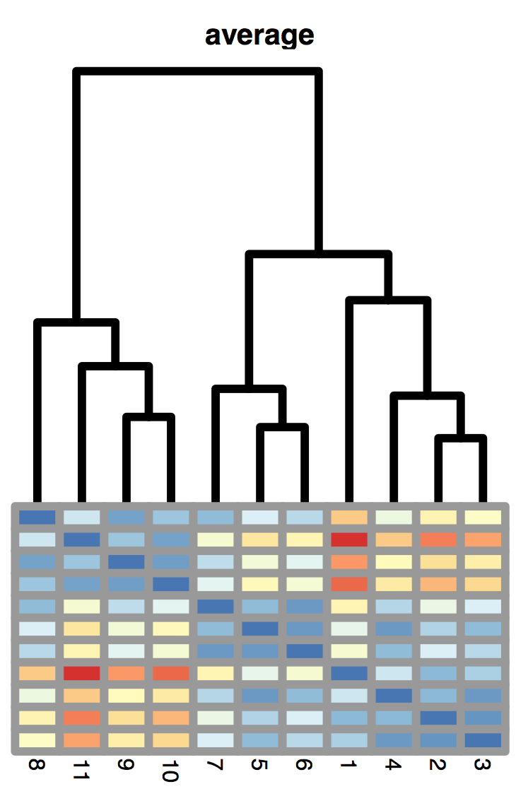
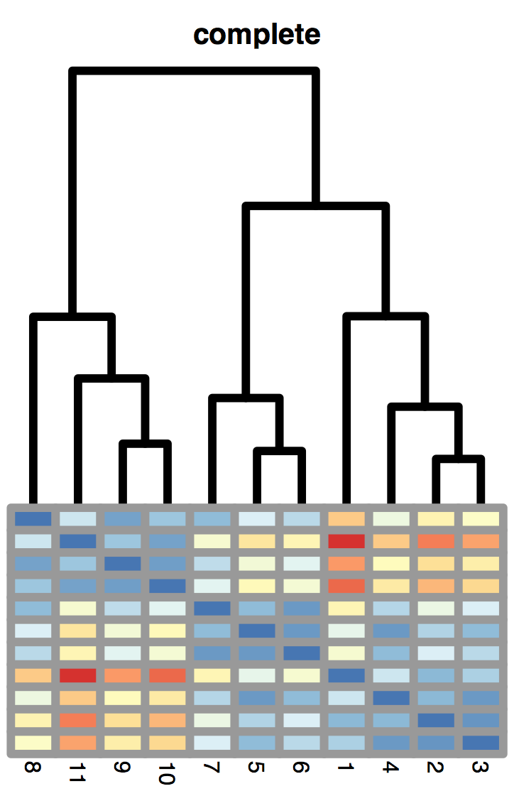
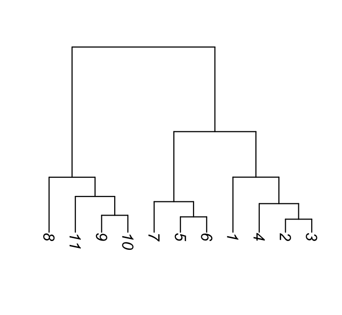
5.6 Hierarchical clustering
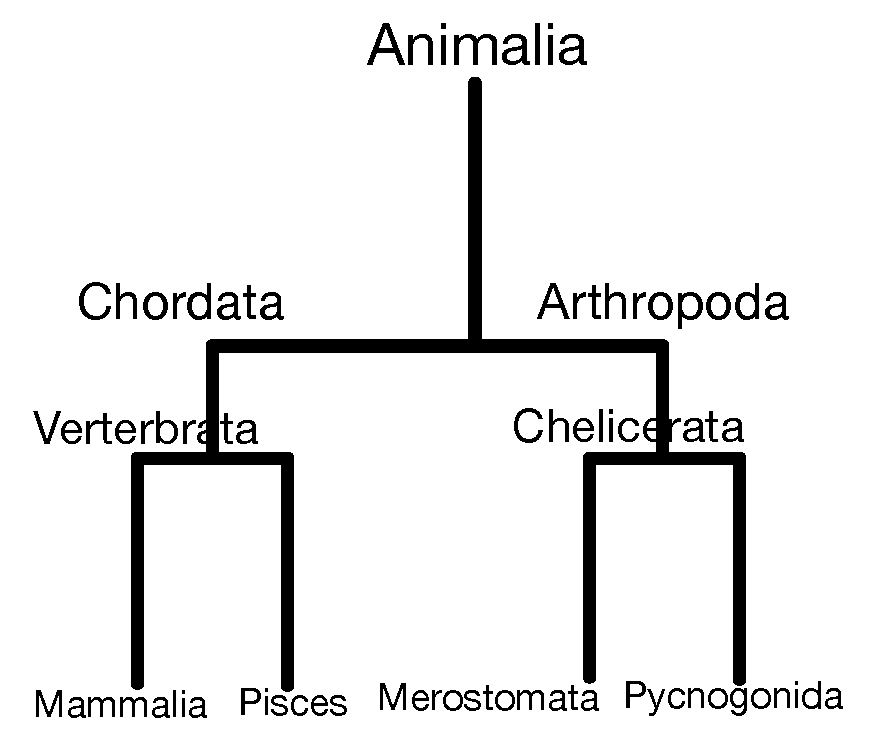
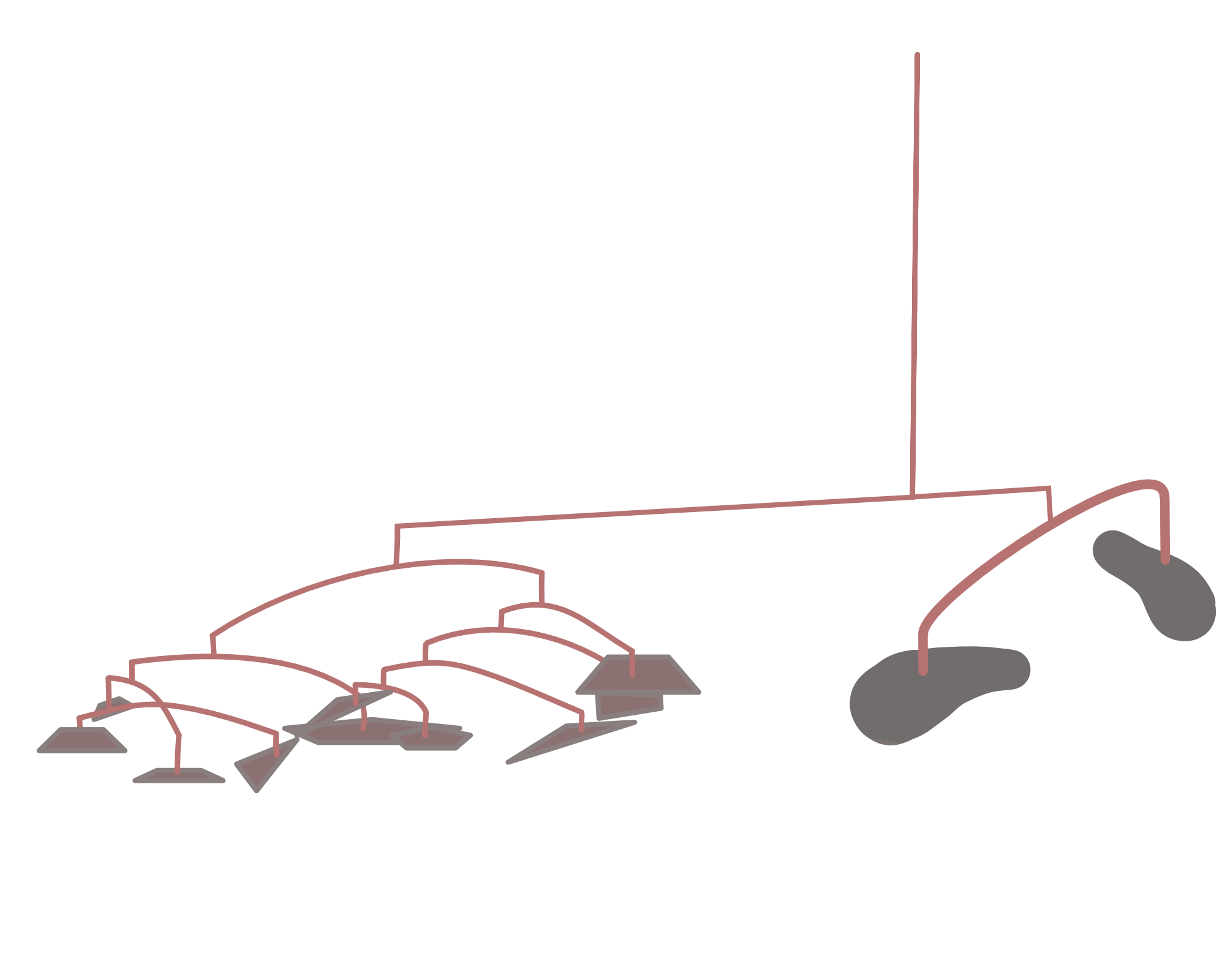
Hierarchical clustering is a bottom-up approach, where similar observations and subclasses are assembled iteratively. Figure 5.19 shows how Linnæus made nested clusters of organisms according to specific characteristics. Such hierarchical organization has been useful in many fields and goes back to Aristotle who postulated a ladder of nature.
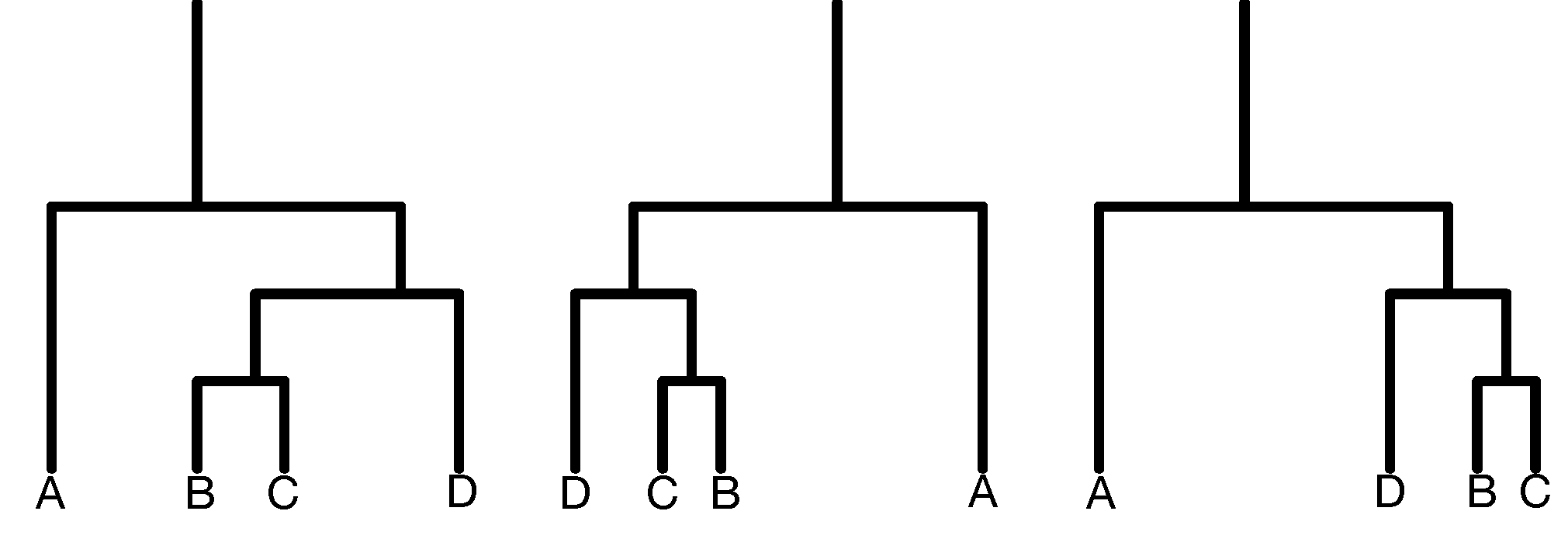
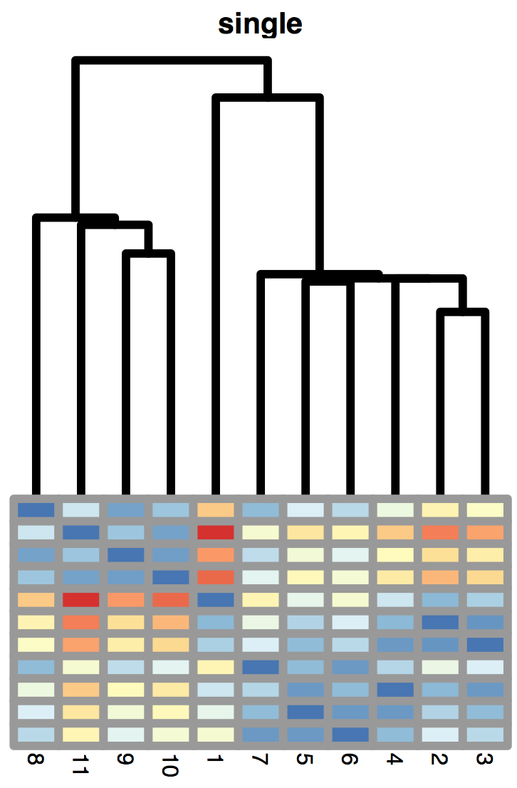
Dendrogram ordering. As you can see in the example of Figure 5.20, the order of the labels does not matter within sibling pairs. Horizontal distances are usually meaningless, while the vertical distances do encode some information. These properties are important to remember when making interpretations about neighbors that are not monophyletic (i.e., not in the same subtree or clade), but appear as neighbors in the plot (for instance B and D in the right hand tree are non-monophyletic neighbors).
Top-down hierarchies. An alternative, top-down, approach takes all the objects and splits them sequentially according to a chosen criterion. Such so-called recursive partitioning methods are often used to make decision trees. They can be useful for prediction (say, survival time, given a medical diagnosis): we are hoping in those instances to split heterogeneous populations into more homogeneous subgroups by partitioning. In this chapter, we concentrate on the bottom-up approaches. We will return to partitioning when we talk about supervised learning and classification in Chapter 12.
5.6.1 How to compute (dis)similarities between aggregated clusters?
A hierarchical clustering algorithm, which works by aggregation, is easy enough to get started, by grouping the most similar observations together. But we will need more than just the distances between all pairs of individual objects. Once an aggregation is made, one is required to say how the distance between the newly formed cluster and all other points (or existing clusters) is computed. There are different choices, all based on the object-object distances, and each choice results in a different type of hierarchical clustering.
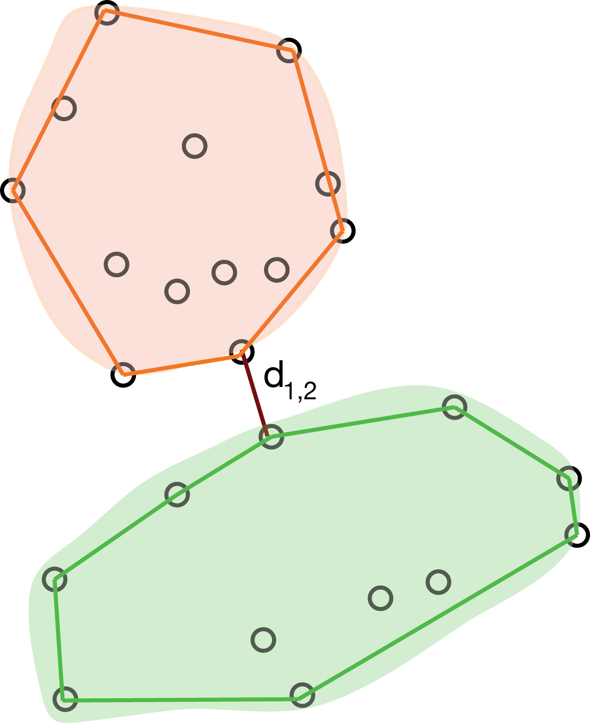
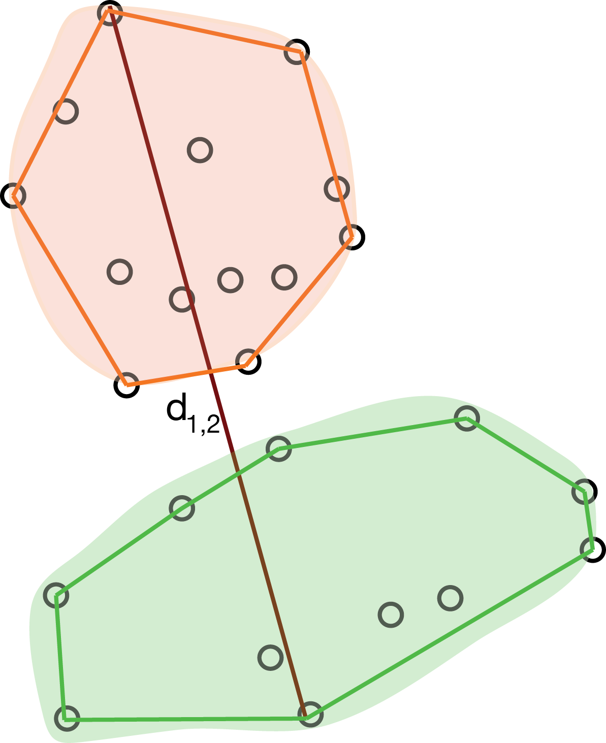
The minimal jump method, also called single linkage or nearest neighbor method computes the distance between clusters as the smallest distance between any two points in the two clusters (as shown in Figure 5.21):
\[ d_{12} = \min_{i \in C_1, j \in C_2 } d_{ij}. \]
This method tends to create clusters that look like contiguous strings of points. The cluster tree often looks like a comb.
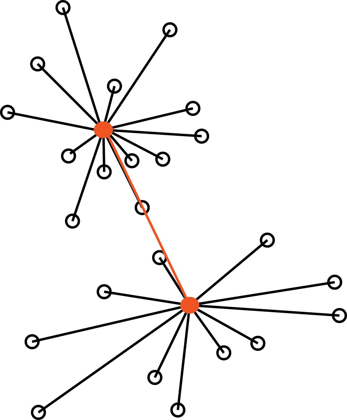
The maximum jump (or complete linkage) method defines the distance between clusters as the largest distance between any two objects in the two clusters, as represented in Figure 5.22:
\[ d_{12} = \max_{i \in C_1, j \in C_2 } d_{ij}. \]
The average linkage method is half way between the two above (here, \(|C_k|\) denotes the number of elements of cluster \(k\)):
\[ d_{12} = \frac{1}{|C_1| |C_2|}\sum_{i \in C_1, j \in C_2 } d_{ij} \]
Ward’s method takes an analysis of variance approach, where the goal is to minimize the variance within clusters. This method is very efficient, however, it tends to create clusters of smaller sizes.
| Method | Pros | Cons |
|---|---|---|
| Single linkage | number of clusters | comblike trees |
| Complete linkage | compact classes | one observation can alter groups |
| Average linkage | similar size and variance | not robust |
| Centroid | robust to outliers | smaller number of clusters |
| Ward | minimising an inertia | classes small if high variability |
These are the choices we have to make building hierarchical clustering trees. An advantage of hierarchical clustering compared to the partitioning methods is that it offers a graphical diagnostic of the strength of groupings: the length of the inner edges in the tree.
When we have prior knowledge that the clusters are about the same size, using average linkage or Ward’s method of minimizing the within class variance is the best tactic.
It is common to see heatmaps whose rows and/or columns are ordered based on a hierarchical clustering tree. Sometimes this makes some clusters look very strong – stronger than what the tree really implies. There are alternative ways of ordering the rows and columns in heatmaps, for instance, in the package NeatMap, that uses ordination methods3 to find orderings.
3 These will be explained in Chapter 9.
5.7 Assessing the quality of a clustering result; choosing the number of clusters
The clustering methods we have described are designed to deliver good groupings of the data, under various definitions of “good” and honoring various constraints. But keep in mind that clustering methods will always deliver groups—even if there are none. It is a legitimate question how to validate the output of a clustering method, or how to compare different outputs of different methods on the same data, using objective criteria. For instance, if there are no real clusters in the data, a hierarchical clustering tree may show relatively short inner branches; but it is difficult to quantify this. The question of clustering quality assessment or benchmarking includes both the choice of clustering method itself, and of its parameters, e.g., the number of clusters.
One criterion is to ask to what extent a clustering maximizes the between group differences while keeping the within-group distances small (maximizing the lengths of red lines and minimizing those of the black lines in Figure 5.23). We formalize this with the within-groups sum of squared distances (WSS):
\[ \text{WSS}_k=\sum_{\ell=1}^k \sum_{x_i \in C_\ell} d^2(x_i, \bar{x}_{\ell}) \tag{5.7}\]
Here, \(k\) is the number of clusters, \(C_\ell\) is the set of objects in the \(\ell\)-th cluster, and \(\bar{x}_\ell\) is the center of mass (the average point) in the \(\ell\)-th cluster. We state the dependence on \(k\) of the WSS in Equation 5.7 as we are interested in comparing this quantity across different values of \(k\), for the same cluster algorithm. Stated as it is, the WSS is however not a sufficient criterion: the smallest value of WSS would simply be obtained by making each point its own cluster. The WSS is a useful building block, but we need more sophisticated ideas than just looking at this number alone.
One idea is to look at \(\text{WSS}_k\) as a function of \(k\). This will always be a decreasing function, but if there is a pronounced region where it decreases sharply and then flattens out, we call this an elbow and might take this as a potential sweet spot for the number of clusters.
Question 5.12 shows us that the within-cluster sums of squares \(\text{WSS}_k\) measures both the distances of all points in a cluster to its center, and the average distance between all pairs of points in the cluster.
When looking at the behavior of various indices and statistics that help us decide how many clusters are appropriate for the data, it can be useful to look at cases where we actually know the right answer.
To start, we simulate data coming from four groups. We use the pipe (%>%) operator and the bind_rows function from dplyr to concatenate the four tibbles corresponding to each cluster into one big tibble.4
4 The pipe operator passes the value to its left into the function to its right. This can make the flow of data easier to follow in code: f(x) %>% g(y) is equivalent to g(f(x), y).
library("dplyr")
simdat = lapply(c(0, 8), function(mx) {
  lapply(c(0,8), function(my) {
    tibble(x = rnorm(100, mean = mx, sd = 2),
           y = rnorm(100, mean = my, sd = 2),
           class = paste(mx, my, sep = ":"))
   }) |> bind_rows()
}) |> bind_rows()
simdat
# A tibble: 400 × 3
x y class
<dbl> <dbl> <chr>
1 -2.42 -4.59 0:0
2 1.89 -1.56 0:0
3 0.558 2.17 0:0
4 2.51 -0.873 0:0
5 -2.52 -0.766 0:0
6 3.62 0.953 0:0
7 0.774 2.43 0:0
8 -1.71 -2.63 0:0
9 2.01 1.28 0:0
10 2.03 -1.25 0:0
# ℹ 390 more rowsggplot(simdat, aes(x = x, y = y, col = class)) + geom_point() + coord_fixed()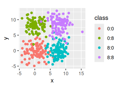
simdat data colored by the class labels. Here, we know the labels since we generated the data – usually we do not know them.
We compute the within-groups sum of squares for the clusters obtained from the \(k\)-means method:
simdatxy = simdat[, c("x", "y")]         # without class label
wss = tibble(k = 1:8, value = NA_real_)
wss$value[1] = sum(scale(simdatxy, scale = FALSE)^2)
for (i in 2:nrow(wss)) {
  km  = kmeans(simdatxy, centers = wss$k[i])
  wss$value[i] = sum(km$withinss)
}
ggplot(wss, aes(x = k, y = value)) + geom_col()
Solution
Here is the code to generate Figure 5.29.
library("fpc")
library("cluster")
CH = tibble(
  k = 2:8,
  value = sapply(k, function(i) {
    p = pam(simdatxy, i)
    calinhara(simdatxy, p$clustering)
  })
)
ggplot(CH, aes(x = k, y = value)) + geom_line() + geom_point() +
  ylab("CH index")
simdat data.
5.7.1 Using the gap statistic
Taking the logarithm of the within-sum-of-squares \(\log(\text{WSS}_k)\) and comparing it to averages from simulated data with less structure can be a good way of choosing \(k\). This is the basic idea of the gap statistic introduced by Tibshirani et al. (2001). We compute \(\log(\text{WSS}_k)\) for a range of values of \(k\), the number of clusters, and compare it to that obtained on reference data of similar dimensions with various possible ‘non-clustered’ distributions. We can use uniformly distributed data as we did above or data simulated with the same covariance structure as our original data.
This algorithm is a Monte Carlo method that compares the gap statistic for the observed data to an average over simulations of data with similar structure.
Algorithm for computing the gap statistic (Tibshirani et al. 2001):
Cluster the data with \(k\) clusters and compute \(\text{WSS}_k\) for the various choices of \(k\).
Generate \(B\) plausible reference data sets, using Monte Carlo sampling from a homogeneous distribution and redo Step 1 above for these new simulated data. This results in \(B\) new within-sum-of-squares for simulated data \(W_{kb}^*\), for \(b=1,...,B\).
Compute the \(\text{gap}(k)\)-statistic:
\[ \text{gap}(k) = \overline{l}_k - \log \text{WSS}_k \quad\text{with}\quad \overline{l}_k =\frac{1}{B}\sum_{b=1}^B \log W^*_{kb} \]
Note that the first term is expected to be bigger than the second one if the clustering is good (i.e., the WSS is smaller); thus the gap statistic will be mostly positive and we are looking for its highest value.
- We can use the standard deviation
\[ \text{sd}_k^2 = \frac{1}{B-1}\sum_{b=1}^B\left(\log(W^*_{kb})-\overline{l}_k\right)^2 \]
to help choose the best \(k\). Several choices are available, for instance, to choose the smallest \(k\) such that
\[ \text{gap}(k) \geq \text{gap}(k+1) - s'_{k+1}\qquad \text{where } s'_{k+1}=\text{sd}_{k+1}\sqrt{1+1/B}. \]
The packages cluster and clusterCrit provide implementations.
Solution
library("cluster")
library("ggplot2")
pamfun = function(x, k)
  list(cluster = pam(x, k, cluster.only = TRUE))

gss = clusGap(simdatxy, FUNcluster = pamfun, K.max = 8, B = 50,
              verbose = FALSE)
plot_gap = function(x) {
  gstab = data.frame(x$Tab, k = seq_len(nrow(x$Tab)))
  ggplot(gstab, aes(k, gap)) + geom_line() +
    geom_errorbar(aes(ymax = gap + SE.sim,
                      ymin = gap - SE.sim), width=0.1) +
    geom_point(size = 3, col=  "red")
}
plot_gap(gss)
Let’s now use the method on a real example. We load the Hiiragi data that we already explored in Chapter 3 and will see how the cells cluster.
library("Hiiragi2013")
data("x")
We start by choosing the 50 most variable genes (features)5.
5 The intention behind this step is to reduce the influence of technical (or batch) effects. Although individually small, when accumulated over all the 45101 features in x, many of which match genes that are weakly or not expressed, without this feature selection step, such effects are prone to suppress the biological signal.
selFeats = order(MatrixGenerics::rowVars(Biobase::exprs(x)), decreasing = TRUE)[1:50]
embmat = t(Biobase::exprs(x)[selFeats, ])
embgap = clusGap(embmat, FUNcluster = pamfun, K.max = 24, verbose = FALSE)
k1 = maxSE(embgap$Tab[, "gap"], embgap$Tab[, "SE.sim"])
k2 = maxSE(embgap$Tab[, "gap"], embgap$Tab[, "SE.sim"],
           method = "Tibs2001SEmax")
c(k1, k2)
[1] 9 7The default choice for the number of clusters, k1, is the first value of \(k\) for which the gap is not larger than the first local maximum minus a standard error \(s\) (see the manual page of the clusGap function). This gives a number of clusters \(k = 9\), whereas the choice recommended by Tibshirani et al. (2001) is the smallest \(k\) such that \(\text{gap}(k) \geq \text{gap}(k+1) - s_{k+1}'\), this gives \(k = 7\). Let’s plot the gap statistic (Figure 5.31).
plot(embgap, main = "")
cl = pamfun(embmat, k = k1)$cluster
table(pData(x)[names(cl), "sampleGroup"], cl)
cl
1 2 3 4 5 6 7 8 9
E3.25 23 11 1 1 0 0 0 0 0
E3.25 (FGF4-KO) 0 0 1 16 0 0 0 0 0
E3.5 (EPI) 2 1 0 0 0 8 0 0 0
E3.5 (FGF4-KO) 0 0 8 0 0 0 0 0 0
E3.5 (PE) 0 0 0 0 9 2 0 0 0
E4.5 (EPI) 0 0 0 0 0 0 0 4 0
E4.5 (FGF4-KO) 0 0 0 0 0 0 0 0 10
E4.5 (PE) 0 0 0 0 0 0 4 0 0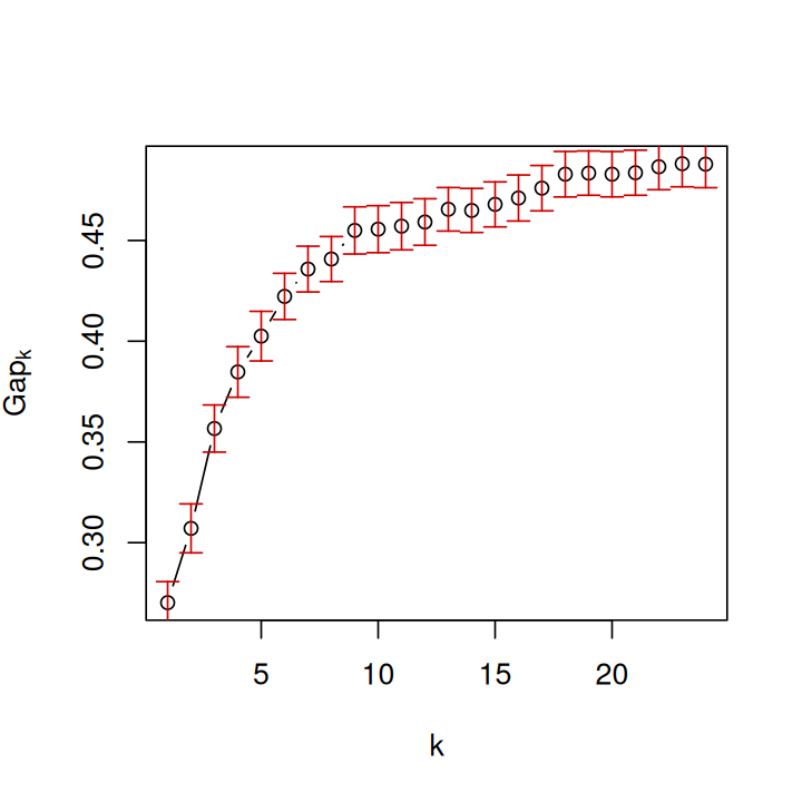
Above we see the comparison between the clustering that we got from pamfun with the sample labels in the annotation of the data.
5.7.2 Cluster validation using the bootstrap
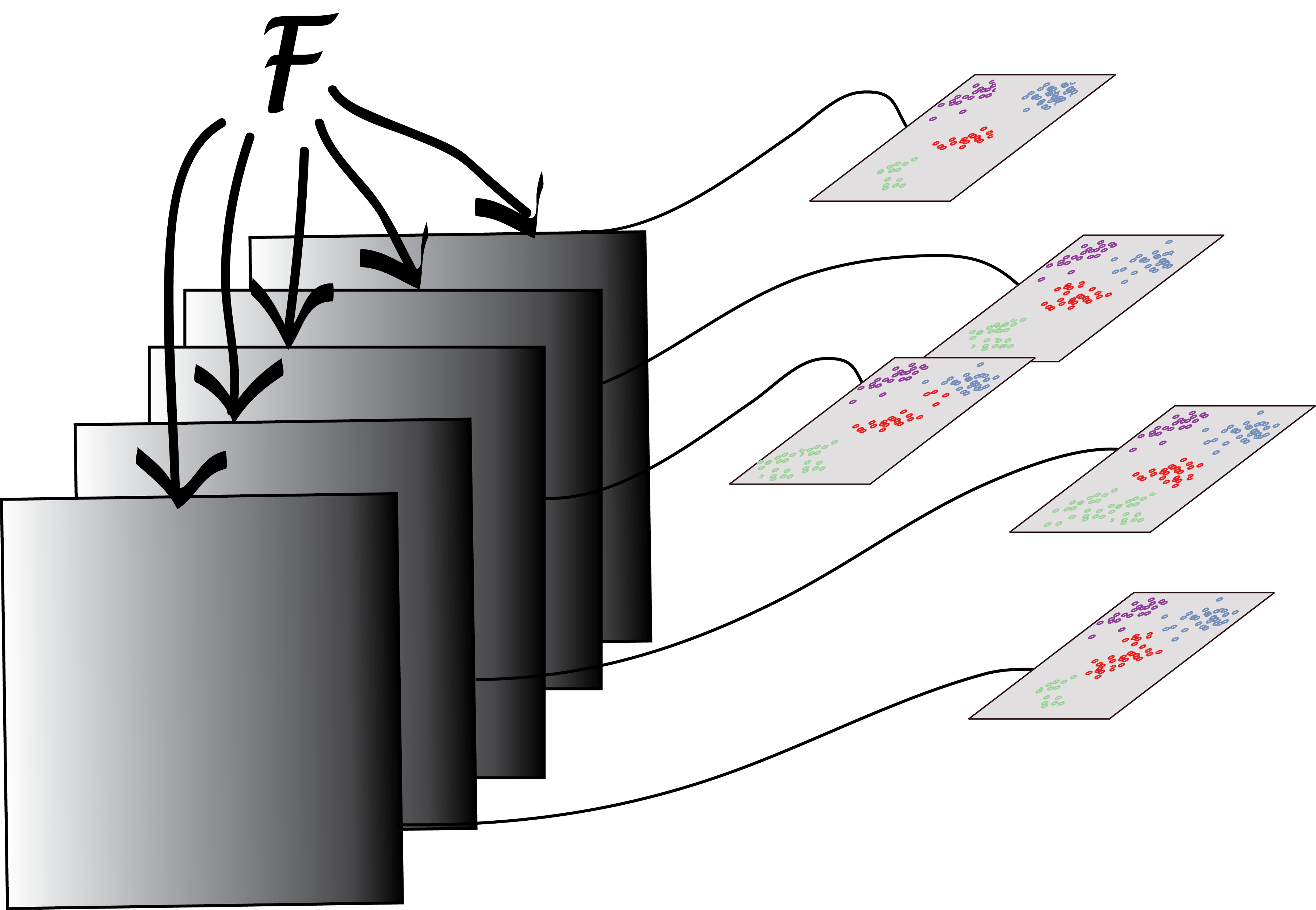
We saw the bootstrap principle in Chapter 4: ideally, we would like to use many new samples (sets of data) from the underlying data generating process, for each of them apply our clustering method, and then see how stable the clusterings are, or how much they change, using an index such as those we used above to compare clusterings. Of course, we don’t have these additional samples. So we are, in fact, going to create new datasets simply by taking different random subsamples of the data, look at the different clusterings we get each time, and compare them. Tibshirani et al. (2001) recommend using bootstrap resampling to infer the number of clusters using the gap statistic.
We will continue using the Hiiragi2013 data. Here we follow the investigation of the hypothesis that the inner cell mass (ICM) of the mouse blastocyst in embyronic day 3.5 (E3.5) falls “naturally” into two clusters corresponding to pluripotent epiblast (EPI) versus primitive endoderm (PE), while the data for embryonic day 3.25 (E3.25) do not yet show this symmetry breaking.
We will not use the true group labels in our clustering and only use them in the final interpretation of the results. We will apply the bootstrap to the two different data sets (E3.5) and (E3.25) separately. Each step of the bootstrap will generate a clustering of a random subset of the data and we will need to compare these through a consensus of an ensemble of clusters. There is a useful framework for this in the clue package (Hornik 2005). The function clusterResampling, taken from the supplement of Ohnishi et al. (2014), implements this approach:
clusterResampling = function(x, ngenes = 50, k = 2, B = 250,
prob = 0.67) {
mat = Biobase::exprs(x)
ce = clue::cl_ensemble(list = lapply(seq_len(B), function(b) {
selSamps = sample(ncol(mat), size = round(prob * ncol(mat)),
replace = FALSE)
submat = mat[, selSamps, drop = FALSE]
sel = order(MatrixGenerics::rowVars(submat), decreasing = TRUE)[seq_len(ngenes)]
submat = submat[sel,, drop = FALSE]
pamres = pam(t(submat), k = k)
pred = clue::cl_predict(pamres, t(mat[sel, ]), "memberships")
clue::as.cl_partition(pred)
}))
cons = clue::cl_consensus(ce)
ag = sapply(ce, clue::cl_agreement, y = cons)
list(agreements = ag, consensus = cons)
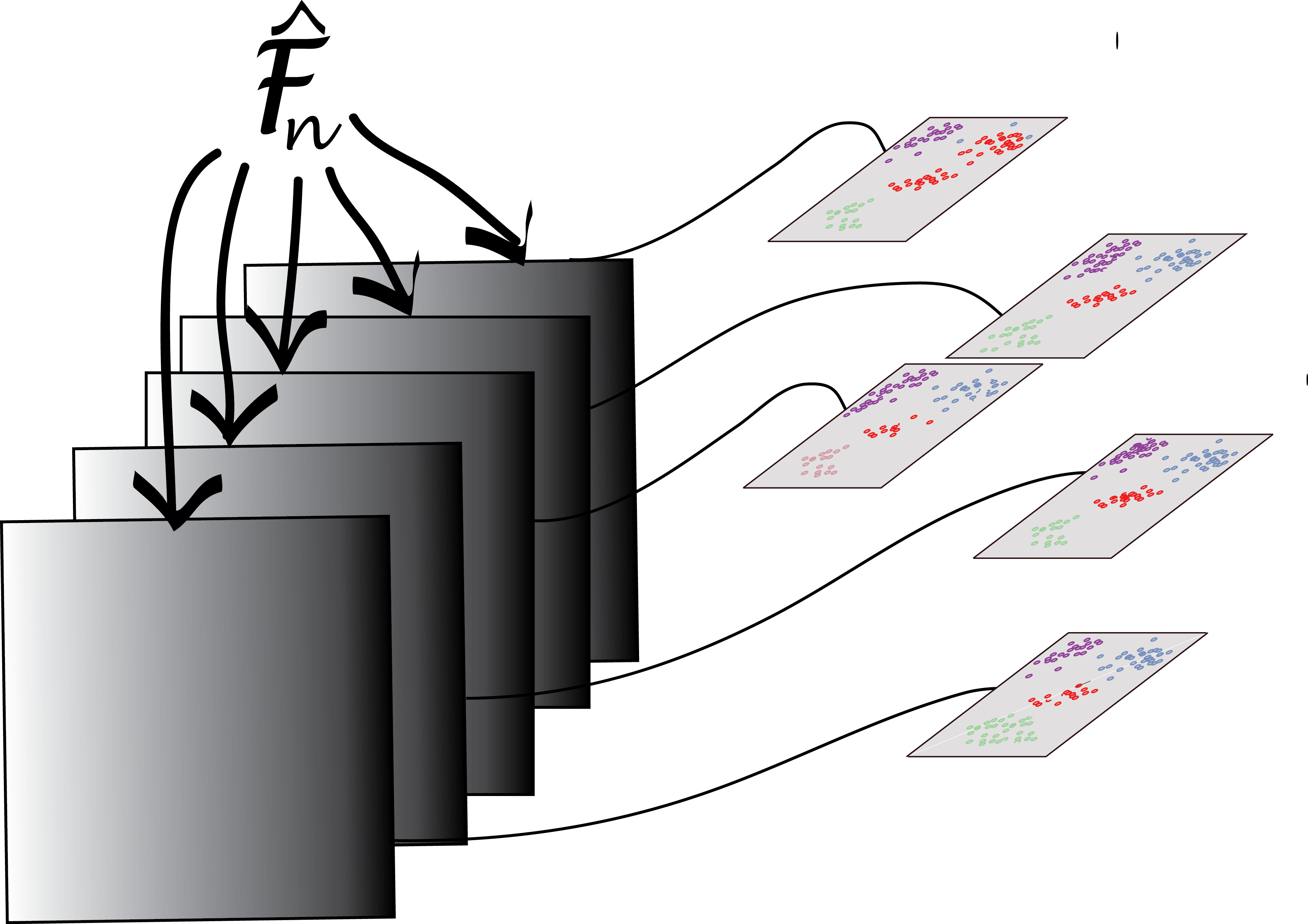
}The function clusterResampling performs the following steps:
Draw a random subset of the data (the data are either all E3.25 or all E3.5 samples) by selecting 67% of the samples without replacement.
Select the top
ngenesfeatures by overall variance (in the subset).Apply \(k\)-means clustering and predict the cluster memberships of the samples that were not in the subset with the
cl_predictmethod from the clue package, through their proximity to the cluster centres.Repeat steps 1-3
Btimes.Apply consensus clustering (
cl_consensus).For each of the
Bclusterings, measure the agreement with the consensus through the function(cl_agreement). Here a good agreement is indicated by a value of 1, and less agreement by smaller values. If the agreement is generally high, then the clustering into \(k\) classes can be considered stable and reproducible; inversely, if it is low, then no stable partition of the samples into \(k\) clusters is evident.
As a measure of between-cluster distance for the consensus clustering, the Euclidean dissimilarity of the memberships is used, i.e., the square root of the minimal sum of the squared differences of \(\mathbf{u}\) and all column permutations of \(\mathbf{v}\), where \(\mathbf{u}\) and \(\mathbf{v}\) are the cluster membership matrices. As agreement measure for Step [clueagree], the quantity \(1 - d/m\) is used, where \(d\) is the Euclidean dissimilarity, and \(m\) is an upper bound for the maximal Euclidean dissimilarity.
iswt = (x$genotype == "WT")
cr1 = clusterResampling(x[, x$Embryonic.day == "E3.25" & iswt])
cr2 = clusterResampling(x[, x$Embryonic.day == "E3.5"  & iswt])
The results are shown in Figure 5.33. They confirm the hypothesis that the E.35 data fall into two clusters.
ag1 = tibble(agreements = cr1$agreements, day = "E3.25")
ag2 = tibble(agreements = cr2$agreements, day = "E3.5")
p1 <- ggplot(bind_rows(ag1, ag2), aes(x = day, y = agreements)) +
  geom_boxplot() +
  ggbeeswarm::geom_beeswarm(cex = 1.5, col = "#0000ff40")
mem1 = tibble(y = sort(clue::cl_membership(cr1$consensus)[, 1]),
              x = seq_along(y), day = "E3.25")
mem2 = tibble(y = sort(clue::cl_membership(cr2$consensus)[, 1]),
              x = seq_along(y), day = "E3.5")
p2 <- ggplot(bind_rows(mem1, mem2), aes(x = x, y = y, col = day)) +
  geom_point() + facet_grid(~ day, scales = "free_x")
gridExtra::grid.arrange(p1, p2, widths = c(2.4,4.0))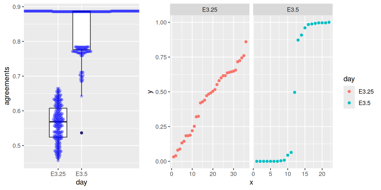
B clusterings; \(1\) indicates perfect agreement, lower values indicate lower degrees of agreement. Right: membership probabilities of the consensus clustering. For E3.25, the probabilities are diffuse, indicating that the individual clusterings often disagree, whereas for E3.5, the distribution is bimodal, with only one ambiguous sample.
5.8 Clustering as a means for denoising
Consider a set of measurements that reflect some underlying true values (say, species represented by DNA sequences from their genomes), but have been degraded by technical noise. Clustering can be used to remove such noise.
5.8.1 Noisy observations with different baseline frequencies
Suppose that we have a bivariate distribution of observations made with the same error variances. However, the sampling is from two groups that have very different baseline frequencies. Suppose, further, that the errors are continuous independent bivariate normally distributed. We have \(10^{3}\) of seq1 and \(10^{5}\) of seq2, as generated for instance by the code:
library("mixtools")
seq1 = rmvnorm(n = 1e3, mu = -c(1, 1), sigma = 0.5 * diag(c(1, 1)))
seq2 = rmvnorm(n = 1e5, mu =  c(1, 1), sigma = 0.5 * diag(c(1, 1)))
twogr = data.frame(
  rbind(seq1, seq2),
  seq = factor(c(rep(1, nrow(seq1)),
                 rep(2, nrow(seq2))))
)
colnames(twogr)[1:2] = c("x", "y")
library("ggplot2")
ggplot(twogr, aes(x = x, y = y, colour = seq,fill = seq)) +
  geom_hex(alpha = 0.5, bins = 50) + coord_fixed()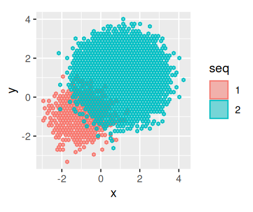
seq2 have many more opportunities for errors than what we see in seq1, of which there are only \(10^{3}\). Thus we see that frequencies are important in clustering the data.
The observed values would look as in Figure 5.34.
![]()
Task
Simulate n=2000 binary variables of length len=200 that indicate the quality of n sequencing reads of length len. For simplicity, let us assume that sequencing errors occur independently and uniformly with probability perr=0.001. That is, we only care whether a base was called correctly (TRUE) or not (FALSE).
n    = 2000
len  = 200
perr = 0.001
seqs = matrix(runif(n * len) >= perr, nrow = n, ncol = len)
Now, compute all pairwise distances between reads.
dists = as.matrix(dist(seqs, method = "manhattan"))For various values of number of reads k (from 2 to n), the maximum distance within this set of reads is computed by the code below and shown in Figure 5.35.
library("tibble")
dfseqs = tibble(
  k = 10 ^ seq(log10(2), log10(n), length.out = 20),
  diameter = vapply(k, function(i) {
    s = sample(n, i)
    max(dists[s, s])
    }, numeric(1)))
ggplot(dfseqs, aes(x = k, y = diameter)) + geom_point()+geom_smooth()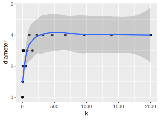
We will now improve the 16SrRNA-read clustering using a denoising mechanism that incorporates error probabilities.
5.8.2 Denoising 16S rRNA sequences
What are the data? In the bacterial 16SrRNA gene there are so-called variable regions that are taxa-specific. These provide fingerprints that enables taxon6 identification. The raw data are FASTQ-files with quality scored sequences of PCR-amplified DNA regions7. We use an iterative alternating approach8 to build a probabilistic noise model from the data. We call this a de novo method, because we use clustering, and we use the cluster centers as our denoised sequence variants (a.k.a. Amplicon Sequence Variants, ASVs, see (Callahan et al. 2017)). After finding all the denoised variants, we create contingency tables of their counts across the different samples. We will show in Chapter 10 how these tables can be used to infer properties of the underlying bacterial communities using networks and graphs.
6 Calling different groups of bacteria taxa rather than species highlights the approximate nature of the concept, as the notion of species is more fluid in bacteria than, say, in animals.
8 Similar to the EM algorithm we saw in Chapter 4.
In order to improve data quality, one often has to start with the raw data and model all the sources of variation carefully. One can think of this as an example of cooking from scratch (see the gruesome details in Ben J. Callahan et al. (2016) and Exercise 5.5).
Solution
Probability theory tells us that the sum of 200 independent Poisson(0.0005) will be Poisson(0.1).
We can also verify this by Monte Carlo simulation:
simseq10K = replicate(1e5, sum(rpois(200, 0.0005)))
mean(simseq10K)
[1] 0.10143vcd::distplot(simseq10K, "poisson")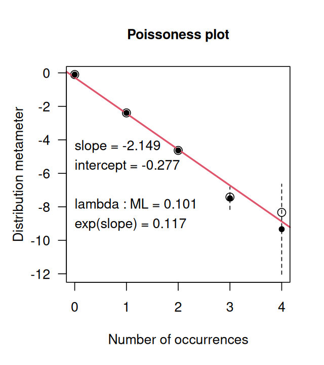
distplot for the simseq10K data.
Figure 5.36 shows us how close the distribution is to being Poisson distributed.
5.8.3 Infer sequence variants
The DADA method (Divisive Amplicon Denoising Algorithm, Rosen et al. (2012)) uses a parameterized model of substitution errors that distinguishes sequencing errors from real biological variation. The model computes the probabilities of base substitutions, such as seeing an \({\tt A}\) instead of a \({\tt C}\). It assumes that these probabilities are independent of the position along the sequence. Because error rates vary substantially between sequencing runs and PCR protocols, the model parameters are estimated from the data themselves using an EM-type approach. A read is classified as noisy or exact given the current parameters, and the noise model parameters are updated accordingly9.
9 In the case of a large data set, the noise model estimation step does not have to be done on the complete set. See https://benjjneb.github.io/dada2/bigdata.html for tricks and tools when dealing with large data sets.
10 F stands for forward strand and R for reverse strand.
The dereplicated sequences10 are read in and then divisive denoising and estimation is run with the dada function as in the following code:
derepFs = readRDS(file="../data/derepFs.rds")
derepRs = readRDS(file="../data/derepRs.rds")
library("dada2")
ddF = dada(derepFs, err = NULL, selfConsist = TRUE)
ddR = dada(derepRs, err = NULL, selfConsist = TRUE)
In order to verify that the error transition rates have been reasonably well estimated, we inspect the fit between the observed error rates (black points) and the fitted error rates (black lines) (Figure 5.37).
plotErrors(ddF)In chunk 'fig-rerrorprofile1': Warning: Removed 164 rows containing missing values or values outside the scale range(`geom_line()`).
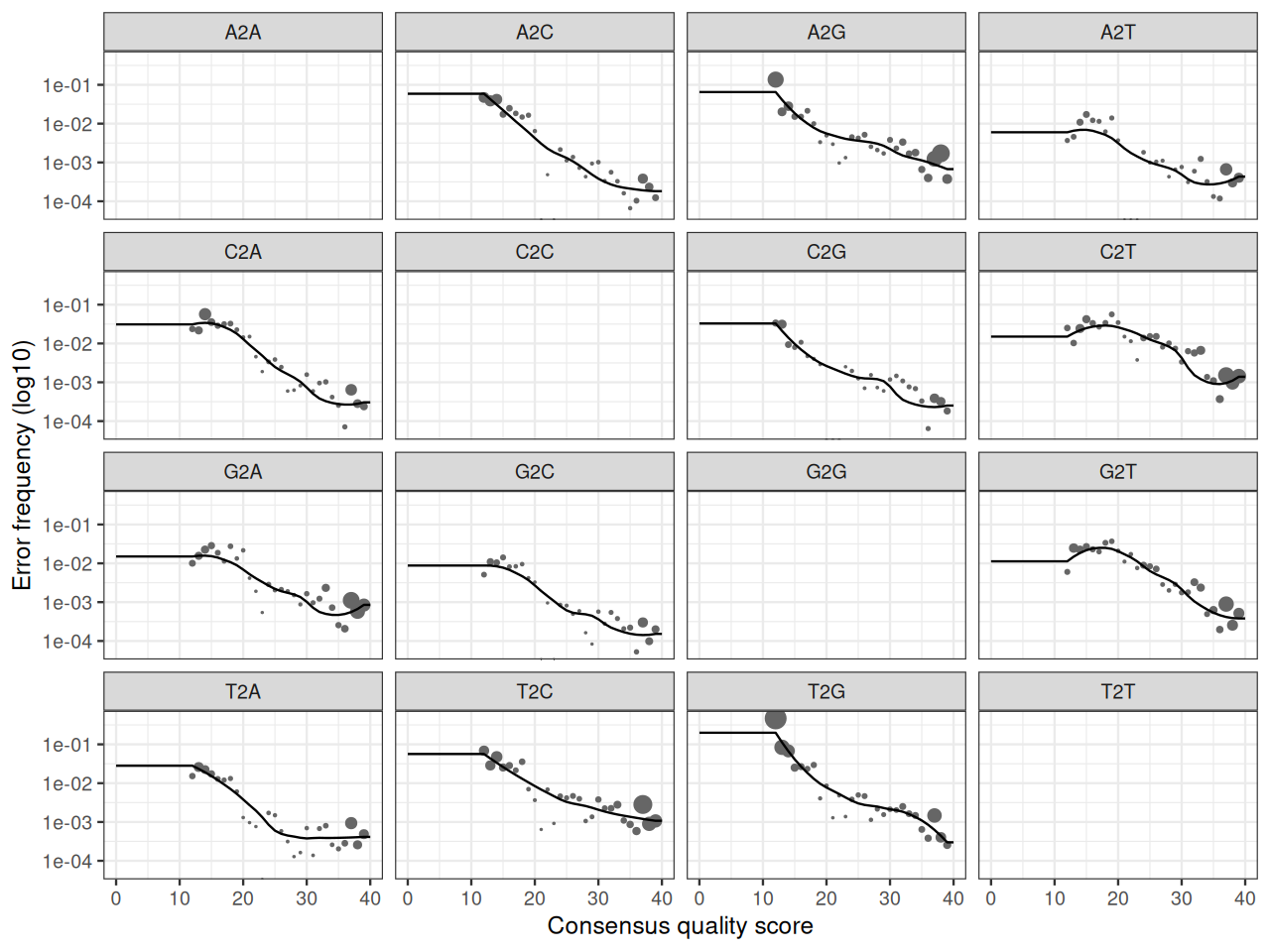
plotErrors(ddF). This shows the frequencies of each type of nucleotide transition as a function of quality.
Once the errors have been estimated, the algorithm is rerun on the data to find the sequence variants:
dadaFs = dada(derepFs, err=ddF[[1]]$err_out, pool = TRUE)
dadaRs = dada(derepRs, err=ddR[[1]]$err_out, pool = TRUE)
Note: The sequence inference function can run in two different modes: Independent inference by sample (pool = FALSE), and pooled inference from the sequencing reads combined from all samples. Independent inference has two advantages: as a functions of the number of samples, computation time is linear and memory requirements are constant. Pooled inference is more computationally taxing, however it can improve the detection of rare variants that occur just once or twice in an individual sample but more often across all samples. As this dataset is not particularly large, we performed pooled inference.
Sequence inference removes nearly all substitution and indel11 errors from the data. We merge the inferred forward and reverse sequences, while removing paired sequences that do not perfectly overlap as a final control against residual errors.
11 The term indel stands for insertion-deletion; when comparing two sequences that differ by a small stretch of characters, it is a matter of viewpoint whether this is an insertion or a deletion, thus the name.
mergers = mergePairs(dadaFs, derepFs, dadaRs, derepRs)We produce a contingency table of counts of ASVs. This is a higher-resolution analogue of the “OTU12 table”, i.e., a samples by features table whose cells contain the number of times each sequence variant was observed in each sample.
12 operational taxonomic units
seqtab.all = makeSequenceTable(mergers[!grepl("Mock",names(mergers))])Chimera are sequences that are artificially created during PCR amplification by the melding of two (in rare cases, more) of the original sequences. To complete our denoising workflow, we remove them with a call to the function removeBimeraDenovo, leaving us with a clean contingency table we will use later on.
seqtab = removeBimeraDenovo(seqtab.all)5.9 Computational and memory Issues
It is important to remember that the computation of all versus all distances of \(n\) objects is an \(O(n^2)\) operation (in time and memory). Classic hierarchical clustering approaches (such as hclust in the stats package) are even \(O(n^3)\) in time. For large \(n\), this may become impractical13. We can avoid the complete computation of the all-vs-all distance matrix. For instance, \(k\)-means has the advantage of only requiring \(O(n)\) computations, since it only keeps track of the distances between each object and the cluster centers, whose number remains the same even if \(n\) increases.
13 E.g., the distance matrix for one million objects, stored as 8-byte floating point numbers, would take up about 4 Terabytes, and an hclust-like algorithm would run 30 years even under the optimistic assumption that each of the iterations only takes a nanosecond.
Fast implementations such as fastclust (Müllner 2013) and dbscan have been carefully optimized to deal with a large number of observations.
5.10 Summary of this chapter
How to compare observations: We saw at the start of the chapter how choosing the distance metric is an essential first step in a clustering analysis; this is a case where the garbage in, garbage out motto applies. Always choose a distance that is scientifically meaningful and compare output from as many distances as possible; sometimes the same data require different distances when different scientific objectives are pursued.
We saw that there are two main approaches to clustering:
iterative partitioning approaches such as \(k\)-means and \(k\)-medoids (PAM) that alternate between estimating the cluster centers and assigning points to them;
hierarchical clustering approaches that first agglomerate points, and subsequently the growing clusters, into nested sequences of sets that can be represented by hierarchical clustering trees.
Biological examples. Clustering is important tool for finding latent classes in single cell measurements, e.g., in immunology. We saw how density-based clustering is useful for lower dimensional data where sparsity is not an issue.
Validating. Clustering algorithms always deliver clusters, so we need to assess their quality, and choose the number of clusters carefully. We saw how statistics such as WSS/BSS or \(\log(\text{WSS})\) can be calibrated using simulations on data where we understand the group structure and can provide useful benchmarks for choosing the number of clusters on new data. Other important tools are visualization, and seeing how stable a clustering result is under meaningful variations, e.g., by (re)sampling the data. Cluster resampling is, however, not a panacea (Luxburg 2010). Using biological information to interpret and confirm the meaning of a newly discovered clustering is always the best validation approach.
There is arguably no ground truth to compare a clustering result against, in general. The old adage of “all models are wrong, some are useful” also applies here. A good clustering is one that turns out to be useful.
Distances and probabilities Finally: distances are not everything. We showed how important it was to take into account baseline frequencies and local densities when clustering. This is essential in a cases such as clustering to denoise 16S rRNA sequence reads where the true class or taxa group occur at very different frequencies.
5.11 Further reading
For a complete book on Finding groups in data, see Kaufman and Rousseeuw (2009). The vignette of the clusterExperiment package contains a complete workflow for generating clusters using many different techniques, including preliminary dimension reduction (PCA) that we will cover in Chapter 7. There is no consensus on methods for deciding how many clusters are needed to describe data in the absence of contiguous biological information. However, making hierarchical clusters of the strong forms is a method that has the advantage of allowing the user to decide how far down to cut the hierarchical tree and be careful not to cut in places where these inner branches are short. See the vignette of clusterExperiment for an application to single cell RNA experimental data.
In analyzing the Hiiragi data, we used cluster probabilities, a concept already mentioned in Chapter 4, where the EM algorithm used them as weights to compute expected value statistics. The notion of probabilistic clustering is well-developed in the Bayesian nonparametric mixture framework, which enriches the mixture models we covered in Chapter 4 to more general settings. See Dundar et al. (2014) for a real example using this framework for flow cytometry. In the denoising and assignment of high-throughput sequencing reads to specific strains of bacteria or viruses, clustering is essential. In the presence of noise, clustering into groups of true strains of very unequal sizes can be challenging. Using the data to create a noise model enables both denoising and cluster assignment concurrently. Denoising algorithms such as those by Rosen et al. (2012) or Benjamin J. Callahan et al. (2016) use an iterative workflow inspired by the EM method (McLachlan and Krishnan 2007).
5.12 Exercises
Exercise 5.3
Load the spirals data from the kernlab package. Plot the results of using \(k\)-means on the data. This should give you something similar to Figure 5.38.
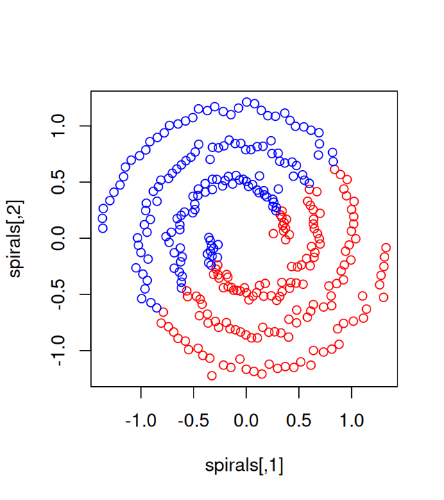
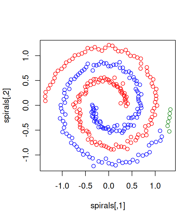
dbscan. The colors represent the three clusters found by the algorithm for the settings .
You’ll notice that the clustering in Figure 5.38 seems unsatisfactory. Show how a different method, such as specc or dbscan, could cluster spirals data in a more useful manner.
Repeat the dbscan clustering with different parameters. How robust is the number of groups?
Exercise 5.5
Amplicon bioinformatics: from raw reads to dereplicated sequences. As a supplementary exercise, we provide the intermediate steps necessary to a full data preprocessing workflow for denoising 16S rRNA sequences. We start by setting the directories and loading the downloaded data:
base_dir = "../data"
miseq_path = file.path(base_dir, "MiSeq_SOP")
filt_path = file.path(miseq_path, "filtered")
fnFs = sort(list.files(miseq_path, pattern="_R1_001.fastq"))
fnRs = sort(list.files(miseq_path, pattern="_R2_001.fastq"))
sampleNames = sapply(strsplit(fnFs, "_"), `[`, 1)
if (!file_test("-d", filt_path)) dir.create(filt_path)
filtFs = file.path(filt_path, paste0(sampleNames, "_F_filt.fastq.gz"))
filtRs = file.path(filt_path, paste0(sampleNames, "_R_filt.fastq.gz"))
fnFs = file.path(miseq_path, fnFs)
fnRs = file.path(miseq_path, fnRs)
print(length(fnFs))
[1] 20The data are highly-overlapping Illumina Miseq \(2\times 250\) amplicon sequences from the V4 region of the 16S rRNA gene (Kozich et al. 2013). There were originally 360 fecal samples collected longitudinally from 12 mice over the first year of life. These were collected by Schloss et al. (2012) to investigate the development and stabilization of the murine microbiome. We have selected 20 samples to illustrate how to preprocess the data.
We will need to filter out low-quality reads and trim them to a consistent length. While generally recommended filtering and trimming parameters serve as a starting point, no two datasets are identical and therefore it is always worth inspecting the quality of the data before proceeding. We show the sequence quality plots for the two first samples in Figure 5.39. They are generated by:
plotQualityProfile(fnFs[1:2]) + ggtitle("Forward")
plotQualityProfile(fnRs[1:2]) + ggtitle("Reverse")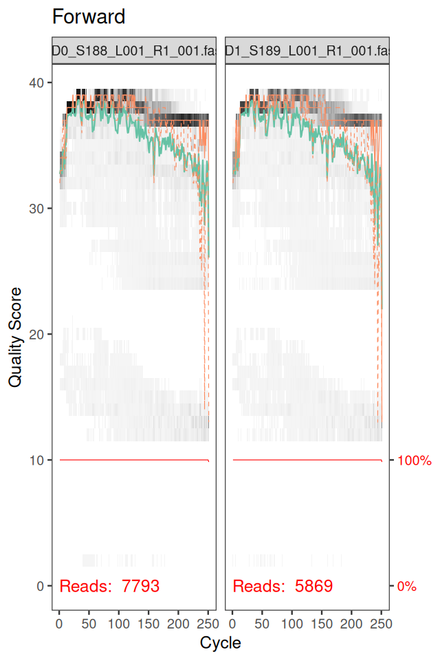
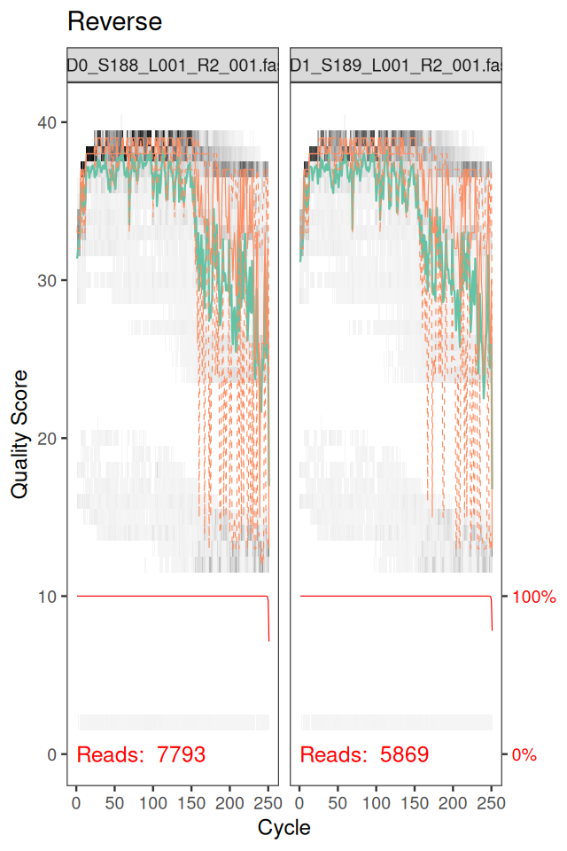
Note that we also see the background distribution of quality scores at each position in Figure 5.39 as a grey-scale heat map. The dark colors correspond to higher frequency.
Page built at 21:14 on 2026-07-15 using R version 4.6.0 (2026-04-24)