Belkin, Mikhail, and Partha Niyogi. 2003. “Laplacian Eigenmaps for Dimensionality Reduction and Data Representation.” Neural Computation 15 (6): 1373–96.
Bengio, Yoshua, Jean-François Paiement, Pascal Vincent, Olivier Delalleau, Nicolas Le Roux, and Marie Ouimet. 2004. “Out-of-Sample Extensions for LLE, Isomap, MDS, Eigenmaps, and Spectral Clustering.” Advances in Neural Information Processing Systems 16: 177–84.
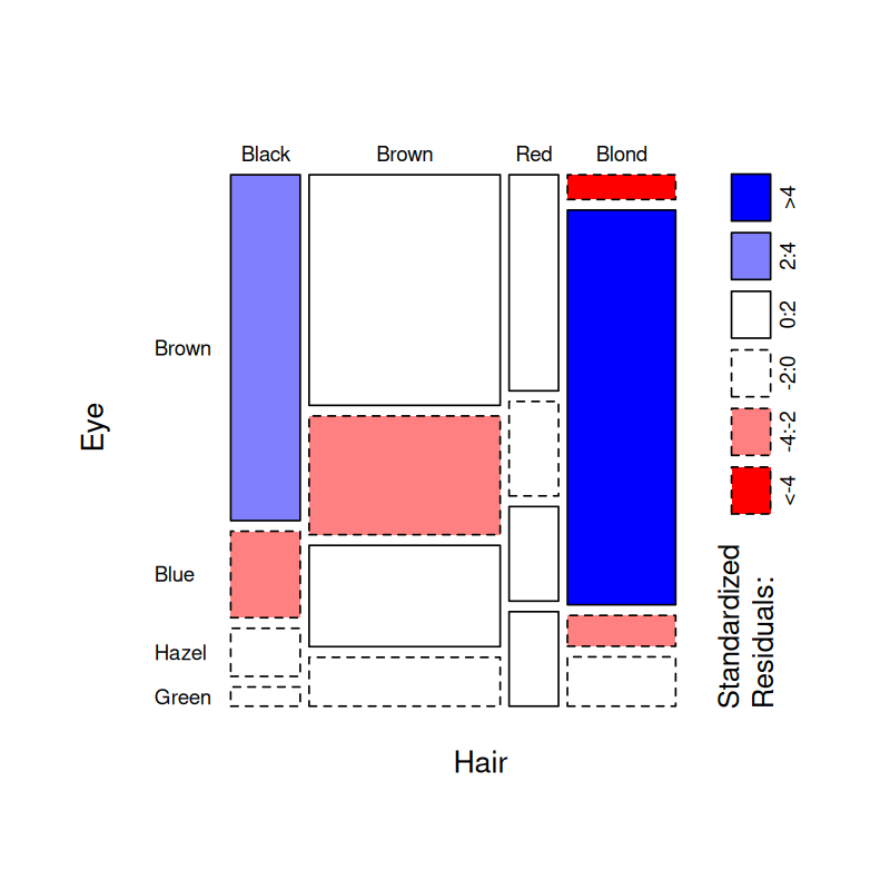
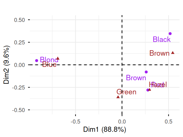
Braak, Cajo ter. 1985. “Correspondence Analysis of Incidence and Abundance Data: Properties in Terms of a Unimodal Respose.” Biometrics 41 (January).
Brodie, Eoin L, Todd Z DeSantis, Dominique C Joyner, et al. 2006. “Application of a High-Density Oligonucleotide Microarray Approach to Study Bacterial Population Dynamics During Uranium Reduction and Reoxidation.” Applied and Environmental Microbiology 72 (9): 6288–98.
Callahan, Ben J, Kris Sankaran, Julia A Fukuyama, Paul J McMurdie, and Susan P Holmes. 2016. “Bioconductor Workflow for Microbiome Data Analysis: From Raw Reads to Community Analyses.” F1000Research 5.
Chessel, Daniel, Anne Dufour, and Jean Thioulouse. 2004.
“The ade4 Package - i: One-Table Methods.” R News 4 (1): 5–10.
http://CRAN.R-project.org/doc/Rnews/.
Diaconis, Persi, Sharad Goel, and Susan Holmes. 2008.
“Horseshoes in Multidimensional Scaling and Kernel Methods.” Annals of Applied Statistics 2: 777.
https://doi.org/DOI:10.1214/08-AOAS165.
Ekman, Gosta. 1954. “Dimensions of Color Vision.” The Journal of Psychology 38 (2): 467–74.
Goslee, Sarah C, Dean L Urban, et al. 2007. “The Ecodist Package for Dissimilarity-Based Analysis of Ecological Data.” Journal of Statistical Software 22 (7): 1–19.
Greenacre, Michael J. 2007. Correspondence Analysis in Practice. Chapman & Hall.
Guillot, Gilles, and François Rousset. 2013. “Dismantling the Mantel Tests.” Methods in Ecology and Evolution 4 (4): 336–44.
Hastie, Trevor, and Werner Stuetzle. 1989. “Principal Curves.” Journal of the American Statistical Association 84 (406): 502–16.
Hastie, Trevor, Robert Tibshirani, and Jerome Friedman. 2008. The Elements of Statistical Learning. \(2^{\text{nd}}\). Springer.
Holmes, Susan. 2006.
“Multivariate Analysis: The French way.” In
Probability and Statistics: Essays in Honor of David a. Freedman, edited by D. Nolan and T. P. Speed, vol. 56. IMS Lecture Notes–Monograph Series. IMS.
http://www.imstat.org/publications/lecnotes.htm.
Holmes, Susan, Alexander V Alekseyenko, Alden Timme, Tyrrell Nelson, Pankaj Jay Pasricha, and Alfred Spormann. 2011. “Visualization and Statistical Comparisons of Microbial Communities Using r Packages on Phylochip Data.” Pacific Symposium on Biocomputing, 142–53.
Izenman, Alan Julian. 2008. “Nonlinear Dimensionality Reduction and Manifold Learning.” In Modern Multivariate Statistical Techniques: Regression, Classification, and Manifold Learning. Springer New York.
Josse, Julie, and Susan Holmes. 2016. “Measuring Multivariate Association and Beyond.” Statistics Surveys 10: 132–67.
Kashyap, Purna C, Angela Marcobal, Luke K Ursell, et al. 2013. “Genetically Dictated Change in Host Mucus Carbohydrate Landscape Exerts a Diet-Dependent Effect on the Gut Microbiota.” PNAS 110 (42): 17059–64.
Kendall, David. 1969. “Incidence Matrices, Interval Graphs and Seriation in Archeology.” Pacific Journal of Mathematics 28 (3): 565–70.
Leek, Jeffrey T, Robert B Scharpf, Héctor Corrada Bravo, et al. 2010. “Tackling the Widespread and Critical Impact of Batch Effects in High-Throughput Data.” Nature Reviews Genetics 11 (10): 733–39.
Moignard, Victoria, Steven Woodhouse, Laleh Haghverdi, et al. 2015. “Decoding the Regulatory Network of Early Blood Development from Single-Cell Gene Expression Measurements.” Nature Biotechnology.
Nelson, Tyrell A, Susan Holmes, Alexander Alekseyenko, et al. 2010. “PhyloChip Microarray Analysis Reveals Altered Gastrointestinal Microbial Communities in a Rat Model of Colonic Hypersensitivity.” Neurogastroenterology & Motility.
Pagès, Jérôme. 2016. Multiple Factor Analysis by Example Using R. CRC Press.
Perraudeau, Fanny, Davide Risso, Kelly Street, Elizabeth Purdom, and Sandrine Dudoit. 2017. “Bioconductor Workflow for Single-Cell RNA Sequencing: Normalization, Dimensionality Reduction, Clustering, and Lineage Inference.” F1000Research 6.
Prentice, IC. 1977. “Non-Metric Ordination Methods in Ecology.” The Journal of Ecology, 85–94.
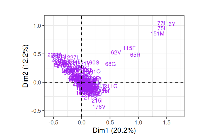
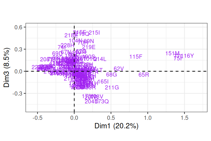
Rhee, Soo-Yon, Matthew J Gonzales, Rami Kantor, Bradley J Betts, Jaideep Ravela, and Robert W Shafer. 2003. “Human Immunodeficiency Virus Reverse Transcriptase and Protease Sequence Database.” Nucleic Acids Research 31 (1): 298–303.
Roweis, Sam T, and Lawrence K Saul. 2000. “Nonlinear Dimensionality Reduction by Locally Linear Embedding.” Science 290 (5500): 2323–26.
Tenenbaum, Joshua B, Vin De Silva, and John C Langford. 2000. “A Global Geometric Framework for Nonlinear Dimensionality Reduction.” Science 290 (5500): 2319–23.
Trosset, Michael W, and Carey E Priebe. 2008. “The Out-of-Sample Problem for Classical Multidimensional Scaling.” Computational Statistics & Data Analysis 52 (10): 4635–42.