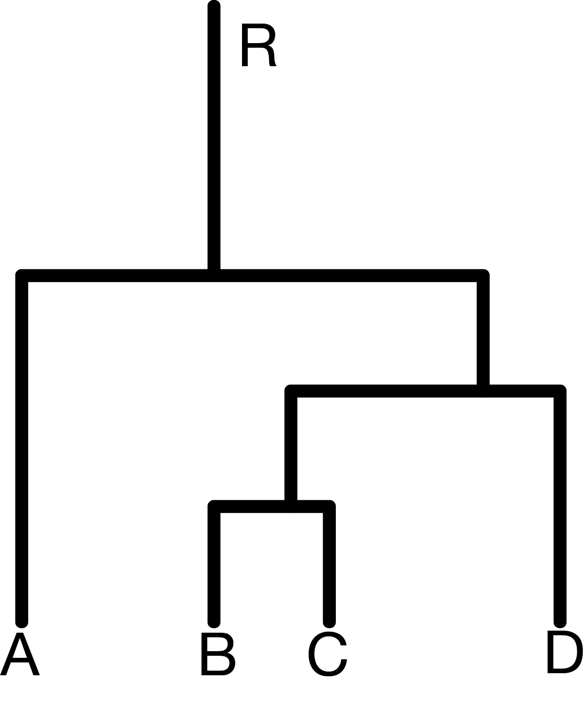
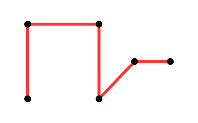
  from to
1    A  B
2    B  C
3    A  E
4    C  D
5 E F10 Networks and Trees
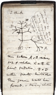
Networks and trees are often used to represent knowledge about a biological system. They can also be used to directly encode observations from an experiment or study. Phylogenetic trees were drawn to represent family and similarity relationships between species, even before Darwin’s famous notebook sketch that gave these trees a mechanistic, causal interpretation. The meaning of the nodes and edges in a network can differ, and needs to be specified. For instance, a network might schematize relationships between proteins, such as in Figure 10.1, where the nodes could stand for genes or their encoded proteins, and edges could be direct physical interactions or more abstract “functional” or “genetic” interactions representing outcomes from an experiment. In this book, we use the terms graph and network largely exchangeably. The former term is a bit more evocative of the mathematical structure, the latter of the biological interpretation.
We saw in Chapter 2 that we could model sequences of state transitions as a Markov chain, which can be represented as directed graphs with weights on the edges. Metabolic pathways in which nodes are chemical metabolites and the edges represent chemical reactions. Mutation history trees are used in cancer genomics to represent lineages of mutations.
Transmission networks are important in studying the epidemiology of infectious diseases. As real networks can be very large, we will need special methods for representing and visualizing them. This chapter will be focused on ways of integrating graphs into a data analytic workflow.
10.1 Goals for this chapter
In this chapter we will
Use the formal definition of a graph’s components: edges, vertices, layout to see how we can manipulate them in R using both adjacency matrices and lists of edges.
We will transform a graph object from igraph into an object that can be visualized according to the layers approach in ggplot2 using ggraph. We will experiment with covariates that we attach to graph edges and nodes.
Graphs are useful ways of encoding prior knowledge about a system, and we will see how they enable us to go from simple gene set analyses to meaningful biological recommendations by mapping significance scores onto the network to detect perturbation hotspots.
We will build phylogenetic trees starting with from DNA sequences and then visualize these trees with the specifically designed R packages ape and ggtree.
We will combine a phylogenetic tree built from microbiome 16S rRNA data with covariates to show how the hierarchical relationship between taxa can increase the power in multiple hypothesis testing.
A special tree called a minimum spanning tree (MST) is very useful for testing the relations between a graph and other covariates. We’ll see how to implement different versions of what is known as the Friedman-Rafsky test. We’ll study both co-occurrence of bacteria in mice litters and strain similarities in HIV contagion networks.
10.2 Graphs
10.2.1 What is a graph and how can it be encoded?
A graph is defined as a combination of two sets, often denoted as \((V,E)\). Here, \(V\) is a set of nodes or vertices, \(E\) is a set of edges between vertices. Each element of \(E\) is a pair of nodes, i.e., consists of two elements of \(V\). An intuitive way to represent a graph is by its from-to representation. If we denote the set of vertices as \(V=(\text{A}, \text{B}, \text{C}, \ldots)\), then the from-to (or edge list) representation is a table of the following form.
The ordering of the rows in the from-to table plays no role. In a directed or oriented graph, the edges are ordered pairs, i.e., the first line in the above table states that there is an edge from A to B, but does not say whether there is also an edge from B to A—this would need to be denoted in a separate row of the table.
In an undirected graph, the edges are unordered pairs, i.e., an edge from A to B is not distinguished from an edge from B to A. Undirected graphs encode symmetric relationships between the nodes, directed graphs represent asymmetric relationships.
It’s important not to confuse a graph with its visualization. It is possible to draw a graph onto a two-dimensional area like in Figure 10.1, but this is optional, and not unique—there are always many different ways to draw the same graph. There is also no guarantee that in such a visualization, edges do not overlap. Depending on the graph, this can happen. Graphs do not live in physical space (neither 2D nor 3D) but are literally just sets of nodes and edges.
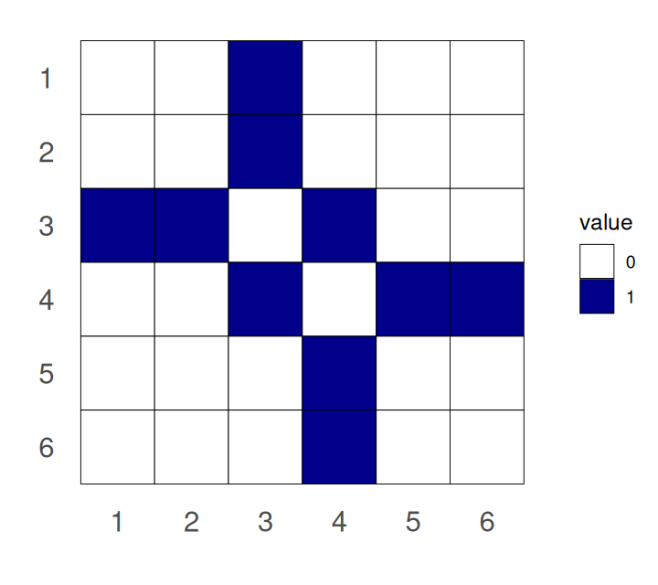
An alternative representation, equivalent to the from-to table, is the adjacency matrix, a quadratic matrix with as many rows (and columns) as nodes in the graph. The matrix contains a non-zero entry in the \(i\)th row and \(j\)th column to encode that there is an edge between the \(i\)th and \(j\)th vertices.
Solution
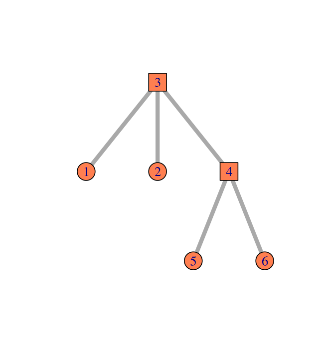
The adjacency matrix is symmetric, i.e., \(M = M^T\). An example is shown in Figures 10.2 and 10.3. g1 is created from a from-to table (encoded in the two-column matrix edges) by the code below.
library("igraph")
edges = matrix(c(1,3, 2,3, 3,4, 4,5, 4,6), byrow = TRUE, ncol = 2)
g1 = graph_from_edgelist(edges, directed = FALSE)
vertex_attr(g1, name = "name") = 1:6
plot(g1, vertex.size = 25, edge.width = 5, vertex.color = "coral")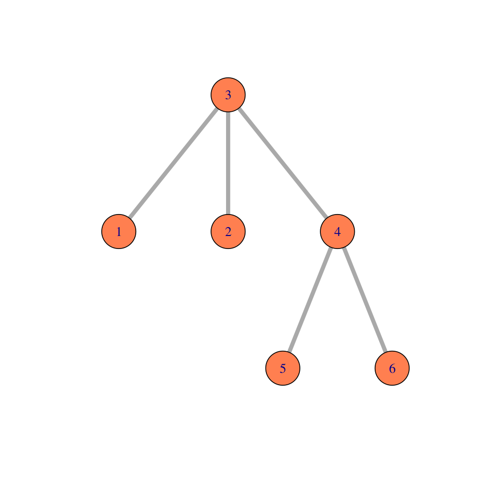
Elements of a simple graph
The nodes or vertices. These are the colored circles with numbers in them in Figure 10.2.
Edges or connections, the segments that join the nodes and which can be directed or not.
Edge attributes, such edge length. When not specified, we suppose the edge lengths are all the same, typically, one. For instance, to compute the distance between two nodes in the graph, we sum up the lengths of the edges along the shortest path.
Edge and node attributes: optionally, each edge or each node can be mapped to further continuous or categorical variables, such as type, color, weight, edge width, node size, \(...\) Pretty much anything is possible here, depending on the application and the intended computations.
We also call a directed graph with edge lengths a network. The adjacency matrix of a network is an \(n\times n\) matrix of positive numbers corresponding to the edge lengths.
Basic concepts
The degree of a node is the number of edges connected to it. In directed graphs we differentiate between in-degree and out-degree for incoming and outgoing edges. We may further distinguish between directed graphs that contain cycles and those that do not (termed cyclic and acyclic graphs).
For large graphs, on can summarize overall graph structure by looking at the distributions of vertex degrees, and we can identify particularly interesting regions or specific nodes and edge in a graph with measures such as centrality and betweenness. These measures are available in various packages (network, igraph).
If the number of edges is of the same order of magnitude as the number of nodes (written \(\#E\sim O(\#V)\)), we say that the graph is sparse. Some graphs have many nodes, for instance, the package ppiData contains a predicted protein interaction (ppipred) graph on about 2500 proteins with around 20000 edges1. A complete adjacency matrix for such a graph requires more than 6 million memory units, of which most contain 0. This is needlessly wasteful. The edge list representation of the same graph is more compact: it only uses storage where there is an edge, in our example, this amounts to 20000 memory units. One particular choice of edge list representation is sparse matrix encodings, such as implemented in the package Matrix.
1 Gene and species phylogenies may even be much larger.
On the other hand, in a dense graph, the number of edges is of the same order of magnitude as the number of potential edges, i.e., the square of the number of nodes (written \(\#E\sim O(\#V^2)\). Memory space can be an issue for the storage of large dense graphs.
Graph layout
We will see several examples where the same graph is plotted in different ways, either for aesthetic or practical reasons. This is done through the choice of the graph layout.
When the edges have lengths representing distances the problem of a 2D representation of the graph is the same as the multidimensional scaling we saw in Chapter 9 It is often solved in a similar way by spreading out the vertex-points as much as possible. In the simple case of edges without lengths, the algorithms can choose different criteria. The method of Fruchterman and Reingold is a basic choice. It is based on a physics-inspired model where similar points attract and repel each other as if under the effect of (Newtonian) physical forces.
Graphs from data
Usually data do not arrive in the form of graphs. Graphical or network representations are often the result of transforming from other data types.
From distances or similarities: graphs can simplify distance or similarity relationships between objects by binarising them. Nodes are connected if they are similar or close, and not connected if not. Thus, the input is a similarity or distance measure between all pairs of objects of interest (genes, proteins, species, phenotypes, \(...\)), to which a threshold is applied. The set of measures could be realized in a dense matrix or be computed on the fly.
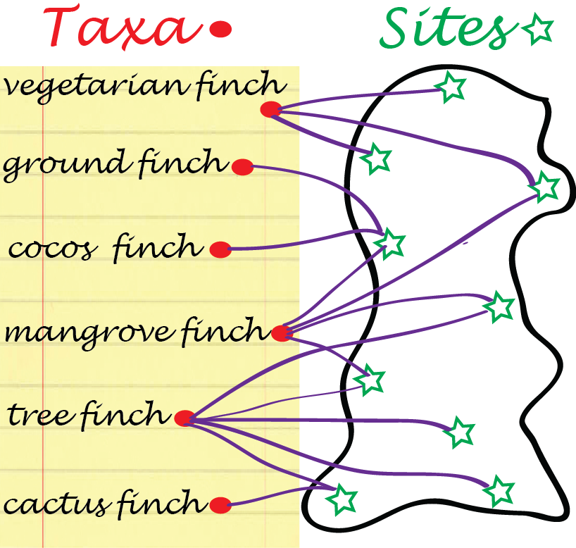
Bipartite graphs: some data arrive naturally as absence or presence relationships between two types of objects, for instance, finch species and islands in the Galapagos archipelago (Figure 10.4), or transcription factors and gene regulatory regions they are considered to bind to. Such relationships can be encoded with 0/1 values in a rectangular matrix, where rows represent one object type and columns the other. The resulting graph has two types of nodes, e.g., finch-nodes and island-nodes, and edges can only exist between nodes of different types, e.g., between a taxon and an island, but not between taxa, nor between islands. Edges in Figure 10.4 represent lives on relationships.
Solution
The output of the following code is shown in Figure 10.5.
finch = readr::read_csv("../data/finch.csv", comment = "#", col_types = "cc")
finch
# A tibble: 122 × 2
.tail .head
<chr> <chr>
1 C Large ground finch
2 D Large ground finch
3 E Large ground finch
4 F Large ground finch
5 G Large ground finch
6 H Large ground finch
7 I Large ground finch
8 J Large ground finch
9 L Large ground finch
10 M Large ground finch
# ℹ 112 more rowslibrary("network")
finch.nw = as.network(finch, bipartite = TRUE, directed = FALSE)
is.island = nchar(network.vertex.names(finch.nw)) == 1
plot(finch.nw, vertex.cex = 2.5, displaylabels = TRUE,
vertex.col = ifelse(is.island, "forestgreen", "gold3"),
label= sub(" finch", "", network.vertex.names(finch.nw)))
finch.nw |> as.matrix() |> t() |> (\(x) x[, order(colnames(x))])() A B C D E F G H I J K L M N O P Q
Large ground finch 0 0 1 1 1 1 1 1 1 1 0 1 1 1 1 1 1
Medium ground finch 1 1 1 1 1 1 1 1 1 1 0 1 0 1 1 0 0
Small ground finch 1 1 1 1 1 1 1 1 1 1 1 1 0 1 1 0 0
Sharp-beaked ground finch 0 0 1 1 1 0 0 1 0 1 0 1 1 0 1 1 1
Cactus ground finch 1 1 1 0 1 1 1 1 1 1 0 1 0 1 1 0 0
Large cactus ground finch 0 0 0 0 0 0 0 0 0 0 1 0 1 0 0 0 0
Large tree finch 0 0 1 1 1 1 1 1 1 0 0 1 0 1 1 0 0
Medium tree finch 0 0 0 0 0 0 0 0 0 0 0 1 0 0 0 0 0
Small tree finch 0 0 1 1 1 1 1 1 1 1 0 1 0 0 1 0 0
Vegetarian finch 0 0 1 1 1 1 1 1 1 1 0 1 0 1 1 0 0
Woodpecker finch 0 0 1 1 1 0 1 1 0 1 0 0 0 0 0 0 0
Mangrove finch 0 0 1 1 0 0 0 0 0 0 0 0 0 0 0 0 0
Warbler finch 1 1 1 1 1 1 1 1 1 1 1 1 1 1 1 1 1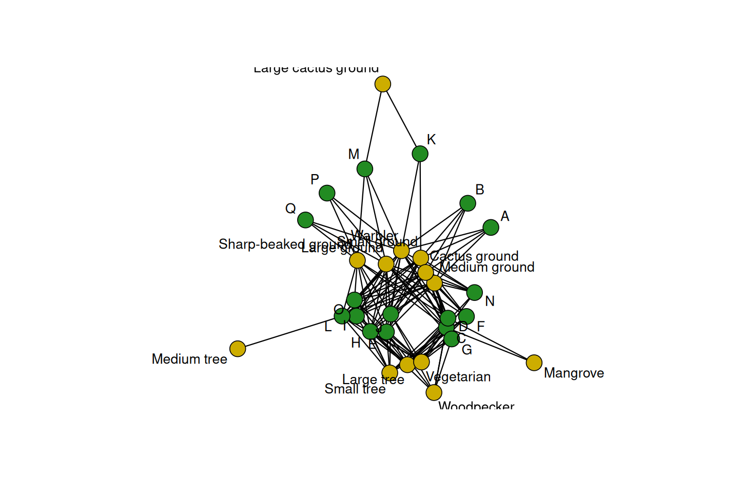
finches graph. There are many ways to improve the layout, including better taking into account the bipartite nature of the graph.
Solution
The output of the following code is shown in Figure 10.6.
library("ggraph")
ggraph(g1, layout = "nicely") +
  geom_edge_link() +
  geom_node_point(size=6,color="#8856a7") +
  geom_node_text(label=vertex_attr(g1)$name,  color="white")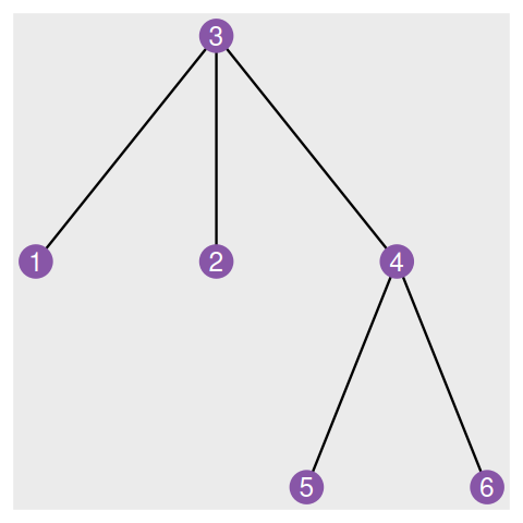
An example: a four state Markov chain
In Chapter 2, we saw how a Markov chain can summarize transitions between nucleotides (considered the states of the system). This is often schematized by a graph. The igraph package provides many choices for graph “decoration”:
library("markovchain")
statesNames = c("A", "C", "G","T")
T1MC = new("markovchain", states = statesNames, transitionMatrix =
  matrix(c(0.2,0.1,0.4,0.3,0,1,0,0,0.1,0.2,0.2,0.5,0.1,0.1,0.8,0.0),
         nrow = 4,byrow = TRUE, dimnames = list(statesNames, statesNames)))
plot(T1MC, edge.arrow.size = 0.4, vertex.color = "purple",
     edge.arrow.width = 2.2, edge.width = 5, edge.color = "blue",
     edge.curved = TRUE, edge.label.cex = 2.5, vertex.size= 32,
     vertex.label.cex = 3.5, edge.loop.angle = 3,
     vertex.label.family = "sans", vertex.label.color = "white")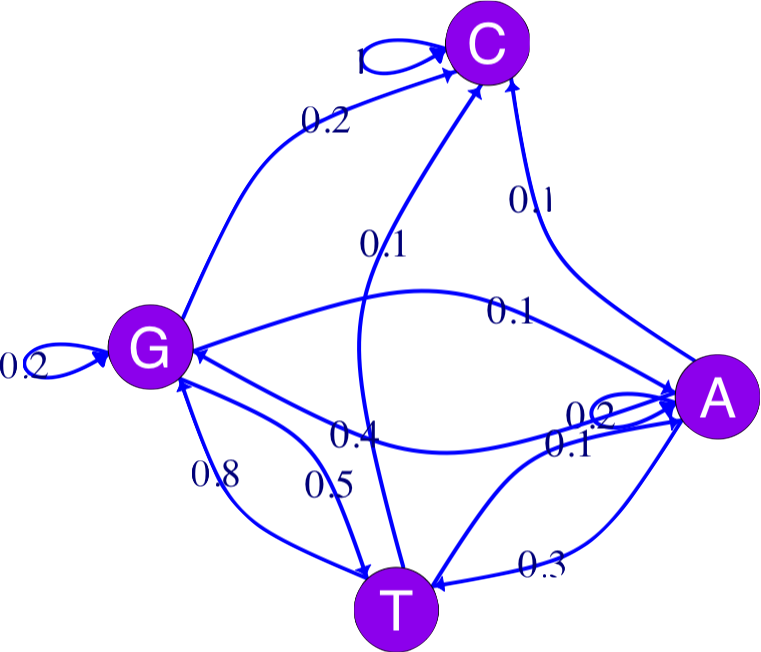
Markov chains are simple models of dynamical systems, and the states are represented by the nodes in the graph. The transition matrix gives us the weights on the directed edges (arrows) between the states.
We will see how to build a complete example of annotated state space Markov chain graph in Exercise 10.3.
10.2.2 Graphs with many layers: labels on edges and nodes
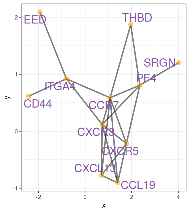
Here is an example of plotting a graph downloaded from the STRING database with annotations at the vertices.
datf = read.table("../data/string_graph.txt", header = TRUE)
grs = graph_from_data_frame(datf[, c("node1", "node2")], directed = FALSE)
E(grs)$weight = 1
V(grs)$size = centr_degree(grs)$res
ggraph(grs) +
  geom_edge_arc(color = "black",  strength = 0.05, alpha = 0.8)+
  geom_node_point(size = 2.5, alpha = 0.5, color = "orange") +
geom_node_label(aes(label=vertex_attr(grs)$name), size = 3, alpha = 0.9, color = "#8856a7", repel = TRUE) 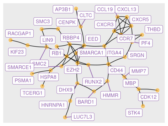
Figure 10.8 shows the full perturbed chemokine subnetwork discovered in the study of breast cancer metastasis using GXNA (Nacu et al. 2007) and reported by Yu et al. (2012).
10.3 From gene set enrichment to networks

In Chapter 8, we studied methods for finding a list of differentially expressed genes. Small sample sizes, coupled with efforts to maintain low FDRs, often result in low power to detect differential expression. Therefore, obtaining a long list of genes that can be confidently declared as differentially expressed is, initially, a triumph. However, understanding the underlying biology requires more than just a laundry list of significant players in a biological system.
10.3.1 Methods using pre-defined gene sets (GSEA)
One of the earliest approaches was to look for gene attributes that are overrepresented or enriched in the laundry list of significant genes. These gene classes are often based on Gene Ontology (GO) categories (for example, genes that are involved in organ growth, or genes that are involved in feeding behavior). The Gene Ontology (GO) is a collection of three ontologies that describe genes and gene products. These ontologies are restricted vocabularies that have the structure of directed acyclic graphs (DAGS). The most specific terms are the leaves of the graph. The GO graph consists of nodes (here, Gene Ontology terms) and edges from more specific terms (children) to less specific (parents), often these edges are directed. Nodes and edges can have multiple attributes that can be visualized. The main purpose of using GO annotations for a particular set of Genes designated as significant in an experiment is to look for the enrichment of a GO term in this list, we will give this term a statistical meaning below. Many other useful lists of important gene sets exist.
For instance, the MsigDB Molecular Signature Database (Liberzon et al. 2011) contains many gene sets that can be accessed from within R using the function getBroadSets from the Bioconductor package GSEABase roughly as follows:
library("GSEABase")
## This requires a login to the website.
fl   =  "/path/to/msigdb_v5.1.xml"
gss  =  getBroadSets(fl)
organism(gss[[1]])
table(sapply(gss, organism))
10.3.2 Gene set analysis with two-way table tests
| Yellow | Blue | Red | |
|---|---|---|---|
| Significant | 25 | 25 | 25 |
| Universe | 500 | 100 | 400 |
Here, we start by explaining a basic approach often called Fisher’s “exact” test or hypergeometric testing.
Define a universe of candidate genes that may potentially be significant; say this universe is of size \(N\). We also have a record of the genes that actually did come out significant, of which we suppose there were \(m\).
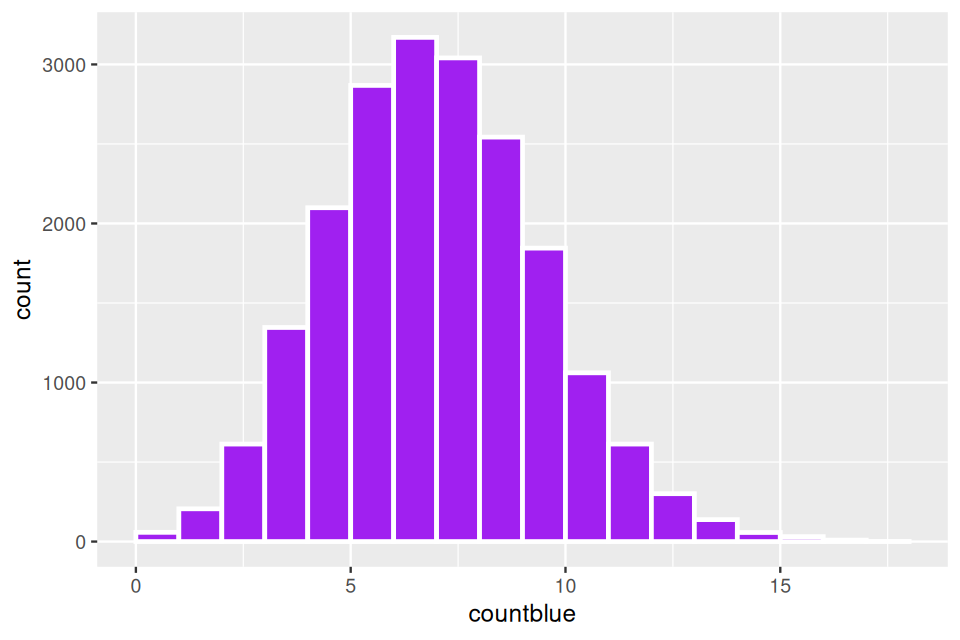
We make a toy model involving balls in boxes, with a total of \(N\) balls corresponding to the genes identified in the gene universe. These genes are split into different functional categories, suppose there are \(N=1,000\) genes, of which 500 are yellow, 100 are blue and 400 are red. Then a subset of \(m=75\) genes are labeled as significant, suppose among these significantly interesting genes, there are 25 yellow, 25 red and 25 blue. Is the blue category enriched or overrepresented?
We use this hypergeometric two-way table testing to account for the fact that some categories are extremely numerous and others are rarer.
Solution
Under the null the 75 are sampled randomly from our unequal boxes as follows:
universe = c(rep("Yellow", 500), rep("Blue", 100), rep("Red", 400))
countblue = replicate(20000, {
  pick75 = sample(universe, 75, replace = FALSE)
  sum(pick75 == "Blue")
})
summary(countblue)
Min. 1st Qu. Median Mean 3rd Qu. Max.
0.000 6.000 7.000 7.482 9.000 18.000 The histogram in Figure 10.9 shows that having a value as large as 25 under the null model would be extremely rare.
In the general case, the gene universe is an urn with \(N\) balls, if we pick the \(m\) balls at random and there is a proportion of \(k/N\) blue balls, we expect to see \(km/N\) blue balls in a draw of size \(k\).
10.3.3 Significant subgraphs and high scoring modules
We have at our disposal more than just the Gene Ontology. There are many different databases of gene networks from which we can choose a known skeleton graph onto which we project significance scores such as p-values from our differential expression experiment. We will follow an idea first suggested by Ideker et al. (2002). This is further developed in Nacu et al. (2007). A careful implementation with many improvements is available as the Bioconductor package BioNet (Beisser et al. 2010). These methods all search for the subgraphs or modules of a scored-skeleton network that seem to be particularly perturbed.
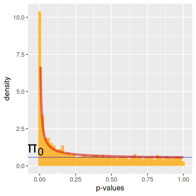
Each gene-node in the network is assigned a score that can either be calculated from a t-statistic or a p-value. Often pathways contain both upregulated and downregulated genes; as pointed out in Ideker et al. (2002), this can be captured by taking absolute values of the test statistic or just incorporating scores computed from the p-values2. Beisser et al. (2010) model the p-values of the genes as we did in Chapter 6: mixture of non-perturbed genes whose p-values will be uniformly distributed and non uniformly distributed p-values from the perturbed genes. We model the signal in the data using a beta distribution for the p-values following Pounds and Morris (2003).
2 We’ll want something like \(-\log p\), so that small p-values give large scores.
Given our node-scoring function, we search for connected hotspots in the graph, i.e., a subgraph of genes with high combined scores.
Using a subgraph search algorithm
Finding the maximal scoring subgraph of a generic graph is known to be intractable in general (we say it is an NP-hard problem), so various approximate algorithms have been proposed. Ideker et al. (2002) suggested using simulated annealing, however this is slow and tends to produce large subgraphs that are difficult to interpret. Nacu et al. (2007) started with a seed vertex and gradually expand around it. Beisser et al. (2010) started the search with a so-called minimal spanning tree (MST), a graph we we will study later in this chapter.
10.3.4 An example with the BioNet implementation
To illustrate the method, we show data from the BioNet package.
The
interactome data contains a connected component of the network comprising 2034 different gene products and 8399 interactions. This constitutes the skeleton graph with which we will work, see Beisser et al. (2010).The dataLym contains the relevant pvalues and \(t\) statistics for 3,583 genes, you can access them and do the analysis as follows:
library("BioNet")
library("DLBCL")
data("dataLym")
data("interactome")
interactome
A graphNEL graph with undirected edges
Number of Nodes = 9386
Number of Edges = 36504 pval = dataLym$t.pval
names(pval) = dataLym$label
subnet = subNetwork(dataLym$label, interactome)
subnet = rmSelfLoops(subnet)
subnetA graphNEL graph with undirected edges
Number of Nodes = 2559
Number of Edges = 7788 Fit a Beta-Uniform model
The p-values are fit to the type of mixture we studied in Chapter 4, with a uniform component from the null with probability \(\pi_0\) and a beta distribution (proportional to \(a x^{a - 1}\)) for the p-values corresponding to the alternatives (Pounds and Morris 2003). \[f(x|a,\pi_0)= \pi_0 + (1-\pi_0) a x^{a - 1}\qquad \mbox{ for } 0 <x \leq 1; \; 0<a<1\] Running the model with an \[fdr\] of 0.001:
The package actually gives a different name to \(\\pi_0\): it uses \(\\lambda\) and calls it the mixing parameter.
fb = fitBumModel(pval, plot = FALSE)
fb
Beta-Uniform-Mixture (BUM) model
3583 pvalues fitted
Mixture parameter (lambda): 0.482
shape parameter (a): 0.180
log-likelihood: 4471.8scores=scoreNodes(subnet, fb, fdr = 0.001)
Then we run a heuristic search for a high scoring subgraph using:
hotSub  =  runFastHeinz(subnet, scores)
hotSub
A graphNEL graph with undirected edges
Number of Nodes = 149
Number of Edges = 234 logFC=dataLym$diff
names(logFC)=dataLym$label
Question 10.7
We made Figure 10.12 using the following code:
plotModule(hotSub, layout = layout.davidson.harel, scores = scores,
                  diff.expr = logFC)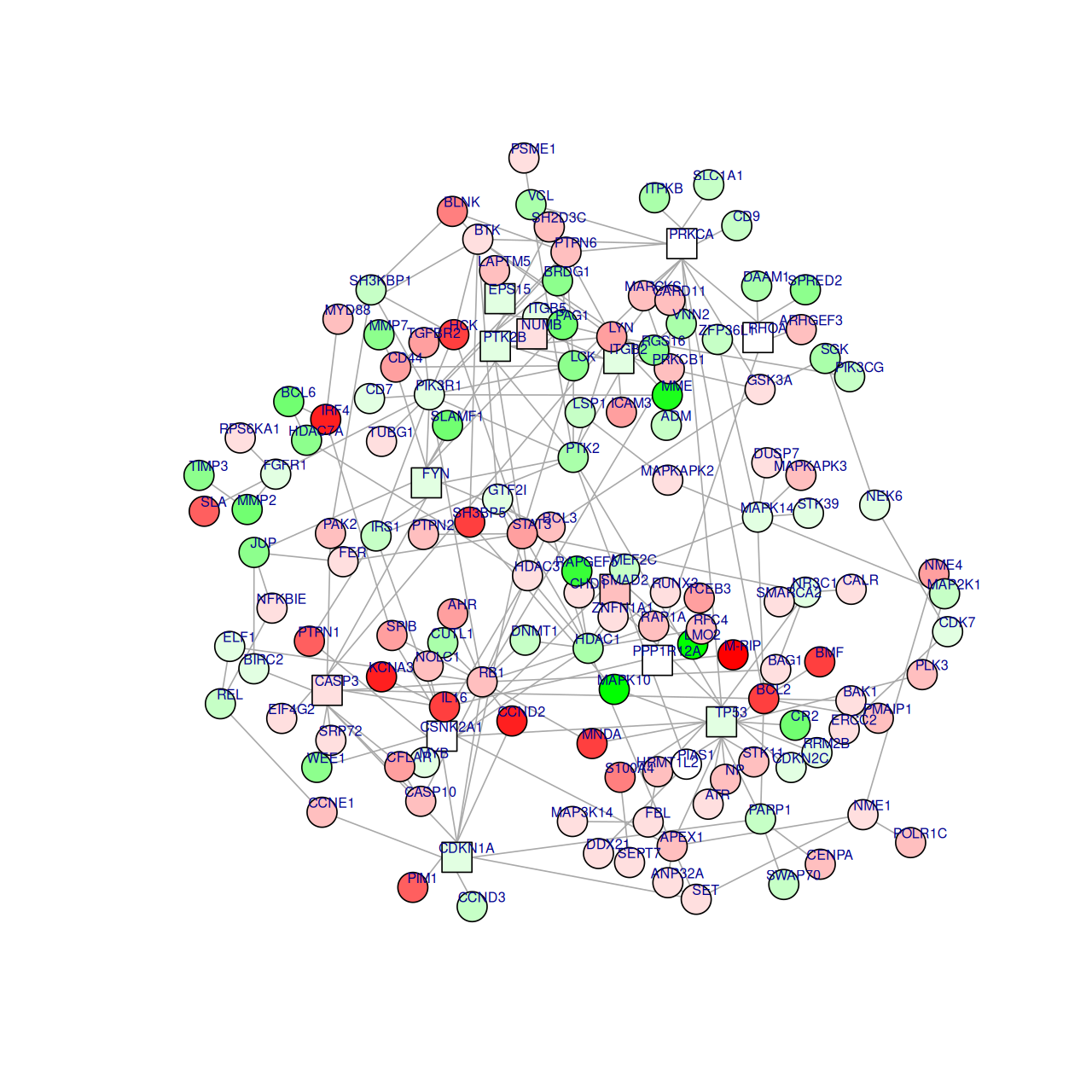
Using the function igraph.from.graphNEL, transform the module object and plot it using the ggraph method shown in Section 10.2.2.
10.4 Phylogenetic Trees
One really important use of graphs in biology is the construction of phylogenetic trees. Trees are graphs with no cycles (the official word for loops, whether self loops, or ones that go through several vertices). Phylogenetic trees are usually rooted binary trees that only have labels on the leaves corresponding to contemporary3 taxa at the tips. The inner nodes correspond to ancestral sequences which have to be inferred from the contemporaneous data on the tips. Many methods use aligned DNA sequences from the different species or populations to infer or estimate the tree. The tips of the tree are usually called OTUs (Operational Taxonomic Units). The statistical parameter of interest in these analyses is the rooted binary tree with OTU labels on its leaves (see Holmes (1999, 2003b) for details).
3 Because they are contemporary, the trees are often represented so that the leaves are a ll the same distance from the root.
The example of HIV
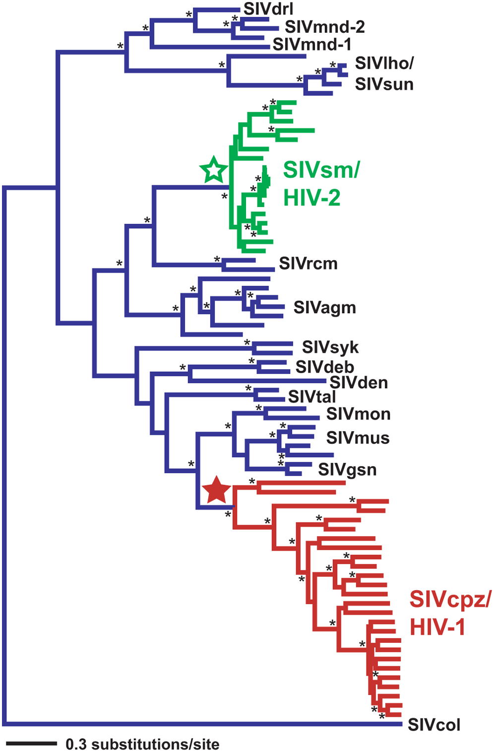
HIV is a virus that protects itself by evolving very fast (within months, several mutations can appear). Its evolution can thus be followed in real time; whereas the evolution of large organisms which has happened over millions of years. HIV trees are built for medical purposes such as the detection and understanding of drug resistance. They are estimated for individual genes. Different genes can show differences in their evolutionary histories and thus produce different gene trees. The phylogenetic tree in Figure 10.14 shows times when the virus switched from monkeys to humans (Wertheim and Worobey 2009).
Special elements in phylogenies
Most phylogenetic trees are shown rooted, the `root’ is usually found by including an outgroup in the tree tips, as we will see later.
Characters that are derived from this common ancestry are called homologous (geneticists doing population studies replace the term homology by identity by descent (IBD)).
Sisters on the tree defined by a common ancestor are called clades or monophyletic groups, they have more than just similarities in common.
10.4.1 Markovian models for evolution.
To infer what happened in the ancestral species from contemporary data collected on the tips of the tree, we have to make assumptions about how substitutions and deletions occur through time. The models we use are all Markovian and said to be time homogeneous: the mutation rate is constant across history.
Continuous Markov chain and generator matrix
We are going to use the Markov chain we saw in Figure 10.7 on the states [A,C,G,T]; however now we consider that the changes of state, i.e. mutations, occur at random times. The gaps between these mutational events will follow an exponential distribution. These continuous time Markov chains have the following properties:
No Memory. \(P(Y(u+t)=j\;|\;Y(t)=i)\) does not depend on times before \(t\).
Time homogeneity. The probability \(P(Y(h+t)=j\,|\,Y(t)=i)\) does not depend on \(t\), but on \(h\), the time between the events and on \(i\) and \(j\).
Linearity. The instantaneous transition rate is of an approximately linear form
\[ \begin{align} P_{ij}(h)&=q_{ij}h+o(h), \quad\text{for }j\neq i\\ P_{ii}(h)&=1-q_i(h)+ o(h), \qquad\text{where }q_i=\sum_{j\neq i}q_{ij}. \end{align} \tag{10.1}\]
\(q_{ij}\) is known as the instantaneous transition rate. These rates define matrices as in Table 10.2.
- Exponential distribution. Times between changes are supposed to be exponentially distributed.
| \(Q = \begin{array}{lcccc} & A & T & C & G \\ A & -3\alpha & \alpha & \alpha & \alpha \\ T & \alpha & -3\alpha & \alpha & \alpha \\ C & \alpha & \alpha & -3\alpha & \alpha \\ G & \alpha & \alpha & \alpha & -3\alpha \\ \end{array}\) | \(Q = \begin{array}{lcccc} & A & T & C & G \\ A & -\alpha-2 \beta & \beta & \beta & \alpha \\ T & \beta & -\alpha-2 \beta & \alpha & \beta \\ C & \beta & \alpha & -\alpha-2 \beta & \beta \\ G & \alpha & \beta & \beta & -\alpha-2 \beta \\ \end{array}\) |
JC69) model, on the right is shown the Kimura (K80) two parameter model.
the instantaneous change probability matrix called the generator. In the simplest possible model, called a Jukes-Cantor model; all the mutations are equally likely (see the left of Table 10.2). A slightly more flexible model, called the Kimura model is shown on the right in Table 10.2.
![Vocabulary overload here! : Transitions in this context mean mutational changes within the purines (A<->G]) or within the pyrimidines (C <-> T); whereas when we talked about Markov chains earlier our transition matrix contains all probabilities of any state changes.](imgs/devil.png){fig-align=‘center’ width=123}
The most flexible model is called the Generalized Time Reversible (GTR) model; it has 6 free parameters. We are going to show an example of data simulated according to these generative models from a known tree.
10.4.2 Simulating data and plotting a tree
Suppose we already know our phylogenetic tree and want to simulate the evolution of the nucleotides down this tree. First we visualize the tree tree1 using ggtree; loading the tree and the relevant packages with:
library("phangorn")
library("ggtree")
load(file.path(DATA,"tree1.RData"))ggtree(tree1, lwd = 2, color = "darkgreen", alpha = 0.8, right = TRUE) +
geom_tiplab(size = 7, angle = 90, offset = 0.05) +
geom_point(aes(shape = isTip, color = isTip), size = 5, alpha = 0.6)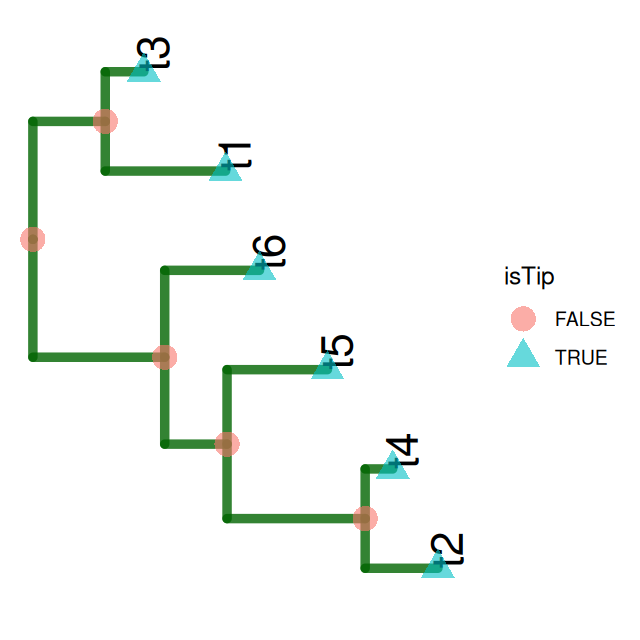
Now we generate some sequences from our tree. Each sequence starts with a new nucleotide letter generated randomly at the root; mutations may occur as we go down the tree. You can see in Figure 10.16 that the colors are not equally represented, because the frequency at the root was chosen to be different from the uniform, see the following code.
seqs6 = simSeq(tree1, l = 60, type = "DNA", bf = c(1, 1, 3, 3)/8, rate = 0.1)
seqs6
6 sequences with 60 character and 26 different site patterns.
The states are a c g t mat6df = data.frame(as.character(seqs6))
p = ggtree(tree1, lwd = 1.2) + geom_tiplab(aes(x = branch), size = 5, vjust = 2)
gheatmap(p, mat6df[, 1:60], offset = 0.01, colnames = FALSE)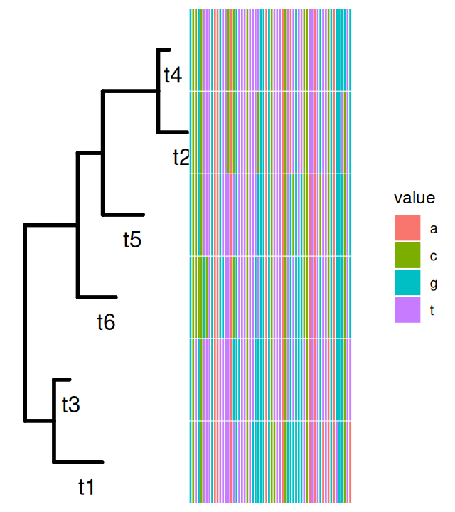
A and C being generated more rarely. As the sequences percolate down the tree, mutations occur, they are more likely to occur on the longer branches.
The standard Markovian models of evolution we saw above enable us to improve these estimates.
10.4.3 Estimating a phylogenetic tree

“In solving a problem of this sort, the grand thing is to be able to reason backward. That is a very useful accomplishment, and a very easy one, but people do not practise it much. In the everyday affairs of life it is more useful to reason forward, and so the other comes to be neglected. There are fifty who can reason synthetically for one who can reason analytically”. Sherlock Holmes
When the true tree-parameter is known, the above-mentioned probabilistic generative models of evolution tells us what patterns to expect in the sequences. As we have seen in earlier chapters, statistics means going back from the data to reasonable estimates of the parameters; here the tree itself and the branch lengths, even the evolutionary rates can be considered to be the parameters.
There are several approaches to estimation: tree `building’ is no exception, here are the main ones:
A nonparametric estimate: the parsimony tree Parsimony is a nonparametric method that minimizes the number of changes necessary to explain the data, it’s solution is the same as that of the Steiner tree problem (see Figure 10.17).
A parametric estimate: the maximum likelihood tree In order to estimate the tree using a maximum likelihood or Bayesian approach one needs a model for molecular evolution that integrates mutation rates and branch edge lengths. ML estimation (e.g., Phyml, FastML, RaxML) use efficient optimization algorithms to maximize the likelihood of a tree under the model assumptions.
Bayesian posterior distributions for trees Bayesian estimation, MrBayes (Ronquist et al. 2012) or BEAST (Bouckaert et al. 2014) both use MCMC to find posterior distributions of the phylogenies. Bayesian methods are not directly integrated into R and require the user to import the collections of trees generated by Monte Carlo methods in order to summarize them and make confidence statements see Chakerian and Holmes (2012) for simple examples.
The semi-parametric approach: distance based methods These methods, called Neighbor Joining and UPGMA, are quite similar to the hierachical clusering algorithms we already encountered in Chapter 5. However, the distance estimation steps uses the parametric evolutionary models of Table 10.2; the `parametric’ part of why we call the method semi-parametric.
The neighbor-joining algorithm itself uses Steiner points as the summary of two combined points, and proceeds iteratively as in hierarchical clustering. It can be quite fast and is often used as a good starting point for the more time-consuming methods.
Let’s start by estimating the tree from the data seqs6 using the nj (neighbor joining) on DNA distances based on the one-parameter Jukes-Cantor model, we make Figure 10.18 using the ggtree function:
tree.nj = nj(dist.ml(seqs6, "JC69"))
ggtree(tree.nj) + geom_tiplab(size = 7) 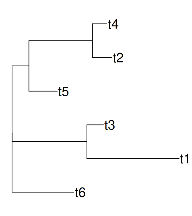
The quality of the tree estimates depend on the number of sequences per taxa and the distance to the root. We can evaluate the quality of the estimates either by using parametric and nonparametric bootstraps or performing Bayesian tree estimation using MCMC. For examples of how to visualize and compare the sampling distribution of trees, see Chakerian and Holmes (2012).
10.4.4 Application to 16S rRNA data
In Chapter 5 we saw how to use a probabilistic clustering method to denoise 16S rRNA sequences. We can now reload these denoised sequences and preprocess them before building their phylogeny4.
4 In order to keep all the information and be able to compare sequences from different experiments, we use the sequences themselves as their label(Callahan et al. 2017).
library("dada2")
seqtab = readRDS(file.path(DATA,"seqtab.rds"))
seqs = getSequences(seqtab)
names(seqs) = seqs
One of the benefits of using well-studied marker loci such as the 16S rRNA gene is the ability to taxonomically classify the sequenced variants. dada2 includes a naive Bayesian classifier method for this purpose (Wang et al. 2007). This classifier compares sequence variants to training sets of classified sequences. Here we use the RDP v16 training set (Cole et al. 2009)5. For example, code for such a classification might look like this.
5 See the download link on the dada2 website: https://benjjneb.github.io/dada2/training.html
fastaRef = "../tmp/rdp_train_set_16.fa.gz"
taxtab = assignTaxonomy(seqtab, refFasta = fastaRef)
Since the assignTaxonomy function runs for a while, the above code is not live and we here load a previously computed result, a table of taxonomic information:
taxtab = readRDS(file.path(DATA,"taxtab16.rds"))
dim(taxtab)
[1] 268 6Note that as the seqs data are randomly generated, they are “cleaner” than the real data we will have to handle.
In particular naturally occurring raw sequences have to be aligned. This is necessary as there are often extra nucleotides in some sequences, a consequence of what we call indel events6. Also mutations occur and appear as substitutions of one nucleotide by another.
6 A nucleotide is deleted or inserted and it is often hard to distinguish which took place.
Here is an example of what the first few characters of aligned sequences looks like:
readLines(file.path(DATA,"mal2.dna.txt")) |> head(12) |> cat(sep="\n") 11 1620
Pre1 GTACTTGTTA GGCCTTATAA GAAAAAAGT- TATTAACTTA AGGAATTATA
Pme2 GTATCTGTTA AGCCTTATAA AAAGATAGT- T-TAAATTAA AGGAATTATA
Pma3 GTATTTGTTA AGCCTTATAA GAGAAAAGTA TATTAACTTA AGGA-TTATA
Pfa4 GTATTTGTTA GGCCTTATAA GAAAAAAGT- TATTAACTTA AGGAATTATA
Pbe5 GTATTTGTTA AGCCTTATAA GAAAAA--T- TTTTAATTAA AGGAATTATA
Plo6 GTATTTGTTA AGCCTTATAA GAAAAAAGT- TACTAACTAA AGGAATTATA
Pfr7 GTACTTGTTA AGCCTTATAA GAAAGAAGT- TATTAACTTA AGGAATTATA
Pkn8 GTACTTGTTA AGCCTTATAA GAAAAGAGT- TATTAACTTA AGGAATTATA
Pcy9 GTACTCGTTA AGCCTTTTAA GAAAAAAGT- TATTAACTTA AGGAATTATA
Pvi10 GTACTTGTTA AGCCTTTTAA GAAAAAAGT- TATTAACTTA AGGAATTATA
Pga11 GTATTTGTTA AGCCTTATAA GAAAAAAGT- TATTAATTTA AGGAATTATAWe will perform this multiple-alignment on our seqs data using the DECIPHER package (Wright 2015):
library("DECIPHER")
alignment = AlignSeqs(DNAStringSet(seqs), anchor = NA, verbose = FALSE)
We use the phangorn package to build the MLE tree (under the GTR model), but will use the neighbor-joining tree as our starting point.
phangAlign = phangorn::phyDat(as(alignment, "matrix"), type = "DNA")
dm = phangorn::dist.ml(phangAlign)
treeNJ = phangorn::NJ(dm)   # Note: tip order != sequence order
fit = phangorn::pml(treeNJ, data = phangAlign)
fitGTR = update(fit, k = 4, inv = 0.2)
fitGTR = phangorn::optim.pml(fitGTR, model = "GTR", optInv = TRUE,
         optGamma = TRUE,  rearrangement = "stochastic",
         control = phangorn::pml.control(trace = 0))
10.5 Combining phylogenetic trees into a data analysis
We now need to combine the phylogenetic tree and the denoised read abundances with the complementary information provided about the samples from which the reads were gathered. This information about the sample is often provided as a spreadhseet (or .csv), and sometimes called the meta-data7. This data combination step is facilitated by the specialized containers and accessors that phyloseq provides.
7 We consider the prefix meta unhelpful and potentially confusing here: the data about the samples is just that: data.
The following set of steps contains a few data cleanup and reorganization tasks—a dull but necessary part of applied statistics—that end in the creation of the object ps1.
samples = read.csv("../data/MIMARKS_Data_combined.csv", header = TRUE)
samples$SampleID = paste0(gsub("00", "", samples$host_subject_id),
                          "D", samples$age-21)
samples = samples[!duplicated(samples$SampleID), ]
stopifnot(all(rownames(seqtab) %in% samples$SampleID))
rownames(samples) = samples$SampleID
keepCols = c("collection_date", "biome", "target_gene", "target_subfragment",
  "host_common_name", "host_subject_id", "age", "sex", "body_product", "tot_mass",
  "diet", "family_relationship", "genotype", "SampleID")
samples = samples[rownames(seqtab), keepCols]
The sample-by-sequence feature table, the sample (meta)data, the sequence taxonomies, and the phylogenetic tree—are combined into a single object as follows:
library("phyloseq")
pso = phyloseq(tax_table(taxtab),
               sample_data(samples),
               otu_table(seqtab, taxa_are_rows = FALSE),
               phy_tree(fitGTR$tree))
We have already encountered several cases of combining heterogeneous datasets into special data classes that automate the linking and keeping consistent the different parts of the dataset (e.g., in Chapter 8, when we studied the pasilla data).
This can be done in one line:
prune_samples(rowSums(otu_table(pso)) > 5000, pso)phyloseq-class experiment-level object
otu_table() OTU Table: [ 268 taxa and 10 samples ]
sample_data() Sample Data: [ 10 samples by 14 sample variables ]
tax_table() Taxonomy Table: [ 268 taxa by 6 taxonomic ranks ]
phy_tree() Phylogenetic Tree: [ 268 tips and 266 internal nodes ]We can also make other data transformations while maintaining the integrity of the links between all the data components.
Plotting the abundances for certain bacteria can be done using barcharts. ggplot2 expressions have been hardwired into suitable one-line calls in the phyloseq package. There is also an interactive Shiny-phyloseq browser based tool (McMurdie and Holmes 2015). For more details, please see the online vignettes.
10.5.1 Hierarchical multiple testing
Hypothesis testing can identify individual bacteria whose abundance relates to sample variables of interest. A standard approach is very similar to the approach we already visited in Chapter 6. Compute a test statistic for each taxa individually; then jointly adjust p-values to ensure a false discovery rate upper bound. However, this procedure does not exploit the structure among the tested hypotheses. For example, if we observe that one Ruminococcus species is strongly associated with age, but the biological reason for this sits at the genus level, then we would expect other species to have such an association as well. To integrate such information, Benjamini and Yekutieli (2003) and Benjamini and Bogomolov (2014) proposed a hierarchical testing procedure, where lower level taxonomic groups are only tested if higher levels are found to be be associated. In the case where many related species have a slight signal, this pooling of information can increase power.
We apply this method to test the association between microbial abundance and age. We use the data object ps1, which is similar to pso from above, but has undergone some additional transformation and filtering steps. We also need to apply the normalization protocols available in the DESeq2 package, which we discussed in Chapter 8, following Love et al. (2014) for RNA-Seq data and McMurdie and Holmes (2014) for 16S rRNA generated count data.
library("DESeq2")
ps1 = readRDS(file.path(DATA,"ps1.rds"))
ps_dds = phyloseq_to_deseq2(ps1, design = ~ ageBin + family_relationship)
In chunk 'deseq-transform': Warning in DESeqDataSet(se, design = design, ignoreRank): some variables indesign formula are characters, converting to factors
geometricmean = function(x)
   if (all(x == 0)) { 0 } else { exp(mean(log(x[x != 0]))) }
geoMeans = apply(counts(ps_dds), 1, geometricmean)
ps_dds = estimateSizeFactors(ps_dds, geoMeans = geoMeans)
ps_dds = estimateDispersions(ps_dds)
abund = getVarianceStabilizedData(ps_dds)
We use the structSSI package to perform the hierarchical testing (Sankaran and Holmes 2014). For more convenient printing, we first shorten the names of the taxa:
rownames(abund) = substr(rownames(abund), 1, 5) |> make.names(unique = TRUE)The hierarchical testing procedure we are now going to do differs from standard multiple hypothesis testing in that univariate tests are done not only for every taxon, but for each higher-level taxonomic group. A helper function, treePValues, is available for this: it expects an edge list encoding parent-child relationships, with the first row specifying the root node.
library("structSSI")
el = phy_tree(ps1)$edge
el0 = el
el0 = el0[rev(seq_len(nrow(el))), ]
el_names = c(rownames(abund), seq_len(phy_tree(ps1)$Nnode))
el[, 1] = el_names[el0[, 1]]
el[, 2] = el_names[el0[, 2]]
unadj_p = treePValues(el, abund, sample_data(ps1)$ageBin)
We can now do our FDR calculations using the hierarchical testing procedure. The test results are guaranteed to control several variants of FDR, but at different levels; we defer details to (Benjamini and Yekutieli 2003; Benjamini and Bogomolov 2014; Sankaran and Holmes 2014).
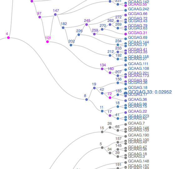
The plot opens in a new browser – a static screenshot of a subtree is displayed in Figure 10.19. Nodes are shaded according to p-values, from blue to orange, representing the strongest to weakest associations. Grey nodes were never tested, to focus power on more promising subtrees. Scanning the full tree; it becomes clear that the association between age group and taxonomic abundances is present in only a few isolated taxonomic groups. It is quite strong in those groups. To give context to these results, we can retrieve the taxonomic identity of the rejected hypotheses.
library("dplyr")
options(digits = 3)
tax = tax_table(ps1)[, c("Family", "Genus")] |> data.frame()
tax$seq = rownames(abund)
hfdr_res@p.vals$seq = rownames(hfdr_res@p.vals)
left_join(tax, hfdr_res@p.vals[,-3]) |>
  arrange(adjp) |> head(9) |> dplyr::select(1,2,4,5)
Family Genus hypothesisName hypothesisIndex
1 Porphyromonadaceae <NA> <NA> NA
2 Porphyromonadaceae <NA> <NA> NA
3 Porphyromonadaceae <NA> <NA> NA
4 Porphyromonadaceae Barnesiella <NA> NA
5 Bacteroidaceae Bacteroides <NA> NA
6 Porphyromonadaceae Barnesiella <NA> NA
7 Rikenellaceae Alistipes <NA> NA
8 Porphyromonadaceae <NA> <NA> NA
9 Porphyromonadaceae <NA> <NA> NAIt seems that the most strongly associated bacteria all belong to family Lachnospiraceae.
10.6 Minimum spanning trees
A very simple and useful graph is the so-called minimum spanning tree (MST). Given a set of vertices, a spanning tree is a tree that goes through all points at least once. Examples are shown in Figure 10.20. Given distances between vertices, the MST is the spanning tree with the minimum total length (see Figure 10.20).
Greedy algorithms work well for computing the MST and there are many implementations in R: mstree in ade4, mst in ape, spantree in vegan, mst in igraph.
Here we are going to take the DNA sequence distances between strains of HIV from patients all over the world and construct their minimum spanning tree. The result is shown in Figure 10.21.
load(file.path(DATA, "dist2009c.RData"))
country09 = attr(dist2009c, "Labels")
mstree2009 = ape::mst(dist2009c)
gr09 = graph_from_adjacency_matrix(mstree2009, mode = "undirected")
ggraph(gr09, layout="fr") +
  geom_edge_link(color = "black",alpha=0.5) +
  geom_node_point(aes(color = vertex_attr(gr09)$name), size = 2) +
  geom_node_text(aes(label = vertex_attr(gr09)$name), color="black",size=2) +
  theme_void() +
  guides(color=guide_legend(keyheight=0.1,keywidth=0.1,
      title="Countries"))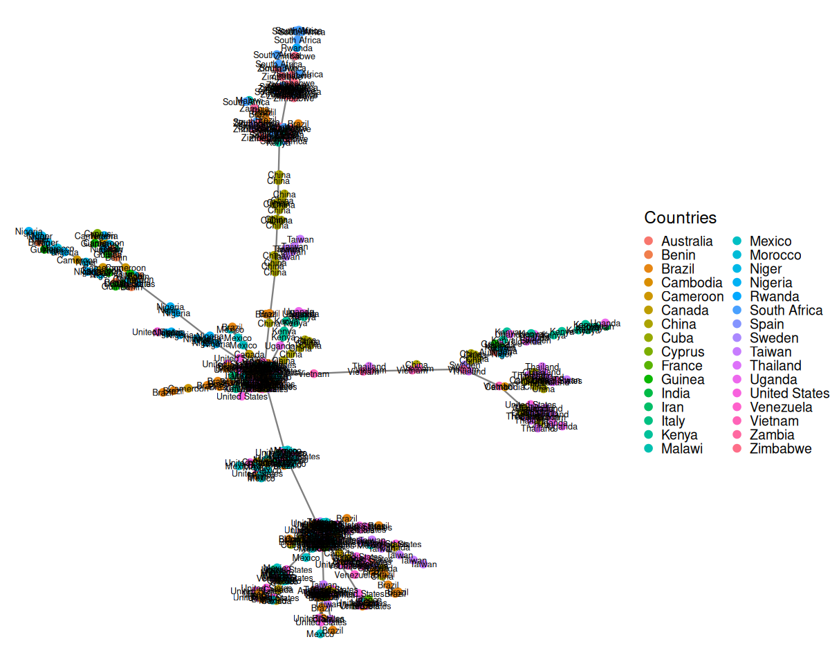
HIVdb database (Rhee et al. 2003).
Solution
See Figure 10.22. Maybe a better, or additional approach would be to first cluster those vertices that are very close together and from the same country.
library("ggraph")
ggraph(gr09, layout="fr") +
  geom_edge_link(color = "black",alpha=0.5) +
  geom_node_point(aes(color = vertex_attr(gr09)$name), size = 2) +
  geom_node_label(aes(label = vertex_attr(gr09)$name), color="black",size=2,repel=TRUE) +
  theme_void() +
  guides(color=guide_legend(keyheight=0.1,keywidth=0.1,
      title="Countries"))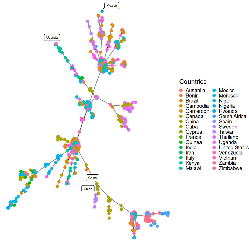
It could be preferable to use a graph layout that incorporates the known geographic coordinates. Thus, we might be able to see how the virus jumped large distances across the world through traveller mobility. We introduce approximate country coordinates, which we then jitter slightly to reduce overlapping.
library("rworldmap")
mat = match(country09, countriesLow$NAME)
coords2009 = data.frame(
  lat = countriesLow$LAT[mat],
  lon = countriesLow$LON[mat],
  country = country09)
layoutCoordinates = cbind(
  x = jitter(coords2009$lon, amount = 15),
  y = jitter(coords2009$lat, amount = 8))
labc = names(table(country09)[which(table(country09) > 1)])
matc = match(labc, countriesLow$NAME)
dfc = data.frame(
  latc = countriesLow$LAT[matc],
  lonc = countriesLow$LON[matc],
  labc)
dfctrans = dfc
dfctrans[, 1] = (dfc[,1] + 31) / 93
dfctrans[, 2] = (dfc[,2] + 105) / 238
Countries = vertex_attr(gr09)$name

ggraph(gr09, layout=layoutCoordinates) +
  geom_node_point(aes(color=Countries),size = 3, alpha=0.75) +
  geom_edge_arc(color = "black", alpha = 0.5, strength=0.15) +
  geom_label(data=dfc,aes(x=lonc,y=latc,label=labc,fill=labc),colour="white",alpha=0.8,size=3,show.legend=F) +
theme_void() 
The input to the minimum spanning tree algorithm is a distance matrix or a graph with a length edge attribute. Figure 10.23 is the minimum spanning tree between cases of HIV, for which strain information was made available through the HIVdb database@HIVdb. The DNA distances were computed using the Jukes-Cantor mutation model.
MST is a very useful component of a simple nonparametric test for detecting differences between factors that are mapped onto its vertices.
10.6.1 MST based testing: the Friedman–Rafsky test
Graph-based two-sample tests8 were introduced by Friedman and Rafsky (Friedman and Rafsky 1979) as a generalization of the Wald-Wolfowitz runs test (see Figure 10.24). Our previous examples show graph vertices associated with covariates such as country of origin. Here we test whether the covariate is significantly associated to the graph structure.
8 Tests that explore whether two samples are drawn from the same distribution.
The Friedman-Rafsky tests for two/multiple sample segregation on a minimum spanning tree. It was conceived as a generalization of the univariate Wald-Wolfowitz runs test. If we are comparing two samples, say men and women, whose coordinates represent a measurement of interest. We color the two groups blue and red as in Figure 10.24, the Wald-Wolfowitz test looks for long runs of the same color that would indicate that the two groups have different means.
Instead of looking for consecutive values of one type (‘runs’), we count the number of connected nodes of the same type.
Once the minimum spanning tree has been constructed, the vertices are assigned `colors’ according to the different levels of a categorical variable. We call pure edges those whose two nodes have the same level of the factor variable. We use \(S_O\), the number of pure edges as our test statistic. To evaluate whether our observed value could have occurred by chance when the groups have the same distributions, we permute the vertix labels (colors) randomly and recount how many pure edges there are. This label swapping is repeated many times, creating our null distribution for \(S\).
10.6.2 Example: Bacteria sharing between mice
Here we illustrate the idea on a collection of samples from mice whose stool were analyzed for their microbial content. We read in a data set with many mice and many taxa, we compute the Jaccard distance and then use the mst function from the igraph package. We annotate the graph with the relevant covariates as shown in the code below:
ps1  = readRDS(file.path(DATA,"ps1.rds"))
sampledata = data.frame( sample_data(ps1))
d1 = as.matrix(phyloseq::distance(ps1, method="jaccard"))
gr = graph_from_adjacency_matrix(d1,  mode = "undirected", weighted = TRUE)
net = igraph::mst(gr)
V(net)$id = sampledata[names(V(net)), "host_subject_id"]
V(net)$litter = sampledata[names(V(net)), "family_relationship"]
We make a ggraph object from the resulting igraph generated minimum spanning tree and then plot it, as shown in Figure 10.25.
ggraph(net, layout="fr")+
  geom_edge_arc(color = "darkgray") +
  geom_node_point(aes(color = id, shape = litter)) +
  theme(legend.position="bottom")
Now we compute the null distribution and p-value for the test, this is implemented in the phyloseqGraphTest package:
library("phyloseqGraphTest")
gt = graph_perm_test(ps1, "host_subject_id", distance="jaccard",
                     type="mst",  nperm=1000)
gt$pval
[1] 0.000999We can take a look at the complete histogram of the null distribution generatedby permutation using:
plot_permutations(gt)In chunk 'fig-mstJaccard': Warning: `qplot()` was deprecated in ggplot2 3.4.0.ℹ The deprecated feature was likely used in the phyloseqGraphTest package. Please report the issue to the authors.
Different choices for the skeleton graph
It is not necessary to use an MST for the skeleton graph that defines the edges. Graphs made by linking nearest neighbors (Schilling 1986) or distance thresholding work as well.
The Bioconductor package phyloseq has functionality for creating graphs based on thresholding a distance matrix through the function make_network. We create a network by creating an edge between samples whose Jaccard dissimilarity is less than a threshold, which we set below via the parameter max.dist. We can also use the ggraph package to add attributes to the vertices indicating which mouse the sample came from and which litter the mouse was in. We see that in the resulting network, shown in Figure 10.27, there is grouping of the samples by both mouse and litter.
net = make_network(ps1, max.dist = 0.35)
sampledata = data.frame(sample_data(ps1))
V(net)$id = sampledata[names(V(net)), "host_subject_id"]
V(net)$litter = sampledata[names(V(net)), "family_relationship"]ggraph(net, layout="fr") +
geom_edge_link(color = "darkgray") +
geom_node_point(aes(color = id, shape = litter)) +
theme(plot.margin = unit(c(0, 5, 2, 0), "cm"))+
theme(legend.position = c(1.4, 0.3),legend.background = element_blank(),
legend.margin=margin(0, 3, 0, 0, "cm"))+
guides(color=guide_legend(ncol=2))+
theme_graph(background = "white")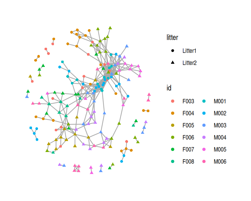
Note that no matter which graph we build between the samples, we can approximate a null distribution by permuting the labels of the nodes of the graph. However, sometimes it will preferable to adjust the permutation distribution to account for known structure between the covariates.
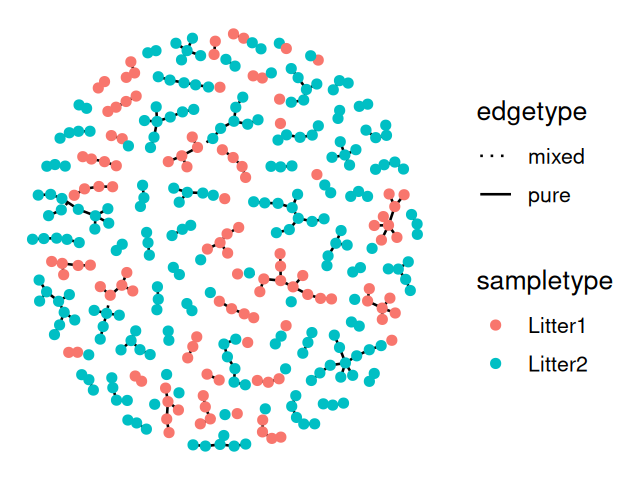
10.6.3 Friedman–Rafsky test with nested covariates
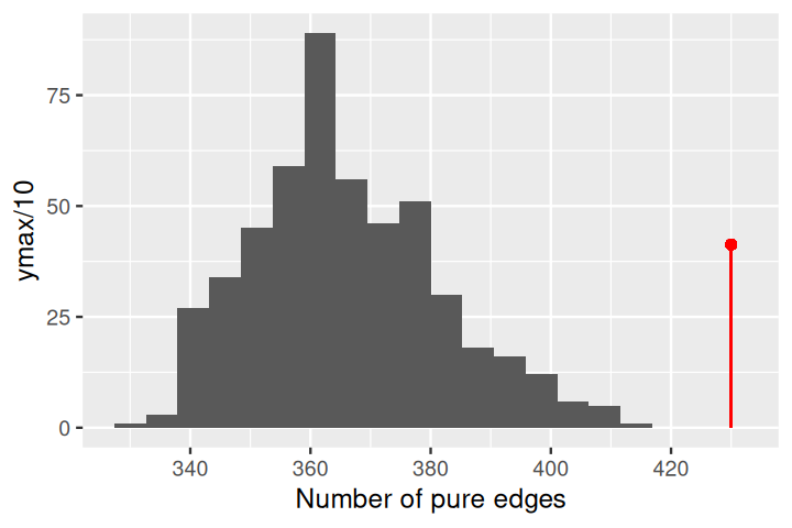
In the test above, we took a rather naïve approach and showed there was a significant difference between individual mice (the host_subject_id variable). Here we perform a slightly different permutation test to find out if we control for the difference between mice; is there a litter (the family_relationship variable) effect? The setup of the test is similar, it is simply how the permutations are generated which differs. We maintain the nested structure of the two factors using the grouping argument. We permute the family_relationship labels but keep the host_subject_id structure intact.
gt = graph_perm_test(ps1, "family_relationship",
        grouping = "host_subject_id",
        distance = "jaccard", type = "mst", nperm= 1000)
gt$pval
[1] 0.004This test has a small p-value, and we reject the null hypothesis that the two samples come from the same distribution. From the plot of the minimum spanning tree in Figure 10.26, we see by eye that the samples group by litter more than we would expect by chance.
plot_permutations(gt)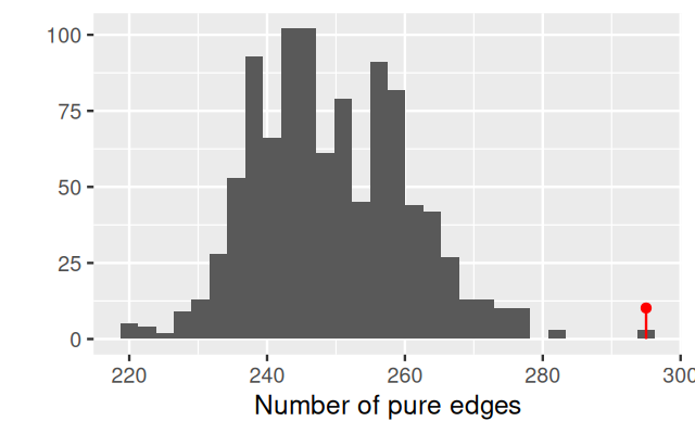
Solution
gtnn1 = graph_perm_test(ps1, "family_relationship",
                      grouping = "host_subject_id",
                      distance = "jaccard", type = "knn", knn = 1)
gtnn1$pval
[1] 0.002Figure 10.29 shows that pairs of samples having edges between them in this nearest neighbor graph are much more likely to be from the same litter.
plot_test_network(gtnn1)In chunk 'fig-knn-1-plot': Warning: `aes_string()` was deprecated in ggplot2 3.0.0.ℹ Please use tidy evaluation idioms with `aes()`.ℹ See also `vignette("ggplot2-in-packages")` for more information.ℹ The deprecated feature was likely used in the phyloseqGraphTest package. Please report the issue to the authors.
Note: The dual graph
In the examples above we sought to show relationships between samples through their shared taxa. It can also be of interest to ask the question about taxa: do some of the taxa co-occur more often than one would expect? This approach can help study microbial `communities’ as they assemble in the microbiome. The methods we developed above all apply to this use-case, all one really does is transpose the data. It is always preferable with sparse data such as the microbiome to use Jaccard and not build correlation networks that can be appropriate in other settings.
10.7 Summary of this chapter
Annotated graphs
In this chapter we have learnt how to store and plot data that have more structure than simple arrays: graphs have edges and nodes that can also be associated to extra annotations that can be displayed usefully.
Important examples of graphs and useful R packages
We started by specific examples such as Markov chain graphs, phylogenetic trees and minimum spanning trees. We saw how to use the ggraph and igraph packages to visualize graphs and show as much information as possible by using specific graph layout algorithms.
Combining graphs with statistical data
We then approached the problem of incorporating a known `skeleton’ graph into differential expression analyses. This enables use to pinpoint perturbation hotspots in a network. We saw how evolutionary models defined along rooted binary trees serve as the basis for phylogenetic tree estimation and how we can incorporate these trees as supplementary information in a differential abundance analysis using the R packages structSSI and phyloseq.
Linking co-occurrence to other variables
Graph and network tools also enable the creation of networks from co-occurrence data and can be used to visualize and test the effect of factor covariates. We saw the Friedman-Rafsky test which provides an easy way of testing dependencies of a variable with the edge structure of a skeleton graph.
Context and intepretation aids
This chapter illustrated ways of incorporating interactions of players in a network and we saw how useful it was to combine this with statistical scores. This often provides biological insight into analyses of complex biological systems.
Previous knowledge or outcome
We saw that graphs can be both useful to encode our previous knowledge, metabolic network information, gene ontologies and phylogenetic trees of known bacteria are all available in standard databases. It is beneficial in a study to incorprate all known information and doing so by combining these skeleton networks with observed data enhances our understanding of experimental results in the context of what is already known.
On the other hand, the graph can be the outcome that we want to predict and we saw how to build graphs from data (phylogenetic trees, co-occurrence networks and minimum spanning trees).
10.8 Further reading
For complete developments and many important consequences of the evolutionary models used in phylogenetic trees, see the books by Li (1997; Li and Graur 1991). The book by Felsenstein (2004) is the classic text on estimating phylogenetic trees.
The book written by the author of the ape packages, Paradis (2011) contains many use-cases and details about manipulation of trees in R. A review of bootstrapping for phylogenetic trees can be found in Holmes (2003a).
We can use a tree as well as abundances in a contingency table data through an extension of PCoA-MDS called DPCoA (Double principal coordinate analysis). For microbiome data, the phylogenetic tree provides distances between taxa; these distances serve as the basis for the first PCoA. A second PCoA enables the projection of the weighted sample points. This has proved very effective in microbial ecology applications, see Purdom (2010) or Fukuyama et al. (2012) for details.
Graphs can be used to predict vertex covariates. There is a large field of applied statistics and machine learning that considers the edges in the graph as a response variable for which one can make predictions based on covariates or partial knowledge of the graph; these include ERGM’s (Exponential Random Graph Models, Robins et al. (2007)) and kernel methods for graphs (Schölkopf et al. 2004).
For theoretical properties of the Friedman-Rafsky test and more examples see Bhattacharya (2015).
A full list packages that deal with graphs and networks is available at: http://www.bioconductor.org/packages/release/BiocViews.html#___GraphAndNetwork.
10.9 Exercises
Solution
Note: the below code is not live, a version of it used to run for the authors at one point, here it is given as a starting point for the reader to finish, it has opportunities for modernization and improvement.
library("markovchain")
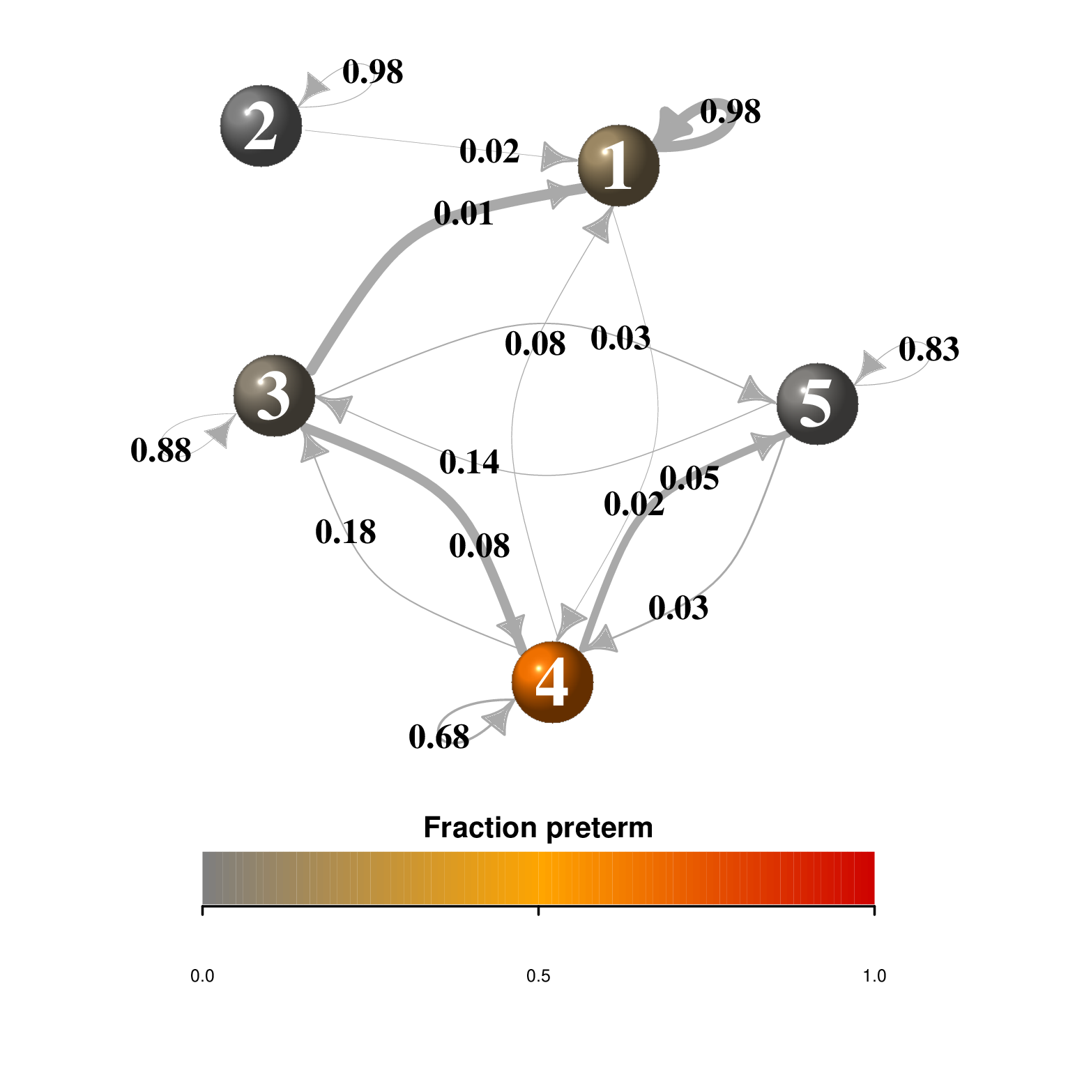
# Make Markov chain object
mcPreg = new("markovchain", states = CSTs,
transitionMatrix = trans, name="PregCST")
mcPreg
# Set up igraph of the markov chain
netMC = markovchain:::.getNet(mcPreg, round = TRUE)Now define a number of plotting parameters, and assign node colors based on the association of that CST and preterm outcome.
wts  =  E(netMC)$weight/100
edgel  =  get.edgelist(netMC)
elcat  =  paste(edgel[,1], edgel[,2])
elrev  =  paste(edgel[,2], edgel[,1])
edge.curved  =  sapply(elcat, function(x) x %in% elrev)
samples_def  =  data.frame(sample_data(ps))
samples_def  =  samples_def[samples$Preterm | samples$Term,] # Only those definitely assigned, i.e. not marginal
premat  =  table(samples_def$CST, samples_def$Preterm)
rownames(premat)  =  markovchain::states(mcPreg)
colnames(premat)  =  c("Term", "Preterm")
premat
premat  =  premat/rowSums(premat)
vert.CSTclrs  =  CSTColors
default.par = par(no.readonly = TRUE)
# Define color scale
# Plotting function for markov chain
plotMC = function(object, ...) {
netMC = markovchain:::.getNet(object, round = TRUE)
plot.igraph(x = netMC, ...)
}
# Color bar for the markov chain visualization, gradient in strength of preterm association
color.bar = function(lut, min, max=-min, nticks=11, ticks=seq(min, max, len=nticks), title=NULL) {
scale = (length(lut)-1)/(max-min)
cur.par = par(no.readonly = TRUE)
par(mar = c(0, 4, 1, 4) + 0.1, oma = c(0, 0, 0, 0) + 0.1)
par(ps = 10, cex = 0.8)
par(tcl=-0.2, cex.axis=0.8, cex.lab = 0.8)
plot(c(min,max), c(0,10), type='n', bty='n', xaxt='n', xlab=", yaxt='n', ylab=", main=title)
axis(1, c(0, 0.5, 1))
for (i in 1:(length(lut)-1)) {
x = (i-1)/scale + min
rect(x,0,x+1/scale,10, col=lut[i], border=NA)
}
}
pal = colorRampPalette(c("grey50", "maroon", "magenta2"))(101)
vert.clrs = sapply(states(mcPreg), function(x) pal[1+round(100*premat[x,"Preterm"])])
vert.sz = 4 + 2*sapply(states(mcPreg),
function(x) nrow(unique(sample_data(ps)[sample_data(ps)$CST==x,"SubjectID"])))
vert.sz = vert.sz * 0.85
vert.font.clrs = c("white", "white", "white", "white", "white")
# E(netMC) to see edge list, have to define loop angles individually by the # in edge list, not vertex
edge.loop.angle = c(0, 0, 0, 0, 3.14, 3.14, 0, 0, 0, 0, 3.14, 0, 0, 0, 0, 0)-0.45
layout = matrix(c(0.6,0.95, 0.43,1, 0.3,0.66, 0.55,0.3, 0.75,0.65), nrow = 5, ncol = 2, byrow = TRUE)
# Color by association with preterm birth
layout(matrix(c(1,1,2,2), 2, 2, byrow = TRUE), heights=c(1,10))
color.bar(pal, min=0, max=1, nticks=6, title="Fraction preterm")
par(mar=c(0,1,1,1)+0.1)
edge.arrow.size=0.8
edge.arrow.width=1.4
edge.width = (15*wts + 0.1)*0.6
edge.labels = as.character(E(netMC)$weight/100)
edge.labels[edge.labels<0.4] = NA # labels only for self-loops
plotMC(mcPreg, edge.arrow.size=edge.arrow.size, edge.arrow.width = edge.arrow.width,
edge.width=edge.width, edge.curved=edge.curved,
vertex.color=vert.clrs, vertex.size=(vert.sz),
vertex.label.font = 2, vertex.label.cex = 1,
vertex.label.color = vert.font.clrs, vertex.frame.color = NA,
layout=layout, edge.loop.angle = edge.loop.angle)
par(default.par)
Solution
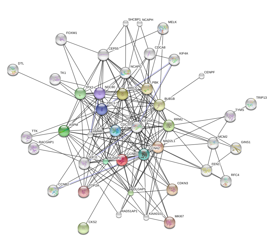
dat = read.table(file.path(DATA,"ccnb1datsmall.txt"), header = TRUE, comment.char = "", stringsAsFactors = TRUE)
v = levels(unlist(dat[,1:2]))        # vertex names
n = length(v)                        # number of vertices
e = matrix(match(as.character(unlist(dat[,1:2])), v),ncol=2) # edge list
w = dat$coexpression                 # edge weights
M is our co-expression network adjacency matrix. Since the STRING data only says if proteins i and j are co-expressed and doesn’t distinguish between (i,j) and (j,i) we want to make M symmetric (undirected) by considering the weight on (i,j) is the same as from (j,i). A is our co-expression graph adjacency matrix and we make \(A_{ij} = 1\) if they are coexpressed.
M = matrix(0, n, n)
M[e] = w
M = M + t(M)
dimnames(M) = list(v, v)
A = 1*(M > 0)
We use default plotting parameters and generate the graph using the package igraph starting with e, the vector of edges (an alternative is to use the adjacency matrix A).
Note: We use a seed to make the graph always look the same. Graph layout often contains an optimization with a random component that makes the picture look different, although the graph itself is the same.
library(igraph)
net = network(e, directed=FALSE)
par(mar=rep(0,4))
plot(net, label=v)
You could make a graph with ggraph.
Solution
We use defaults in making a heatmap except for changing the colors, you can experiment and add additional parameters.
breaks  =  c(0, seq(0.9, 1, length.out=11))
cols  =  grey(1-c(0,seq(0.5,1,length.out=10)))
ccnb1ind  =  which(v == "CCNB1")
vcols  =  rep("white",n)
vcols[ccnb1ind]  =  "blue"
vcols[which(M[,ccnb1ind]>0 | M[ccnb1ind,])]  =  "red"
par(mar = rep(0, 4))
heatmap(M, symm = TRUE, ColSideColors = vcols, RowSideColors = vcols,
        col = cols, breaks = breaks,  frame = TRUE)
legend("topleft", c("Neighbors(CCNB1)", "CCNB1"),
       fill = c("red","blue"),
       bty = "n", inset = 0, xpd = TRUE,  border = FALSE)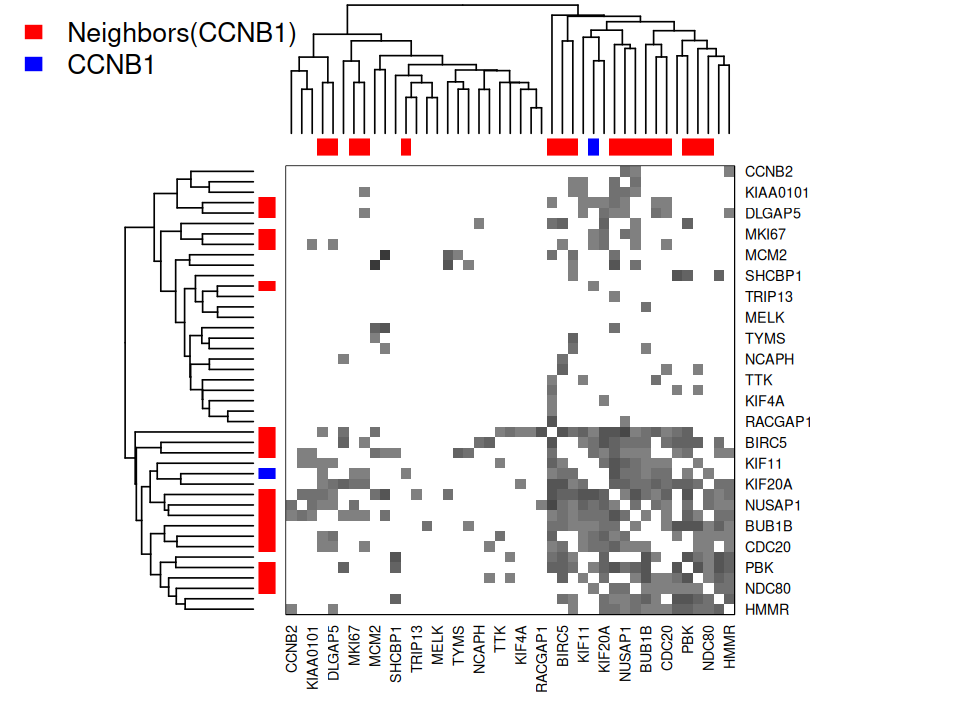
Solution
gt = graph_perm_test(ps1, "family_relationship", distance = "bray",
                     grouping = "host_subject_id", type = "knn", knn = 2)
gt$pval
[1] 0.002plot_test_network(gt)In chunk 'fig-knn-2-plot': Warning in fortify(data, ...): Arguments in `...` must be used.✖ Problematic argument:• layout = layoutℹ Did you misspell an argument name?
permdf = data.frame(perm=gt$perm)
obs = gt$observed
ymax = max(gt$perm)
ggplot(permdf, aes(x = perm)) + geom_histogram(bins = 20) +
  geom_segment(aes(x = obs, y = 0, xend = obs, yend = ymax/10), color = "red") +
  geom_point(aes(x = obs, y = ymax/10), color = "red") + xlab("Number of pure edges")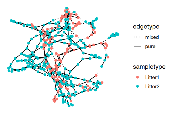
Page built at 21:15 on 2026-07-15 using R version 4.6.0 (2026-04-24)