set.seed(0xdada)
numFlips = 100
probHead = 0.6
coinFlips = sample(c("H", "T"), size = numFlips,
  replace = TRUE, prob = c(probHead, 1 - probHead))
head(coinFlips)
[1] "T" "T" "H" "T" "H" "H"
Hypothesis testing is one of the workhorses of science. It is how we can draw conclusions or make decisions based on finite samples of data. For instance, new treatments for a disease are usually approved on the basis of clinical trials that aim to decide whether the treatment has better efficacy compared to the other available options, and an acceptable trade-off of side effects. Such trials are expensive and can take a long time. Therefore, the number of patients we can enroll is limited, and we need to base our inference on a limited sample of observed patient responses. The data are noisy, since a patient’s response depends not only on the treatment, but on many other factors outside of our control. The sample size needs to be large enough to enable us to make a reliable conclusion. On the other hand, it also must not be too large, so that we do not waste precious resources or time, e.g., by making drugs more expensive than necessary, or by denying patients that would benefit from the new drug access to it. The machinery of hypothesis testing was developed largely with such applications in mind, although today it is used much more widely.
In biological data analysis (and in many other fields1) we see hypothesis testing applied to screen thousands or millions of possible hypotheses to find the ones that are worth following up. For instance, researchers screen genetic variants for associations with a phenotype, or gene expression levels for associations with disease. Here, “worthwhile” is often interpreted as “statistically significant”, although the two concepts are clearly not the same. It is probably fair to say that statistical significance is a necessary condition for making a data-driven decision to find something interesting, but it’s clearly not sufficient. In any case, such large-scale association screening is closely related to multiple hypothesis testing.
1 Detecting credit card fraud, email spam detection, \(...\)
In this chapter we will:
Familiarize ourselves with the statistical machinery of hypothesis testing, its vocabulary, its purpose, and its strengths and limitations.
Understand what multiple testing means.
See that multiple testing is not a problem – but rather, an opportunity, as it overcomes many of the limitations of single testing.
Understand the false discovery rate.
Learn how to make diagnostic plots.
Use hypothesis weighting to increase the power of our analyses.

If statistical testing—decision making with uncertainty—seems a hard task when making a single decision, then brace yourself: in genomics, or more generally with “big data”, we need to accomplish it not once, but thousands or millions of times. In Chapter 2, we saw the example of epitope detection and the challenges from considering not only one, but several positions. Similarly, in whole genome sequencing, we scan every position in the genome for evidence of a difference in the DNA sequencing data at hand and a reference sequence (or, another set of sequencing data): that’s in the order of six billion tests if we are looking at human data! In genetic or chemical compound screening, we test each of the reagents for an effect in the assay, compared to a control: that’s again tens of thousands, if not millions of tests. In Chapter 8, we will analyse RNA-Seq data for differential expression by applying a hypothesis test to each of the thousands of genes assayed.
Suppose we measured the abundance level of a marker molecule to decide whether some cells we are studying are in cell state A or B. First, let’s consider that we have no prior assumption, and that we just want to use the data to make a more or less symmetric choice between the two outcomes. This is a classification task. We’ll cover classification in Chapter 12. In this chapter, we consider the asymmetric case: based on what we already know (we could call this our prior knowledge), cell state A is predominant, the “default”. We’ll only call B if there is strong enough evidence for it. Maybe B is rare, unusual, interesting, and if we find it, we are going to commit resources to study it further. Whereas A is uninteresting and demands no further follow-up. In such cases, the machinery of hypothesis testing is for us.
Formally, there are many similarities between hypothesis testing and classification. In both cases, we aim to use data to choose between several possible decisions. The distinction can be a fuzzy, and it is even possible to think of hypothesis testing as a special case of classification. However, these two approaches are geared towards different objectives and underlying assumptions. When you encounter a statistical decision problem, it can be useful to check which approach is more appropriate.
Hypothesis testing has traditionally been taught with p-values first, introducing them as the primal, basic concept. Multiple testing and false discovery rates were then presented as derived, additional ideas. There are good mathematical and practical reasons for doing so, and the rest of this chapter follows this tradition. However, in this prefacing section we would like to point out that the false discovery rate is in fact the more intuitive concept, and that it also tends to be more useful in practice. A p-value is something more abstract, and it is often not quite clear what to do with it, and thus keeps confusing those who want to use it for decision making. So here is an attempt to be more pedagogical, revert the order, and learn about false discovery rates first. We can then think of p-values as something second-best, which we have to resort to if the false discovery rate is not accessible.
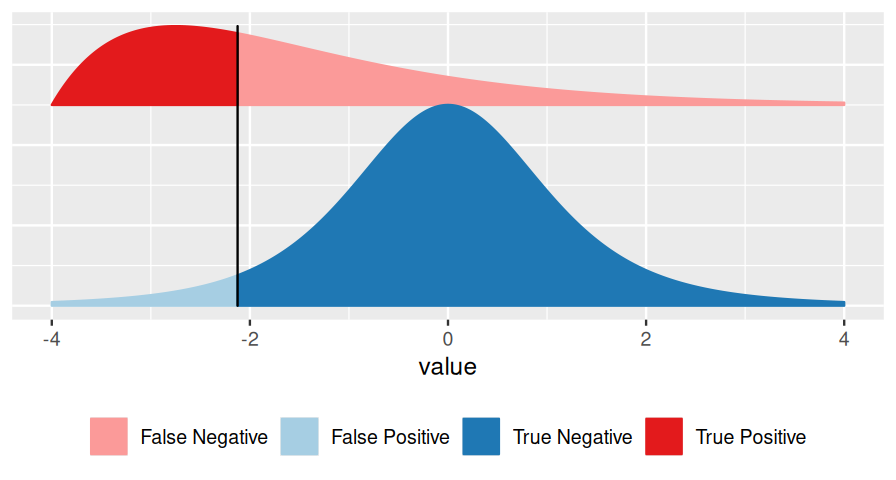
Consider Figure 6.2, which represents a binary decision problem. Let’s say we call a discovery whenever the summary statistic \(x\) is particularly small, i.e., when it falls to the left of the vertical black bar2. Then the false discovery rate3 (FDR) is simply the fraction of false discoveries among all discoveries, i.e.:
2 This is “without loss of generality”: we could also flip the \(x\)-axis and call something with a high score a discovery.
3 This is a rather informal definition. For more precise definitions, see for instance (Storey 2003; Efron 2010) and Section 6.10.
\[ \text{FDR}=\frac{\text{area shaded in light blue}}{\text{sum of the areas left of the vertical bar (light blue + strong red)}}. \tag{6.1}\]
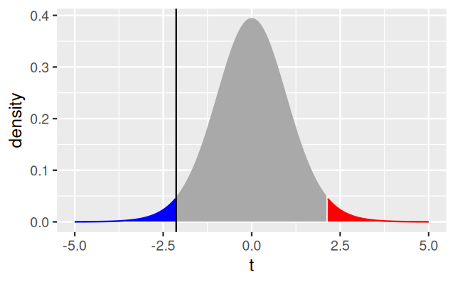
The FDR depends not only on the position of the decision threshold (the vertical bar), but also on the shape and location of the two distributions, and on their relative sizes. In Figures 6.2 and 6.3, the overall blue area is twice as big as the overall red area, reflecting the fact that the blue class is (in this example) twice as prevalent (or: a priori, twice as likely) as the red class.
Note that this definition does not require the concept or even the calculation of a p-value. It works for any arbitrarily defined score \(x\). However, it requires knowledge of three things:
the distribution of \(x\) in the blue class (the blue curve),
the distribution of \(x\) in the red class (the red curve),
the relative sizes of the blue and the red classes.
If we know these, then we are basically done at this point; or we can move on to supervised classification in Chapter 12, which deals with the extension of Figure 6.2 to multivariate \(x\).
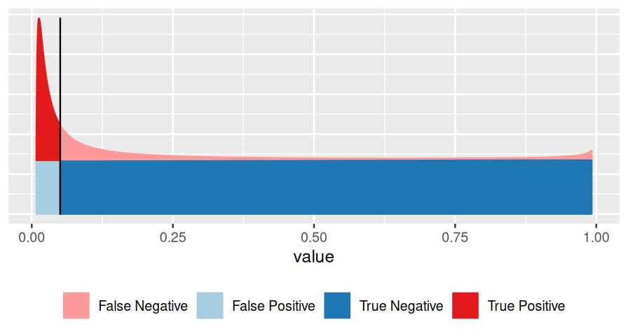
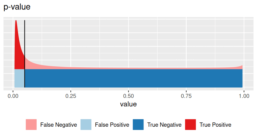
Very often, however, we do not know all of these, and this is the realm of hypothesis testing. In particular, suppose that one of the two classes (say, the blue one) is easier than the other, and we can figure out its distribution, either from first principles or simulations. We use that fact to transform our score \(x\) to a standardized range between 0 and 1 (see Figures 6.2—6.4), which we call the p-value. We give the class a fancier name: null hypothesis. This addresses Point 1 in the above list. We do not insist on knowing Point 2 (and we give another fancy name, alternative hypothesis, to the red class). As for Point 3, we can use the conservative upper limit that the null hypothesis is far more prevalent (or: likely) than the alternative and do our calculations under the condition that the null hypothesis is true. This is the traditional approach to hypothesis testing.
Thus, instead of basing our decision-making on the intuitive FDR (Equation 6.2), we base it on the
\[ \text{p-value}=\frac{\text{area shaded in light blue}}{\text{overall blue area}}. \tag{6.2}\]
In other words, the p-value is the precise and often relatively easy-to-compute answer to a rather convoluted question (and perhaps the wrong question). The FDR answers the right question, but requires a lot more input, which we often do not have.
Here is the good news about multiple testing: even if we do not know Items 2 and 3 from the bullet list above explicitly for our tests (and perhaps even if we are unsure about Point 1 (Efron 2010)), we may be able to infer this information from the multiplicity—and thus convert p-values into estimates of the FDR!
Thus, multiple testing tends to make our inference better, and our task simpler. Since we have so much data, we do not only have to rely on abstract assumptions. We can check empirically whether the requirements of the tests are actually met by the data. All this can be incredibly helpful, and we get it because of the multiplicity. So we should think about multiple testing not as a “problem” or a “burden”, but as an opportunity!
So now let’s dive into hypothesis testing, starting with single testing. To really understand the mechanics, we use one of the simplest possible examples: suppose we are flipping a coin to see if it is fair4. We flip the coin 100 times and each time record whether it came up heads or tails. So, we have a record that could look something like this:
4 We don’t look at coin tossing because it’s inherently important, but because it is an easy “model system” (just as we use model systems in biology): everything can be calculated easily, and you do not need a lot of domain knowledge to understand what coin tossing is. All the important concepts come up, and we can apply them, only with more additional details, to other applications.
which we can simulate in R. Let’s assume we are flipping a biased coin, so we set probHead different from 1/2:
set.seed(0xdada)
numFlips = 100
probHead = 0.6
coinFlips = sample(c("H", "T"), size = numFlips,
replace = TRUE, prob = c(probHead, 1 - probHead))
head(coinFlips)[1] "T" "T" "H" "T" "H" "H"Now, if the coin were fair, we would expect half of the time to get heads. Let’s see.
table(coinFlips)coinFlips
H T
59 41 So that is different from 50/50. Suppose we showed the data to a friend without telling them whether the coin is fair, and their prior assumption, i.e., their null hypothesis, is that coins are, by and large, fair. Would the data be strong enough to make them conclude that this coin isn’t fair? They know that random sampling differences are to be expected. To decide, let’s look at the sampling distribution of our test statistic – the total number of heads seen in 100 coin tosses – for a fair coin5. As we saw in Chapter 1, the number, \(k\), of heads, in \(n\) independent tosses of a coin is
5 We haven’t really defined what we mean be fair – a reasonable definition would be that head and tail are equally likely, and that the outcome of each coin toss does not depend on the previous ones. For more complex applications, nailing down the most suitable null hypothesis can take some thought.
\[ P(K=k\,|\,n, p) = \left(\begin{array}{c}n\\k\end{array}\right) p^k\;(1-p)^{n-k}, \tag{6.3}\]
where \(p\) is the probability of heads (0.5 if we assume a fair coin). We read the left hand side of the above equation as “the probability that the observed value for \(K\) is \(k\), given the values of \(n\) and \(p\)”. Statisticians like to make a difference between all the possible values of a statistic and the one that was observed6, and we use the upper case \(K\) for the possible values (so \(K\) can be anything between 0 and 100), and the lower case \(k\) for the observed value.
6 In other words, \(K\) is the abstract random variable in our probabilistic model, whereas \(k\) is its realization, that is, a specific data point.
We plot Equation 6.3 in Figure 6.5; for good measure, we also mark the observed value numHeads with a vertical blue line.
library("dplyr")
k = 0:numFlips
numHeads = sum(coinFlips == "H")
binomDensity = tibble(k = k,
p = dbinom(k, size = numFlips, prob = 0.5))library("ggplot2")
ggplot(binomDensity) +
geom_bar(aes(x = k, y = p), stat = "identity") +
geom_vline(xintercept = numHeads, col = "blue")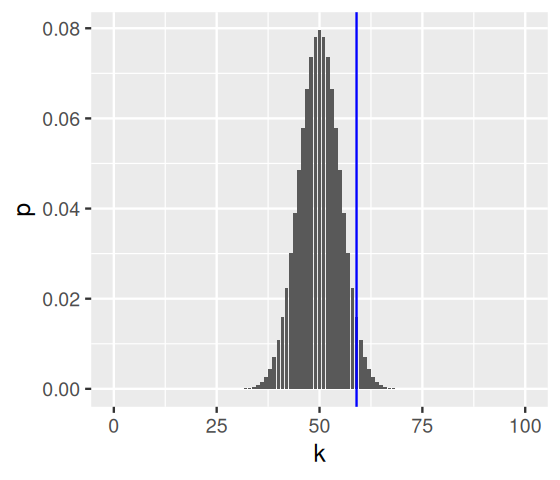
Suppose we didn’t know about Equation 6.3. We can still use Monte Carlo simulation to give us something to compare with:
numSimulations = 10000
outcome = replicate(numSimulations, {
  coinFlips = sample(c("H", "T"), size = numFlips,
                     replace = TRUE, prob = c(0.5, 0.5))
  sum(coinFlips == "H")
})
ggplot(tibble(outcome)) + xlim(-0.5, 100.5) +
  geom_histogram(aes(x = outcome), binwidth = 1, center = 50) +
  geom_vline(xintercept = numHeads, col = "blue")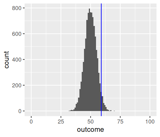
As expected, the most likely number of heads is 50, that is, half the number of coin flips. But we see that other numbers near 50 are also quite likely. How do we quantify whether the observed value, 59, is among those values that we are likely to see from a fair coin, or whether its deviation from the expected value is already large enough for us to conclude with enough confidence that the coin is biased? We divide the set of all possible \(k\) (0 to 100) in two complementary subsets, the rejection region and the region of no rejection. Our choice here7 is to fill up the rejection region with as many \(k\) as possible while keeping their total probability, assuming the null hypothesis, below some threshold \(\alpha\) (say, 0.05).
7 More on this in Section 6.3.1.
In the code below, we use the function arrange from the dplyr package to sort the p-values from lowest to highest, then pass the result to mutate, which adds another dataframe column reject that is defined by computing the cumulative sum (cumsum) of the p-values and thresholding it against alpha. The logical vector reject therefore marks with TRUE a set of ks whose total probability is less than alpha. These are marked in Figure 6.7, and we can see that our rejection region is not contiguous – it comprises both the very large and the very small values of k.
library("dplyr")
alpha = 0.05
binomDensity = arrange(binomDensity, p) |>
        mutate(reject = (cumsum(p) <= alpha))

ggplot(binomDensity) +
  geom_bar(aes(x = k, y = p, col = reject), stat = "identity") +
  scale_colour_manual(
    values = c(`TRUE` = "red", `FALSE` = "darkgrey")) +
  geom_vline(xintercept = numHeads, col = "blue") +
  theme(legend.position = "none")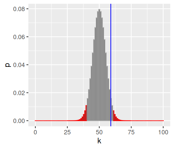
The explicit summation over the probabilities is clumsy, we did it here for pedagogic value. For one-dimensional distributions, R provides not only functions for the densities (e.g., dbinom) but also for the cumulative distribution functions (pbinom), which are more precise and faster than cumsum over the probabilities. These should be used in practice.
We see in Figure 6.7 that the observed value, 59, lies in the grey shaded area, so we would not reject the null hypothesis of a fair coin from these data at a significance level of \(\alpha=0.05\).
We have just gone through the steps of a binomial test. In fact, this is such a frequent activity in R that it has been wrapped into a single function, and we can compare its output to our results.
binom.test(x = numHeads, n = numFlips, p = 0.5)
    Exact binomial test

data:  numHeads and numFlips
number of successes = 59, number of trials = 100, p-value = 0.08863
alternative hypothesis: true probability of success is not equal to 0.5
95 percent confidence interval:
 0.4871442 0.6873800
sample estimates:
probability of success
0.59 Let’s summarise the general principles of hypothesis testing:
Decide on the effect that you are interested in, design a suitable experiment or study, pick a data summary function and test statistic.
Set up a null hypothesis, which is a simple, computationally tractable model of reality that lets you compute the null distribution, i.e., the possible outcomes of the test statistic and their probabilities under the assumption that the null hypothesis is true.
Decide on the rejection region, i.e., a subset of possible outcomes whose total probability is small8.
Do the experiment and collect the data9; compute the test statistic.
Make a decision: reject the null hypothesis10 if the test statistic is in the rejection region.
8 More on this in Section 6.3.1.
9 Or if someone else has already done it, download their data.
10 That is, conclude that it is unlikely to be true.
Note how in this idealized workflow, we make all the important decisions in Steps 1–3 before we have even seen the data. As we already alluded to in the Introduction (Figures 1 and 2), this is often not realistic. We will also come back to this question in Section 6.6.
There was also idealization in our null hypothesis that we used in the example above: we postulated that a fair coin should have a probability of exactly 0.5 (not, say, 0.500001) and that there should be absolutely no dependence between tosses. We did not worry about any possible effects of air drag, elasticity of the material on which the coin falls, and so on. This gave us the advantage that the null hypothesis was computationally tractable, namely, with the binomial distribution. Here, these idealizations may not seem very controversial, but in other situations the trade-off between how tractable and how realistic a null hypothesis is can be more substantial. The problem is that if a null hypothesis is too idealized to start with, rejecting it is not all that interesting. The result may be misleading, and certainly we are wasting our time.
The test statistic in our example was the total number of heads. Suppose we observed 50 tails in a row, and then 50 heads in a row. Our test statistic ignores the order of the outcomes, and we would conclude that this is a perfectly fair coin. However, if we used a different test statistic, say, the number of times we see two tails in a row, we might notice that there is something funny about this coin.
What we have just done is look at two different classes of alternative hypotheses. The first class of alternatives was that subsequent coin tosses are still independent of each other, but that the probability of heads differed from 0.5. The second one was that the overall probability of heads may still be 0.5, but that subsequent coin tosses were correlated.
So let’s remember that we typically have multiple possible choices of test statistic (in principle it could be any numerical summary of the data). Making the right choice is important for getting a test with good power11. What the right choice is will depend on what kind of alternatives we expect. This is not always easy to know in advance.
11 See Section 1.4.1 and 6.4.
12 The assumptions don’t need to be exactly true – it is sufficient that the theory’s predictions are an acceptable approximation of the truth.
Once we have chosen the test statistic we need to compute its null distribution. You can do this either with pencil and paper or by computer simulations. A pencil and paper solution is parametric and leads to a closed form mathematical expression (like Equation 6.3), which has the advantage that it holds for a range of model parameters of the null hypothesis (such as \(n\), \(p\)). It can also be quickly computed for any specific set of parameters. But it is not always as easy as in the coin tossing example. Sometimes a pencil and paper solution is impossibly difficult to compute. At other times, it may require simplifying assumptions. An example is a null distribution for the \(t\)-statistic (which we will see later in this chapter). We can compute this if we assume that the data are independent and normally distributed: the result is called the \(t\)-distribution. Such modelling assumptions may be more or less realistic. Simulating the null distribution offers a potentially more accurate, more realistic and perhaps even more intuitive approach. The drawback of simulating is that it can take a rather long time, and we need extra work to get a systematic understanding of how varying parameters influence the result. Generally, it is more elegant to use the parametric theory when it applies12. When you are in doubt, simulate – or do both.
How to choose the right rejection region for your test? First, what should its size be? That is your choice of the significance level or false positive rate \(\alpha\), which is the total probability of the test statistic falling into this region even if the null hypothesis is true13.
13 Some people at some point in time for a particular set of questions colluded on \(\alpha=0.05\) as being “small”. But there is nothing special about this number, and in any particular case the best choice for a decision threshold may very much depend on context (Wasserstein and Lazar 2016; Altman and Krzywinski 2017).
Given the size, the next question is about its shape. For any given size, there are usually multiple possible shapes. It makes sense to require that the probability of the test statistic falling into the rejection region is as large possible if the alternative hypothesis is true. In other words, we want our test to have high power, or true positive rate.
The criterion that we used in the code for computing the rejection region for Figure 6.7 was to make the region contain as many k as possible. That is because in absence of any information about the alternative distribution, one k is as good as any other, and we maximize their total number.
A consequence of this is that in Figure 6.7 the rejection region is split between the two tails of the distribution. This is because we anticipate that unfair coins could have a bias either towards head or toward tail; we don’t know. If we did know, we would instead concentrate our rejection region all on the appropriate side, e.g., the right tail if we think the bias would be towards head. Such choices are also referred to as two-sided and one-sided tests. More generally, if we have assumptions about the alternative distribution, this can influence our choice of the shape of the rejection region.
Having set out the mechanics of testing, we can assess how well we are doing. Table 6.1 compares reality (whether or not the null hypothesis is in fact true) with our decision whether or not to reject the null hypothesis after we have seen the data.
| Test vs reality | Null hypothesis is true | \(...\) is false |
|---|---|---|
| Reject null hypothesis | Type I error (false positive) | True positive |
| Do not reject | True negative | Type II error (false negative) |
It is always possible to reduce one of the two error types at the cost of increasing the other one. The real challenge is to find an acceptable trade-off between both of them. This is exemplified in Figure 6.2. We can always decrease the false positive rate (FPR) by shifting the threshold to the right. We can become more “conservative”. But this happens at the price of higher false negative rate (FNR). Analogously, we can decrease the FNR by shifting the threshold to the left. But then again, this happens at the price of higher FPR. A bit on terminology: the FPR is the same as the probability \(\alpha\) that we mentioned above. \(1 - \alpha\) is also called the specificity of a test. The FNR is sometimes also called \(\beta\), and \(1 - \beta\) the power, sensitivity or true positive rate of a test.
Many experimental measurements are reported as rational numbers, and the simplest comparison we can make is between two groups, say, cells treated with a substance compared to cells that are not. The basic test for such situations is the \(t\)-test. The test statistic is defined as
\[ t = c \; \frac{m_1-m_2}{s}, \tag{6.4}\]
where \(m_1\) and \(m_2\) are the mean of the values in the two groups, \(s\) is the pooled standard deviation and \(c\) is a constant that depends on the sample sizes, i.e., the numbers of observations \(n_1\) and \(n_2\) in the two groups. In formulas14,
14 Everyone should try to remember Equation 6.4, whereas many people get by with looking up Equation 6.5 when they need it.
\[ \begin{align} m_g &= \frac{1}{n_g} \sum_{i=1}^{n_g} x_{g, i} \quad\quad\quad g=1,2\\ s^2 &= \frac{1}{n_1+n_2-2} \left( \sum_{i=1}^{n_1} \left(x_{1,i} - m_1\right)^2 + \sum_{j=1}^{n_2} \left(x_{2,j} - m_2\right)^2 \right)\\ c &= \sqrt{\frac{n_1n_2}{n_1+n_2}} \end{align} \tag{6.5}\]
where \(x_{g, i}\) is the \(i^{\text{th}}\) data point in the \(g^{\text{th}}\) group. Let’s try this out with the PlantGrowth data from R’s datasets package.
library("ggbeeswarm")
data("PlantGrowth")
ggplot(PlantGrowth, aes(y = weight, x = group, col = group)) +
  geom_beeswarm() + theme(legend.position = "none")
tt = with(PlantGrowth,
       t.test(weight[group =="ctrl"],
              weight[group =="trt2"],
              var.equal = TRUE))
tt
    Two Sample t-test

data:  weight[group == "ctrl"] and weight[group == "trt2"]
t = -2.134, df = 18, p-value = 0.04685
alternative hypothesis: true difference in means is not equal to 0
95 percent confidence interval:
 -0.980338117 -0.007661883
sample estimates:
mean of x mean of y
5.032 5.526 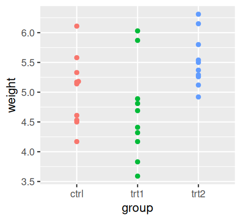
PlantGrowth data.
To compute the p-value, the t.test function uses the asymptotic theory for the \(t\)-statistic Equation 6.4; this theory states that under the null hypothesis of equal means in both groups, the statistic follows a known, mathematical distribution, the so-called \(t\)-distribution with \(n_1+n_2-2\) degrees of freedom. The theory uses additional technical assumptions, namely that the data are independent and come from a normal distribution with the same standard deviation. We could be worried about these assumptions. Clearly they do not hold: weights are always positive, while the normal distribution extends over the whole real axis. The question is whether this deviation from the theoretical assumption makes a real difference. We can use a permutation test to figure this out (we will discuss the idea behind permutation tests in a bit more detail in Section 6.5.1).
plgr = dplyr::filter(PlantGrowth, group %in% c("ctrl", "trt2"))

alpha  = 0.05
xrange = 5 * c(-1, 1)
deckel = function(x) ifelse(x < xrange[1], xrange[1], ifelse(x > xrange[2], xrange[2], x))

sim_null = tibble(
  t = replicate(10000, t.test(weight ~ sample(group), var.equal = TRUE, data = plgr)$statistic)
)
sim_thresh = quantile(sim_null$t, c(alpha/2, 1-alpha/2))
sim_null = mutate(sim_null,
  t = deckel(t),        # avoid warnings about out of range data
  reject = ifelse(t <= sim_thresh[1], "low", ifelse(t > sim_thresh[2], "high", "none"))
)

theo_thresh = qt(c(alpha/2, 1-alpha/2), df =  nrow(plgr) - 2)
theo_null = tibble(
  t = seq(-5, 5, by = 0.05),
  density = dt (x = t, df = nrow(plgr)  - 2),
  reject = ifelse(t <= theo_thresh[1], "low", ifelse(t > theo_thresh[2], "high", "none"))
)

p1 = ggplot(sim_null, aes(x = t, col = reject, fill = reject)) +
       geom_bar(stat = "bin", breaks = seq(-5, 5, by = 0.2))
p2 = ggplot(theo_null, aes(x = t, y = density, col = reject, fill = reject)) +
       geom_area()

for (p in list(p1, p2))
  print(p +
        geom_vline(xintercept = tt$statistic, col = "#101010") +
        scale_colour_manual(values = c(low = "blue", high = "red", none = "darkgrey")) +
        scale_fill_manual(values = c(low = "blue", high = "red", none = "darkgrey")) +
        xlim(xrange) + theme(legend.position = "none"))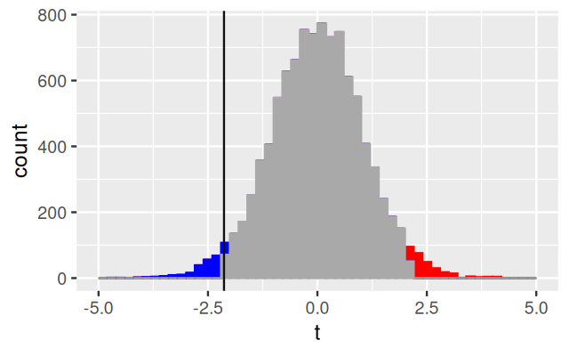
The \(t\)-test comes in multiple flavors, all of which can be chosen through parameters of the t.test function. What we did above is called a two-sided two-sample unpaired test with equal variance. Two-sided refers to the fact that we were open to reject the null hypothesis if the weight of the treated plants was either larger or smaller than that of the untreated ones.
Two-sample15 indicates that we compared the means of two groups to each other; another option is to compare the mean of one group against a given, fixed number.
15 It can be confusing that the term sample has a different meaning in statistics than in biology. In biology, a sample is a single specimen on which an assay is performed; in statistics, it is a set of measurements, e.g., the \(n_1\)-tuple \(\left(x_{1,1},...,x_{1,n_1}\right)\) in Equation 6.5, which can comprise several biological samples. In contexts where this double meaning might create confusion, we refer to the data from a single biological sample as an observation.
Unpaired means that there was no direct 1:1 mapping between the measurements in the two groups. If, on the other hand, the data had been measured on the same plants before and after treatment, then a paired test would be more appropriate, as it looks at the change of weight within each plant, rather than their absolute weights.
Equal variance refers to the way the statistic Equation 6.4 is calculated. That expression is most appropriate if the variances within each group are about the same. If they are very different, an alternative form (Welch’s \(t\)-test) and associated asymptotic theory exist.
The independence assumption. Now let’s try something peculiar: duplicate the data.
with(rbind(PlantGrowth, PlantGrowth),
       t.test(weight[group == "ctrl"],
              weight[group == "trt2"],
              var.equal = TRUE))
    Two Sample t-test

data:  weight[group == "ctrl"] and weight[group == "trt2"]
t = -3.1007, df = 38, p-value = 0.003629
alternative hypothesis: true difference in means is not equal to 0
95 percent confidence interval:
 -0.8165284 -0.1714716
sample estimates:
mean of x mean of y
    5.032     5.526
Note how the estimates of the group means (and thus, of the difference) are unchanged, but the p-value is now much smaller! We can conclude two things from this:
The power of the \(t\)-test depends on the sample size. Even if the underlying biological differences are the same, a dataset with more observations tends to give more significant results16.
The assumption of independence between the measurements is really important. Blatant duplication of the same data is an extreme form of dependence, but to some extent the same thing happens if you mix up different levels of replication. For instance, suppose you had data from 8 plants, but measured the same thing twice on each plant (technical replicates), then pretending that these are now 16 independent measurements is wrong.
16 You can also see this from the way the numbers \(n_1\) and \(n_2\) appear in Equation 6.5.
What happened above when we contrasted the outcome of the parametric \(t\)-test with that of the permutation test applied to the \(t\)-statistic? It’s important to realize that these are two different tests, and the similarity of their outcomes is desirable, but coincidental. In the parametric test, the null distribution of the \(t\)-statistic follows from the assumed null distribution of the data, a multivariate normal distribution with unit covariance in the \((n_1+n_2)\)-dimensional space \(\mathbb{R}^{n_1+n_2}\), and is continuous: the \(t\)-distribution. In contrast, the permutation distribution of our test statistic is discrete, as it is obtained from the finite set of \((n_1+n_2)!\) permutations17 of the observation labels, from a single instance of the data (the \(n_1+n_2\) observations). All we assume here is that under the null hypothesis, the variables \(X_{1,1},...,X_{1,n_1},X_{2,1},...,X_{2,n_2}\) are exchangeable. Logically, this assumption is implied by that of the parametric test, but is weaker. The permutation test employs the \(t\)-statistic, but not the \(t\)-distribution (nor the normal distribution). The fact that the two tests gave us a very similar result is a consequence of the Central Limit Theorem.
17 Or a random subset, in case we want to save computation time.
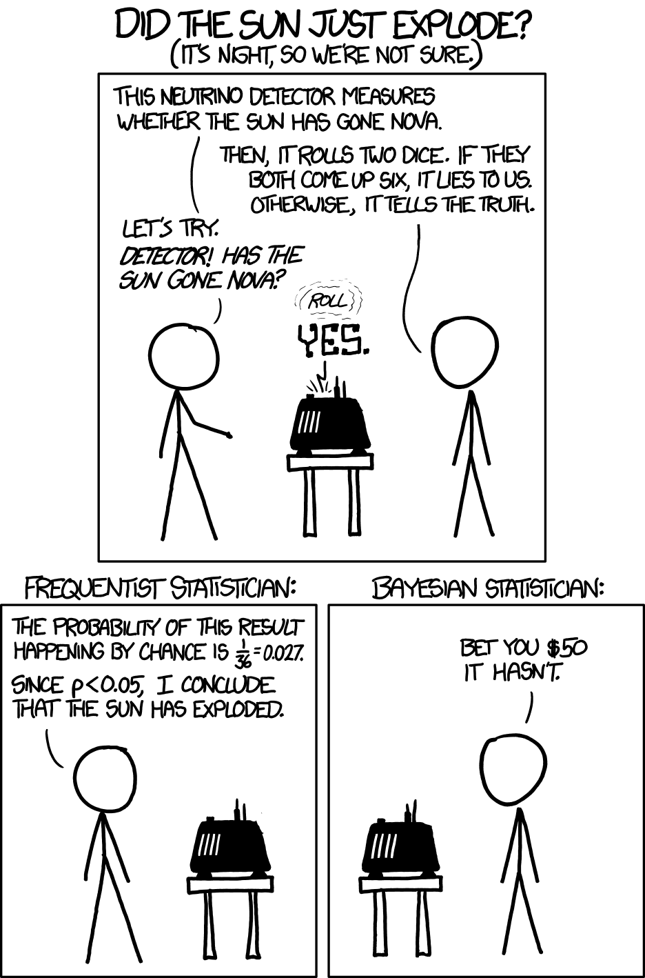
Let’s go back to the coin tossing example. We did not reject the null hypothesis (that the coin is fair) at a level of 5%—even though we “knew” that it is unfair. After all, probHead was chosen as 0.6 in Section 6.2. Let’s suppose we now start looking at different test statistics. Perhaps the number of consecutive series of 3 or more heads. Or the number of heads in the first 50 coin flips. And so on. At some point we will find a test that happens to result in a small p-value, even if just by chance (after all, the probability for the p-value to be less than 0.05 under the null hypothesis—fair coin—is one in twenty). We just did what is called p-value hacking18 (Head et al. 2015). You see what the problem is: in our zeal to prove our point we tortured the data until some statistic did what we wanted. A related tactic is hypothesis switching or HARKing – hypothesizing after the results are known: we have a dataset, maybe we have invested a lot of time and money into assembling it, so we need results. We come up with lots of different null hypotheses and test statistics, test them, and iterate, until we can report something.
These tactics violate the rules of hypothesis testing, as described in Section 6.3, where we laid out one sequential procedure of choosing the hypothesis and the test, and then collecting the data. But, as we saw in Chapter 2, such tactics can be tempting in reality. With biological data, we tend to have so many different choices for “normalising” the data, transforming the data, trying to adjust for batch effects, removing outliers, …. The topic is complex and open-ended. Wasserstein and Lazar (2016) give a readable short summary of the problems with how p-values are used in science, and of some of the misconceptions. They also highlight how p-values can be fruitfully used. The essential message is: be completely transparent about your data, what analyses were tried, and how they were done. Provide the analysis code. Only with such contextual information can a p-value be useful.
Avoid fallacy. Keep in mind that our statistical test is never attempting to prove our null hypothesis is true - we are simply saying whether or not there is evidence for it to be false. If a high p-value were indicative of the truth of the null hypothesis, we could formulate a completely crazy null hypothesis, do an utterly irrelevant experiment, collect a small amount of inconclusive data, find a p-value that would just be a random number between 0 and 1 (and so with some high probability above our threshold \(\alpha\)) and, whoosh, our hypothesis would be demonstrated!
The quandary illustrated in the cartoon occurs with high-throughput data in biology. And with force! You will be dealing not only with 20 colors of jellybeans, but, say, with 20,000 genes that were tested for differential expression between two conditions, or with 6 billion positions in the genome where a DNA mutation might have happened. So how do we deal with this? Let’s look again at our table relating statistical test results with reality (Table 6.1), this time framing everything in terms of many hypotheses.
| Test vs reality | Null hypothesis is true | \(...\) is false | Total |
|---|---|---|---|
| Rejected | \(V\) | \(S\) | \(R\) |
| Not rejected | \(U\) | \(T\) | \(m-R\) |
| Total | \(m_0\) | \(m-m_0\) | \(m\) |
\(m\): total number of tests (and null hypotheses)
\(m_0\): number of true null hypotheses
\(m-m_0\): number of false null hypotheses
\(V\): number of false positives (a measure of type I error)
\(T\): number of false negatives (a measure of type II error)
\(S\), \(U\): number of true positives and true negatives
\(R\): number of rejections
In the rest of this chapter, we look at different ways of taking care of the type I and II errors.
The family wise error rate (FWER) is the probability that \(V>0\), i.e., that we make one or more false positive errors. We can compute it as the complement of making no false positive errors at all19.
19 Assuming independence.
\[ \begin{align} P(V>0) &= 1 - P(\text{no rejection of any of $m_0$ nulls}) \\ &= 1 - (1 - \alpha)^{m_0} \to 1 \quad\text{as } m_0\to\infty. \end{align} \tag{6.6}\]
For any fixed \(\alpha\), this probability is appreciable as soon as \(m_0\) is in the order of \(1/\alpha\), and it tends towards 1 as \(m_0\) becomes larger. This relationship can have serious consequences for experiments like DNA matching, where a large database of potential matches is searched. For example, if there is a one in a million chance that the DNA profiles of two people match by random error, and your DNA is tested against a database of 800000 profiles, then the probability of a random hit with the database (i.e., without you being in it) is:
1 - (1 - 1/1e6)^8e5[1] 0.5506712That’s pretty high. And once the database contains a few million profiles more, a false hit is virtually unavoidable.
How are we to choose the per-hypothesis \(\alpha\) if we want FWER control? The above computations suggest that the product of \(\alpha\) with \(m_0\) may be a reasonable ballpark estimate. Usually we don’t know \(m_0\), but we know \(m\), which is an upper limit for \(m_0\), since \(m_0\le m\). The Bonferroni method is simply that if we want FWER control at level \(\alpha_{\text{FWER}}\), we should choose the per hypothesis threshold \(\alpha = \alpha_{\text{FWER}}/m\). Let’s check this out on an example.
m = 10000
ggplot(tibble(
  alpha = seq(0, 7e-6, length.out = 100),
  p     = 1 - (1 - alpha)^m),
  aes(x = alpha, y = p)) +  geom_line() +
  xlab(expression(alpha)) +
  ylab("Prob( no false rejection )") +
  geom_hline(yintercept = 0.05, col = "red")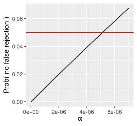
In Figure 6.11, the black line intersects the red line (which corresponds to a value of 0.05) at \(\alpha=5.13\times 10^{-6}\), which is just a little bit more than the value of \(0.05/m\) implied by the Bonferroni method.
A potential drawback of this method, however, is that if \(m_0\) is large, the rejection threshold is very small. This means that the individual tests need to be very powerful if we want to have any chance of detecting something. Often FWER control is too stringent, and would lead to an ineffective use of the time and money that was spent to generate and assemble the data. We will now see that there are more nuanced methods of controlling our type I error.
Let’s look at some data. We load up the RNA-Seq dataset airway, which contains gene expression measurements (gene-level counts) of four primary human airway smooth muscle cell lines with and without treatment with dexamethasone, a synthetic glucocorticoid. We’ll use the DESeq2 method that we’ll discuss in more detail in Chapter 8 For now it suffices to say that it performs a test for differential expression for each gene. Conceptually, the tested null hypothesis is similar to that of the \(t\)-test, although the details are slightly more involved since we are dealing with count data.
library("DESeq2")
library("airway")
data("airway")
aw   = DESeqDataSet(se = airway, design = ~ cell + dex)
aw   = DESeq(aw)
awde = as.data.frame(results(aw)) |> dplyr::filter(!is.na(pvalue))The p-value histogram is an important sanity check for any analysis that involves multiple tests. It is a mixture composed of two components:
null: the p-values resulting from the tests for which the null hypothesis is true.
alt: the p-values resulting from the tests for which the null hypothesis is not true. The relative size of these two components depends on the fraction of true nulls and true alternatives (i.e., on \(m_0\) and \(m\)), and it can often be visually estimated from the histogram. If our analysis has high statistical power, then the second component (“alt”) consists of mostly small p-values, i.e., appears as a peak near 0 in the histogram; if the power is not high for some of the alternatives, we expect that this peak extends towards the right, i.e., has a “shoulder”. For the “null” component, we expect (by definition of the p-value for continuous data and test statistics) a uniform distribution in \([0,1]\). Let’s plot the histogram of p-values for the airway data.
ggplot(awde, aes(x = pvalue)) +
  geom_histogram(binwidth = 0.025, boundary = 0)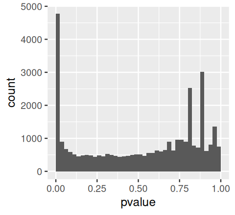
airway data.
In Figure 6.12 we see the expected mixture. We also see that the null component is not exactly flat (uniform): this is because the data are counts. While these appear quasi-continuous when high, for the tests with low counts the discreteness of the data and the resulting p-values shows up in the spikes towards the right of the histogram.
Now suppose we reject all tests with a p-value less than \(\alpha\). We can visually determine an estimate of the false discovery proportion with a plot such as in Figure 6.13, generated by the following code.
alpha = binw = 0.025
pi0 = 2 * mean(awde$pvalue > 0.5)
ggplot(awde,
  aes(x = pvalue)) + geom_histogram(binwidth = binw, boundary = 0) +
  geom_hline(yintercept = pi0 * binw * nrow(awde), col = "blue") +
  geom_vline(xintercept = alpha, col = "red")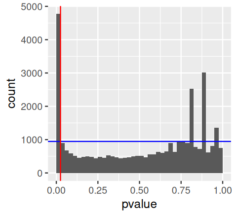
We see that there are 4772 p-values in the first bin \([0,\alpha]\), among which we expect around 945 to be nulls (as indicated by the blue line). Thus we can estimate the fraction of false rejections as
pi0 * alpha / mean(awde$pvalue <= alpha)[1] 0.1980092The false discovery rate (FDR) is defined as
\[ \text{FDR} = \text{E}\!\left [\frac{V}{\max(R, 1)}\right ], \tag{6.7}\]
where \(R\) and \(V\) are as in Table 6.2. The expression in the denominator makes sure that the FDR is well-defined even if \(R=0\) (in that case, \(V=0\) by implication). Note that the FDR becomes identical to the FWER if all null hypotheses are true, i.e., if \(V=R\). \(\text{E[ ]}\) stands for the expected value. That means that the FDR is not a quantity associated with a specific outcome of \(V\) and \(R\) for one particular experiment. Rather, given our choice of tests and associated rejection rules for them, it is the average20 proportion of type I errors out of the rejections made, where the average is taken (at least conceptually) over many replicate instances of the experiment.
20 Since the FDR is an expectation value, it does not provide worst case control: in any single experiment, the so-called false discovery proportion (FDP), that is the realized value \(v/r\) (without the \(\text{E[ ]}\)), could be much higher or lower.
There is a more elegant alternative to the “visual FDR” method of the last section. The procedure, introduced by Benjamini and Hochberg (1995) has these steps:
First, order the p-values in increasing order, \(p_{(1)} ... p_{(m)}\)
Then for some choice of \(\varphi\) (our target FDR), find the largest value of \(k\) that satisfies: \(p_{(k)} \leq \varphi \, k / m\)
Finally reject the hypotheses \(1, ..., k\)
We can see how this procedure works when applied to our RNA-Seq p-values through a simple graphical illustration:
phi  = 0.10
awde = mutate(awde, rank = rank(pvalue))
m    = nrow(awde)

ggplot(dplyr::filter(awde, rank <= 7000), aes(x = rank, y = pvalue)) +
  geom_line() + geom_abline(slope = phi / m, col = "red")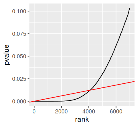
The method finds the rightmost point where the black (our p-values) and red lines (slope \(\varphi / m\)) intersect. Then it rejects all tests to the left.
kmax = with(arrange(awde, rank),
         last(which(pvalue <= phi * rank / m)))
kmax
[1] 4099Thirteen years before Benjamini and Hochberg (1995), Schweder and Spjøtvoll (1982) suggested a diagnostic plot of the observed \(p\)-values that permits estimation of the fraction of true null hypotheses. For a series of hypothesis tests \(H_1, ..., H_m\) with \(p\)-values \(p_i\), they suggested plotting
\[ \left( 1-p_i, N(p_i) \right) \mbox{ for } i \in 1, ..., m, \tag{6.8}\]
where \(N(p)\) is the number of \(p\)-values greater than \(p\). An application of this diagnostic plot to awde$pvalue is shown in Figure 6.15. When all null hypotheses are true, each of the \(p\)-values is uniformly distributed in \([0,1]\), Consequently, the empirical cumulative distribution of the sample \((p_1, ..., p_m)\) is expected to be close to the line \(F(t)=t\). By symmetry, the same applies to \((1 - p_1, ..., 1 - p_m)\). When (without loss of generality) the first \(m_0\) null hypotheses are true and the other \(m-m_0\) are false, the empirical cumulative distribution of \((1-p_1, ..., 1-p_{m_0})\) is again expected to be close to the line \(F_0(t)=t\). The empirical cumulative distribution of \((1-p_{m_0+1}, ..., 1-p_{m})\), on the other hand, is expected to be close to a function \(F_1(t)\) which stays below \(F_0\) but shows a steep increase towards 1 as \(t\) approaches \(1\). In practice, we do not know which of the null hypotheses are true, so we only observe a mixture whose empirical cumulative distribution is expected to be close to
\[ F(t) = \frac{m_0}{m} F_0(t) + \frac{m-m_0}{m} F_1(t). \tag{6.9}\]
Such a situation is shown in Figure 6.15. If \(F_1(t)/F_0(t)\) is small for small \(t\) (i.e., the tests have reasonable power), then the mixture fraction \(\frac{m_0}{m}\) can be estimated by fitting a line to the left-hand portion of the plot, and then noting its height on the right. Such a fit is shown by the red line. Here, we focus on those tests for which the count data are not all very small numbers (baseMean>=1), since for these the p-value null distribution is sufficiently close to uniform (i.e., does not show the discreteness mentioned above), but you could try the making the same plot on all of the genes.
awdef = awde |>
  dplyr::filter(baseMean >=1) |>
  arrange(pvalue) |>
  mutate(oneminusp = 1 - pvalue,
         N = n() - row_number())
jj = round(nrow(awdef) * c(1, 0.5))
slope = with(awdef, diff(N[jj]) / diff(oneminusp[jj]))
ggplot(awdef) +
  geom_point(aes(x = oneminusp, y = N), size = 0.15) +
  xlab(expression(1-p[i])) +
  ylab(expression(N(p[i]))) +
  geom_abline(intercept = 0, slope = slope, col = "red3") +
  geom_hline(yintercept = slope, linetype = "dotted") +
  geom_vline(xintercept = 1, linetype = "dotted") +
  geom_text(x = 0, y = slope, label = paste(round(slope)),
hjust = -0.1, vjust = -0.25) 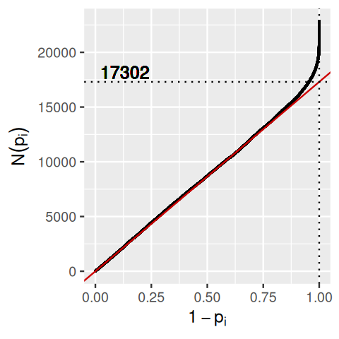
There are 22853 rows in awdef, thus, according to this simple estimate, there are 22853-17302=5551 alternative hypotheses.
While the xkcd cartoon in the chapter’s opening figure ends with a rather sinister interpretation of the multiple testing problem as a way to accumulate errors, Figure 6.16 highlights the multiple testing opportunity: when we do many tests, we can use the multiplicity to increase our understanding beyond what’s possible with a single test.
Let’s get back to the histogram in Figure 6.13. Conceptually, we can think of it in terms of the so-called two-groups model (Efron 2010):
\[ f(p)= \pi_0 + (1-\pi_0) f_{\text{alt}}(p), \tag{6.10}\]
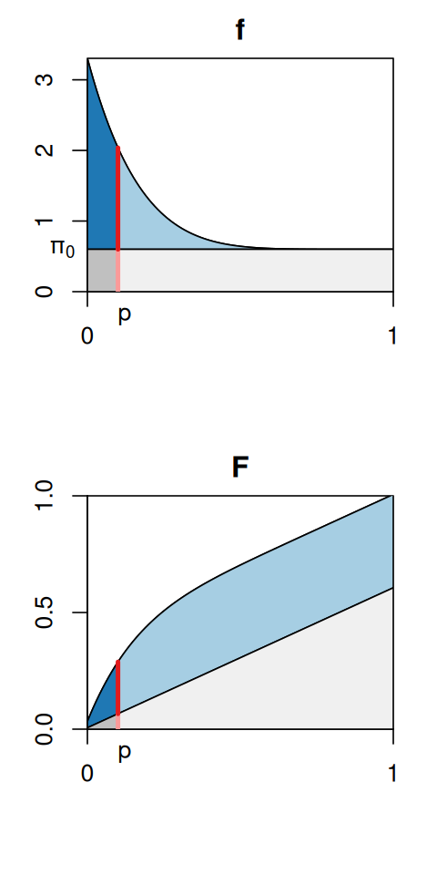
Here, \(f(p)\) is the density of the distribution (what the histogram would look like with an infinite amount of data and infinitely small bins), \(\pi_0\) is a number between 0 and 1 that represents the size of the uniform component, and \(f_{\text{alt}}\) is the alternative component. This is a mixture model, as we already saw in Chapter 4. The mixture densities and the marginal density \(f(p)\) are visualized in the upper panel of Figure 6.17: the blue areas together correspond to the graph of \(f_{\text{alt}}(p)\), the grey areas to that of \(f_{\text{null}}(p) = \pi_0\). If we now consider one particular cutoff \(p\) (say, \(p=0.1\) as in Figure 6.17), then we can compute the probability that a hypothesis that we reject at this cutoff is a false positive, as follows. We decompose the value of \(f\) at the cutoff (red line) into the contribution from the nulls (light red, \(\pi_0\)) and from the alternatives (darker red, \((1-\pi_0) f_{\text{alt}}(p)\)). The local false discovery rate is then
\[ \text{fdr}(p) = \frac{\pi_0}{f(p)}. \tag{6.11}\]
By definition this quantity is between 0 and 1. Note how the \(\text{fdr}\) in Figure 6.17 is a monotonically increasing function of \(p\), and this goes with our intuition that the fdr should be lowest for the smallest \(p\) and then gradually get larger, until it reaches 1 at the very right end. We can make a similar decomposition not only for the red line, but also for the area under the curve. This is
\[ F(p) = \int_0^p f(t)\,dt, \tag{6.12}\]
and the ratio of the dark grey area (that is, \(\pi_0\) times \(p\)) to the overall area \(F(p)\) is the tail area false discovery rate (Fdr21),
21 The convention is to use the lower case abbreviation fdr for the local, and the abbreviation Fdr for the tail-area false discovery rate in the context of the two-groups model Equation 6.10. The abbreviation FDR is used for the original definition Equation 6.7, which is a bit more general, namely, it does not depend on the modelling assumptions of Equation 6.10.
\[ \text{Fdr}(p) = \frac{\pi_0\,p}{F(p)}. \tag{6.13}\]
We’ll use the data version of \(F\) for diagnostics in Figure 6.21.
The packages qvalue and fdrtool offer facilities to fit these models to data.
library("fdrtool")
ft = fdrtool(awde$pvalue, statistic = "pvalue")
In fdrtool, what we called \(\pi_0\) above is called eta0:
ft$param[,"eta0"] eta0
0.8822922 The FDR (or the Fdr) is a set property. It is a single number that applies to a whole set of rejections made in the course of a multiple testing analysis. In contrast, the fdr is a local property. It applies to an individual hypothesis. Recall Figure 6.17, where the fdr was computed for each point along the \(x\)-axis of the density plot, whereas the Fdr depends on the areas to the left of the red line.
Historically, the terms multiple testing correction and adjusted p-value have been used for process and output. In the context of false discovery rates, these terms are not helpful, if not confusing. We advocate avoiding them. They imply that we start out with a set of p-values \((p_1,...,p_m)\), apply some canonical procedure, and obtain a set of “corrected” or “adjusted” p-values \((p_1^{\text{adj}},...,p_m^{\text{adj}})\). However, the output of the Benjamini-Hochberg method is not p-values, and neither are the FDR, Fdr or the fdr. Remember that FDR and Fdr are set properties, and associating them with an individual test makes as much sense as confusing average and marginal costs. Fdr and fdr also depend on a substantial amount of modelling assumptions. In the next session, you will also see that the method of Benjamini-Hochberg is not the only game in town, and that there are important and useful extensions, which further displace any putative direct correspondence between the set of hypotheses and p-values that are input into a multiple testing procedure, and its outputs.
The Benjamini-Hochberg method and the two-groups model, as we have seen them so far, implicitly assume exchangeability of the hypotheses: all we use are the p-values. Beyond these, we do not take into account any additional information. This is not always optimal, and here we’ll study ways of how to improve on this.
Let’s look at an example. Intuitively, the signal-to-noise ratio for genes with larger numbers of reads mapped to them should be better than for genes with few reads, and that should affect the power of our tests. We look at the mean of normalized counts across observations. In the DESeq2 package this quantity is called the baseMean.
awde$baseMean[1][1] 708.6022cts = counts(aw, normalized = TRUE)[1, ]
ctsSRR1039508 SRR1039509 SRR1039512 SRR1039513 SRR1039516 SRR1039517 SRR1039520
663.3142 499.9070 740.1528 608.9063 966.3137 748.3722 836.2487
SRR1039521
605.6024 mean(cts)[1] 708.6022Next we produce the histogram of this quantity across genes, and plot it against the p-values (Figures 6.18 and 6.19).
ggplot(awde, aes(x = asinh(baseMean))) +
  geom_histogram(bins = 60)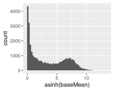
baseMean. We see that it covers a large dynamic range, from close to 0 to around 330000.
ggplot(awde, aes(x = rank(baseMean), y = -log10(pvalue))) +
  geom_hex(bins = 60) +
  theme(legend.position = "none")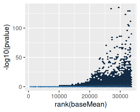
baseMean versus the negative logarithm of the p-value. For small values of baseMean, no small p-values occur. Only for genes whose read counts across all observations have a certain size, the test for differential expression has power to come out with a small p-value.
For convenience, we discretize baseMean into a factor variable group, which corresponds to six equal-sized groups.
awde = mutate(awde, stratum = cut(baseMean, include.lowest = TRUE,
  breaks = signif(quantile(baseMean,probs=seq(0,1,length.out=7)),2)))
In Figures 6.20 and 6.21 we see the histograms of p-values and the ECDFs stratified by stratum.
ggplot(awde, aes(x = pvalue)) + facet_wrap( ~ stratum, nrow = 4) +
  geom_histogram(binwidth = 0.025, boundary = 0)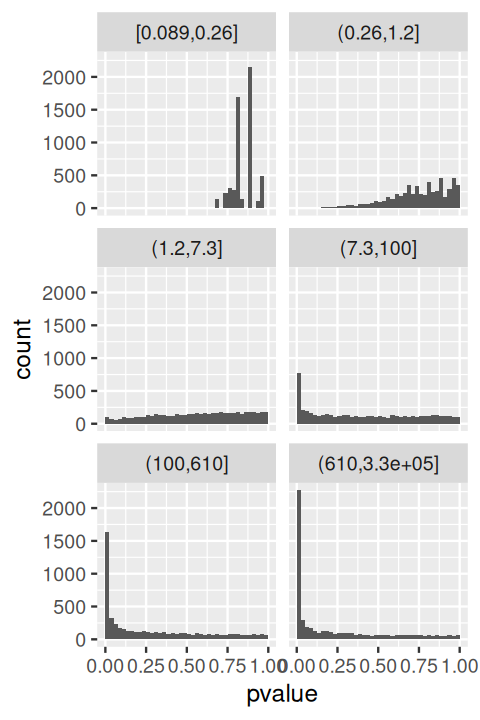
baseMean.
ggplot(awde, aes(x = pvalue, col = stratum)) +
  stat_ecdf(geom = "step") + theme(legend.position = "bottom")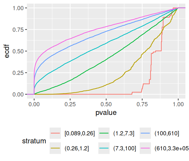
If we were to fit the two-group model to these strata separately, we would get quite different estimates for \(\pi_0\) and \(f_{\text{alt}}\). For the most lowly expressed genes, the power of the DESeq2-test is low, and the p-values essentially all come from the null component. As we go higher in average expression, the height of the small-p-values peak in the histograms increases, reflecting the increasing power of the test.
Can we use that to improve our handling of the multiple testing? It turns out that this is possible. One approach is independent hypothesis weighting (IHW) (Ignatiadis et al. 2016; Ignatiadis and Huber 2021)22.
library("IHW")
ihw_res = ihw(awde$pvalue, awde$baseMean, alpha = 0.1)
rejections(ihw_res)
[1] 4892Let’s compare this to what we get from the ordinary (unweighted) Benjamini-Hochberg method:
padj_BH = p.adjust(awde$pvalue, method = "BH")
sum(padj_BH < 0.1)
[1] 4099With hypothesis weighting, we get more rejections. For these data, the difference is notable though not spectacular; this is because their signal-to-noise ratio is already quite high. In other situations, where there is less power to begin with (e.g., where there are fewer replicates, the data are more noisy, or the effect of the treatment is less drastic), the difference from using IHW can be more pronounced.
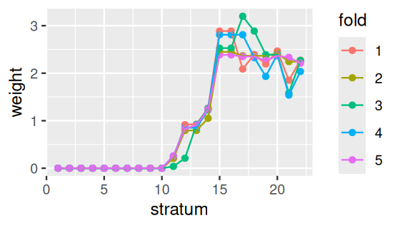
We can have a look at the weights determined by the ihw function (Figure 6.22).
plot(ihw_res)In chunk 'fig-testing-ihwplot': Warning: `aes_string()` was deprecated in ggplot2 3.0.0.ℹ Please use tidy evaluation idioms with `aes()`.ℹ See also `vignette("ggplot2-in-packages")` for more information.ℹ The deprecated feature was likely used in the IHW package. Please report the issue to the authors.
Intuitively, what happens here is that IHW chooses to put more weight on the hypothesis strata with higher baseMean, and low weight on those with very low counts. The Benjamini-Hochberg method has a certain type-I error budget, and rather than spreading it equally among all hypotheses, here we take it away from those strata that have little change of small fdr anyway, and “invest” it in strata where many hypotheses can be rejected at small fdr.
Such possibilities for stratification by an additional summary statistic besides the p-value—in our case, the baseMean—exist in many multiple testing situations. Informally, we need such a so-called covariate to be
statistically independent from our p-values under the null, but
informative of the prior probability \(\pi_0\) and/or the power of the test (the shape of the alternative density, \(f_{\text{alt}}\)) in the two-groups model.
These requirements can be assessed through diagnostic plots as in Figures 6.18—6.21.
We have explored the concepts behind single hypothesis testing and then moved on to multiple testing. We have seen how some of the limitations of interpreting a single p-value from a single test can be overcome once we are able to consider a whole distribution of outcomes from many tests. We have also seen that there are often additional summary statistics of our data, besides the p-values. We called them informative covariates, and we saw how we can use them to weigh the p-values and overall get more (or better) discoveries.
The usage of hypothesis testing in the multiple testing scenario is quite different from that in the single test case: for the latter, the hypothesis test might literally be the final result, the culmination of a long and expensive data acquisition campaign (ideally, with a prespecified hypothesis and data analysis plan). In the multiple testing case, its outcome will often just be an intermediate step: a subset of most worthwhile hypotheses selected by screening a large initial set. This subset is then followed up by more careful analyses.
We have seen the concept of the false discovery rate (FDR). It is important to keep in mind that this is an average property, for the subset of hypotheses that were selected. Like other averages, it does not say anything about the individual hypotheses. Then there is the concept of the local false discovery rate (fdr), which indeed does apply to an individual hypothesis. The local false discovery rate is however quite unrelated to the p-value, as the two-group model showed us. Much of the confusion and frustration about p-values seems to come from the fact that people would like to use them for purposes that the fdr is made for. It is perhaps a historical aberration that so much of applied sciences focuses on p-values and not local false discovery rate. On the other hand, there are also practical reasons, since a p-value is readily computed, whereas a fdr is difficult to estimate or control from data without making strong modelling assumptions.
We saw the importance of diagnostic plots, in particular, to always look at the p-value histograms when encountering a multiple testing analysis.
A comprehensive text book treatment of multiple testing is given by Efron (2010).
Outcome switching in clinical trials: http://compare-trials.org
For hypothesis weighting, the IHW vignette, the IHW paper (Ignatiadis et al. 2016) and the references therein.
Page built at 21:15 on 2026-07-15 using R version 4.6.0 (2026-04-24)