fn = system.file("extdata", "pasilla_gene_counts.tsv",
                  package = "pasilla", mustWork = TRUE)
counts = as.matrix(read.csv(fn, sep = "\t", row.names = "gene_id"))8 High-Throughput Count Data & Generalized Linear Models
Many measurement devices in biotechnology are based on massively parallel sampling and counting of molecules. One example is high-throughput DNA sequencing. Its applications fall broadly into two main classes of data output: in the first case, the output of interest are the sequences themselves, perhaps also their polymorphisms or differences to other sequences seen before. In the second case, the sequences themselves are more or less well-understood (say, we have a well-assembled and annotated genome), and our interest is on how abundant different sequence regions are in our sample.
For instance, in RNA-Seq (Ozsolak and Milos 2011), we sequence the RNA molecules found in a population of cells or in a tissue.

In ChIP-Seq, we sequence DNA regions that are bound to particular DNA-binding proteins (selected by immuno-precipitation); in RIP-Seq, RNA molecules or regions of them bound to a particular RNA-binding protein; in DNA-Seq, we sequence genomic DNA and are interested in the prevalence of genetic variants in heterogeneous populations of cells, for instance the clonal composition of a tumor. In high-throughput chromatin conformation capture (HiC) we aim to map the 3D spatial arrangement of DNA; in genetic screens (using, say, RNAi or CRISPR-Cas9 libraries for perturbation and high-throughput sequencing for readout), we’re interested in the proliferation or survival of cells upon gene knockdown, knockout or modification. In microbiome analysis, we study the abundance of different microbial species in complex microbial habitats.
Ideally we might want to sequence and count all molecules of interest in the sample. Generally this is not possible: the biochemical protocols are not 100% efficient, and some molecules or intermediates get lost along the way. Moreover it’s often also not even necessary. Instead, we sequence and count a statistical sample. The sample size will depend on the complexity of the sequence pool assayed; it can go from tens of thousands to billions. This sampling nature of the data is important when it comes to analyzing them. We hope that the sampling is sufficiently representative for us to identify interesting trends and patterns.
8.1 Goals of this chapter
In this chapter, we will become familiar with count data in high-throughput sequencing applications such as RNA-Seq. We will understand and model the sampling processes that underlie the data in order to interpret them. Our main aim is to detect and quantify systematic changes between samples from different conditions, say untreated versus treated, where the task is to distinguish such systematic changes from sampling variations and experimental variability within the same conditions. In order to do this, we will also equip ourselves with a set of needed statistical concepts and tools:
multifactorial designs, linear models and analysis of variance
generalized linear models
robustness and outlier detection
shrinkage estimation
In fact, these concepts have a much wider range of applications: they can also be applied to other types of data where want to detect differences in noisy data as a function of some experimental covariate. In particular, the framework of generalized linear models is quite abstract and generic, but this has the advantage that it can be adapted to many different data types, so that we don’t need to reinvent the wheel, but rather can immediately enjoy a wide range of associated tools and diagnostics.
As a bonus, we will also look at data transformations that make the data amenable to unsupervised methods such as those that we saw in Chapters 5 and 7, and which make it easier to visualize the data.
8.2 Some core concepts
Before we start, let’s settle some key terminology.
A sequencing library is the collection of DNA molecules used as input for the sequencing machine.
Fragments are the molecules being sequenced. Since the currently most widely used technology1 can only deal with molecules of length around 300–1000 nucleotides, these are obtained by fragmenting the (generally longer) DNA or cDNA molecules of interest.
A read is the sequence obtained from a fragment. With the current technology, the read covers not the whole fragment, but only one or both ends of it, and the read length on either side is up to around 150 nucleotides.
1 We refer to https://www.illumina.com/techniques/sequencing.html
2 For any particular application, it’s best to check the recent literature on the most appropriate approaches and choices.
3 E.g., in the case of RNA-Seq, the genome together with an annotation of its transcripts.
Between sequencing and counting, there is an important aggregation or clustering step involved, which aggregates sequences that belong together: for instance, all reads belonging to the same gene (in RNA-Seq), or to the same binding region (ChIP-Seq). There are several approaches to this and choices to be made, depending on the aim of the experiment2. The methods include explicit alignment or hash-based mapping to a reference sequence3, and reference-independent sequence-similarity based clustering of the reads – especially if there is no obvious reference, such as in metagenomics or metatranscriptomics. We need to choose whether to consider different alleles or isoforms separately, or to merge them into an equivalence class. For simplicity, we’ll use the term gene in this chapter for these operational aggregates, even though they can be various things depending on the particular application.
8.3 Count data
Let us load an example dataset. It resides in the experiment data package pasilla.
system.file to locate a file that is shipped together with the pasilla package. When you work with your own data, you will need to prepare the matrix counts yourself.The data are stored as a rectangular table in a tab-delimited file, which we’ve read into the matrix counts.
dim(counts)[1] 14599 7counts[ 2000+(0:3), ] untreated1 untreated2 untreated3 untreated4 treated1 treated2
FBgn0020369 3387 4295 1315 1853 4884 2133
FBgn0020370 3186 4305 1824 2094 3525 1973
FBgn0020371 1 0 1 1 1 0
FBgn0020372 38 84 29 28 63 28
treated3
FBgn0020369 2165
FBgn0020370 2120
FBgn0020371 0
FBgn0020372 27The matrix tallies the number of reads seen for each gene in each sample. We call it the count table. It has 14599 rows, corresponding to the genes, and 7 columns, corresponding to the samples. When loading data from a file, a good plausibility check is to print out some of the data, and maybe not only at the very beginning, but also at some random point in the middle, as we have done above.
The table is a matrix of integer values: the value in the \(i\)th row and the \(j\)th column of the matrix indicates how many reads have been mapped to gene \(i\) in sample \(j\). The statistical sampling models that we discuss in this chapter rely on the fact that the values are the direct, “raw” counts of sequencing reads – not some derived quantity, such as normalized counts, counts of covered base pairs, or the like; this would only lead to nonsensical results.
8.3.1 The challenges of count data
What are the challenges that we need to overcome with such count data?
The data have a large dynamic range, starting from zero up to millions. The variance, and more generally, the distribution shape of the data in different parts of the dynamic range are very different. We need to take this phenomenon, called heteroskedasticity, into account.
The data are non-negative integers, and their distribution is not symmetric – thus normal or log-normal distribution models may be a poor fit.
We need to understand the systematic sampling biases and adjust for them. Confusingly, this is often called normalization. Examples are the total sequencing depth of an experiment (even if the true abundance of a gene in two libraries is the same, we expect different numbers of reads for it depending on the total number of reads sequenced), or differing sampling probabilities (even if the true abundance of two genes within a biological sample is the same, we expect different numbers of reads for them if their biophysical properties differ, such as length, GC content, secondary structure, binding partners).
We need to understand the stochastic properties of the sampling, as well as other sources of stochastic experimental variation. For studies with large numbers of biological samples, this is usually straightforward, and we can even fall back on resampling- or permutation-based methods. For designed experiments, however, sample sizes tend to be limited.
For instance, there are four replicates from the untreated and three from the treated condition in the pasilla data. This means that resampling- or permutation-based methods will not have enough power. To proceed, we need to make distributional assumptions. Essentially, what such assumptions do is that they let us compute the probabilities of rare events in the tails of the distribution – i.e., extraordinarily high or low counts – from a small number of distribution parameters.
- But even that is often not enough, in particular the estimation of dispersion parameters4 is difficult with small sample sizes. In that case, we need to make further assumptions, such as that genes with similar locations also have similar dispersions. This is called sharing of information across genes, and we’ll come back to it in Section 8.10.1.
4 Distributions can be parameterized in various ways; often the parameters correspond to some measure of location and some measure of dispersion; a familiar measure of location is the mean, and a familiar measure of dispersion is the variance (or standard deviation), but for some distributions other measures are also in use.
8.3.2 RNA-Seq: what about gene structures, splicing, isoforms?
Eukaryotic genes are complex: most of them consist of multiple exons, and mRNAs result from concatenation of exons through a process called splicing. Alternative splicing and multiple possible choices of start and stop sites enable the generation of multiple, alternative isoforms from the same gene locus. It is possible to use high-throughput sequencing to detect the isoform structures of transcripts. From the fragments that are characteristic for specific isoforms, it is also possible to detect isoform specific abundances. With current RNA-Seq data, which only give us relatively short fragments of the full-length isoforms, it tends to be difficult to assemble and deconvolute full-length isoform structures and abundances (Steijger et al. 2013). Because of that, procedures with the more modest aim of making only local statements (e.g., inclusion or exclusion of individual exons) have been formulated (Anders et al. 2012), and these can be more robust. We can expect that future technologies will sequence full-length transcripts.
8.4 Modeling count data
8.4.1 Dispersion
Consider a sequencing library that contains \(n_1\) fragments corresponding to gene 1, \(n_2\) fragments for gene 2, and so on, with a total library size of \(n = n_1+n_2+\cdots\). We submit the library to sequencing and determine the identity of \(r\) randomly sampled fragments. A welcome simplification comes from looking at the orders of magnitude of these numbers:
the number of genes is in the tens of thousands;
the value of \(n\) depends on the amount of cells that were used to prepare, but for bulk RNA-Seq it will be in the billions or trillions;
the number of reads \(r\) is usually in the tens of millions, and thus much smaller than \(n\).
From this we can conclude that the probability that a given read maps to the \(i^{\text{th}}\) gene is \(p_i=n_i/n\), and that this is pretty much independent of the outcomes for all the other reads. So we can model the number of reads for gene \(i\) by a Poisson distribution, where the rate of the Poisson process is the product of \(p_i\), the initial proportion of fragments for the \(i^{\text{th}}\) gene, times \(r\), that is: \(\lambda_i=rp_i\).
In practice, we are usually not interested in modeling the read counts within a single library, but in comparing the counts between libraries. That is, we want to know whether any differences that we see between different biological conditions – say, the same cell line with and without drug treatment – are larger than expected “by chance”, i.e., larger than what we may expect even between biological replicates. Empirically, it turns out that replicate experiments vary more than what the Poisson distribution predicts. Intuitively, what happens is that \(p_i\) and therefore also \(\lambda_i\) vary even between biological replicates; perhaps the temperature at which the cells grew was slightly different, or the amount of drug added varied by a few percent, or the incubation time was slightly longer. To account for that, we need to add another layer of modeling on top. We already saw hierarchical models and mixtures in Chapter 4. It turns out that the gamma-Poisson (a.k.a. negative binomial) distribution suits our modeling needs. Instead of a single \(\lambda\) – which represents both mean and variance –, this distribution has two parameters. In principle, these can be different for each gene, and we will come back to the question of how to estimate them from the data.
8.4.2 Normalization
Often, there are systematic biases that have affected the data generation and are worth taking into account. Unfortunately, the term normalization is commonly used for that aspect of the analysis, even though it is misleading: it has nothing to do with the normal distribution, norms in a vector space, or normal vectors. Rather, what we aim for is identifying the nature and estimating the magnitude of systematic biases, and take them into account in our model-based analysis of the data.
The most important systematic bias stems from variations in the total number of reads in each sample. If we have more reads for one library than in another, then we might assume that, everything else being equal, the counts are proportional to each other with some proportionality factor \(s\). Naively, we could propose that a decent estimate of \(s\) for each sample is simply given by the sum of the counts of all genes. However, it turns out that we can do better. To understand this, a toy example helps.
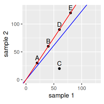
Consider a dataset with 5 genes and two samples as displayed in Figure 8.1. If we estimate \(s\) for each of the two samples by its sum of counts, then the slope of the blue line represents their ratio. According to this, gene C is down-regulated in sample 2 compared to sample 1, while the other genes are all somewhat up-regulated. If we now instead estimate \(s\) such that their ratios correspond to the red line, then we will still conclude that gene C is down-regulated, while the other genes are unchanged. The second version is more parsimonious and is often preferred by scientists. The slope of the red line can be obtained by robust regression. This is what the DESeq2 method does.
Solution
See Figure 8.2, produced by the code below. In this case, there is not much difference, the results are nearly proportional.
library("tibble")
library("ggplot2")
library("DESeq2")
ggplot(tibble(
  `size factor` = estimateSizeFactorsForMatrix(counts),
  `sum` = colSums(counts)), aes(x = `size factor`, y = `sum`)) +
  geom_point()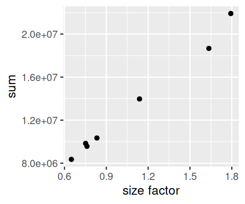
Solution
See Figure 8.3, produced by the following code.
library("matrixStats")
sf = estimateSizeFactorsForMatrix(counts)
ncounts  = counts / matrix(sf,
   byrow = TRUE, ncol = ncol(counts), nrow = nrow(counts))
uncounts = ncounts[, grep("^untreated", colnames(ncounts)),
                     drop = FALSE]
ggplot(tibble(
        mean = rowMeans(uncounts),
        var  = MatrixGenerics::rowVars( uncounts)),
     aes(x = log(mean), y = log(var))) +
  geom_hex() + coord_fixed() + theme(legend.position = "none") +
  geom_abline(slope = 1:2, color = c("forestgreen", "red"))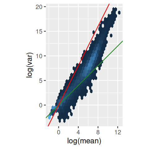
counts data. The axes are logarithmic. Also shown are lines through the origin with slopes 1 (green) and 2 (red).
The green line (slope 1) is what we expect if the variance (\(v\)) equals the mean (\(m\)), as is the case for a Poisson-distributed random variable: \(v=m\). We see that this approximately fits the data in the lower range. The red line (slope 2) corresponds to the quadratic mean-variance relationship \(v=m^2\); lines parallel to it (not shown) would represent \(v = cm^2\) for various values of \(c\). We can see that in the upper range of the data, the quadratic relationship approximately fits the data, for some value of \(c<1\).
8.5 A basic analysis
8.5.1 Example dataset: the pasilla data
Let’s return to the pasilla data from Section 8.3. These data are from an experiment on Drosophila melanogaster cell cultures that investigated the effect of RNAi knock-down of the splicing factor pasilla (Brooks et al. 2011) on the cells’ transcriptome. There were two experimental conditions, termed untreated and treated in the header of the count table that we loaded. They correspond to negative control and to siRNA against pasilla. The experimental metadata of the 7 samples in this dataset are provided in a spreadsheet-like table, which we load.
pasilla_sample_annotation.csv that comes with the pasilla package. We locate it with the function system.file. When you work with your own data, you will need to prepare an analogous file, or directly a dataframe like pasillaSampleAnno.annotationFile = system.file("extdata",
"pasilla_sample_annotation.csv",
package = "pasilla", mustWork = TRUE)
pasillaSampleAnno = readr::read_csv(annotationFile)
pasillaSampleAnno# A tibble: 7 × 6
file condition type `number of lanes` total number of read…¹ `exon counts`
<chr> <chr> <chr> <dbl> <chr> <dbl>
1 treate… treated sing… 5 35158667 15679615
2 treate… treated pair… 2 12242535 (x2) 15620018
3 treate… treated pair… 2 12443664 (x2) 12733865
4 untrea… untreated sing… 2 17812866 14924838
5 untrea… untreated sing… 6 34284521 20764558
6 untrea… untreated pair… 2 10542625 (x2) 10283129
7 untrea… untreated pair… 2 12214974 (x2) 11653031
# ℹ abbreviated name: ¹`total number of reads`As we see here, the overall dataset was produced in two batches, the first one consisting of three sequencing libraries that were subjected to single read sequencing, the second batch consisting of four libraries for which paired end sequencing was used. As so often, we need to do some data wrangling: we replace the hyphens in the type column by underscores, as arithmetic operators in factor levels are discouraged by DESeq2, and convert the type and condition columns into factors, explicitly specifying our preferred order of the levels (the default is alphabetical).
library("dplyr")
pasillaSampleAnno = mutate(pasillaSampleAnno,
condition = factor(condition, levels = c("untreated", "treated")),
type = factor(sub("-.*", "", type), levels = c("single", "paired")))
We note that the design is approximately balanced between the factor of interest, condition, and the “nuisance factor” type:
with(pasillaSampleAnno,
       table(condition, type))
type
condition single paired
untreated 2 2
treated 1 2DESeq2 uses a specialized data container, called DESeqDataSet to store the datasets it works with. Such use of specialized containers – or, in R terminology, classes – is a common principle of the Bioconductor project, as it helps users to keep together related data. While this way of doing things requires users to invest a little more time upfront to understand the classes, compared to just using basic R data types like matrix and dataframe, it helps avoiding bugs due to loss of synchronization between related parts of the data. It also enables the abstraction and encapsulation of common operations that could be quite wordy if always expressed in basic terms5. DESeqDataSet is an extension of the class SummarizedExperiment in Bioconductor. The SummarizedExperiment class is also used by many other packages, so learning to work with it will enable you to use quite a range of tools.
5 Another advantage is that classes can contain validity methods, which make sure that the data always fulfill certain expectations, for instance, that the counts are positive integers, or that the columns of the counts matrix align with the rows of the sample annotation dataframe.
6 Note how in the code below, we have to put in extra work to match the column names of the counts object with the file column of the pasillaSampleAnno dataframe, in particular, we need to remove the "fb" that happens to be used in the file column for some reason. Such data wrangling is very common. One of the reasons for storing the data in a DESeqDataSet object is that we then no longer have to worry about such things.
We use the constructor function DESeqDataSetFromMatrix to create a DESeqDataSet from the count data matrix counts and the sample annotation dataframe pasillaSampleAnno6.
mt = match(colnames(counts), sub("fb$", "", pasillaSampleAnno$file))
stopifnot(!any(is.na(mt)))

pasilla = DESeqDataSetFromMatrix(
  countData = counts,
  colData   = pasillaSampleAnno[mt, ],
  design    = ~ condition)
class(pasilla)
[1] "DESeqDataSet"
attr(,"package")
[1] "DESeq2"is(pasilla, "SummarizedExperiment")[1] TRUEThe SummarizedExperiment class – and therefore DESeqDataSet – also contains facilities for storing annotation of the rows of the count matrix. For now, we are content with the gene identifiers from the row names of the counts table.
8.5.2 The DESeq2 method
After these preparations, we are now ready to jump straight into differential expression analysis. Our aim is to identify genes that are differentially abundant between the treated and the untreated cells. To this end, we will apply a test that is conceptually similar to the \(t\)-test, which we encountered in Section 6.5, although mathematically somewhat more involved. We will postpone these details for now, and will come back to them in Section 8.7. A choice of standard analysis steps are wrapped into a single function, DESeq.
pasilla = DESeq(pasilla)The DESeq function is simply a wrapper that calls, in order, the functions estimateSizeFactors (for normalization, as discussed in Section 8.4.2), estimateDispersions (dispersion estimation) and nbinomWaldTest (hypothesis tests for differential abundance). The test is between the two levels extttuntreated and exttttreated of the factor condition, since this is what we specified when we constructed the pasilla object through the argument design=\simcondition. You can always call each of these three functions individually if you want to modify their behavior or interject custom steps. Let us look at the results.
res = results(pasilla)
res[order(res$padj), ] |> head()
log2 fold change (MLE): condition treated vs untreated
Wald test p-value: condition treated vs untreated
DataFrame with 6 rows and 6 columns
baseMean log2FoldChange lfcSE stat pvalue
<numeric> <numeric> <numeric> <numeric> <numeric>
FBgn0039155 730.596 -4.61901 0.1687068 -27.3789 4.88599e-165
FBgn0025111 1501.411 2.89986 0.1269205 22.8479 1.53430e-115
FBgn0029167 3706.117 -2.19700 0.0969888 -22.6521 1.33042e-113
FBgn0003360 4343.035 -3.17967 0.1435264 -22.1539 9.56283e-109
FBgn0035085 638.233 -2.56041 0.1372952 -18.6490 1.28772e-77
FBgn0039827 261.916 -4.16252 0.2325888 -17.8965 1.25663e-71
padj
<numeric>
FBgn0039155 4.06661e-161
FBgn0025111 6.38497e-112
FBgn0029167 3.69104e-110
FBgn0003360 1.98979e-105
FBgn0035085 2.14354e-74
FBgn0039827 1.74316e-688.5.3 Exploring the results
The first step after a differential expression analysis is the visualization of the following three or four basic plots:
the histogram of p-values (Figure 8.4),
the MA plot (Figure 8.5) and
an ordination plot (Figure 8.6).
In addition, a heatmap (Figure 8.7) can be instructive.
These are essential data quality assessment measures – and the general advice on quality assessment and control given in Section 13.6 also applies here.
The p-value histogram is straightforward (Figure 8.4).
ggplot(as(res, "data.frame"), aes(x = pvalue)) +
  geom_histogram(binwidth = 0.01, fill = "Royalblue", boundary = 0)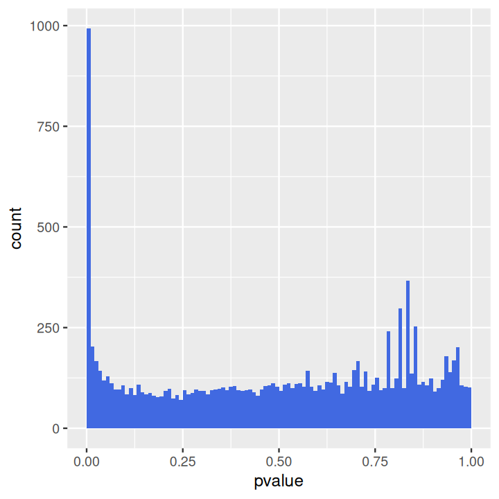
The distribution displays two main components: a uniform background with values between 0 and 1, and a peak of small p-values at the left. The uniform background corresponds to the non-differentially expressed genes. Usually this is the majority of genes. The left hand peak corresponds to differentially expressed genes7. As we already saw in Chapter 6, the ratio of the level of the background to the height of the peak gives us a rough indication of the false discovery rate (FDR) that would be associated with calling the genes in the leftmost bin differentially expressed. In our case, the leftmost bin contains all p-values between 0 and 0.01, which correspond to 993 genes. The background level is at around 100, so the FDR associated with calling all genes in the leftmost bin would be around 10%.
7 For the data shown here, the histogram also contains a few isolated peaks in the middle or towards the right; these stem from genes with small counts and reflect the discreteness of the data.
Sometimes it turns out that the background distribution is not uniform, but shows a tilted shape with an increase towards the right. This tends to be an indication of batch effects; you can explore this further in Exercise 8.1.
To produce the MA plot, we can use the function plotMA in the DESeq2 package (Figure 8.5).
plotMA(pasilla, ylim = c( -2, 2))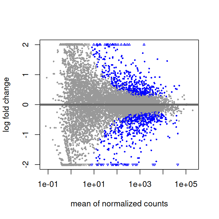
To produce PCA plots similar to those we saw in Chapter 7, we can use the DESeq2 function plotPCA (Figure 8.6).
pas_rlog = rlogTransformation(pasilla)
plotPCA(pas_rlog, intgroup=c("condition", "type")) + coord_fixed()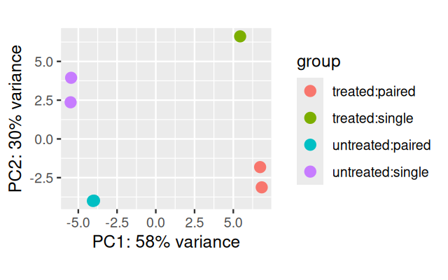
As we saw in the previous chapter, this type of plot is useful for visualizing the overall effect of experimental covariates and/or to detect batch effects. Here, the first principal axis, PC1, is mostly aligned with the experimental covariate of interest (untreated / treated), while the second axis is roughly aligned with the sequencing protocol (single / paired).
We used a data transformation, the regularized logarithm or rlog, which we will investigate more closely in Section 8.10.2.
Heatmaps can be a powerful way of quickly getting an overview over a matrix-like dataset, count tables included. Below you see how to make a heatmap from the rlog-transformed data. For a matrix as large as counts(pasilla), it is not practical to plot all of it, so we plot the submatrix of the 30 genes with the highest average expression.
library("pheatmap")
select = order(rowMeans(assay(pas_rlog)), decreasing = TRUE)[1:30]
pheatmap( assay(pas_rlog)[select, ],
     scale = "row",
     annotation_col = as.data.frame(
        colData(pas_rlog)[, c("condition", "type")] ))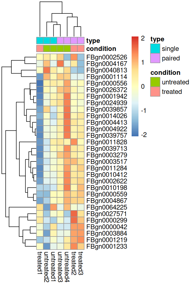
In Figure 8.7, pheatmap arranged the rows and columns of the matrix by the dendrogram from an unsupervised clustering, and the clustering of the columns (samples) is dominated by the type factor. This highlights that our differential expression analysis above was probably too naive, and that we should adjust for this strong “nuisance” factor when we are interested in testing for differentially expressed genes between conditions. We will do this in Section 8.9.
8.5.4 Exporting the results
An HTML report of the results with plots and sortable/filterable columns can be exported using the ReportingTools package on a DESeqDataSet that has been processed by the DESeq function. For a code example, see the RNA-Seq differential expression vignette of the ReportingTools package or the manual page for the publish method for the DESeqDataSet class.
A CSV file of the results can be exported using write.csv (or its counterpart from the readr package).
write.csv(as.data.frame(res), file = "treated_vs_untreated.csv")8.6 Critique of default choices and possible modifications
8.6.1 The few changes assumption
Underlying the default normalization and the dispersion estimation in DESeq2 (and many other differential expression methods) is that most genes are not differentially expressed.
This assumption is often reasonable (well-designed experiments usually ask specific questions, so that not everything changes all at once), but what should we do if it does not hold? Instead of applying these operations on the data from all genes, we will then need to identify a subset of (“negative control”) genes for which we believe the assumption is tenable, either because of prior biological knowledge, or because we explicitly controlled their abundance as external “spiked in” features.
8.6.2 Point-like null hypothesis
As a default, the DESeq function tests against the null hypothesis that each gene has the same abundance across conditions; this is a simple and pragmatic choice. Indeed, if the sample size is limited, what is statistically significant also tends to be strong enough to be biologically interesting. But as sample size increases, statistical significance in these tests may be present without much biological relevance. For instance, many genes may be slightly perturbed by downstream, indirect effects. We can modify the test to use a more permissive, interval-based null hypothesis; we will further explore this in Section 8.10.4.
8.7 Multi-factor designs and linear models
8.7.1 What is a multifactorial design?
Let’s assume that in addition to the siRNA knockdown of the pasilla gene, we also want to test the effect of a certain drug. We could then envisage an experiment in which the experimenter treats the cells either with negative control, with the siRNA against pasilla, with the drug, or with both. To analyse this experiment, we can use the notation
\[ y = \beta_0 + x_1 \beta_1 + x_2 \beta_2 + x_1x_2\beta_{12}. \tag{8.1}\]
This equation can be parsed as follows. The left hand side, \(y\), is the experimental measurement of interest. In our case, this is the suitably transformed expression level (we’ll discuss this in Section 8.8.3) of a gene. Since in an RNA-Seq experiment there are lots of genes, we’ll have as many copies of Equation 8.1, one for each. The coefficient \(\beta_0\) is the base level of the measurement in the negative control; often it is called the intercept.
The design factors \(x_1\) and \(x_2\) are binary indicator variables: \(x_1\) takes the value 1 if the siRNA was transfected and 0 if not, and similarly, \(x_2\) indicates whether the drug was administered. In the experiment where only the siRNA is used, \(x_1=1\) and \(x_2=0\), and the third and fourth terms of Equation 8.1 vanish. Then, the equation simplifies to \(y=\beta_0+\beta_1\). This means that \(\beta_1\) represents the difference between treatment and control. If our measurements are on a logarithmic scale, then
\[ \begin{align} \beta_1 = y-\beta_0 &=\log_2(\text{expression}_{\text{treated}}) -\log_2(\text{expression}_{\text{untreated}})\\ &=\log_2\frac {\text{expression}_{\text{treated}}} {\text{expression}_{\text{untreated}}} \end{align} \tag{8.2}\]
is the logarithmic fold change due to treatment with the siRNA. In exactly the same way, \(\beta_2\) is the logarithmic fold change due to treatment with the drug. What happens if we treat the cells with both siRNA and drug? In that case, \(x_1=x_2=1\), and Equation 8.1 can be rewritten as
\[ \beta_{12} = y - (\beta_0 + \beta_1 + \beta_2). \tag{8.3}\]
This means that \(\beta_{12}\) is the difference between the observed outcome, \(y\), and the outcome expected from the individual treatments, obtained by adding to the baseline the effect of siRNA alone, \(\beta_1\), and of drug alone, \(\beta_2\).
We call \(\beta_{12}\) the interaction effect of siRNA and drug. It has nothing to do with a physical interaction, the terminology indicates that the effects of these two different experimental factors do not simply add up, but combine in a more complicated fashion.
For instance, if the target of the drug and of the siRNA were equivalent, leading to the same effect on the cells, then we biologically expect that \(\beta_1=\beta_2\). We also expect that their combination has no further effect, so that \(\beta_{12}=-\beta_1\). If, on the other hand, the targets of the drug and of the siRNA are in parallel pathways that can buffer each other, we’ll expect that \(\beta_1\) and \(\beta_2\) are both relatively small, but that the combined effect is synergistic, and \(\beta_{12}\) is large.
Not always do we care about interactions. Many experiments are designed with multiple factors where we care most about each of their individual effects. In that case, the combinatorial treatment might not be present in the experimental design, and the model to use for the analysis is a version of Equation 8.1 with the rightmost term removed.
We can succinctly encode the design of the experiment in the design matrix. For instance, for the combinatorial experiment described above, the design matrix is
\[ \begin{array}{c|c|c} x_0 & x_1 & x_2\\ \hline 1&0&0\\ 1&1&0\\ 1&0&1\\ 1&1&1\end{array} \tag{8.4}\]
The columns of the design matrix correspond to the experimental factors, and its rows represent the different experimental conditions, four in our case. If, instead, the combinatorial treatment is not performed, then the design matrix is reduced to only the first three rows of 8.4.
8.7.2 What about noise and replicates?
Equation 8.1 provides a conceptual decomposition of the observed data into the effects caused by the different experimental variables. If our data (the \(y\)s) were absolutely precise, we could set up a linear system of equations, one equation for each of the four possible experimental conditions represented by the \(x\)s, and solve for the \(\beta\)s.
Of course, we usually wish to analyze real data that are affected by noise. We then need replicates to estimate the levels of noise and assess the uncertainty of our estimated \(\beta\)s. Only then we can empirically assess whether any of the observed changes between conditions are significantly larger than those occuring just due to experimental or natural variation. We need to slightly extend the equation,
\[ y_{j} = x_{j0} \; \beta_0 + x_{j1} \; \beta_1 + x_{j2} \; \beta_2 + x_{j1}\,x_{j2}\;\beta_{12} + \varepsilon_j. \tag{8.5}\]
We have added the index \(j\) and a new term \(\varepsilon_j\). The index \(j\) now explicitly counts over our individual replicate experiments; for instance, if for each of the four conditions we perform three replicates, then \(j\) counts from 1 to 12. The design matrix has now 12 rows, and \(x_{jk}\) is the value of the matrix in its \(j\)th row and \(k\)th column.
The additional terms \(\varepsilon_j\), which we call the residuals, are there to absorb differences between replicates. However, one additional modeling component is needed: the system of twelve equations 8.5 would be underdetermined without further information, since it has now more variables (twelve epsilons and four betas) than it has equations (twelve, one for each \(j\)). To fix this, we require that the \(\varepsilon_j\) be small. One popular way – we’ll encounter others – to overcome this is to minimize the sum of squared residuals,
\[ \sum_j \varepsilon_j^2 \quad\to\quad\text{min}. \tag{8.6}\]
It turns out that with this requirement satisfied, the \(\beta\)s represent the average effects of each of the experimental factors, while the residuals \(\varepsilon_j\) reflect the experimental fluctuations around the mean between the replicates. This approach, which is called the least sum of squares fitting, is mathematically convenient, since it can achieved by straightforward matrix algebra. It is what the R function lm does.
8.7.3 Analysis of variance
A model like 8.5 is called a linear model, and often it is implied that criterion 8.6 is used to fit it to data. This approach is elegant and powerful, but for novices it can take some time to appreciate all its facets. What is the advantage over just simply taking, for each distinct experimental condition, the average over replicates and comparing these values across conditions? In simple cases, the latter approach can be intuitive and effective. However, it comes to its limits when the replicate numbers are not all the same in the different groups, or when one or more of the \(x\)-variables is continuous-valued. In these cases, one will invariably end up with something like fitting 8.5 to the data. A useful way to think about 8.5 is contained in the term analysis of variance, abbreviated ANOVA. In fact, what Equation 8.5 does is decompose the variability of \(y\) that we observed in the course of our experiments into elementary components: its baseline value \(\beta_0\), its variability caused by the effect of the first variable, \(\beta_1\), its variability caused by the effect of the second variable, \(\beta_2\), its variability caused by the effect of the interaction, \(\beta_{12}\), and variability that is unaccounted for. The last of these we commonly call noise, the other ones, systematic variability.
8.7.4 Robustness
The sum 8.6 is sensitive to outliers in the data. A single measurement \(y_{j}\) with an outlying value can draw the \(\beta\) estimates far away from the values implied by the other replicates. This is the well-known fact that methods based on least sum of squares have a low breakdown point: if even only a single data point is outlying, the whole statistical result can be strongly affected. For instance, the average of a set of \(n\) numbers has a breakdown point of \(\frac{1}{n}\), meaning that it can be arbitrarily changed by changing only a single one of the numbers. On the other hand, the median has a much higher breakdown point. Changing a single number often has no effect at all, and when it does, the effect is limited to the range of the data points in the middle of the ranking (i.e., those adjacent to rank \(\frac{n}{2}\)). To change the median by an arbitrarily high amount, you need to change half the observations. We call the median robust, and its breakdown point is \(\frac{1}{2}\). Remember that the median of a set of numbers \(y_1, y_2, ...\) minimizes the sum \(\sum_j|y_j-\beta_0|\).
To achieve a higher degree of robustness against outliers, other choices than the sum of squares 8.6 can be used as the objective of minimization. Among these are:
\[ \begin{align} R &= \sum_j |\varepsilon_j| & \text{Least absolute deviations} \\ R &= \sum_j \rho_s(\varepsilon_j) & \text{M-estimation} \\ R &= Q_{\theta}\left( \{\varepsilon_1^2, \varepsilon_2^2,... \} \right) & \text{LTS, LQS} \\ R &= \sum_j w_j \varepsilon_j^2 & \text{general weighted regression} \end{align} \tag{8.8}\]
Here, \(R\) is the quantity to be minimized. The first choice in Equation 8.8 is called least absolute deviations regression. It can be viewed as a generalization of the median. Although conceptually simple, and attractive on first sight, it is harder to minimize than the sum of squares, and it can be less stable and less efficient especially if the data are limited, or do not fit the model8. The second choice in Equation 8.8, also called M-estimation, uses a penalization function \(\rho_s\) (least-squares regression is the special case with \(\rho_s(\varepsilon)=\varepsilon^2\)) that looks like a quadratic function for a limited range of \(\varepsilon\), but has a smaller slope, flattens out, or even drops back to zero, for absolute values \(|\varepsilon|\) that are larger than the scale parameter \(s\). The intention behind this is to downweight the effect of outliers, i.e. of data points that have large residuals (Huber 1964). A choice of \(s\) needs to be made and determines what is called an outlier. One can even drop the requirement that \(\rho_s\) is quadratic around 0 (as long as its second derivative is positive), and a variety of choices for the function \(\rho_s\) have been proposed in the literature. The aim is to give the estimator desirable statistical properties (say, bias and efficiency) when and where the data fit the model, but to limit or nullify the influence of those data points that do not, and to keep computations tractable.
8 The Wikipedia article gives an overview.
Solution
Huber’s paper defines, on Page 75:
\[ \rho_s(\varepsilon) = \left\{ \begin{array}{cc} \frac{1}{2}\varepsilon^2, \quad\text{for }|\varepsilon|< s\\ s|\varepsilon|-\frac{1}{2}s^2, \quad\text{for }|\varepsilon|\ge s\\ \end{array} \right. \]
The graph produced by the below code is shown in Figure 8.8.
rho = function(x, s)
  ifelse(abs(x) < s, x^2 / 2,  s * abs(x) - s^2 / 2)

df = tibble(
  x        = seq(-7, 7, length.out = 100),
  parabola = x ^ 2 / 2,
  Huber    = rho(x, s = 2))

ggplot(reshape2::melt(df, id.vars = "x"),
  aes(x = x, y = value, col = variable)) + geom_line()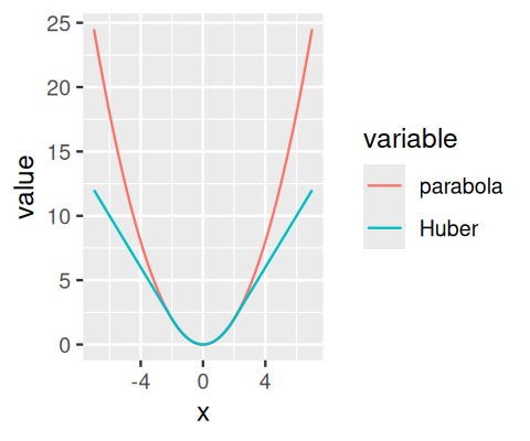
Choice three in 8.8 generalises the least sum of squares method in yet another way. In least quantile of squares (LQS) regression, the the sum over the squared residuals is replaced with a quantile, for instance, \(Q_{50}\), the median, or \(Q_{90}\), the 90%-quantile (Rousseeuw 1987). In a variation thereof, least trimmed sum of squares (LTS) regression, a sum of squared residuals is used, but the sum extends not over all residuals, but only over the fraction \(0\le\theta\le1\) of smallest residuals. The motivation in either case is that outlying data points lead to large residuals, and as long as they are rare, they do not affect the quantile or the trimmed sum.
However, there is a price: while the least sum of squares optimization 8.6 can be done through straightforward linear algebra, more complicated iterative optimization algorithms are needed for M-estimation, LQS and LTS regression.
The final approach in 8.8 represents an even more complex way of weighting down outliers. It assumes that we have some way of deciding what weight \(w_j\) we want to give to each observation, presumably down-weighting outliers. For instance, in Section 8.10.3, we will encounter the approach used by the DESeq2 package, in which the leverage of each data point on the estimated \(\beta\)s is assessed using a measure called Cook’s distance. For those data whose Cook’s distance is deemed too large, the weight \(w_j\) is set to zero, whereas the other data points get \(w_j=1\). In effect, this means that the outlying data points are discarded and that ordinary regression is performed on the others. The extra computational effort of carrying the weights along is negligible, and the optimization is still straightforward linear algebra.
All of these approaches to outlier robustness introduce a degree of subjectiveness and rely on sufficient replication. The subjectiveness is reflected by the parameter choices that need to be made: \(s\) in 8.8 (2), \(\theta\) in 8.8 (3), the weights in 8.8 (4). One scientist’s outlier may be the Nobel prize of another. On the other hand, outlier removal is no remedy for sloppy experiments and no justification for wishful thinking.
8.8 Generalized linear models
We need to explore two more theoretical concepts before we can proceed to our next application example. Equations of the form 8.5 model the expected value of the outcome variable, \(y\), as a linear function of the design matrix, and they are fit to data according to the least sum of squares criterion 8.6; or a robust variant thereof. We now want to generalize these assumptions.
8.8.1 Modeling the data on a transformed scale
We already saw that it can be fruitful to consider the data not on the scale that we obtained them, but after some transformation, for instance, the logarithm. This idea can be generalized, since depending on the context, other transformations are useful. For instance, the linear model 8.5 would not directly be useful for modeling outcomes that are bounded within an interval, say, \([0,1]\) as an indicator of disease risk. In a linear model, the values of \(y\) cover, in principle, the whole real axis. However, if we transform the expression on the right hand with a sigmoid function, for instance, \(f(y) = 1/(1+e^{-y})\), then the range of this function9, is bounded between 0 and 1 and can be used to model such an outcome.
9 It is called the logistic function (Verhulst 1845), and the associated regression model is called logistic regression.
8.8.2 Other error distributions
The other generalization regards the minimization criterion 8.6. In fact, this criterion can be derived from a specific probabilistic model and the maximum likelihood principle (we already encountered this in Chapter 2). To see this, consider the probabilistic model
\[ p(\varepsilon_j) = \frac{1}{\sqrt{2\pi}\sigma} \exp \left(-\frac{\varepsilon_j^2}{2\sigma^2}\right), \tag{8.9}\]
that is, we believe that the residuals follow a normal distribution with mean 0 and standard deviation \(\sigma\). Then it is plausible to demand from a good model (i.e., from a good set of \(\beta\)s) that these probabilities are large. Formally,
\[ \prod_j p(\varepsilon_j) \quad\to\quad\text{max}. \tag{8.10}\]
Let’s revise some core concepts: the left hand side of Equation 8.10, i.e., the product of the probabilities of the residuals, is a function of both the model parameters \(\beta_1, \beta_2, ...\) and the data \(y_1, y_2, ...\); call it \(f(\beta,y)\). If we think of the model parameters \(\beta\) as given and fixed, then the collapsed function \(f(y)\) simply indicates the probability of the data. We could use it, for instance, to simulate data. If, on the other hand, we consider the data as given, then \(f(\beta)\) is a function of the model parameters, and it is called the likelihood. The second view is the one we take when we optimise 8.6 (and thus 8.10), and hence the \(\beta\)s obtained this way are what is called maximum-likelihood estimates.
The generalization that we can now make is to use a different probabilistic model. We can use the densities of other distributions than the normal instead of Equation 8.9. For instance, to be able to deal with count data, we will use the gamma-Poisson distribution.
8.8.3 A generalized linear model for count data
The differential expression analysis in DESeq2 uses a generalized linear model of the form:
\[ \begin{align} K_{ij} & \sim \text{GP}(\mu_{ij}, \alpha_i) \\ \mu_{ij} &= s_j\, q_{ij} \\ \log_2(q_{ij}) &= \sum_k x_{jk} \beta_{ik}. \end{align} \tag{8.11}\]
Let us unpack this step by step. The counts \(K_{ij}\) for gene \(i\), sample \(j\) are modeled using a gamma-Poisson (GP) distribution with two parameters, the mean \(\mu_{ij}\) and the dispersion \(\alpha_i\). By default, the dispersion is different for each gene \(i\), but the same across all samples, therefore it has no index \(j\). The second line in Equation 8.11 states that the mean is composed of a sample-specific size factor \(s_j\)10 and \(q_{ij}\), which is proportional to the true expected concentration of fragments for gene \(i\) in sample \(j\). The value of \(q_{ij}\) is given by the linear model in the third line via the link function, \(\log_2\). The design matrix \((x_{jk})\) is the same for all genes (and therefore does not depend on \(i\)). Its rows \(j\) correspond to the samples, its columns \(k\) to the experimental factors. In the simplest case, for a pairwise comparison, the design matrix has only two columns, one of them everywhere filled with 1 (corresponding to \(\beta_0\) of Section 8.7.1) and the other one containing 0 or 1 depending on whether the sample belongs to one or the other group. The coefficients \(\beta_{ik}\) give the \(\log_2\) fold changes for gene \(i\) for each column of the design matrix \(X\).
10 The model can be generalized to use sample- and gene-dependent normalization factors \(s_{ij}\). This is explained in the documentation of the DESeq2 package.
8.9 Two-factor analysis of the pasilla data
Besides the treatment with siRNA, which we have already considered in Section 8.5, the pasilla data have another covariate, type, which indicates the type of sequencing that was performed.
We saw in the exploratory data analysis (EDA) plots in Section 8.5.3 that the latter had a considerable systematic effect on the data. Our basic analysis of Section 8.5 did not take this account, but we will do so now. This should help us get a more correct picture of which differences in the data are attributable to the treatment, and which are confounded – or masked – by the sequencing type.
pasillaTwoFactor = pasilla
design(pasillaTwoFactor) = formula(~ type + condition)
pasillaTwoFactor = DESeq(pasillaTwoFactor)
Of the two variables type and condition, the one of primary interest is condition, and in DESeq2, the convention is to put it at the end of the formula. This convention has no effect on the model fitting, but it helps simplify some of the subsequent results reporting. Again, we access the results using the results function, which returns a dataframe with the statistics of each gene.
res2 = results(pasillaTwoFactor)
head(res2, n = 3)
log2 fold change (MLE): condition treated vs untreated
Wald test p-value: condition treated vs untreated
DataFrame with 3 rows and 6 columns
baseMean log2FoldChange lfcSE stat pvalue padj
<numeric> <numeric> <numeric> <numeric> <numeric> <numeric>
FBgn0000003 0.171569 0.6745518 3.871091 0.1742537 0.861666 NA
FBgn0000008 95.144079 -0.0406731 0.222215 -0.1830351 0.854770 0.951975
FBgn0000014 1.056572 -0.0849880 2.111821 -0.0402439 0.967899 NAIt is also possible to retrieve the \(\log_2\) fold changes, p-values and adjusted p-values associated with the type variable. The function results takes an argument contrast that lets users specify the name of the variable, the level that corresponds to the numerator of the fold change and the level that corresponds to the denominator of the fold change.
resType = results(pasillaTwoFactor,
  contrast = c("type", "single", "paired"))
head(resType, n = 3)
log2 fold change (MLE): type single vs paired
Wald test p-value: type single vs paired
DataFrame with 3 rows and 6 columns
baseMean log2FoldChange lfcSE stat pvalue padj
<numeric> <numeric> <numeric> <numeric> <numeric> <numeric>
FBgn0000003 0.171569 -1.611546 3.871083 -0.416304 0.677188 NA
FBgn0000008 95.144079 -0.262255 0.220686 -1.188362 0.234691 0.543822
FBgn0000014 1.056572 3.290586 2.087243 1.576522 0.114905 NASo what did we gain from this analysis that took into account type as a nuisance factor (sometimes also called, more politely, a blocking factor), compared to the simple comparison between two groups of Section 8.5? Let us plot the p-values from both analyses against each other.
trsf = function(x) ifelse(is.na(x), 0, (-log10(x)) ^ (1/6))
ggplot(tibble(pOne = res$pvalue,
              pTwo = res2$pvalue),
    aes(x = trsf(pOne), y = trsf(pTwo))) +
    geom_hex(bins = 75) + coord_fixed() +
    xlab("Single factor analysis (condition)") +
    ylab("Two factor analysis (type + condition)") +
    geom_abline(col = "orange")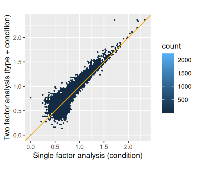
As we can see in Figure 8.9, the p-values in the two-factor analysis are similar to those from the one-factor analysis, but are generally smaller. The more sophisticated analysis has led to an, albeit modest, increase in power. We can also see this by counting the number of genes that pass a certain significance threshold in each case:
compareRes = table(
   `simple analysis` = res$padj < 0.1,
   `two factor` = res2$padj < 0.1 )
addmargins( compareRes )
two factor
simple analysis FALSE TRUE Sum
FALSE 6973 289 7262
TRUE 25 1036 1061
Sum 6998 1325 8323The two-factor analysis found 1325 genes differentially expressed at an FDR threshold of 10%, while the one-factor analysis found 1061. The two-factor analysis has increased detection power. In general, the gain can be even much larger, or also smaller, depending on the data. The proper choice of the model requires informed adaptation to the experimental design and data quality.
8.10 Further statistical concepts
8.10.1 Sharing of dispersion information across genes
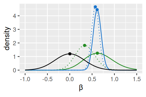
We already saw an explanation of Bayesian (or empirical Bayes) analysis in Figure 6.16. The idea is to use additional information to improve our estimates (information that we either known a priori, or have from analysis of other, but similar data). This idea is particularly useful if the data per se are relatively noisy. DESeq2 uses an empirical Bayes approach for the estimation of the dispersion parameters (the \(\alpha\)s in the third line of Equation 8.11) and, optionally, the logarithmic fold changes (the \(\beta\)s). The priors are, in both cases, taken from the distributions of the maximum-likelihood estimates (MLEs) across all genes. It turns out that both of these distributions are uni-modal; in the case of the \(\beta\)s, with a peak at around 0, in the case of the \(\alpha\), at a particular value, the typical dispersion. The empirical Bayes machinery then shrinks each per-gene MLE towards that peak, by an amount that depends on the sharpness of the empirical prior distribution and the precision of the ML estimate (the better the latter, the less shrinkage will be done). The mathematics are explained in (Love et al. 2014), and Figure 8.10 visualizes the approach for the \(\beta\)s.
8.10.2 Count data transformations
For testing for differential expression we operate on raw counts and use discrete distributions. For other downstream analyses – e.g., for visualization or clustering – it might however be useful to work with transformed versions of the count data.
Maybe the most obvious choice of transformation is the logarithm. However, since count values for a gene can become zero, some advocate the use of pseudocounts, i.e., transformations of the form
\[ y = \log_2(n + 1)\quad\mbox{or more generally,}\quad y = \log_2(n + n_0), \tag{8.12}\]
where \(n\) represents the count values and \(n_0\) is a somehow chosen positive constant.
Let’s look at two alternative approaches that offer more theoretical justification, and a rational way of choosing the parameter equivalent to \(n_0\) above. One method incorporates priors on the sample differences, and the other uses the concept of variance-stabilizing transformations.
Variance-stabilizing transformation
We already explored variance-stabilizing transformations in Section 4.4.4. There we computed a piece-wise linear transformation for a discrete set of random variables (Figure 4.26) and also saw how to use calculus to derive a smooth variance-stabilizing transformation for a gamma-Poisson mixture. These computations are implemented in the DESeq2 package (Anders and Huber 2010):
vsp = varianceStabilizingTransformation(pasilla)Let us explore the effect of this on the data, using the first sample as an example, and comparing it to the \(\log_2\) transformation; the plot is shown in Figure 8.11 and is made with the following:
j = 1
ggplot(
  tibble(
    counts = rep(assay(pasilla)[, j], 2),
    transformed = c(
      assay(vsp)[, j],
      log2(assay(pasilla)[, j])
      ),
    transformation = rep(c("VST", "log2"), each = nrow(pasilla))
  ),
  aes(x = counts, y = transformed, col = transformation)) +
  geom_line() + xlim(c(0, 600)) + ylim(c(0, 9))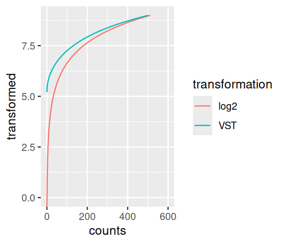
Regularized logarithm (rlog) transformation
There is a second way to come up with a data transformation. It is conceptually distinct from variance stabilization. Instead, it builds upon the shrinkage estimation that we already explored in Section 8.10.1. It works by transforming the original count data to a \(\log_2\)-like scale by fitting a “trivial” model with a separate term for each sample and a prior distribution on the coefficients which is estimated from the data. The fitting employs the same regularization as what we discussed in Section 8.10.1. The transformed data \(q_{ij}\) are defined by the third line of Equation 8.11, where the design matrix \(\left(x_{jk}\right)\) is of size \(K \times (K+1)\) – here \(K\) is the number of samples– and has the form
\[ X=\left(\begin{array}{ccccc}1&1&0&0&\cdot\\1&0&1&0&\cdot\\1&0&0&1&\cdot\\\cdot&\cdot&\cdot&\cdot&\cdot\end{array}\right). \tag{8.13}\]
Without priors, this design matrix would lead to a non-unique solution, however the addition of a prior on non-intercept \(\beta\)s allows for a unique solution to be found.
In DESeq2, this functionality is implemented in the function rlogTransformation. It turns out in practice that the rlog transformation is also approximately variance-stabilizing, but in contrast to the variance-stabilizing transformation of Section 8.10.2 it deals better with data in which the size factors of the different samples are very distinct.
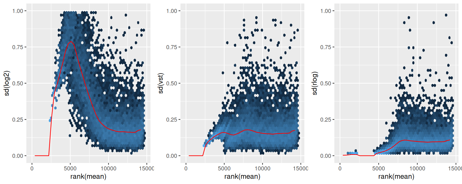
Solution
See Figure 8.12.
library("vsn")
rlp = rlogTransformation(pasilla)

msd = function(x)
  meanSdPlot(x, plot = FALSE)$gg + ylim(c(0, 1)) +
     theme(legend.position = "none")

gridExtra::grid.arrange(
  msd(log2(counts(pasilla, normalized = TRUE) + 1)) +
    ylab("sd(log2)"),
  msd(assay(vsp)) + ylab("sd(vst)"),
  msd(assay(rlp)) + ylab("sd(rlog)"),
  ncol = 3
)
8.10.3 Dealing with outliers
The data sometimes contain isolated instances of very large counts that are apparently unrelated to the experimental or study design, and which may be considered outliers. There are many reasons why outliers can arise, including rare technical or experimental artifacts, read mapping problems in the case of genetically differing samples, and genuine, but rare biological events. In many cases, users appear primarily interested in genes that show a consistent behaviour, and this is the reason why by default, genes that are affected by such outliers are set aside by DESeq. The function calculates, for every gene and for every sample, a diagnostic test for outliers called Cook’s distance(Cook 1977). Cook’s distance is a measure of how much a single sample is influencing the fitted coefficients for a gene, and a large value of Cook’s distance is intended to indicate an outlier count. DESeq2 automatically flags genes with Cook’s distance above a cutoff and sets their p-values and adjusted p-values to NA.
The default cutoff depends on the sample size and number of parameters to be estimated; DESeq2 uses the \(99\%\) quantile of the \(F(p,m-p)\) distribution (with \(p\) the number of parameters including the intercept and \(m\) number of samples).
With many degrees of freedom – i.e., many more samples than number of parameters to be estimated – it might be undesirable to remove entire genes from the analysis just because their data include a single count outlier. An alternate strategy is to replace the outlier counts with the trimmed mean over all samples, adjusted by the size factor for that sample. This approach is conservative: it will not lead to false positives, as it replaces the outlier value with the value predicted by the null hypothesis.
8.10.4 Tests of \(\log_2\) fold change above or below a threshold
Let’s come back to the point we raised in Section 8.6: how to build into the tests our requirement that we want to detect effects that have a strong enough size, as opposed to ones that are statistically significant, but very small. Two arguments to the results function allow for threshold-based Wald tests: lfcThreshold, which takes a numeric of a non-negative threshold value, and altHypothesis, which specifies the kind of test. It can take one of the following four values, where \(\beta\) is the \(\log_2\) fold change specified by the name argument, and \(\theta\) represents lfcThreshold:
greater: \(\beta > \theta\)less: \(\beta < (-\theta)\)greaterAbs: \(\left|\beta\right| > \theta\) (two-tailed test)lessAbs: \(|\beta| < \theta\) (p-values are the maximum of the upper and lower tests)
These are demonstrated in the following code and visually by MA-plots in Figure 8.13. (Note that the plotMA method, which is defined in the DESeq2 package, uses base graphics.)
par(mfrow = c(4, 1), mar = c(2, 2, 1, 1))
myMA = function(h, v, theta = 0.5) {
  plotMA(pasilla, lfcThreshold = theta, altHypothesis = h,
         ylim = c(-2.5, 2.5))
  abline(h = v * theta, col = "dodgerblue", lwd = 2)
}
myMA("greaterAbs", c(-1, 1))
myMA("lessAbs",    c(-1, 1))
myMA("greater",          1)
myMA("less",         -1   )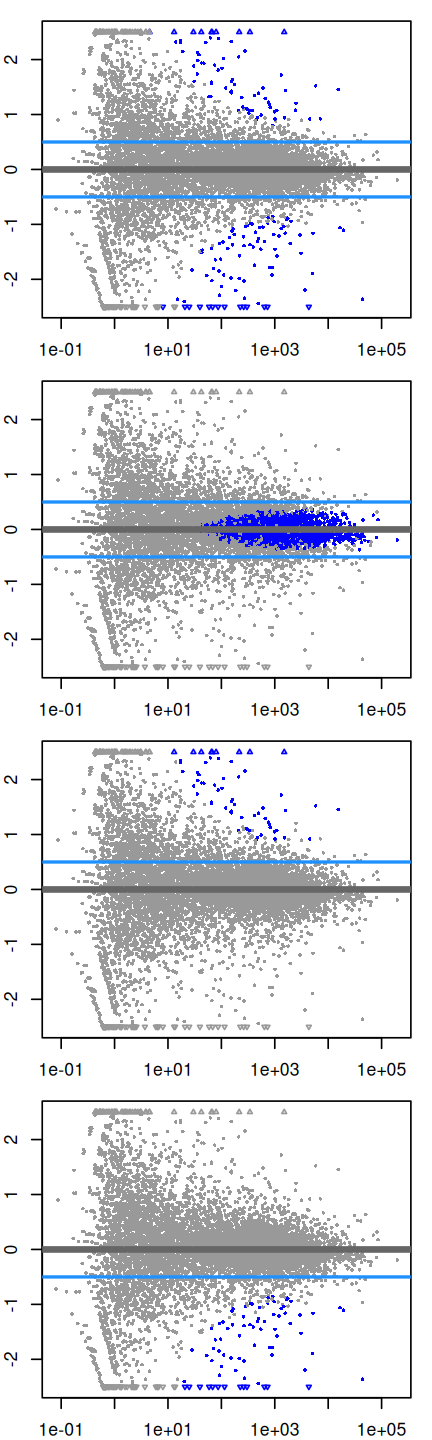
altHypothesis = "greaterAbs", "lessAbs", "greater", and "less".
To produce the results tables instead of MA plots, the same arguments as to plotMA (except ylim) would be provided to the results function.
8.11 Summary of this chapter
We have seen how to analyze count tables from high-throughput sequencing (and analagous data types) for differential abundance. We built upon the powerful and elegant framework of linear models. In this framework, we can analyze a basic two-groups comparison as well as more complex multifactorial designs, or experiments with covariates that have more than two levels or are continuous. In ordinary linear models, the sampling distribution of the data around the expected value is assumed to be independent and normal, with zero mean and the same variances. For count data, the distributions are discrete and tend to be skewed (asymmetric) with highly different variances across the dynamic range. We therefore employed a generalization of ordinary linear models, called generalized linear models (GLMs), and in particular considered gamma-Poisson distributed data with dispersion parameters that we needed to estimate from the data.
Since the sampling depth is typically different for different sequencing runs (replicates), we need to estimate the effect of this variable parameter and take it into account in our model. We did this through the size factors \(s_i\). Often this part of the analysis is called normalization (the term is not particularly descriptive, but unfortunately it is now well-settled in the literature).
For designed experiments, the number of replicates is (and should be) usually too small to estimate the dispersion parameter (and perhaps even the model coefficients) from the data for each gene alone. Therefore we use shrinkage or empirical Bayes techniques, which promise large gains in precision for relatively small costs of bias.
While GLMs let us model the data on their original scale, sometimes it is useful to transform the data to a scale where the data are more homoskedastic and fill out the range more uniformly – for instance, for plotting the data, or for subjecting them to general purpose clustering, dimension reduction or learning methods. To this end, we saw the variance stabilizing transformation.
A major, and quite valid critique of differential expression testing such as exercised here is that the null hypothesis – the effect size is exactly zero – is almost never true, and therefore our approach does not provide consistent estimates of what the differentially expressed gene are. In practice, this may be overcome by considering effect size as well as statistical significance. Moreover, we saw how to use “banded” null hypotheses.
8.12 Further reading
The DESeq2 method is explained in the paper by Love et al. (2014), and practical aspects of the software in the package vignette. See also the edgeR package and paper (Robinson et al. 2009) for a related approach.
A classic textbook on robust regression and outlier detection is the book by Rousseeuw and Leroy (1987). For more recent developments the CRAN task view on Robust Statistical Methods is a good starting point.
The Bioconductor RNA-Seq workflow at https://www.bioconductor.org/help/workflows/rnaseqGene (Love et al. 2015) covers a number of issues related specifically to RNA-Seq that we have sidestepped here.
An extension of the generalized linear model that we saw to detecting alternative exon usage from RNA-Seq data is presented in the DEXSeq paper (Anders et al. 2012), and applications of these ideas to biological discovery were described by Reyes et al. (2013) and Reyes and Huber (2017).
For some sequencing-based assays, such as RIP-Seq, CLIP-Seq, the biological analysis goal boils down to testing whether the ratio of input and immunoprecipitate (IP) has changed between conditions. Mike Love’s post on the Bioconductor forum provides a clear and quick how-to: https://support.bioconductor.org/p/61509.
8.13 Exercises
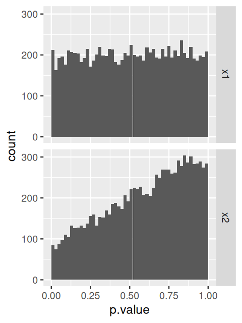
x1 and x2 (see code).
Page built at 21:15 on 2026-07-15 using R version 4.6.0 (2026-04-24)